
Add to collection
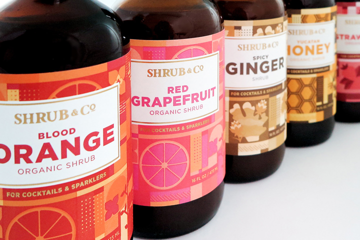

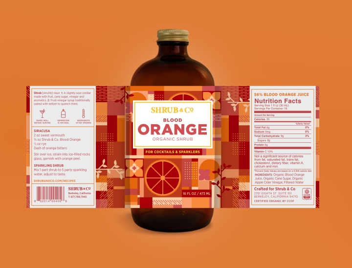
Shrub & Co is a boutique company from Berkeley, California — creating delectable all natural shrubs — which are slightly sour cordials made with cane sugar, vinegar and aromatics. They’re used in specialty cocktails or added to sparkling water for a sweet or sometimes savory and refreshing drink.
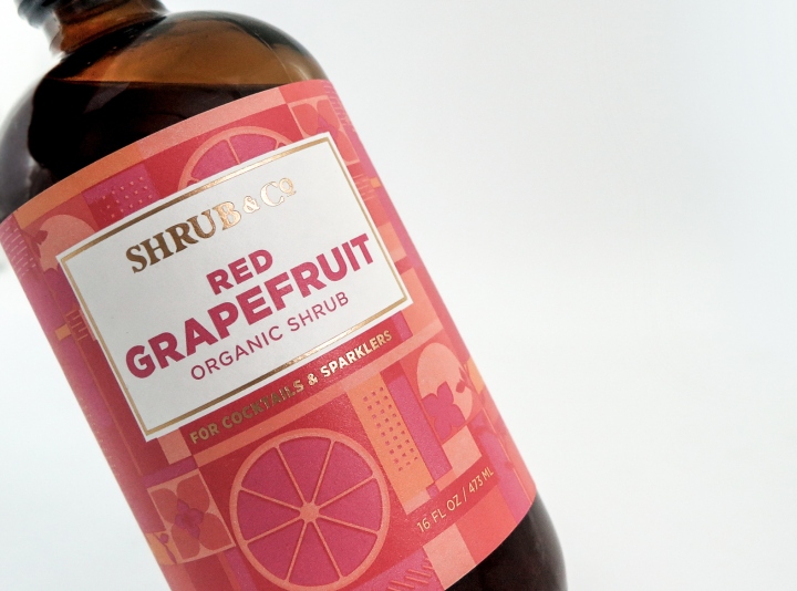
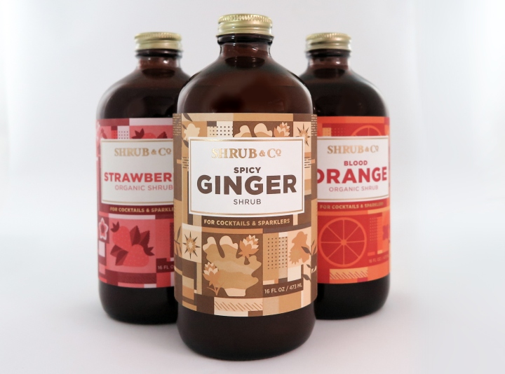
Shrub & Co approached Nørvik Design to redesign their existing set of labels eager for a fresh new look and feel. The concept was to create a flexible graphic system for all eight flavors. Each label has four sets of geometric illustrations that reflect that particular flavor. Within these elements, we play on the unique attributes of the shrub: for instance the orange blossom of the Blood Orange Shrub, or a twig from the Douglas Fir infused Cranberry Shrub.
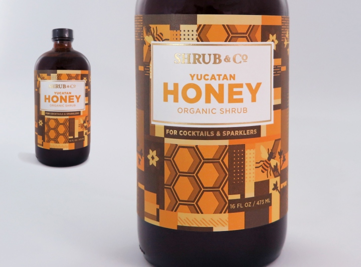
The objective was to creative a label that was versatile for future flavors in development. Shrub & Co’s target audience are cocktail aficionados, bartenders, and high-end liquor purveyors. Our color palette maintains three Pantone swatches for each flavor. A more robust color palette comes from mixing those Pantone inks. The final touch is gold foil stamping. All of these elements come together and create a label just as bold and colorful as the tangy taste of the shrub!
Designed by Gretchen Natvig / Nørvik Design


Add to collection