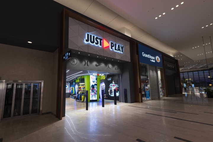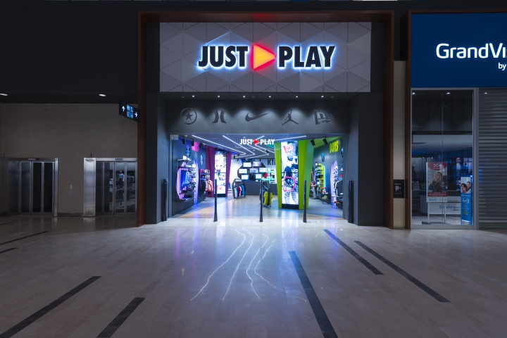
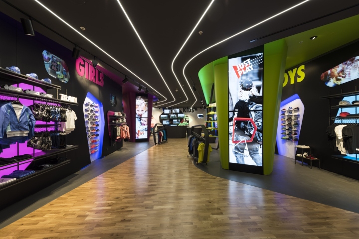

The new chain of sportswear shops, catering for youngsters aged between four and fourteen, opens its first store at the brand new Adigeo Shopping Centre, in collaboration with Nike Inc. The very first “Just Play” store was inaugurated on 29 March, in conjunction with the public opening of the Adigeo Shopping Centre in Verona, Italy. The new sportswear brand, which holds Nike, Converse, Hurley and Jordan brands, plans to meet the growing, specific demands of pre-school kids and young secondary school athletes alike. Project development was entrusted to the “Studio Apostoli” architecture and design practice in Verona. The practice, an authority in various fields at international level, worked initially on analysing the strategic, operational and economic feasibility of the project.

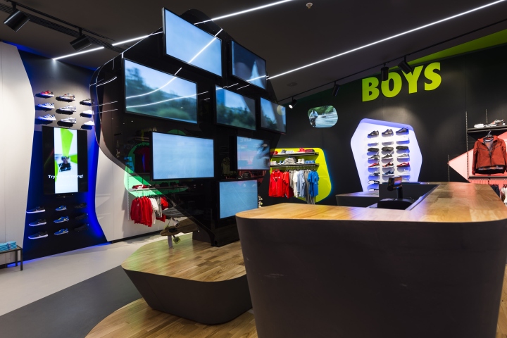
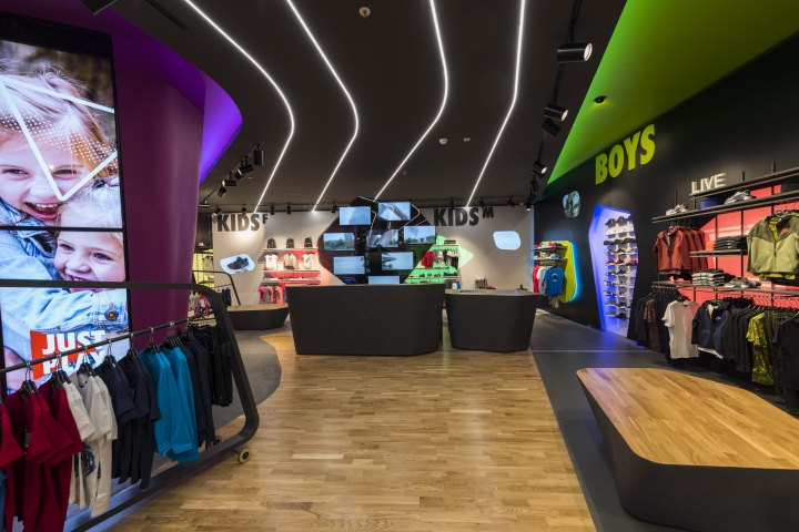
Based on this survey, it then developed a new concept of store that breaks away from monotonous patterns linked to classical Point of Sale concepts, aiming to become a specific benchmark for young athletes and their parents. The Concept stems precisely from the observed need for teenagers to find a place they can fully identify with, where they can express their desire to play, to surface and play sports. An analysis made on different sociological and market information has thuscome up with a truly innovative store model, the result of a merger between store and online shop. This store impresses with its strong, decisive character and the clear-cut theming of its various areas. The entrance front view opens onto a central path which focuses on a multimedia tree, the hub of the store.

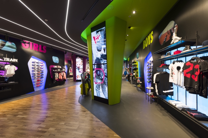
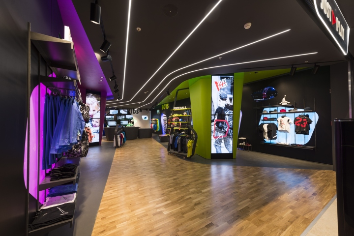
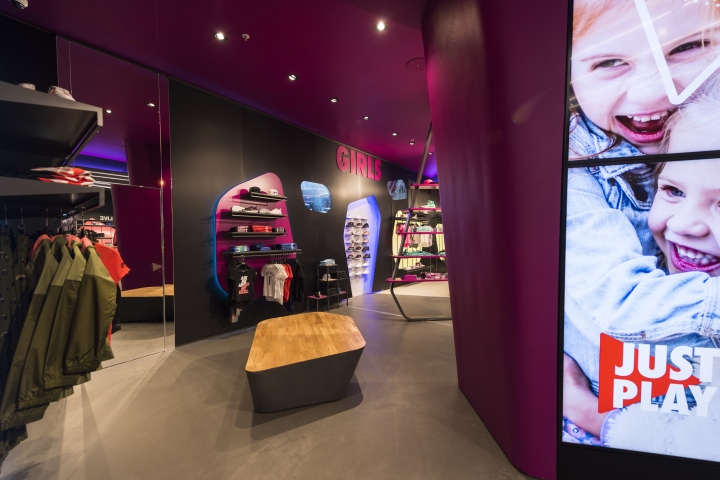
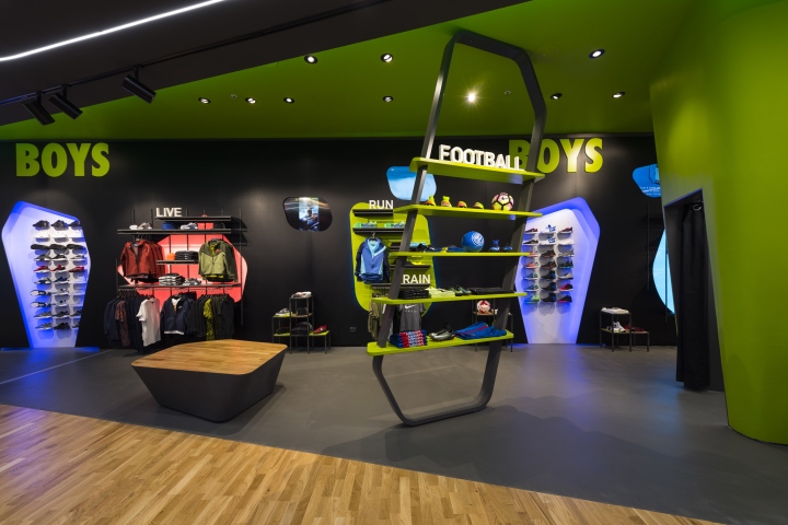
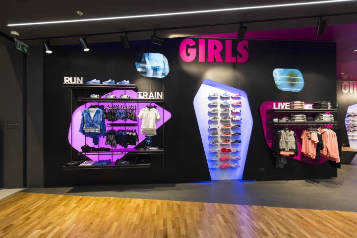
On both sides of the path, two mirrored and complementary spaces are immediately recognisable for their colourful aspect, full of vitamins and energy. Two prismatic totems, coloured green and fuchsia, characterise these spaces; at the same time serving as internal communication totems and dressing rooms for the store’s young customers. These also include some impressive, recessed video walls, immediately visible from the entrance and composed of sixteen screens, which can either act independently or form one large image. The totems seem to make a breach in the ceiling, invading it with their dynamic, colourful presence, providing strong impact for a scenicbackdrop which is intentionally urban in style.The store is divided into three main areas for the public, according to the two sexes and two age groups, and featuring some micro corners for the four brands.

From the architectural and interior design point of view, the Concept exudes dynamism, created using bright colours and irregular shapes, extremely attractive and designed for the specific target. Important tools for emotional communication include not only, in multimedia terms, the various recessed wall screens along the perimeter, used to define brands and sectors, but also, in concrete terms, the various island units, reminiscent of sports equipment shapes, such as skateboards or surfboards, in contrast with the deliberately essential, almost Spartan, clothes hangers in metal, Plexiglas and lacquered wood.The floors, irregularly shaped, are partly made of wood, with a clear reference to parquet gyms and typical basketball court markings, and partly in resin, with an effect defined as “street”. The ceiling features various bright lines of strong character, reminiscent of an athletics track.

All furnishings are custom-designed and again feature particular irregular shapes and contrast, achieved by the use of wood and metal. Lighting is the soul of the project; studied with particular attention and obtained through the installation of RGB lighting fixtures, combined with a DALI system able to handle scenarios in combination with the operation of the various monitors or programmed scenarios and which can be managed directly by the customer. Two main scenarios in particular have been identified, depending on the type of user that the store is catering for: parental figures in the morning timeslot, when the expected scenario will be softer and smoother, children in the afternoons and on weekends, times when lights, colours and videos become extremely impactful, dynamic and absorbing.

There are several spotlights in the suspended ceiling providing concentrated illumination for specific areas, while some LED strips run along the perimeter of the various display areas to create lighting and shadow effects. Apostoli has approached the project with the notions of “marketing and communication acknowledgment” which so often characterise his work, combined with expertise in the multimedia sector. In line with the established trend of the Millennial Generation, those born after the year 2000, the store offers maximum connectivity plus the ability to actively interact with multimedia technologies.Young buyers will find a tree of tablets and monitors in front of them at the entrance, displaying all products on sale.

They can also get feedback and direct contact with the store community, and register to fully enjoy their shopping experience. Once a preference is expressed, users will be able to locate the desired items, following the instructions on the same tablet which will guide them through the store like a real browser. The totem video walls are not just communication aids, but real tools which enhance a shopping experience, making it more absorbing and memorable through the use of virtual mirrors. These devices contain a library of 3D garments, which are also available on the various displays in the store, and use these video-mirrors to make items appear as if the user had them on, changing models and colours with a simple click.

The whole experience can obviously be shared on social networks, and it is possible to link and integrate the physical shopping experiencein the store with the store available online.Changeable and dynamic, “Just Play” aims to establish itself not only as a simple point of sale, but a meeting place, especially for children, to live and share situations and emotions, one tailor-made to customer needs and always able to make shopping a different and rewarding experience. The guiding idea is not only to provide shopping but also to host various kinds of events.
Design: Alberto Apostoli Architecture and Design
Photography: Luca Morandin
