
Eindhoven – A visit to the optician rarely entails much surprise – white walls and tiles, a series of frames displayed on wall-mounted shelves, neon lights and a few desks. But for eyewear retailer Ace & Tate, individuality is key, and not just when it comes to picking a pair of sunglasses.
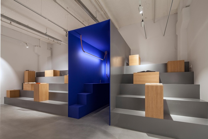
As seen in their Amsterdam and Utrecht locations, both inspired and created by artists, the brand is fond of interiors with distinctive stories that give their spaces a transcendent quality. No Ace & Tate store is ever ‘just’ a place to purchase eyewear.
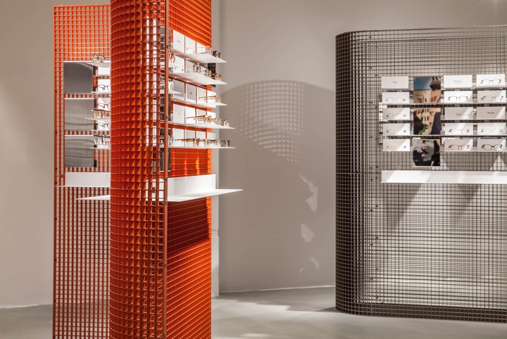
Designed by OS & OOS, Ace & Tate’s new Eindhoven location – the brand’s biggest thus far – draws inspiration from the city’s distinctive industrial architecture while putting forth a play on optometric notions of far-sightedness and near-sightedness.
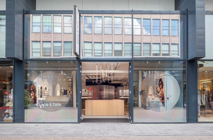
These concepts were translated spatially through a play on visual perception: the space gradually reveals itself as the store’s slightly reflective façade draws visitors in.
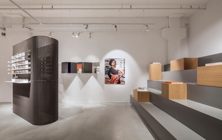
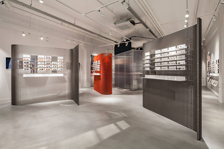
OS & OOS dismissed bland carpets and tiles reminiscent of medical examination rooms in favour of raw concrete in line with Eindhoven’s historical architecture style. Traditional optometric elements were also adapted to the theme; the store’s display system was integrated into a standing metal grid, for instance.
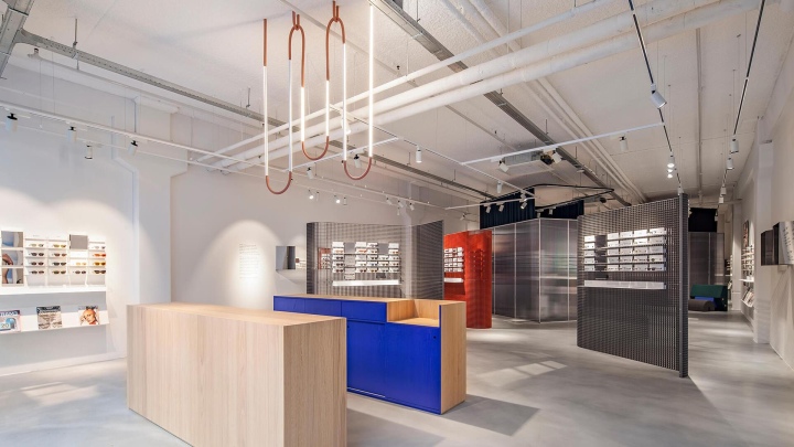
This gesture is not only a supplemental nod to the city’s industrial architectural structures, but also a way to challenge expectations and give the space the ambiance of an art gallery thanks to the sharp lines and juxtaposition of colourful metal and concrete.
Text: Chahinez Bensari
Photos: Wouter van der Sar
https://www.frameweb.com/news/ace-tate-eindhoven-retail-becomes-art-form


Add to collection

