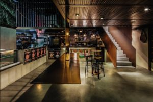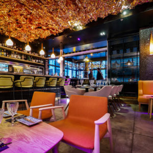
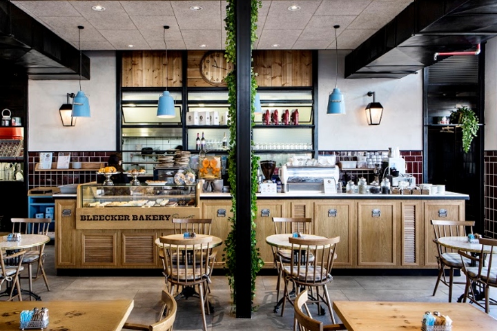

Bleecker Bakery is a chain of neighborhood restaurants with approximately 25 branches around the country. The chain offers a varied dairy menu, as well as their coffee and pastries menu. Our design brief was to create a familiar and relaxed ambiance, a place where the neighborhood could come together to eat, drink and feel at home. At Itay Gidron Studios, we saw space as a place where the customer would feel like they are entertaining friends in their own backyard. At the initial stage of the project, we visited many restaurants and neighborhood cafes to research the very essence of a neighborhood establishment.
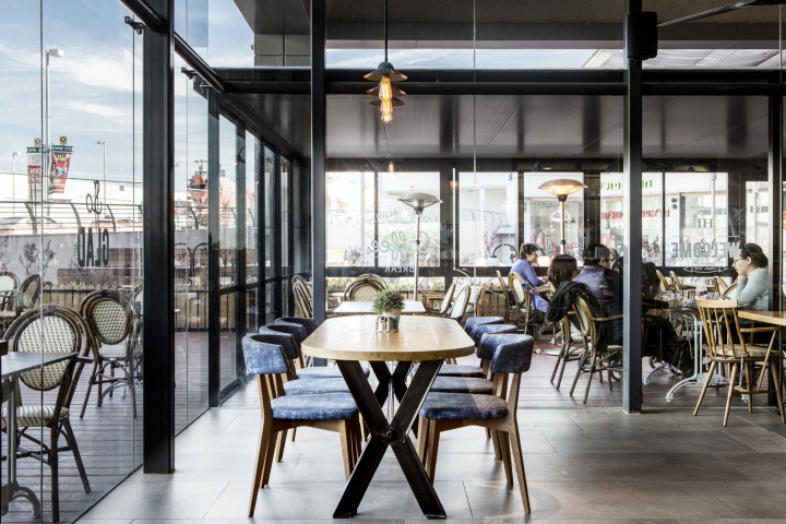
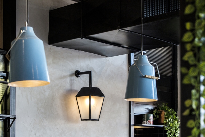
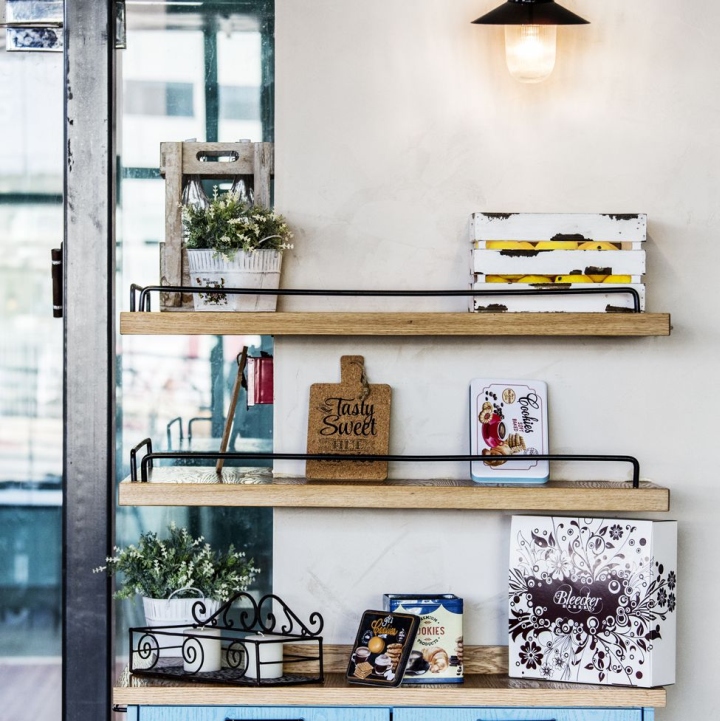
We took inspiration from the design themes as well as the materials used in these spaces to give a homely feel. In the plan, we tried to maintain clear, definitive, lines of material and texture, and to preserve the character and identity of the chain among all the different branches. One of the ways to do so is by the use of the brand color, the sky blue, in the small details of the furnishings, including the light fittings, highlight fabrics and small decorations. The range of materials were chosen specifically for being simple and easily available – natural oak wood, black iron, brown ceramic tiles, bright plaster, and a floor of granite-porcelain in a cement shade.
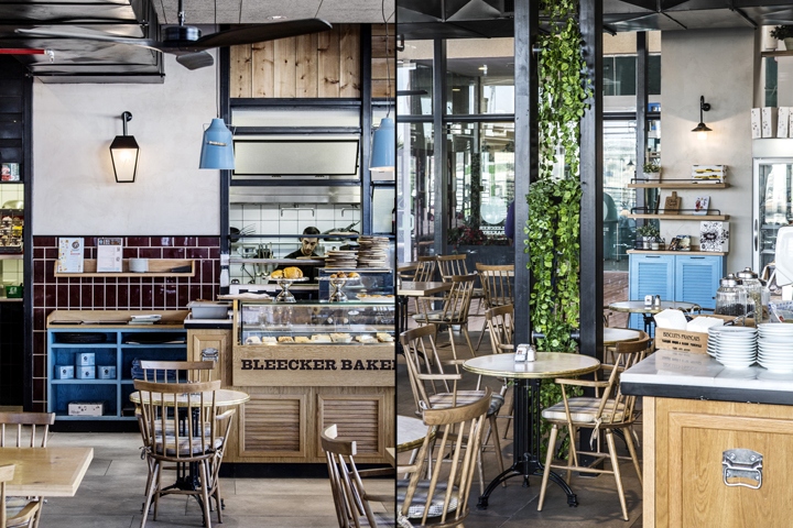
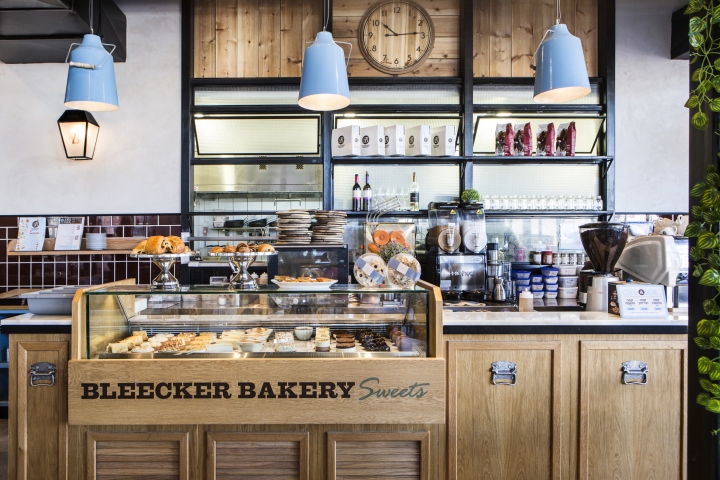
Another important feature within the branch, which was given a lot of design attention, was the display of the baked goods and desserts. We showcased the pastries and desserts within a natural oak veneer display. The showcase, set in front of the backdrop of the white Carrara surface and with light fixtures above, draws the customers’ eyes to the delicious treats inside, making them hard to resist. To further highlight the intimate and homely feel, we liked the idea of an open kitchen.
So instead of a wall dividing the bar from the kitchen, a 3×4, floor to ceiling window was designed with glass and wood to allow for a flow between the kitchen and restaurant area and for customers to see the activity of the chefs inside. Two black dividers stand on either side of the window, one leading to the kitchen entrance and one for the restrooms, further drawing attention to the light from the kitchen. Made of cast iron, these doorways were designed with light features above to create a sense of depth.

Throughout the branch, the walls were painted with light cement and fitted with a street-light like light fitting, to enhance the feeling of being “outside”. Each of the custom designed light fittings also contains the chain logo. One challenge we encountered in this branch were the support-beams in the center of the space. After some thought, we decided that “less is more” and so kept them as clean as possible. They were painted black so they would match the room dividers and not take any attention away from the rest of the design.
Garnished with greenery, they helped to add a certain level of intimacy throughout the space. In one of the corners we placed a table for 6-8 diners. This area was designed with the specific purpose of being an area for a small event or meet-up with a larger group of friends. In order to give this space a little separation from the rest of the restaurant and to encourage a more sociable experience, the oak table was designed in an oval shape with specially upholstered chairs and 3 hanging fixtures above it.
Design: Studio itay Gidron
Photography: Itay Benit




Add to collection

