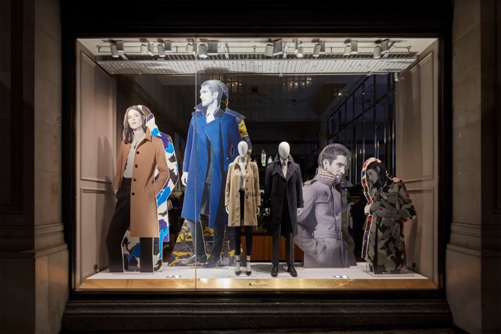

Design direction from client: ‘Monochrome with a colour accent; a break from black and white. Colour is a powerful force; that draws our focus to the intrinsic features of the pieces photographed. Images are cropped with purpose to accentuate the beauty of the cloth, texture and details.’ The client wanted to have over-sized/giant cut-outs of the campaign imagery centre-stage, as larger than life standalone props.
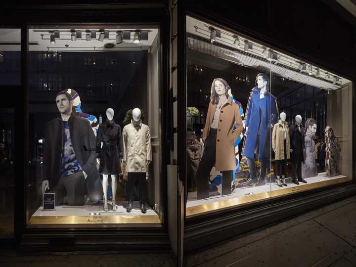
The colour palette was mostly monochromatic, and it was Hello Flamingo’s job to drive the creative concept to include the camouflage print. So, the design team gave each of the cut-outs their own camouflage shadow – which you can find in the season’s collection.
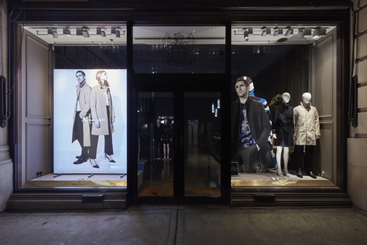
The camo shadows were set 50mm back from the photography to give a sense of depth and all the cut-outs were staggered in the window to enhance that feeling of depth. The cut-outs were huge, some were over 3m high to fill the vast Westfield window space. The display is simple, however, it is incredibly impactful and works well in the enormous Westfield windows, as well as the smaller GMS ones.
Design: Hello Flamingo Ltd.
Photography: Melvyn Vincent


Add to collection
