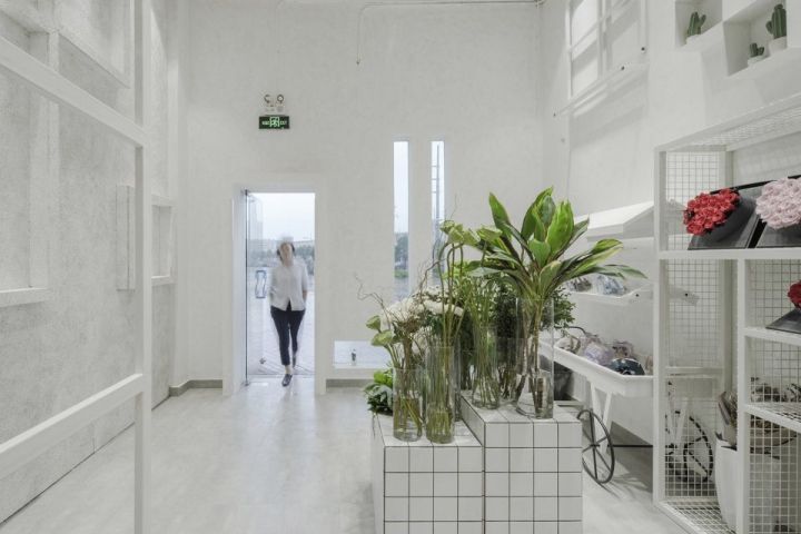

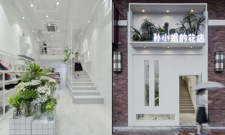
White door in the red brick against the background is particularly eye-catching, not only the simple rectangular light into interior spaces, but also to let pedestrians pass by the store to watch the accessibility of the vitality of the plant, the door is not a common symbol design but to join the display of the property, the level of scattered tropical plants, has not yet entered the flower shop was attracted by its unique temperament. The location of Sun’s flower shop is in Wanda Plaza of Changshu witch have flowers, courses and buyer coats. Designed in this project only with a white and a single square element to create a pleasant plant kingdom, set off the characteristics of the product at the same time without losing the fun of space.
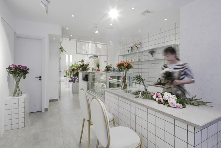
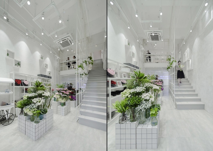
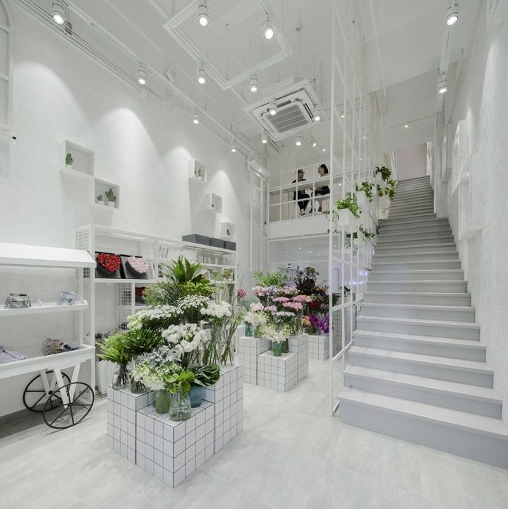
Different from other stores in the region can bring psychological touch of cool to the customer at any time. The first floor of the entrance placed three groups of high and low flower racks to meet the bottled flowers into the column, the left side of the wall can display the eternal life, aromatherapy candles and other gift package products. Cash bar in the second half of the floor, to ensure that florists have a relatively independent and not subject to interference creative space.In the absence of freezer, we have arranged in the inside of a storage of fresh flowers cold storage, enough to spend on weekdays retail flowers and movable timber.
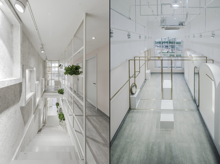
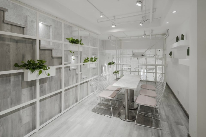
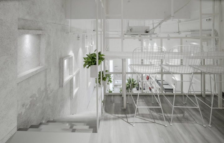
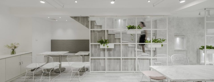
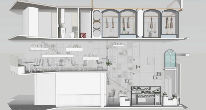
The mezzanine on the first floor is mainly for communication, and is used for daily flower lessons, friends small gathering, Confidante afternoon tea. Designers here arranged three different types of tables and chairs. In the sandwich fence designed a bar, which achieved with the first floor of the barrier-free communication, sitting in the bar chair can be directly seen downstairs three groups of flowers display area and long strip of glass into the sun. Put yourself in a relaxed atmosphere as if you were on holiday. The two groups of seats can be separated or merged, after the merger fully meet the needs of a multiplayer course.
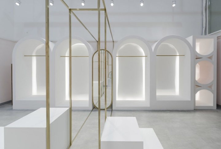
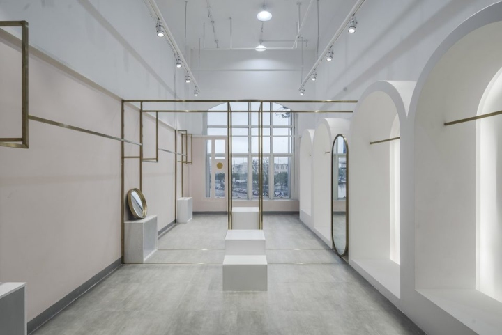
Inside and staircase between the deck to provide chat to two or three people. On the second floor for the display and sales of hand-dress, the designer left the window to the best position of the light left to the product display, the guests will be the purpose of direct access to the display area after a lap to visit the locker room, In order to facilitate the payment side of the locker room is the cashier. The walking stream of the guest presents a U-shaped, barrier-free and does not go back to the road. In particular, we arranged a toilet next to the stairs that were about to leave, In order to avoid the repeated replacement clothing after makeup.

The mezzanine floor of the second floor is the office for the staff of Miss Sun. Although it is limited in size, it meets the needs of their daily work and meetings. On the first floor of the mezzanine and the second floor of the connection, we designed a straight to the top of the stairs, the inspiration from the Vietnamese thin floor, in a narrow space, the designer after repeated study to ensure that the space to maximize the use of Comfort, the angle of the stairs and the height of each staircase made a decision.
The handrail at the staircase was replaced by an ingenious steel structure square elements were used throughout the space. This design not only creates a good atmosphere but also serves as a display area for hydroponic plants and makes it on the stairs of people in the absence of handrails in the case, comprehensive protection can still be achieved. The walls of the stairs are made of wood with a square of different sizes, as the plane display area, and a square steel structure in Vicenza, makes the spatial feature of good interest are realized.
Design: D+space design
Photography: Fancy Images
http://www.gooood.hk/warmer-white-by-dspace-design.htm


Add to collection
