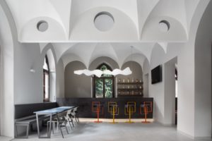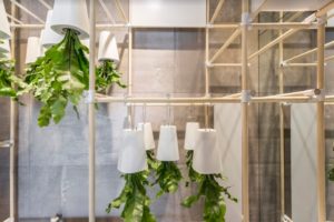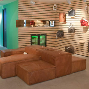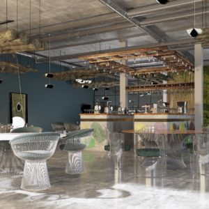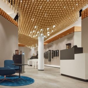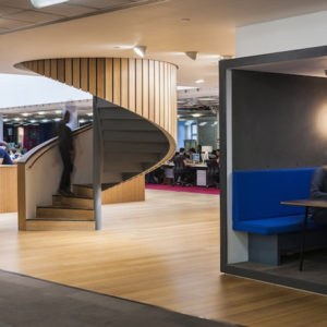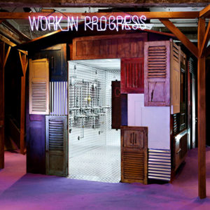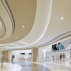

Previously it was a two-floor white modern building; this project intends to upgrade the space in the first floor while the existing function in the second floor is kept. Based on the number of diners and the functional needs, the spatial layout is rearranged by adding to the southwest part of the original building, so as to form an indoor coffee zone in the first floor and an open terrace in the second floor. In terms of design, we try not to affect the sense of integrity of the original building, but deliver the spiritual presence with a stronger sense of modernity to the new building through the new addition.

The new addition is made of steel framework, the south part is partitioned by a transparent glass, the west part facing the river is entirely provided with an opening/closing glass door, and the thickness of the roof is minimized to make it light and transparent. After the previous southward wall in the first floor is removed from the window, we replace it with a fully transparent glass and partition, when all glass doors are opened, the boundary between indoor and outdoor space becomes vague, the flowers, grasses and trees in the outdoor courtyard are also incorporated as a part of the indoor space, and the natural environment and the building are not marked, so that the spatial levels of indoor, outdoor, and natural courtyard are progressive.

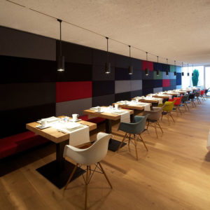
With a view to material selection, we use harmonious material and color to ensure that the space is generally elegant, comfortable and poetic. The original dining table is harmonious and complementary to the gray and wooden chairs, terrazzo floor, and the dining zone covered with small white square tiles. The chandelier above the table has a unique shape, which also changes the spatial rhythm. The original staircase accessible to the second floor is removed and redesigned, the new staircase has a stronger sense of modeling, its red coating becomes a brilliant spot for the whole space as well as the most pleasant note in the restaurant.

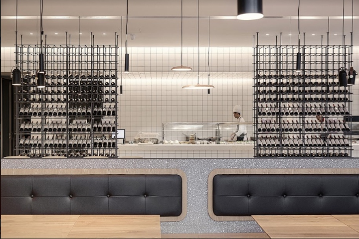
The new staircase is not completely closed, so that the intermediate space between two floors is connected and associated. The metal wine rack is partitioned and grid-shaped in such a way that the spatial shape becomes light and transparent. After this upgrading project, in addition to the Chinese and western food, the restaurant additionally has a food supermarket next to the coffee bar counter, which provides fresh organic vegetables and fruits, wine and organic cereal in gift wraps, and meets the diners’ needs for healthy food materials.
Design: A3 Vision
Photography: Hongyu Sun


Add to collection
