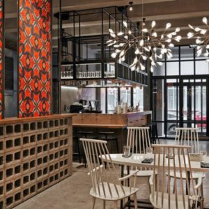

In the latter half of 2016, the rebuilding construction firm received a special transformation commission, the client said, ”we want to a KTV, but it isn`t like a KTV. People can play, sing, dance and so on in it. ”The client`s request is very special, the information of the request is very large. In the broad sense, the design requirements made us to break the fixed patters to design the new KTV. We started from the two basic points and focused on two problems. We design the new KTV to totally different from the tradition KTV. It can make the customers feel special, happy, interest and so on.

THE RINGS IN THE LOBBY
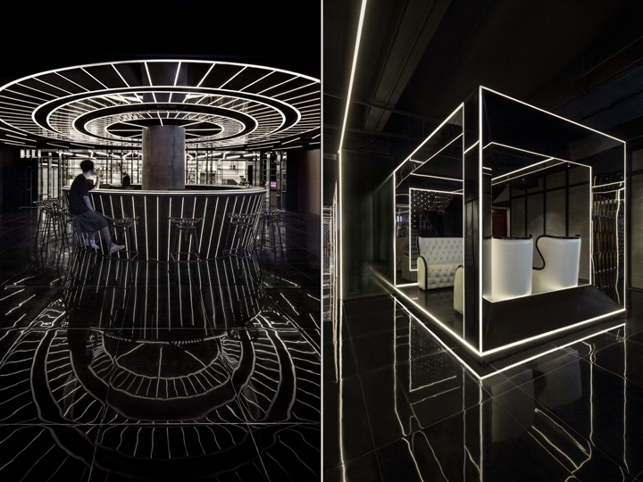
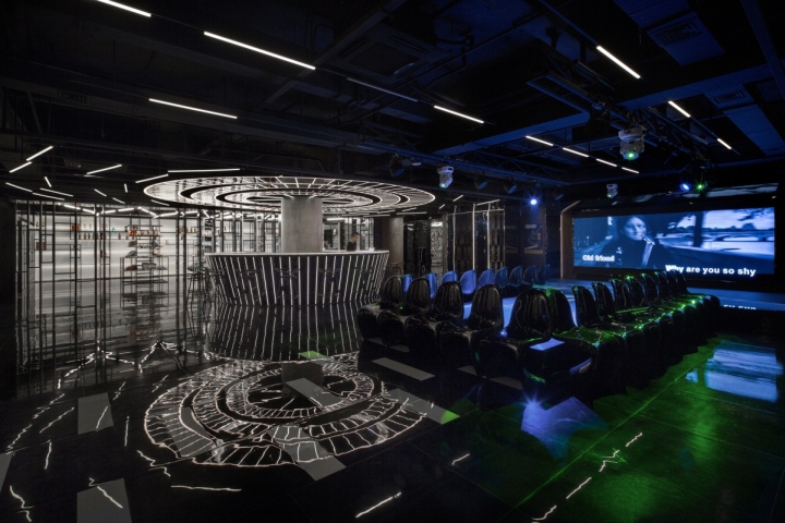
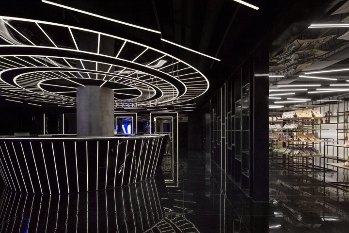
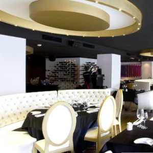
As the door of the elevator opens, the magnificent shining comes any eyes. The light rings of the help desk, the shape of smallpox and the reflection of the ground shine each other. These shining rings become the visual memories of the lobby.the shape of the “rings”also makes the active lines smoother.

PROGRESSIVE OVERLAPPING
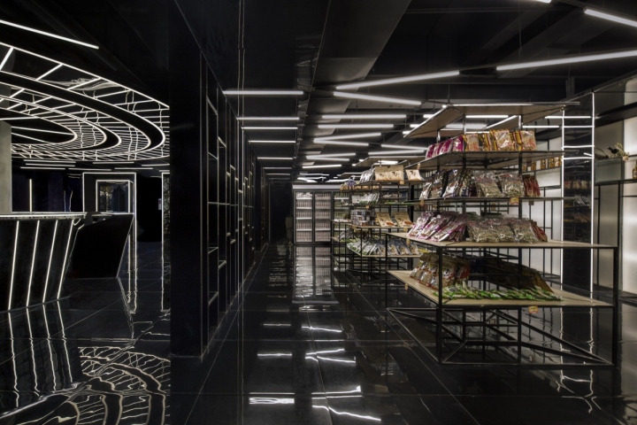
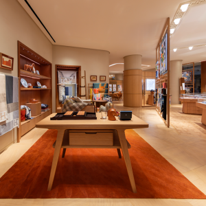
The space from the T to the “Rings” is presented by superposition effect of the three views. The main view is the rings of the help desk and ceiling shape. The buffer view is the wine rack partition of audio concept as the wall of the supermarket.The background view is the display wall in the supermarket.

SUSPENSION
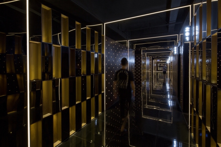
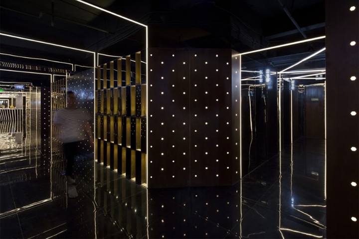
The customers in the KTV are in a half – drunk state,we faced with two choices.We chose to make them a little more sober or a half – drunk state. We chose the latter. The linear light source from the surface of the ground to the wall and ceiling reflect to the light reflective brick surface. It can create a kind of feeling—suspensive. People stand on the ground as if they were standing in the space or they can think that they are between the actual space and reflective space. The design of the passageway is obvious.

THE TRANSFIXON
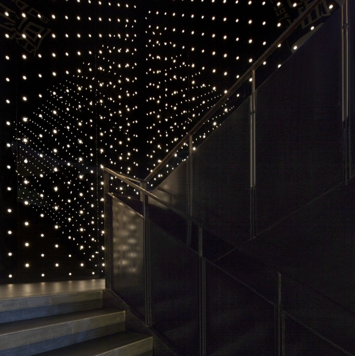
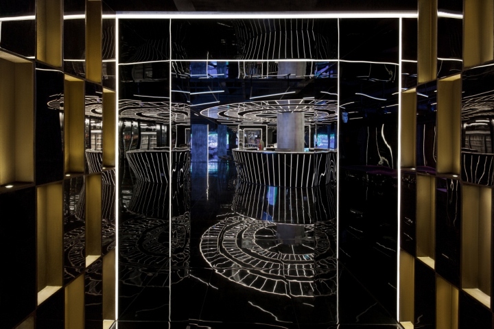
The whole block of the project is divided into four parts. They are the lobby, the first passageway, the staircase hall of the second floor to the third and the second passageway. We created a suspension like in the air as “cube”. It is special practical view from the lobby to the rooms.There are two doors at the ends of the east and west of the “cube”. The passageway and the stairs are in the same straight line. You stand on the passageway or the stair,the “cube” is like the same frame to emphasize the sense of ceremony.

THE UNEXPECTED
Almost things are becoming more and more controllable. If they are like a video player to easily use, our life may be more and more boring. We need some unceitain and unexpected things. Base on them, we used a lot of reflective materials in the space. The reflective mirrors, infinite reflection from the mirrors, the reflection of the different angles, they can make people or things meet and see each other on different positions and angles. They also see the views of various, conjoint, reflective pictures.

THE VIGNETTING
Most of the entertainment sites choose to use colorful light sources to render its atmosphere. However we chose warm white light only one colour. We want to show entertainment by space and materials so that we can be different from the others. They render the KTV atmosphere by use ambient light.
Design: Shenzhen Rebuilding Design Studio
Photography: Niestudio
