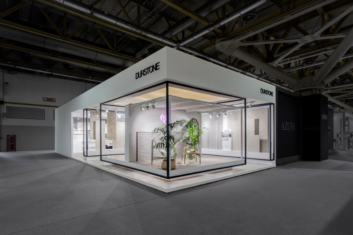

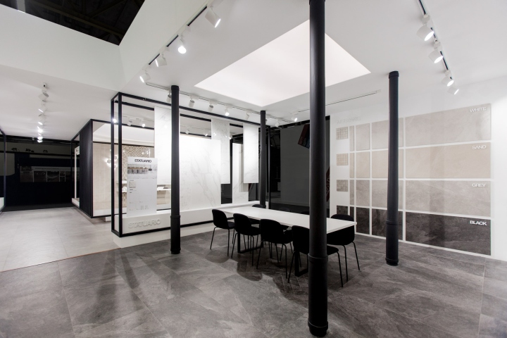
The goal was to create a space to present two brands under the same roof: Durstone and Q. Durstone is the main brand of the company, that includes their floor tiles collections and is characterized by minimal architecture. On the other hand, their wall tiles are included in Q: a “young soul” brand that reappears at this fair with a renewed concept: the “The Blooming Gallery”. The minimalist and open-space concept for Durstone is characterized by the black on white contrast and clean, sleek lines.
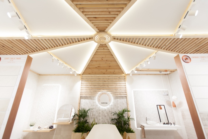
Therefore the attention is focused on the new collections with original displays and two mock-ups placed at the entrance. A series of elevated platforms formed the different exhibition areas, whose system is mainly a series of panels that emerge from the platforms and are suspended from the ceiling. Definitely, the design of the “Casa Chic” mock-up at the entrance is the highlight of the stand: french provence heart and mediterranean soul. On the other hand, the young soul brand q manifests itself into the stand as “The Blooming Galley”.
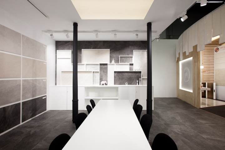
Japanese inspiration is found in that space due to the simple shapes and materials such as pine wood, fabric and cooper. Its composition is radial, starting from the “Q” placed on the top of the roof, following through the stripped latticework and ending on a central meeting space. The exhibition system provides a perfect appreciation of their new wall tile collections. In essence, the stand presents a cohesive space that showcases the main product line, Durstone, as well as the company’s “Q” collection, focusing on youthful and contemporary styles.
Design and photography: VXLAB


Add to collection

