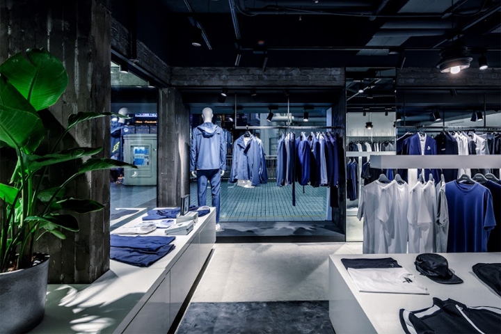

A major Hong Kong based fashion group established a new lifestyle brand for young and fashion-forward men, requires a spatial design for their first retail store that reflect it brand identity.
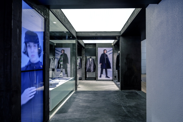
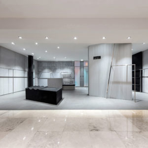
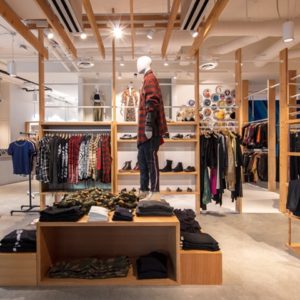
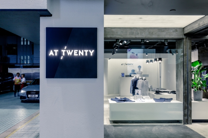
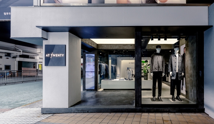
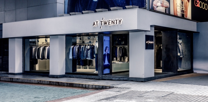
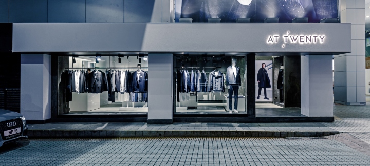
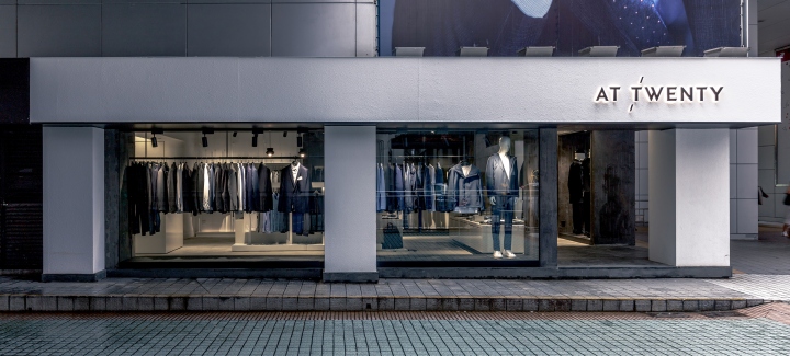
Located at a prominent corner unit in Causeway Bay, the retail heart of Hong Kong, the new concept store of At Twenty designed by VERB STUDIO in collaboration with PARA DESIGNWORKS, aimed to create a spatial experience that manifest the philosophy of the brand and it products.
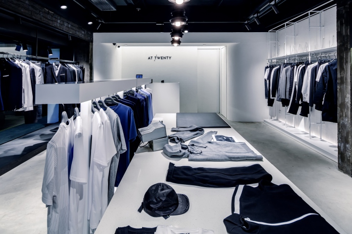
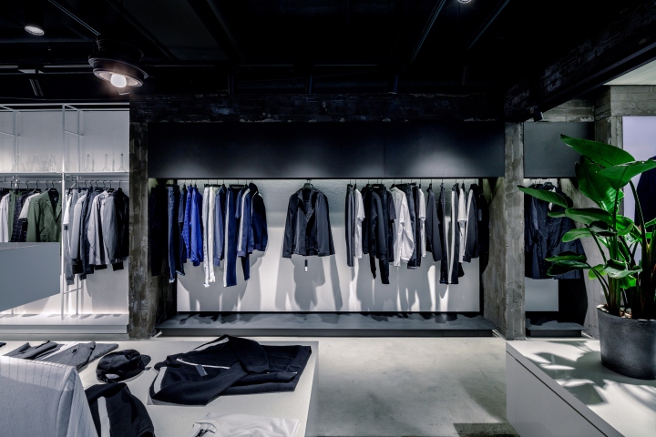
The design started with a minimal approach that the geometry has been stripped down to it fundamental state. The existing structural frame of the facade have been revealed and preserved, while a new grid works has been implemented at the interior to define different zones.
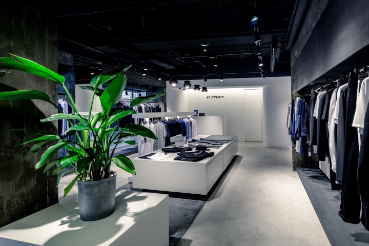
The design further refined through the emphasis on material and texture, the soft stucco like exterior in white; the grayish casted concrete texture at the interior; linked through a sharp matte black metal. As the result, a design delivered a spatial experience that resonates with character of its brand identity.
Design: VERB + PARA
Photography: Increase Production Limited


Add to collection


