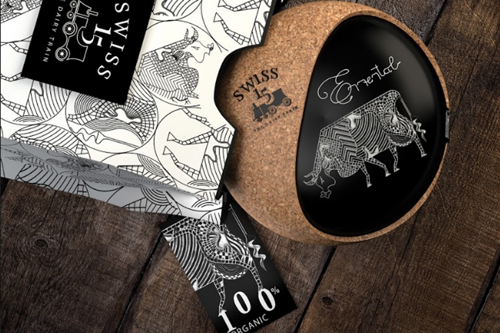

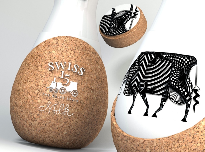
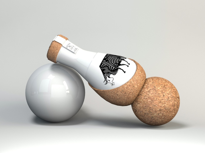
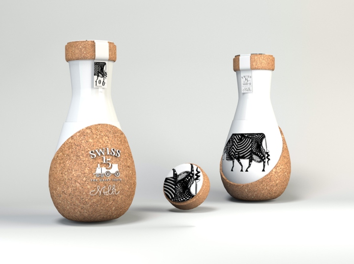
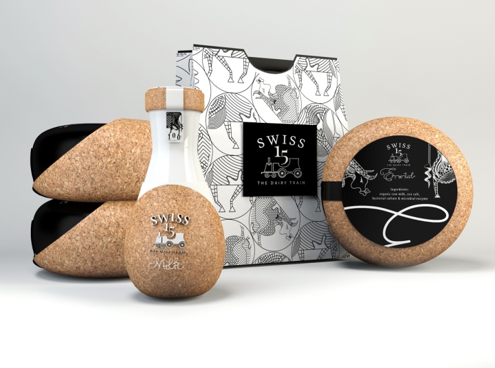
Using handcrafted elements on organic, moveable shapes for unveiling an authentic visual message. “Swiss 15 – The dairy train” project wants to reinvent the classical image of dairy packaging, elevating the symbol of the milk’s creator to a more iconic one. The organic shapes of the products are using light and clean lines in their design composition and also natural, bio-degradable materials – glass, cork, natural wax.
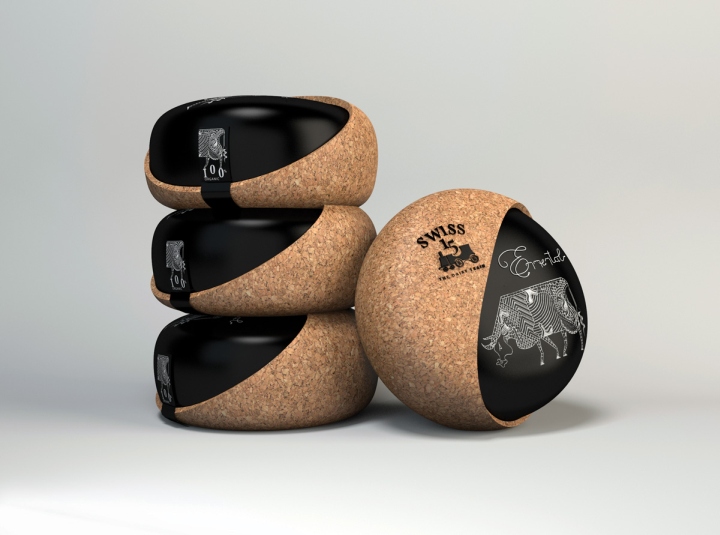
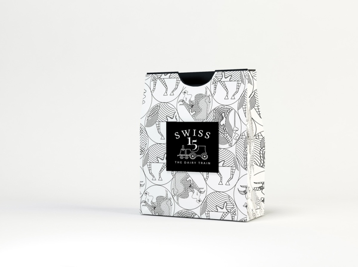
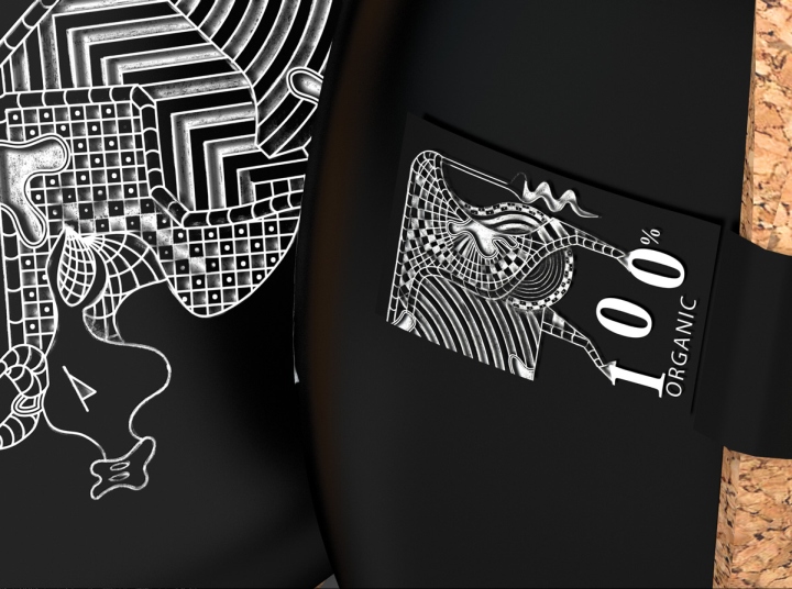
The creative direction of the Swiss milk and cheese packaging design sends the eye directly to the contemporary black and white pattern that covers the body of the animal in question. Working with the hands, pencils and other instruments on textured paper, combining old with new, crafted details with computer generated elements gives authenticity and value to the dairy packaging design.
Design and photography: CreativeByDefinition





Add to collection


