
Köln Arcaden – New Shopping Experience in Cologne Kalk District.
The district Cologne Kalk on the right hand of the Rhine shapes up well. Also the shopping mall “Köln Arcaden” in its center appears now in a new guise. Along the entire customer journey, kplus konzept has developed a modern, inviting design for the changing target groups in the district. Living on the “Schäl Sick”, which means “wrong side” in Cologne dialect for all districts on the right side of the river Rhine, gets an increasingly better image for the young, mobile middle class.
The former working-class district – well connected in terms of infrastructure, home to numerous start-ups and large corporations, and in the forefront when it comes to the development of former industrial sites – is currently turning into an inspiring, creative multi-cultural and easy-living district. So the mission for the mall refurbishment was to surprise, to stage, to arouse emotions.
In line with the young target group, three thematic shopping areas were developed and implemented (in close cooperation with the property manager mfi – a division of Unibail-Rodamco Group): the “Urban Heights” on the first floor, “Dynamic Downtown” on the ground floor and the “Streetkitchen” in the basement. Each level has got its own look & feel appropriate to the theme. In addition, the main entrance and all the side entrances have been redesigned by kplus konzept and become a new attraction.
Signage with Patterns
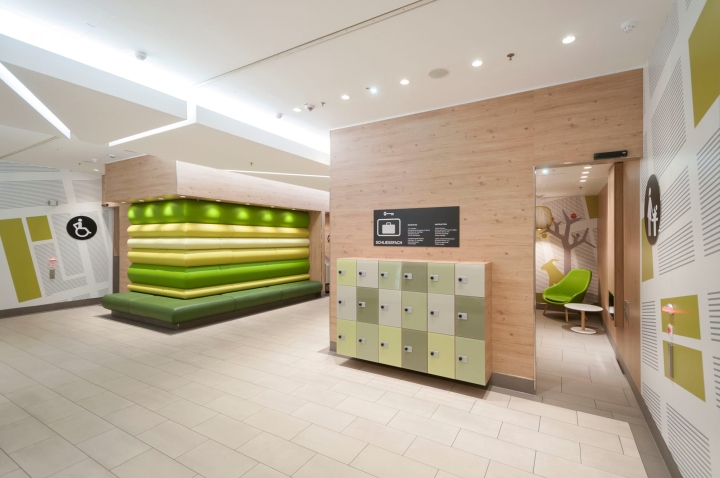
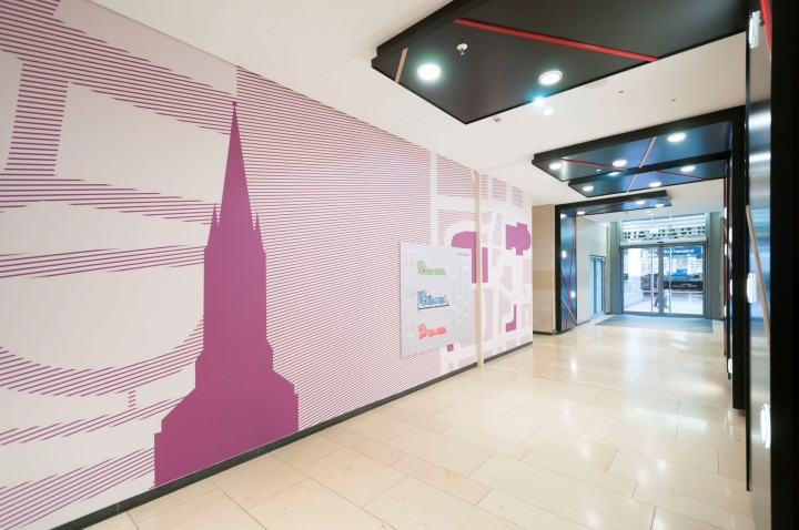
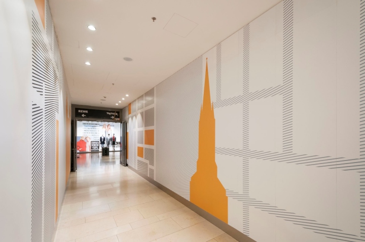
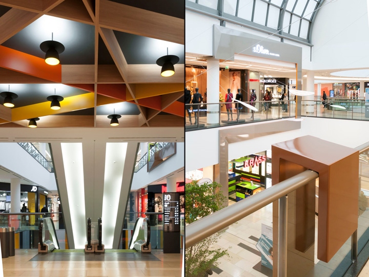
The basis for the differentiation of the floors is a graphic developed from the grid of the Cologne city map. Each pattern marks floors and parking levels, always in combination with a different colour theme, providing in this way not only aesthetics, but also the best possible orientation. Ceiling light, wall and floor design of the rest areas – they all skilfully play with the pattern theme.
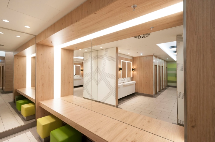
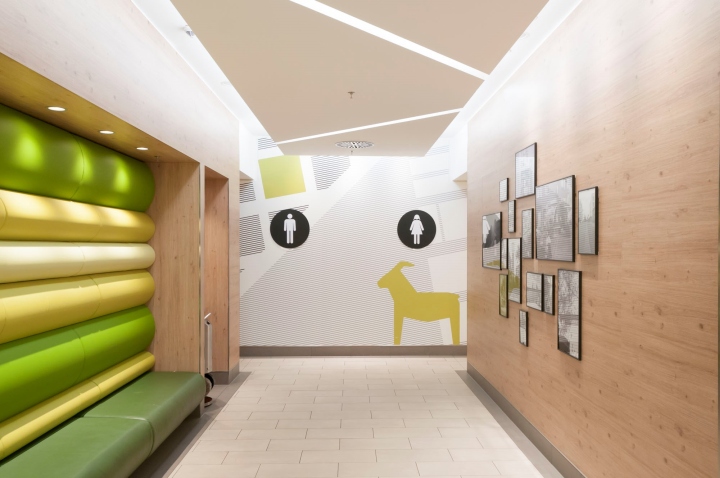
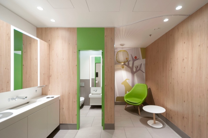
And, no doubt, Kalk district, even though on the “Schäl Sick” is a part of Cologne: the wall graphics integrate the landmarks of the Rhine metropolis in silhouette (including the mascot billy goat of the soccer team Fortuna Köln). They can be admired at all stages of the customer journey and serve as a guiding system in the building. For example when stopping over in the completely redesigned customer toilet, which presents itself in refreshing aesthetics as a true oasis of well-being with a lot of comfort and services, such as a nursing and nappy changing lounge.
The Sky over Cologne Kalk
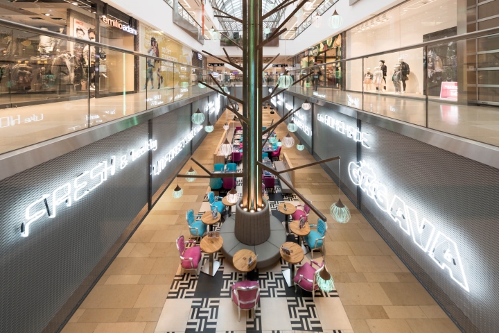
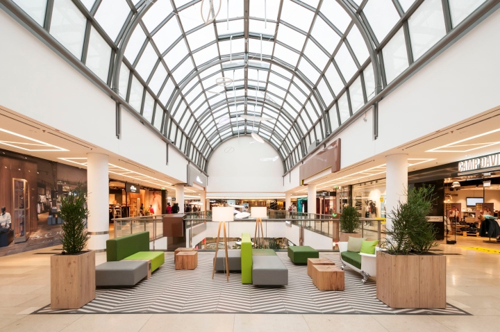
Daylight as far as the eye can reach. The central atrium provides a 20m long opening to the basement. From here grows skyward the “Light Tree”, the mall sculpture created by kplus konzept. Another design highlight here are the “Street Front Elements”. Designed as a bridge between the floors, they elegantly ensure that the eyes are on tenants and attractions on the other floors. Similarly, the balcony construction for green or merchandise presentations attract the views.
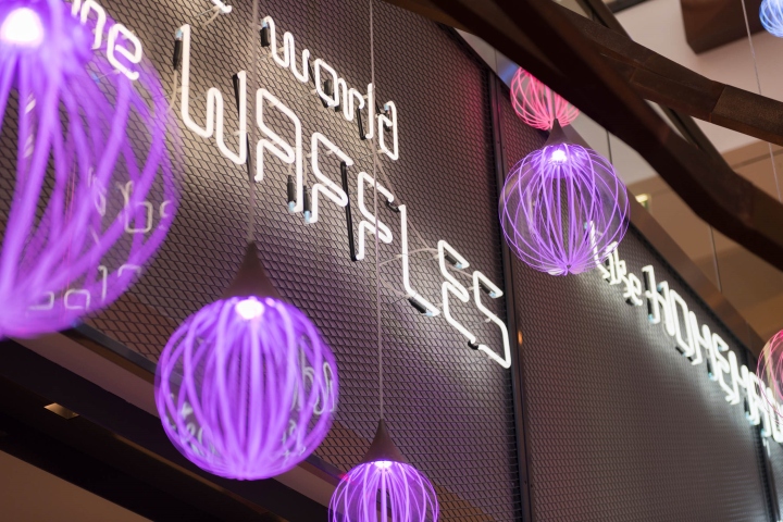
But what would be the best shopping trip without a culinary stopover? The “Streetkitchen” offers cool casual dining in the middle of Cologne Kalk. In the long atrium of the basement, the food court has become a street that stands out as an urban meeting place not only with the central light tree, but also with neon lettering and skillful colour and light accents in furnishing, lighting and flooring.
Relax – Downtown!
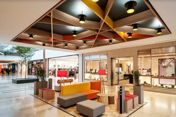
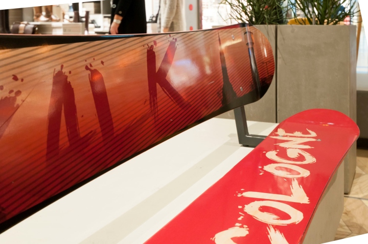
Relaxed shopping breaks, views, recharge the mobile phone – that’s what the many, spacious and comfortable lounge areas on all center levels offer. In the “Urban Heights” area for family, fashion and entertainment, they lure with natural materials, colours and creative surprises, such as the couch on bath feet. “Dynamic Downtown” is the floor for casual & young fashion. Its lounges are designed in bold colours, and the visitors can relax on bench constructed from a redesigned snowboard, embellished with a decent shot of Cologne-Kalk, all made by kplus konzept!
Design: kplus konzept GmbH
Photography: kplus konzept | Studios


Add to collection

