Nguyen Hoang Tu flagship store by Red5 Studio, Ho Chi Minh City – Vietnam
posted by retail design blog on 2018-03-21
Hồ Chí Minh
Add to collection

Nguyen Hoang Tu is a young fashion designer who has shaped his own direction as “an independent artist” – showing through his collections that have been performed domestically and internationally. Nguyen Hoang Tu store will be the venue for limited conceptual fashion products, dedicated for women, and honoring the value of silk as well as handicraft details.
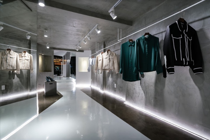
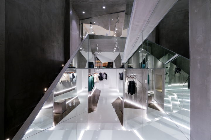
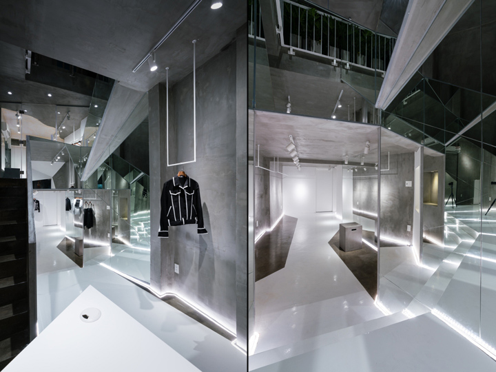
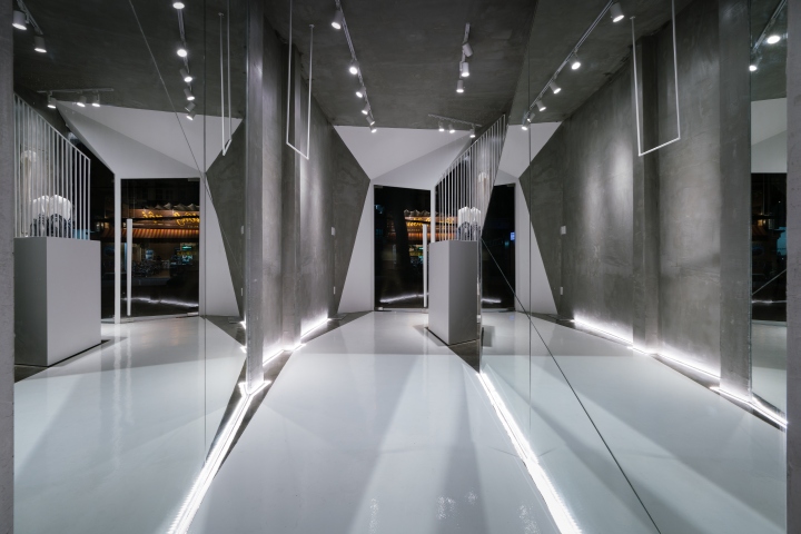
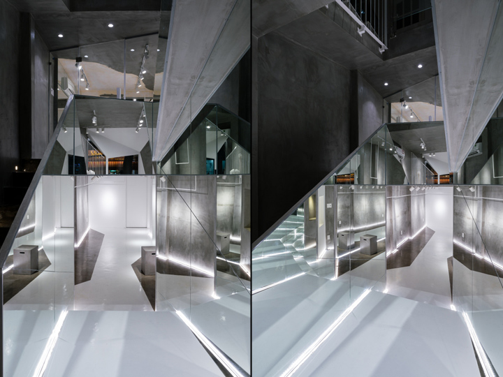
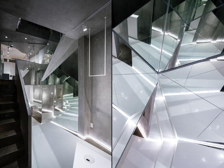
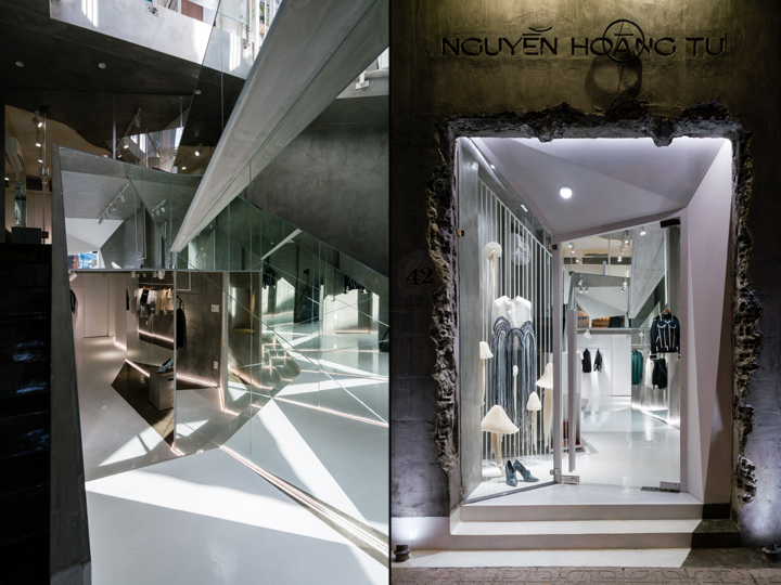
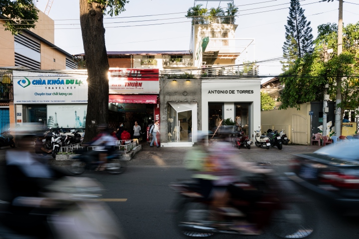
The original ground was also a fashion shop which was rebuilt several times. The ground floor is 2.6m x 15m and the mezzanine is 8m long, narrow stairs, fragmented space, mixed with brick and concrete pillars. The only advantage is the high void which creating the illusion of depth and space. Right next door is also a very eye-catching fashion shop. After inspecting carefully the site and assessing the situation, the designer knew that this project needing a lot effort to completely change the façade as well as the interior space in order to achieve the intentions of the architect and the owner’s desire.
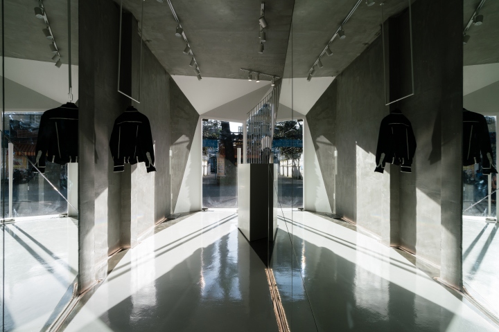
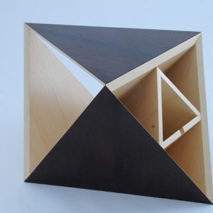
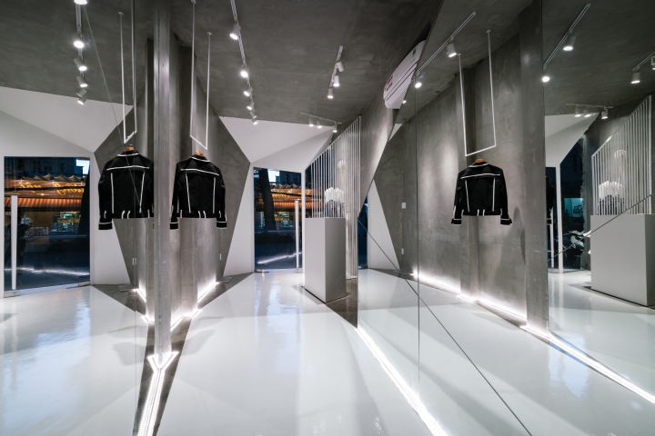
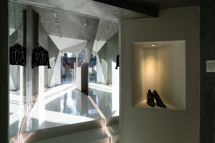
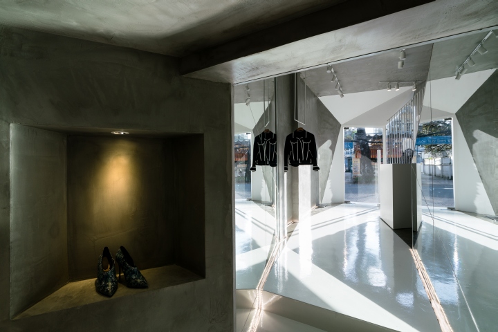
“Contrast” is the decisive method: the facade contrasts with the adjacent stalls, the interior space contrasts with the display products … And that was concretized by the square façade door which was rolled back to form a sloping angle. When it opened, we will at short notice the suit that is the highlight of the collection, in the sense that the store wanted to display at that time. Concrete facade is also demolished to create that messy look but still can show and make you feel the sense of timidity and aesthetics, and it immediately gives the impression that this is a unique fashion store, specializes in ideas, unlike any other trendy stores in the market.
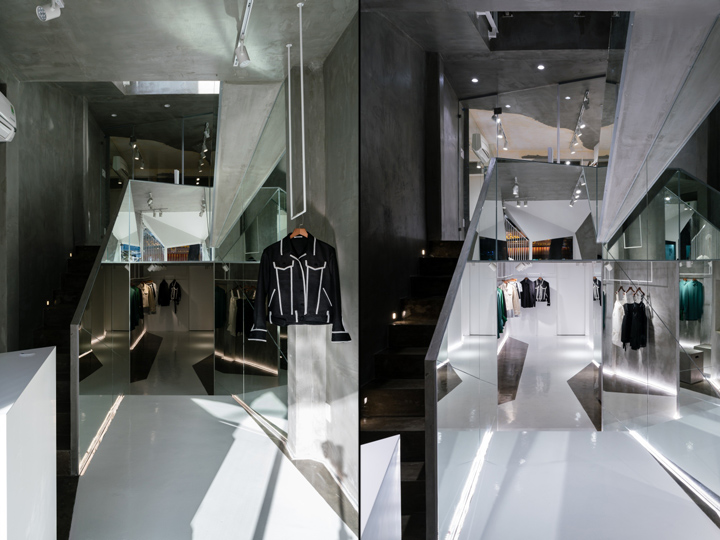
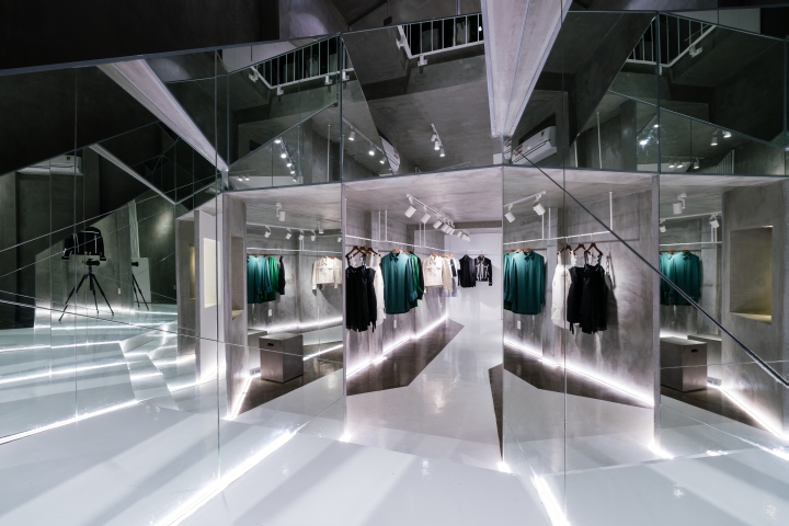
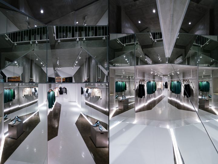
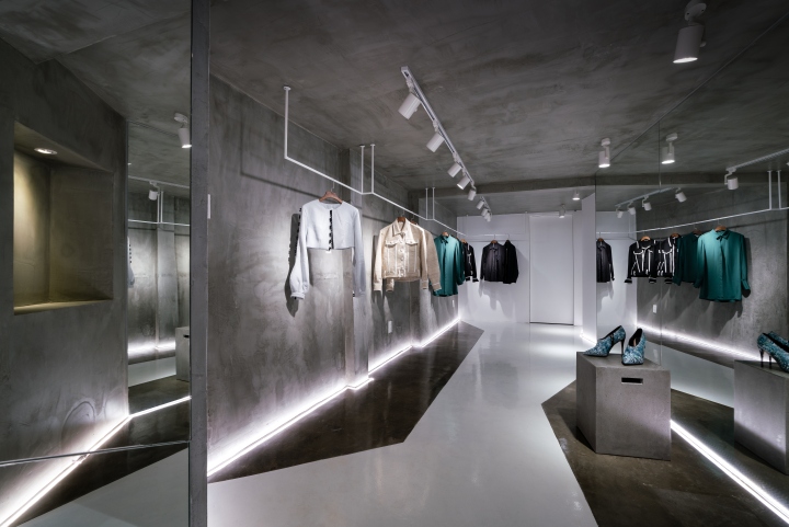
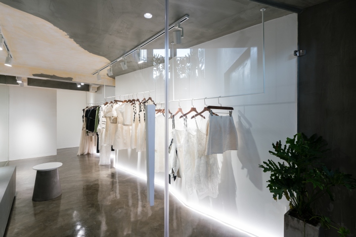
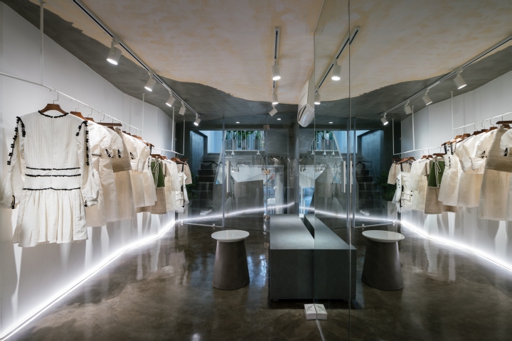
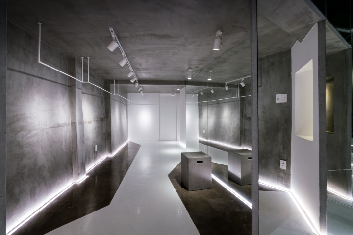
Interior and interior space are also in accordance with the principle of contrast theme as above. Material elements such as cement, glass and light are used in combination with the cube, zigzag shape, creating an impressive exhibition space. The white painted epoxy floor evokes sensation of the runway. Three reflective glasses have both the effect of enlarging the space and creating the virtual space that makes everything exceptional. The upper mezzanine also deliberately retains part of the old ceiling and mastic cement … all fit to create a whole represented the language of contrast.
Usually, with showrooms, people are afraid that too much emphasis in the interior design will break the feeling as well as the focus of the audience on the main factor that the product should be honored. But in this case, it’s not a problem, but a perfect combination.
Designed by Lai Chinh Truc / Red5 Studio
Photography by Quang Tran


Add to collection