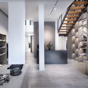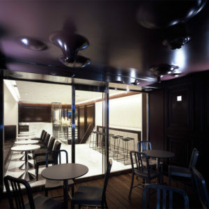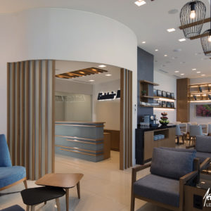
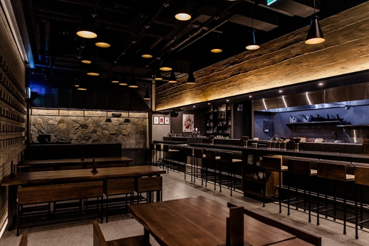

Kinka is an Izakaya restaurant based in Canada. This time, they launched two brands in Korea will – Kinka, Isakaya, and Kinton, the Ramen house. We planned a space to reveal the characteristics of each of the two brands and allow them to connect freely at the same time. To convey the taste of Japan, which likes natural beauty and the raw taste of its ingredients, it has set the spatial concept as `the passage of time garden’ and used the finishing materials from nature as soil, stone, wood to maximize the texture of material property and capture the condensed time in them.
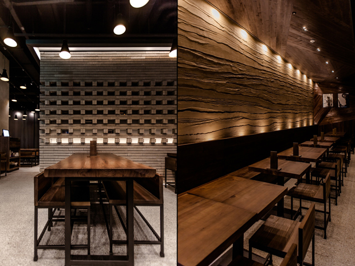
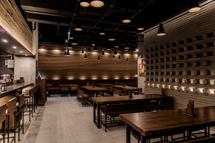
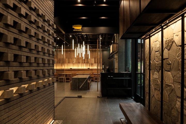
The waiting zone, which connects Kinka and Kinton, ended with a Q-block. The middle layer allowed the blocks to be stacked in a three-dimensional structure so that it can seamlessly connect with the interior, not the monotony. (Warm light leaks from the inside of the wall with indirect lighting.) On the left side of the waiting zone is Kinka, which looks private, and on the right is Kinton, which is light and casual through a glass door.

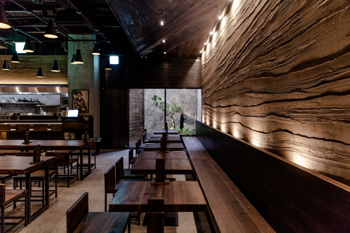
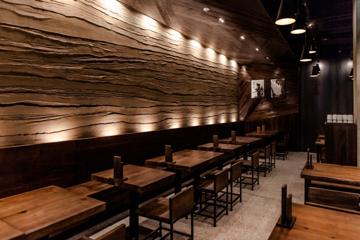
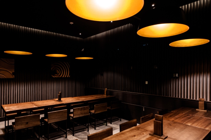
Kinka revealed its specific refined appearance of Japan using a range of finishes with similar colors. Walls with multiple layers of earth material are designed to represent time-intensive sedimentation, while hardwood furniture has a depth of time. We have lit up the center of gravity using lighting. So that visitors don’t feel weighed down by the weight of material that fills the spaces with stone, hardwood, or soil. Point color lighting which are covered with different levels of height are sufficient to offset the weight of the material.
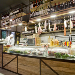
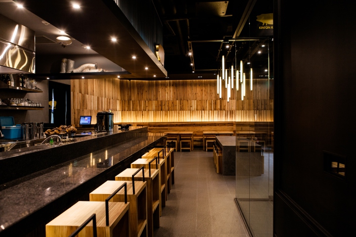
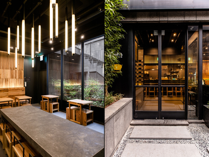
Kinton created a casual atmosphere using bright wood and corrugated steel. The reason why they used more than 70 percent of their wooden logs and it was not boring is because they gave them a three-dimensional effect by giving them a sense of form. Wood was cut into three different lengths to fit the wall at the most beautiful proportions, and then cut into two equal sides and attached them. In addition, the indirect lighting maximizes the texture of wood.
External sunken have the effect of not only overcoming the frustration of the basement, but also bringing in passers-by. In the sunken space starts from the staircase was created landscaping, giving the impression of entering the gardens from downtown. The bird-chirping and water-flowing sound of nature from sound installation makes mysterious feeling like walking in the garden.
Designed by design danaham
Photography by Jeong Wook, Park




Add to collection
