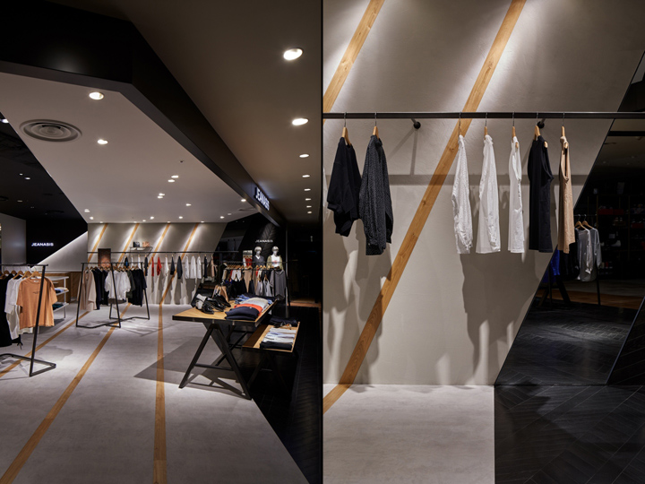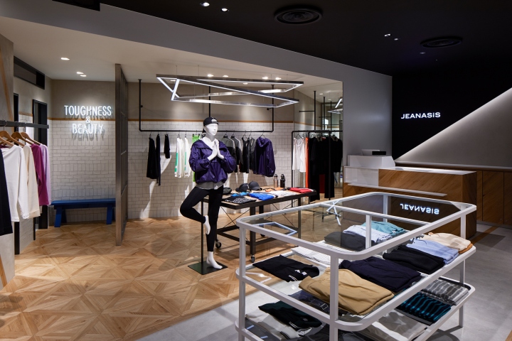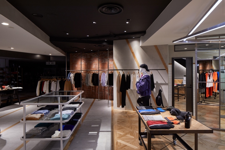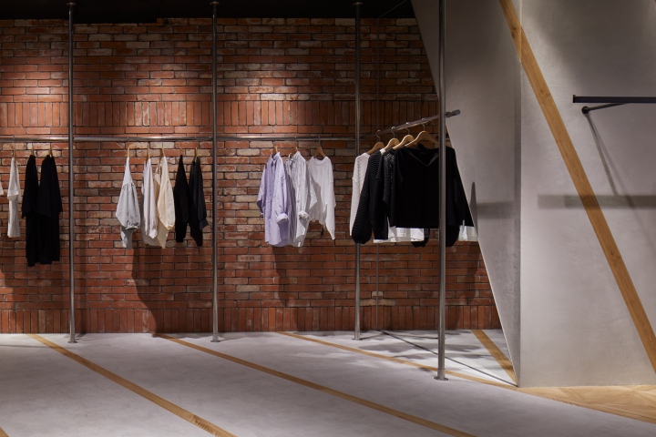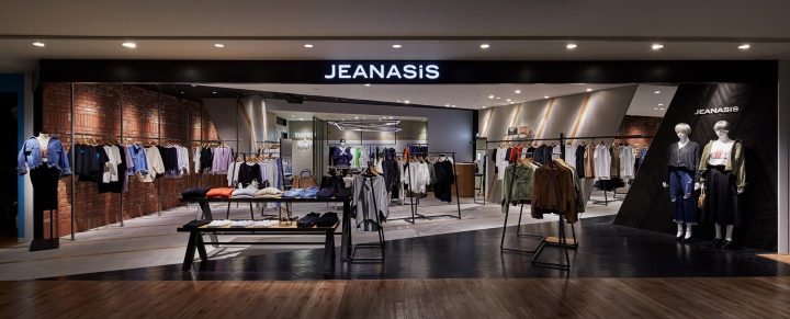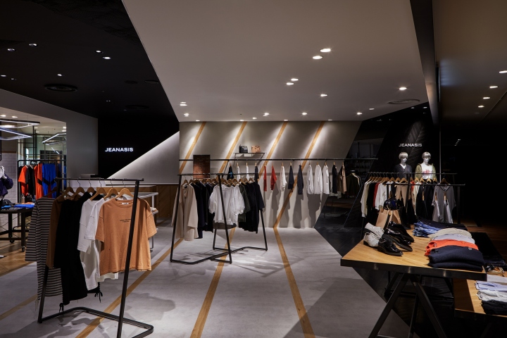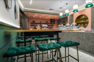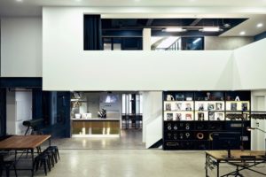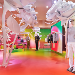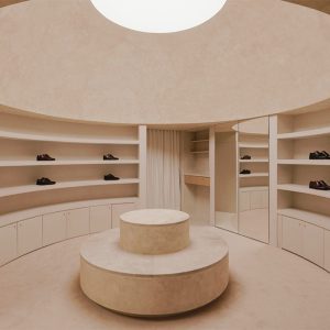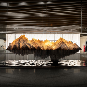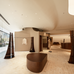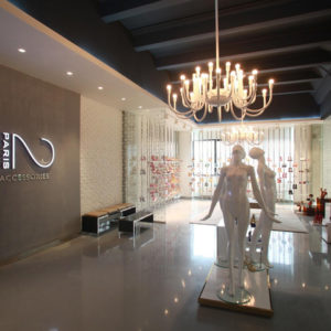
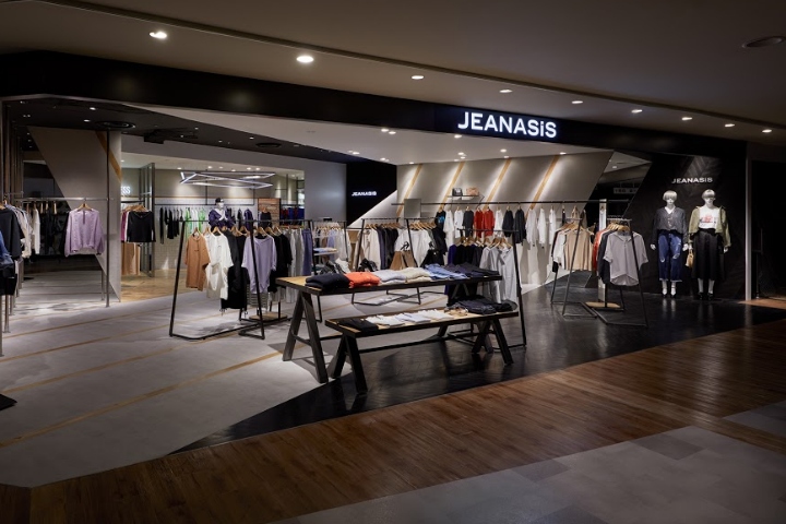

This is a new design style of JEANASIS, of which has brand concept “Clothes of consistent solid black of and noble white without flattering”. The style of JEANASIS is feminine but masculine, cute but cool. We thought that design with contrasts should express solidity, nobleness, selectiveness of the brand. We did not consider each of component in two dimension, but comprehend floors, walls, ceilings as a set from 3D point of view and try a design contrasting those elements sterically.

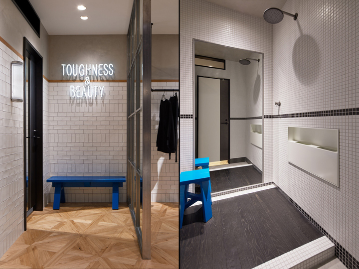
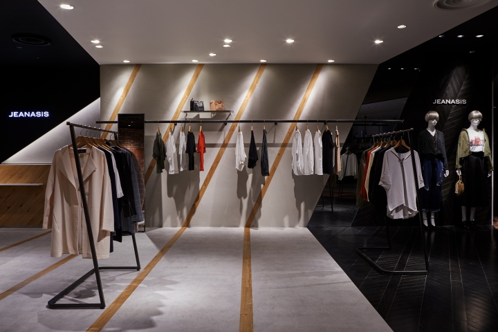
The facade of black steel, the French herringbone floor, walls with black dyeing finish, the mortar floor and walls with stripes, vintage bricks, all of those materials creates contrasts in the sharp slant lines. The design with contrasts also makes room for Yoga clothes in the back. There seems to exist rules in those lines, but not really. Perfect rules with some flexibility, that we believe to express femininity in the cool style of JEANASIS.

This design concept assumes that JEANASIS will have more of this store in the future those featuring different materials from one store to another. That symbolizes contemporary elements of the fast changing fashion industry while the essential design concept for JEANASIS, “steric contrast of various materials”, will never change.
Designed by fan Inc.
Photography by Nacasa & Partners Inc.
