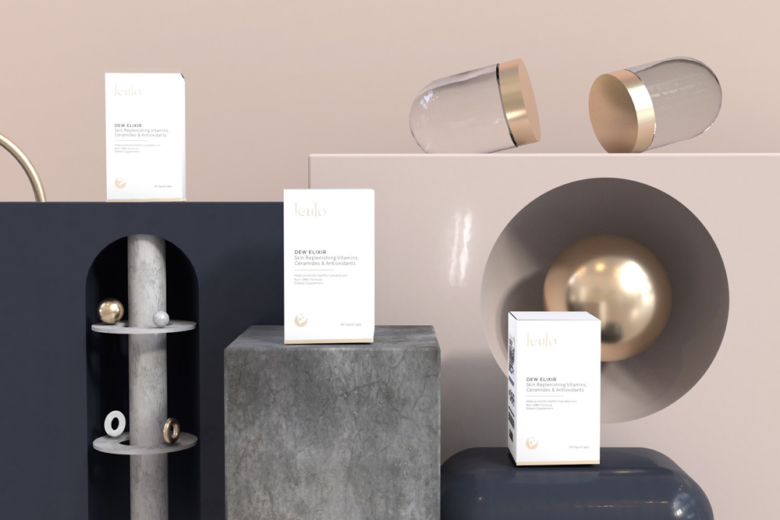
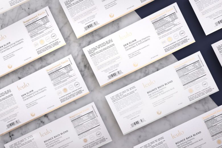
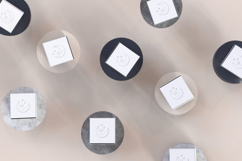
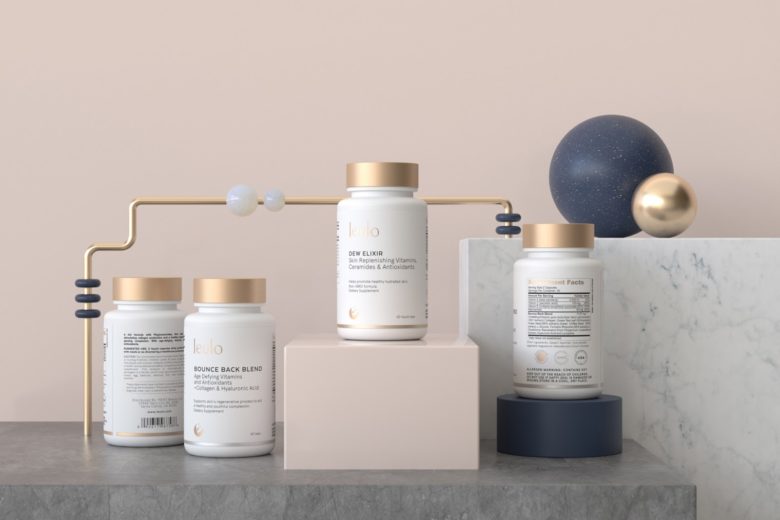
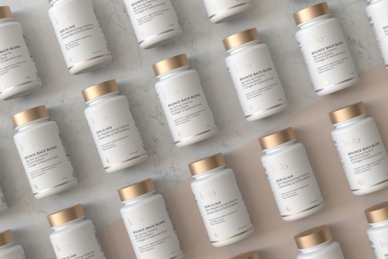
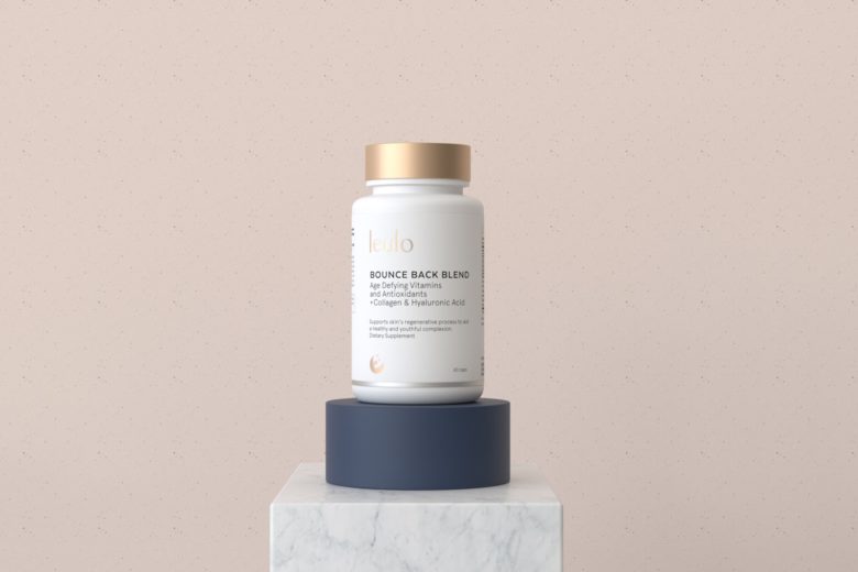
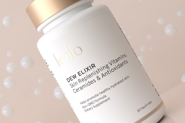
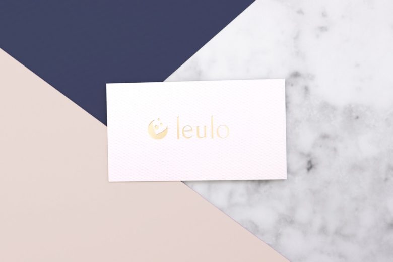
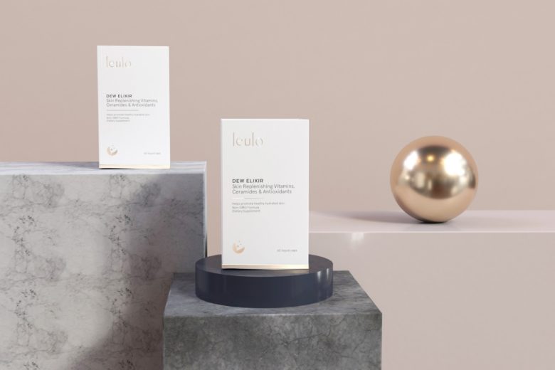
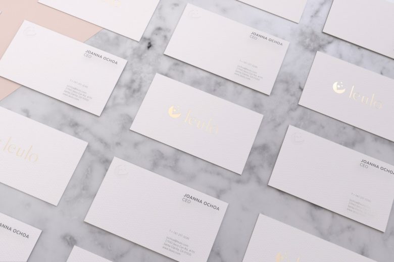
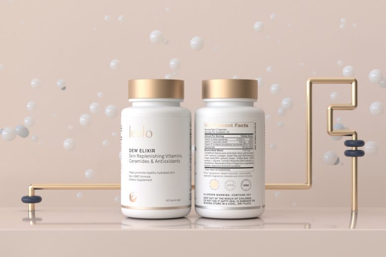
Leulo is a Californian brand which produce a full array of skincare supplements. To communicate one of the main features of the brand “a beautiful skin comes from within” We selected a colour palette that inspires naturality and sophistication, gold and white as a visual accent, blending with pastel tones, which accompany the identity to add up a fresh and clean scenario. The packing is organized in a clear and concise manner, making visible the benefits and ingredients of each supplement, the typeface used in the logo is a personalized selection with clean endings that are complemented with the icon in an appropriate way. The result is a coherent packaging with an accent of elegance.
What’s Unique?
The shape of the bottle is clean and fresh, the cap have an interesting golden/copper tone which is a perfect duo.
Designed by Lanza Studio
Add to collection


