In 1984, graphic designer Carlos Rolando created a poster for a Japanese-inspired shoe for Camper. The late ad man used a white background and the brand’s red logo to engage in a visual play with the sun-mark flag, adding an outline of the shoe and a set of kanji characters, both in black. That poster, on permanent display at the Museu del Disseny in Barcelona, was a wonderfully digestible visual exercise that communicated several layers of information in a succinct way.
But what would happen if that cultural translation took place today, traveling the other way around? That’s what Camper just did by having Kengo Kuma envision the space for their new Passeig de Gràcia store in the Catalonian capital.
On the busy passeig, Kuma is in fine company, surrounded by works from Josep Puig i Cadafalch, Lluís Domènech i Montaner and one of Barcelona’s most celebrated sons, Antoni Gaudí. The modernist architect came up with the modular panot, a hexagonal floor tile that still paves the shopping street; the intricate nature-inspired pattern only comes alive when its six pieces are assembled together in proper order.
A few minutes from Gràcia is the Gothic Quarter, the oldest part of the city. There, one can find red-hued Roman walls still standing, holding up ceilings of vaulted brick arches – a traditional construction method called volta catalana. When Barcelona outgrew its original quarter in the 19th century, it spilled over to the Eixample, a precise, efficient and downright whimsical octagonal urban plan created by Ildelfons Cerdà.
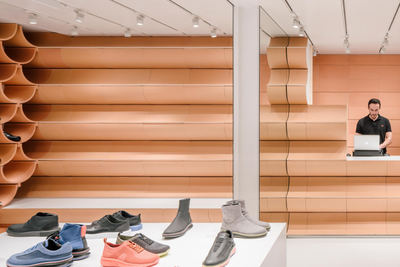
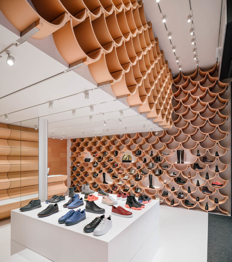
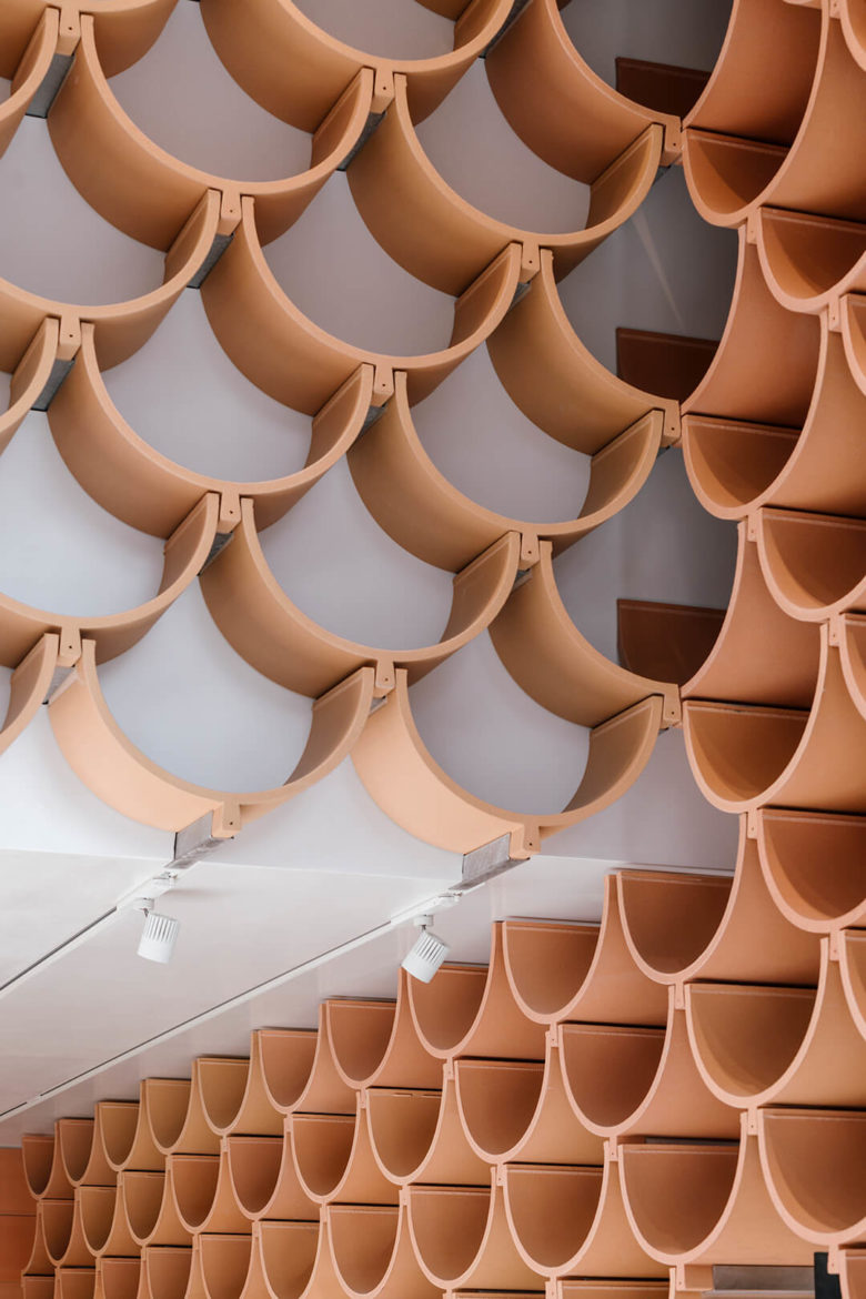
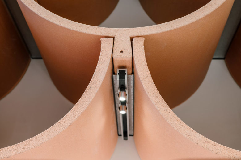
Upon first glance, the new Camper store is an exercise in modular ingenuity: a group of tightly assembled half-circles of raw ceramic, wide enough to fit an adult shoe, create a kaleidoscopic wallpaper of shelves. Inside each bespoke metal joint hides a small spotlight that illuminates the footwear samples.
But one only has to look outside to realize what the Japanese architect and his team did with this store: it is an homage to the unique Catalonian mindset represented through its design. As the recent separatist discussions have painfully brought to surface and the hit film Ocho apellidos catalanes mockingly highlighted, Catalonia sees itself as an odd branch in the tree of Spain. Its unofficial motto is seny i rauxa, a permanent mental state that dances between austere levelheadedness and wild abandonment – now you see where Dalí and Miró came from. Add to this a geological predisposition for crafts exploited since the arrival of the Iberians in the Bronze Age, and that explains why the region turned into a creative and manufacturing hub during early industrial times.
And that’s all there, in Kengo Kuma’s Camper store. The punctilious assemblage is a nod the panot. The naked ceramic pieces point to the city’s rooftops. The elements, so thin and large that they proved almost impossible to make, were produced by the legendary Ceràmica Cumella, whose tiles line the Sagrada Familia and the Casa Batlló. The arches speak of the volta catalana, a shape that fascinated Kuma and his team. The seny of the intricate and mathematically complex modular system gives way to the rauxa of gleefully covering the entire store with it, from walls to shelves to counter. It’s almost an inside joke for the City of Counts, told by a Japanese man.
Carlos Rolando was born in Argentina in the 1930s and moved to Barcelona three decades later. It was ultimately a foreigner who, through his logos, shaped the way many Catalonians quickly read some of their most popular brands, from Roca to Mango to Desigual. I am strongly in favour of letting locals tell their own stories through design, as many foreigners usually indulge in presenting blatant caricatures of the territory’s perceived culture. But this, happily, is an exception to that unfortunate practice: just like Rolando was able to convey a Barcelonan homage to Japan, Kuma has been able to tip his hat the other way around.
Designed by Kengo Kuma
Photography by ImagenSubliminal



Add to collection
