Add to collection
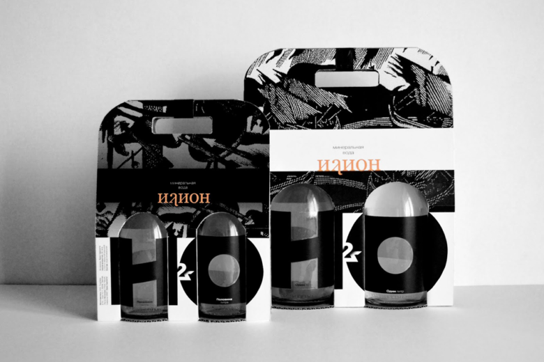
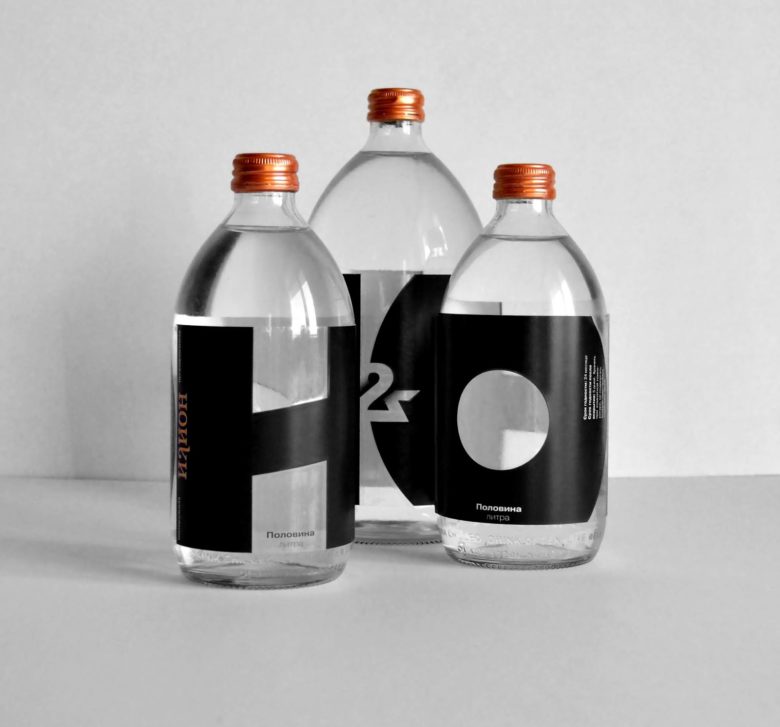
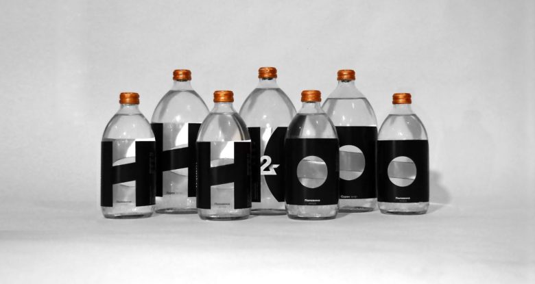
Packaging is based on Homer’s poems “The Iliad” and “The Odyssey”. In the Russian language “Iliad” writes as “Илиада” and “Odyssey” writes as “Одиссея”. So the first letters of the names of the two poems and the ampersand between them (И&O) appear on the bottles as a water formula. In addition to bottles, a cardboard box was designed. It allows you to easily transport two bottles and also retains the readability of the main project idea – И&О as H2O.
For me, it was important to convey the epic and drama of Homer’s poems. Therefore, the label is black, like the ashes of Troy. The Iliad and Odyssey are the foundations of world art, just as water is the foundation of life, and black and white is the foundation of color. That is why the packaging is mostly black and white, with the exception of the caps and the name that appear to be bronze, which reminds weapons from the time of Troy. The bronze covers and the name, in turn, echo the back side of the box, which is the color of cardboard.
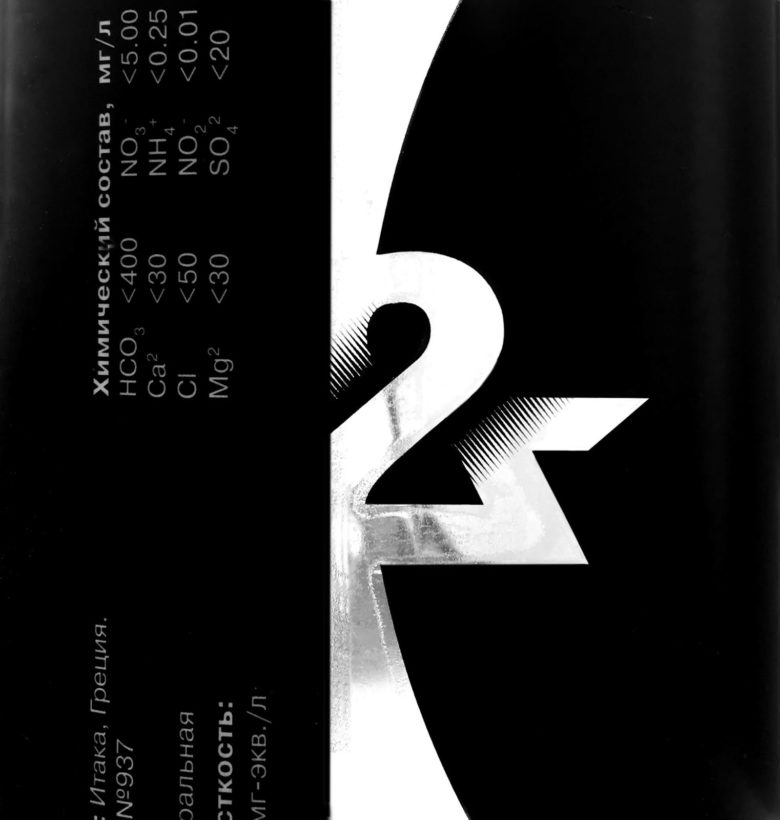
Particular attention was paid to the design of the ampersand, which at the same time would resemble the numeral two, the raster gradient plays an important role in this, it visually draws a two to an ampersand. This raster gradient is echoed by Dmitry Bisti’s graphics, which motifs are used in the design. The name of the packaging “Илион” is the ancient name of Troy “Ilion”.
Designed by Anastasia Seregina

Add to collection