Overtone by Thirst Craft
posted by retail design blog on 2019-03-09
Add to collection
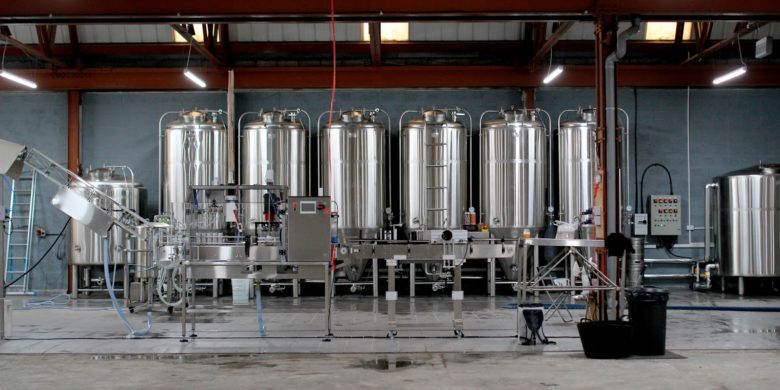
With innovation at its heart, Overtone’s ambition was to bring dynamic brewing to Scotland. However as a completely new brewery in the third most innovative craft brewery market in the world, it needed to strike the balance between dynamism and building strong brand presence to succeed. They turned to Thirst, drinks branding and strategy specialists who know the craft beer category like the back of a Camden Hells can.
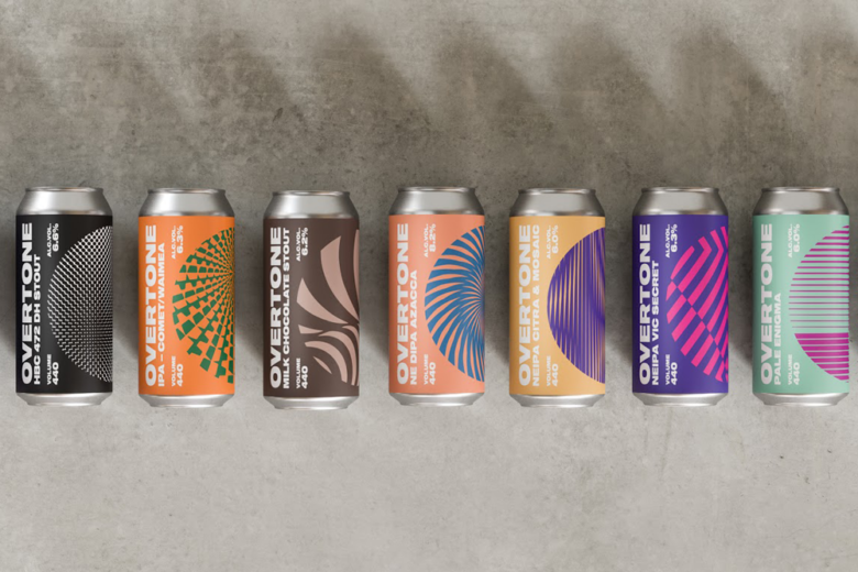
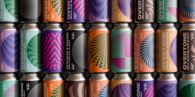
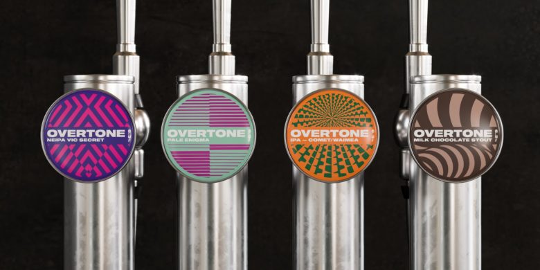
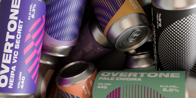
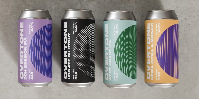
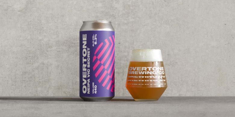
With bottle shop shelves looking increasingly like an eclectic art gallery, Thirst needed to ensure that Overtone made an immediate and sustainable impact without sacrificing creativity. Inspired by the founder’s favourite music scene, techno, they created a brand that captured the cutting edge graphics and cult status of iconic record labels. An extended wordmark and strong ‘O’ device created an impactful and ownable brand which would look at home on an underground club poster.
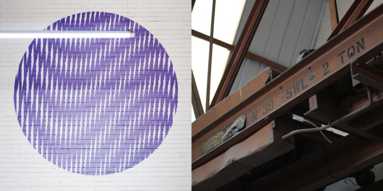
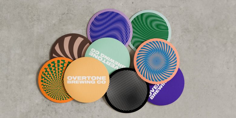
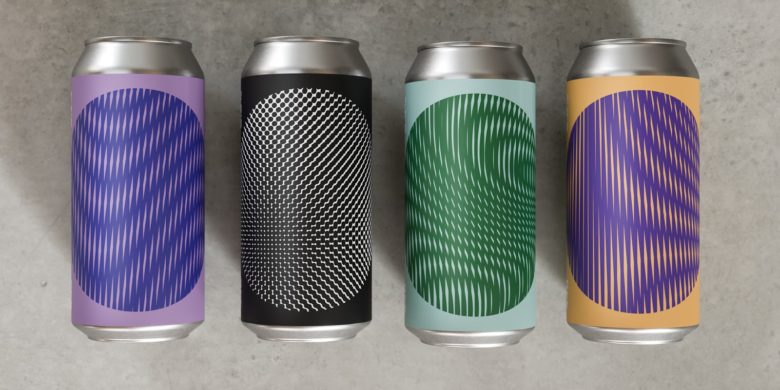
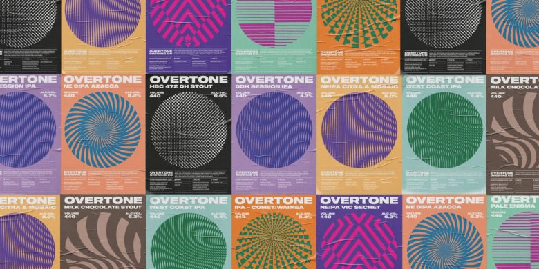
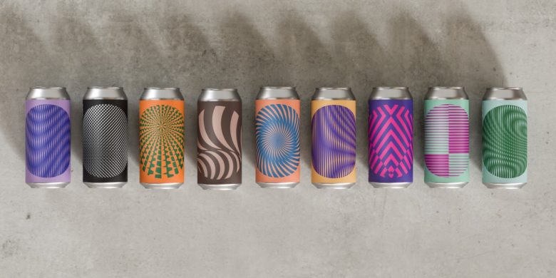
The patterns themselves are inspired by Overtone’s name. Overtones are frequencies that alter the qualities of a sound, so Thirst translated this idea into a visual by using lines and colour to create illusions that changed the qualities of the label in front of your eyes. These patterns tied in with the styles of beer as well as creating a piece of art on shelf.
This design is as pragmatic as it is powerful. With infinite pattern possibilities that can be turned round at speed, Overtone are able to continue their innovative brewing while keeping their brand strong and their labels fresh over and over and over again.
Designed by Thirst Craft
Add to collection