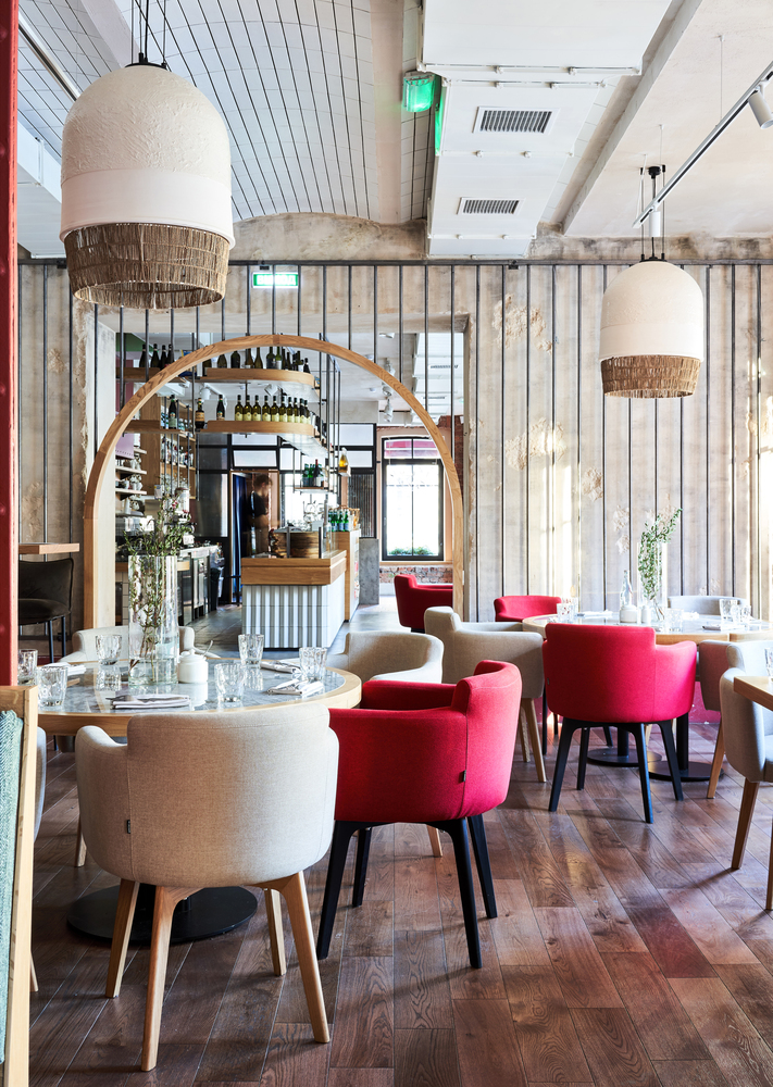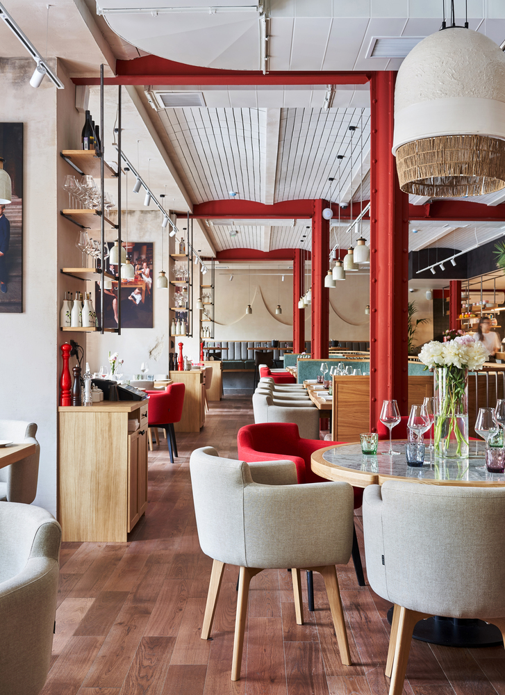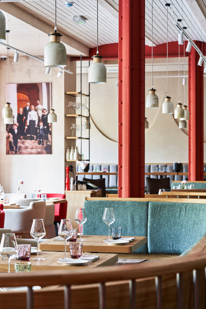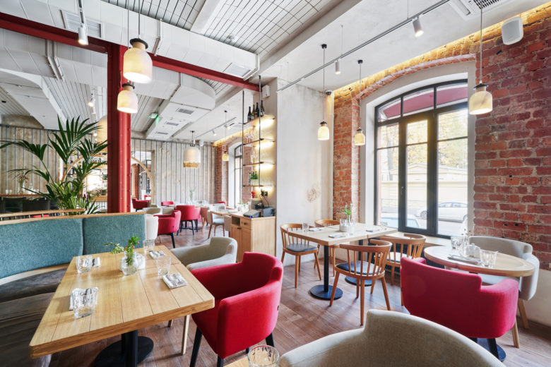
The interior is inspired by the motives of modern Italy, the street elements of the exterior, the special feeling of the mixture of eras that we enjoy just by walking, for example, in Milan.
This is not a provincial flavor, not picturesque narrow streets and not noisy flows of tourists among pizzerias. There is a very intelligent feeling “timeless”, on the one hand, and on the other – a majestic modern esthetics.
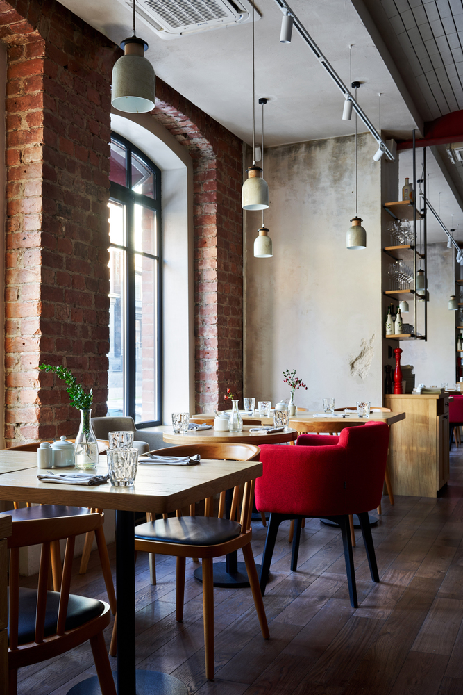
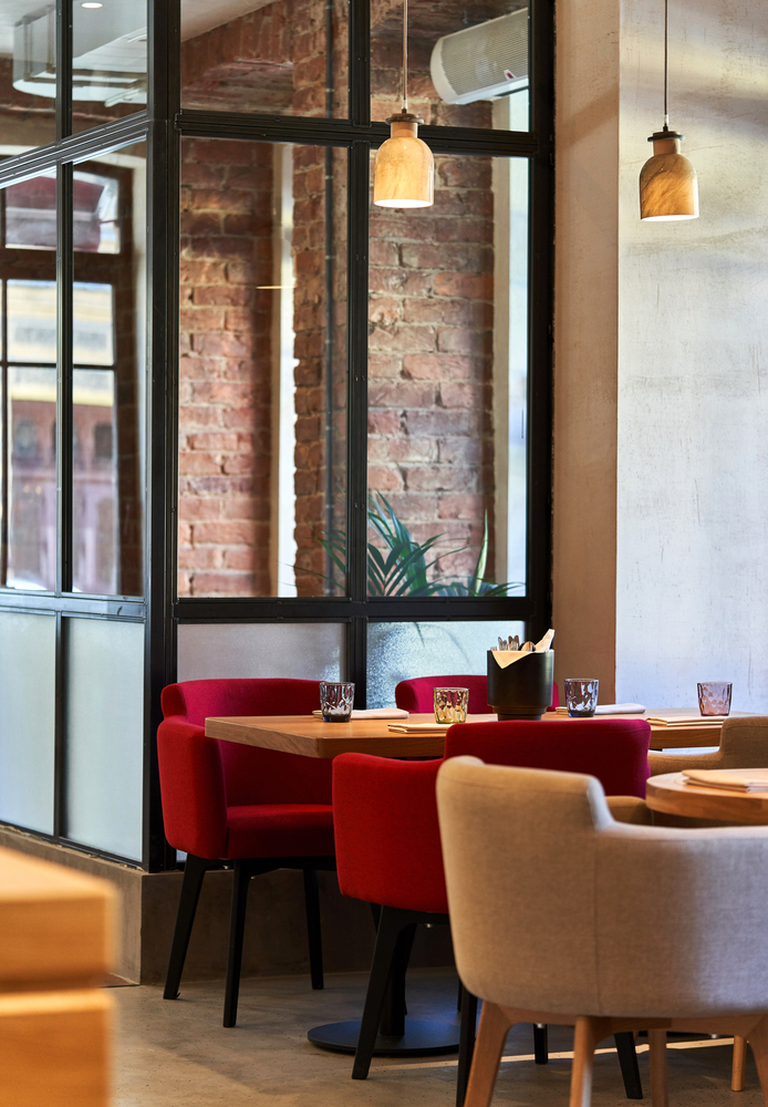
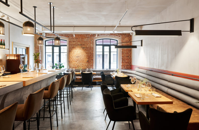
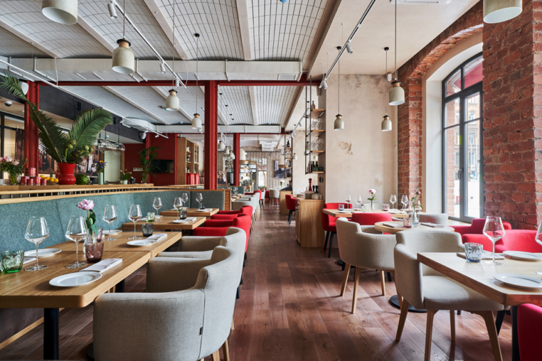
The native architecture comes to the forefront with spacious halls, cast-iron columns and girth rails, vaulted ceilings and arched windows – in this we see an important “cultural bridge” to create the right atmosphere here.
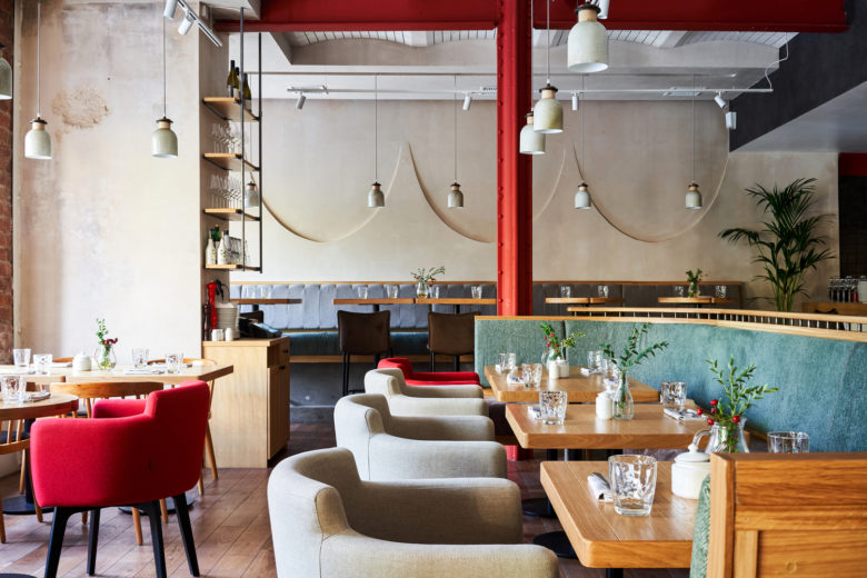
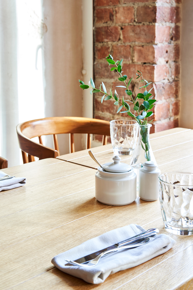
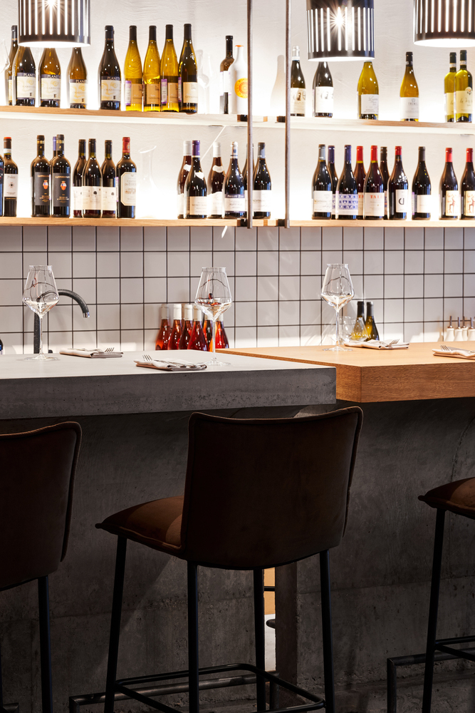
For the first time for chain restaurants interiors, we refuse from the “extra” elements of decor and do something open, free, consciously maintaining a sense of air and strictly abstaining from the scenery. This is an important part of the interior philosophy: cuisine of “Italy” should be matched by a beautiful, clean, atmospheric interior that is out of trend, without any unnecessary objects, to decorate and emphasize the main thing – food. To do this, for example, we build the light in a special way, focusing it on the tables, and almost completely reducing all other lights.
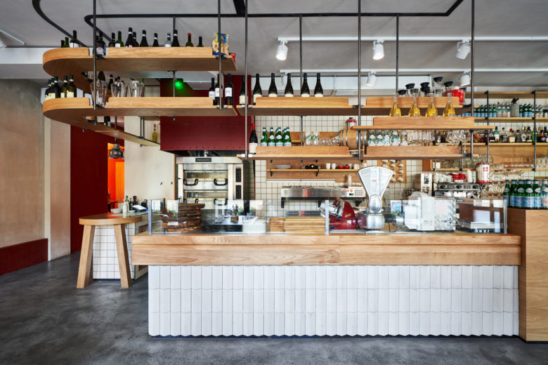
Directly in the first room there is a single stand with Pasta Chef and Pizza Chef – this is the first thing that guests see when entering to the restaurant. Everything happens here in an open home format. Opposite there is a small guest landing where you can better feel the atmosphere and watch the processes of making pizza and pasta.
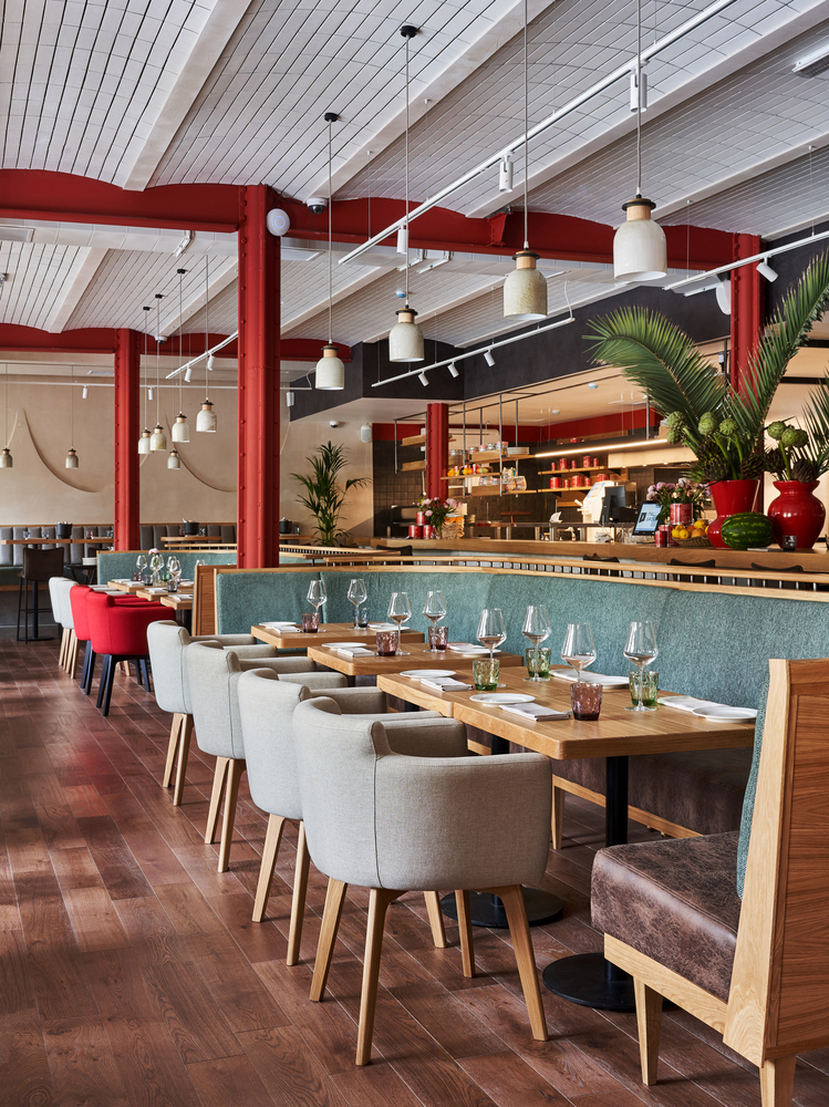
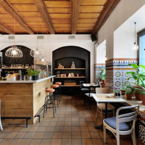
Through a wooden arch with a metal exterior grid, we find ourselves in the main hall. Vaulted ceilings are finished with facade tiles, they are supported by centennial metal structures. Author’s glass and ceramic lamps complement and decorate the upper level. Landings of the main hall are moderately compacted, somewhere rared, with zoning by metal fences and small palm trees. All furniture and accessories in the restaurant were created according to the design project – it is maintained in one direction, carries a light shade of vintage, remaining quite complex and sophisticated.
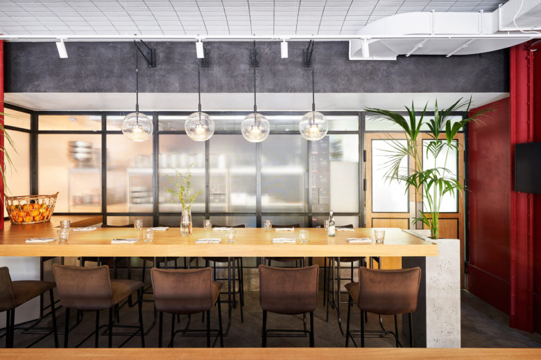
But the center of life of the main hall, of course, remains the fully open kitchen, separated from the guests by an extended contact counter, enveloping two cast-iron columns and turning smoothly into a four-meter communal table.
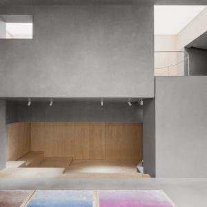
The restaurant has a farthest “wine room”, which features is a common cast concrete table that can accommodate up to sixteen people. Nearby is a service desk, which allows for master classes, and conceptual sofa seating in front of it makes the room even more universal.
Continuity is an important part of the interior concept, its principle. This is not just an “timeless” idea. We take the best features of the chain, revise them and reflect them in a new reading – clean, airy, intelligent and atmospheric.
Architects: PAUM design
Lead Architects: Polina Masiianskaia, Anna Philippova
Design Team: Anatolii Mozalevskii, Victoria Chugunova, Dmitry Rybak
Photographs: Sergey Melnikov
