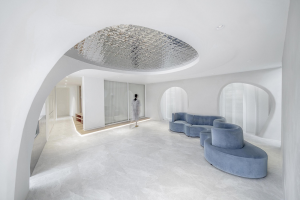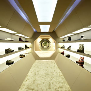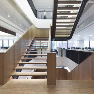

The design of the Visma offices has a refined Scandinavian aesthetic while maintaining a true sense of originality for the software company’s Polish location in Krakow. The Design Group was tasked with completing a dynamic space for the Visma Software offices at their location in Krakow, Poland.
Brightness, simplicity, minimalism, and a pinch of refined aesthetics; the easiest way to portray the Scandinavian interior design. The new office of the Polish branch of the Visma brand has also been arranged following this theme. Yet in this design, being the responsibility of The Design Group, there are as many Scandinavian inspirations as there are original variations of them.
Visma is a Norwegian company delivering software and digital services for business. Visma has over 200 offices around the world, including Poland. The Visma Software office is based in the new High5ive office complex, which is also known as the Krakow business center. Situated near the main railway station and Galeria Krakowska, its investors expect that it will be used by office lessees as well as residents of the capital of the Małopolska Region.
Norwegian Visma has nearly perfectly mastered consistent communication of its activities. They have incorporated this into their own product design language, called Nordic Cool. Drawing on Nordic tradition, it describes Visma’s approach to communication in three words: clear, refined, and reduced. Consequently, the brand’s products have features that make it easy for customers to recognize their origin and for the company to provide a clear message regardless of the state of product manufacturing. Moreover, Nordic Cool has become the main principle organizing the layout of the Krakow office.
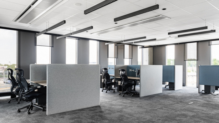
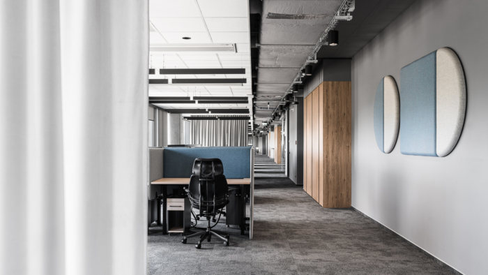
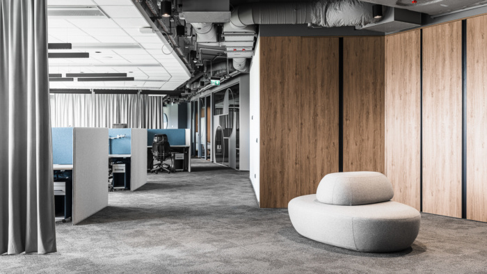
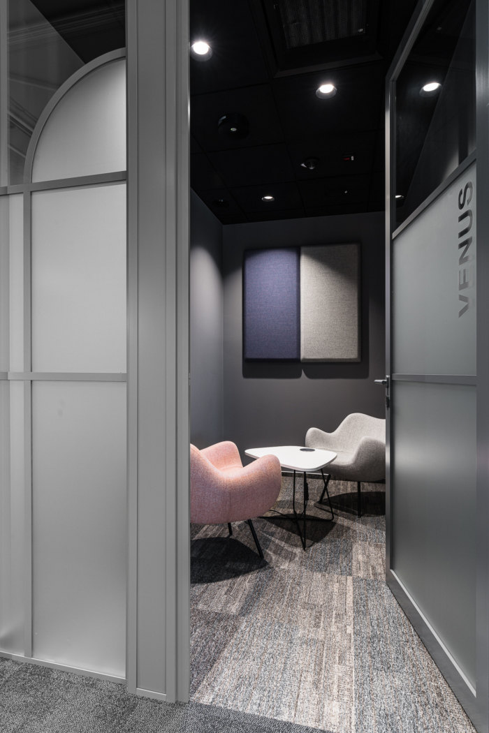
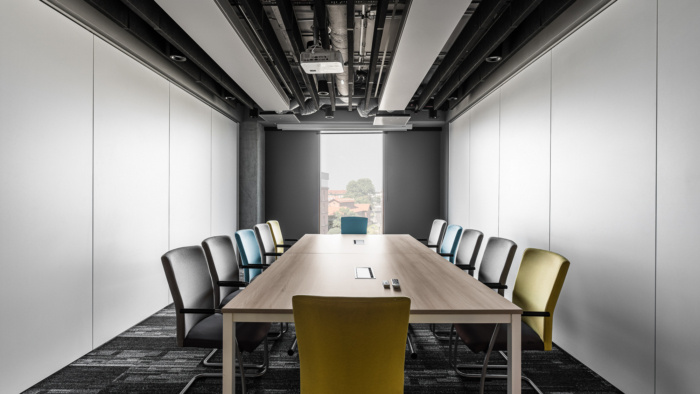
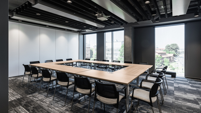
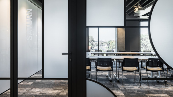
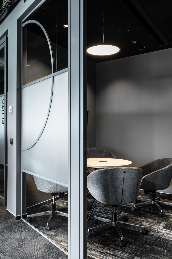
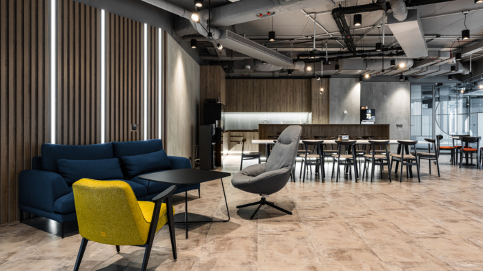
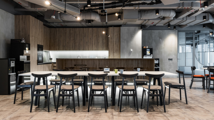
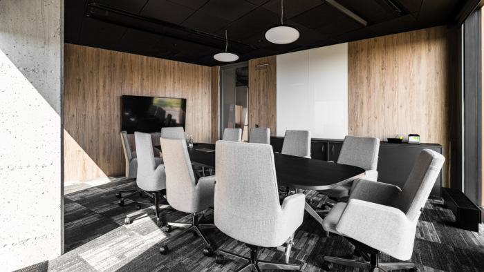
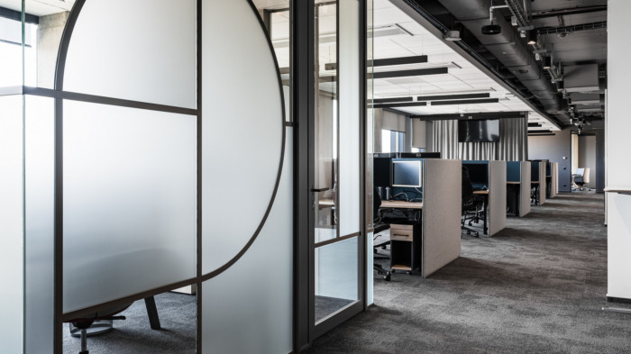
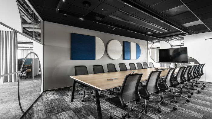
The Visma Krakow office spans for nearly 1500 m2 that are (mainly) made of open space, but there are also three offices, one shared room where up to five people can work, three conference rooms, and a chill out room. Each of the rooms is named after one of the solar system planets, following the investor’s idea.
The client approved The Design Group’s design brief nearly immediately. Although their aim was to maintain the interior style in the Scandinavian beat, they agreed to the solutions put forward by the Warsaw design office, even though they break this tide. As a result, the office has earned a lot of distinctive features that, importantly, preserve the style reminiscent of the specifics of Visma’s work and visual identity.
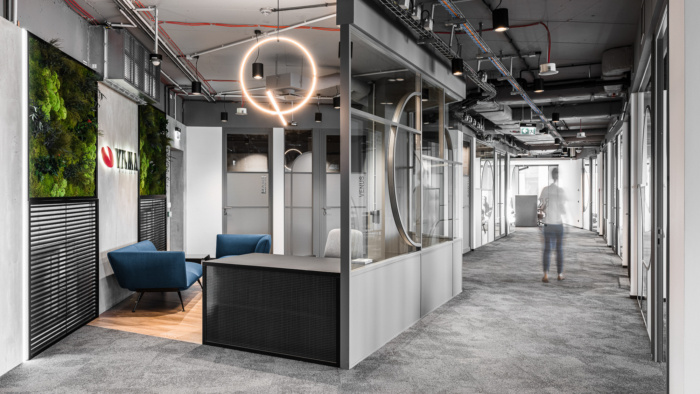
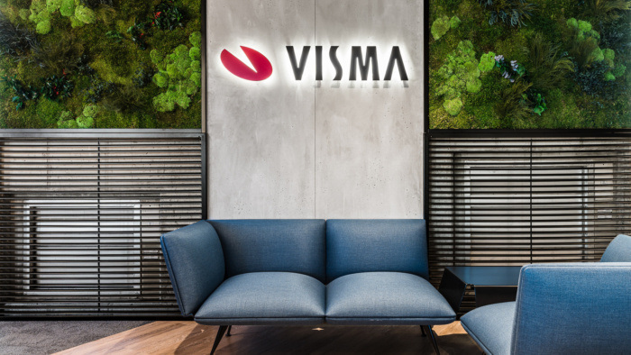
The power of the original solutions resonates already in the desk arrangement. The counter, decorated with glass reinforced with black mesh, catches the eye. Just above it, there is a spectacular “circle” lighting. The lamp model has been selected to match the recurring interior shapes. At the reception desk, there are also elements made of architectural concrete and the so-called living walls.
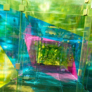
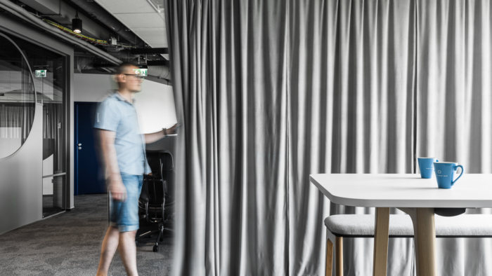
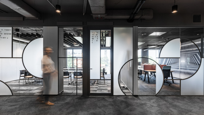
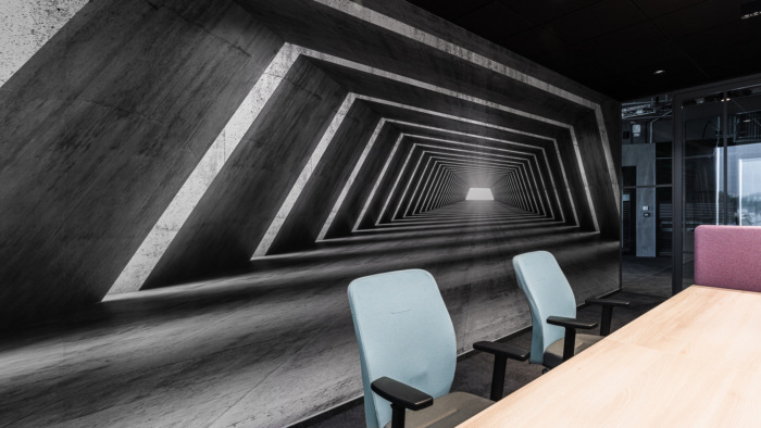
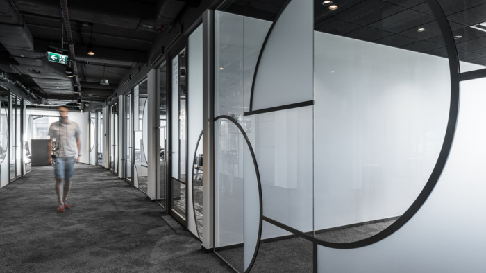
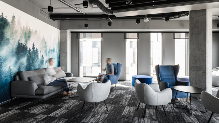
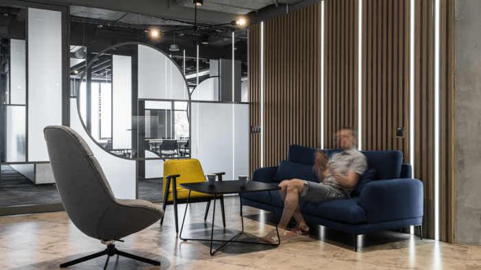
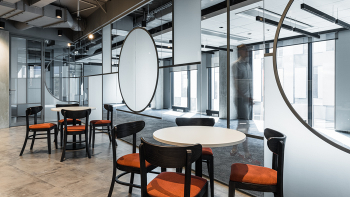
Still, the impressive glazing separating subsequent zones of space remains the highlight of the Krakow office. The glazing is also one of the ideas of The Design Group. The glass walls resembling stained-glass windows feature grey muntin bars, and also those, as well as the glass-wooden decorative panels on the walls, refer by their shape to the Visma logo. There are zero-and-one strings on some of them; an obvious reference to the binary system, the basis of the programming code. Programming, thus the domain of Visma. These specific decorations made of numbers are an original concept by The Design Group, too. The whole arrangement is crowned by a gray ceiling making the design timeless. Let’s not forget direct references alluding to Norway – the photo wallpapers with the calm, mountainous tenor.
Design: The Design Group
Photography: Fotomohito
Add to collection
