
Norlo Coffee by designhappyuk
posted by retail design blog on 2022-01-26
Add to collection
The Brief
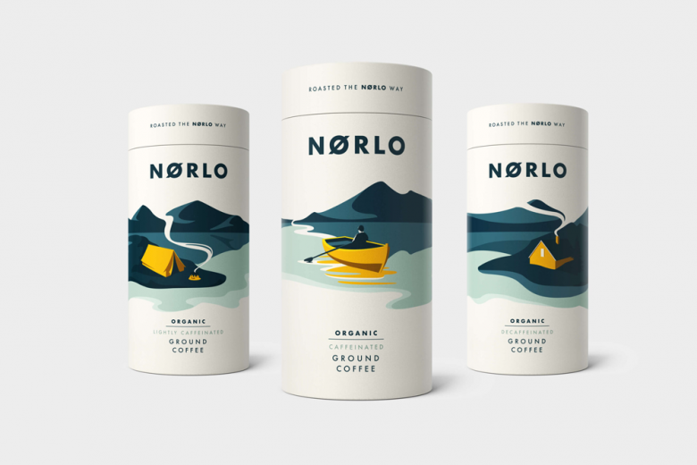
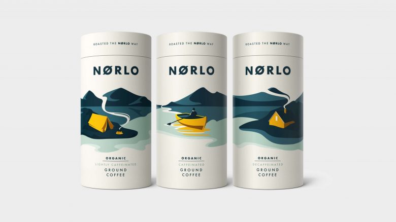
Design Happy were approached to craft a stand-alone coffee brand from the ground up to portray the unique Scandinavian Lifestyle and their lighter coffee roasting process. In doing so we needed to drive differentiation from other mainstream competitors and create shelf space in a busy retail aisle that is littered with dark smoldering coffee beans and rich aromatic depictions. The brand wasn’t just for coffee snobs but had to be aspirational, yet down to earth for consumers looking for something a little different to their usual brew.
Our Approach
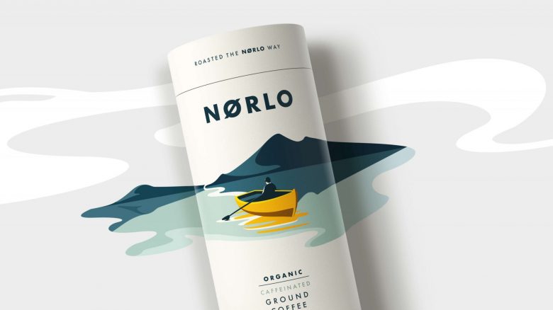
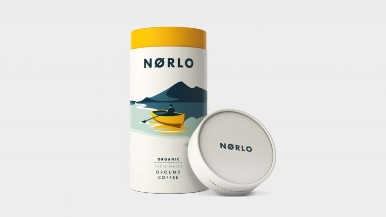
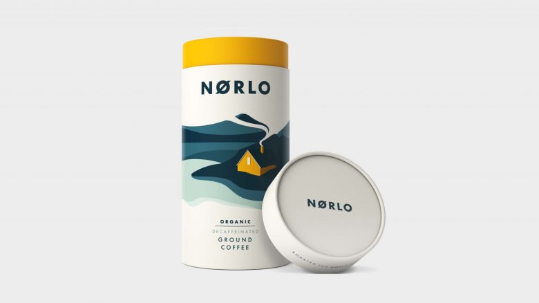
Taking inspiration from the clean, minimalist Scandinavian style, we created a range of bespoke illustration vistas that re-imagined the traditional coffee language while staying true to the spirit of the brand of being a lighter more flavoursome roast.
Opting to turn the category on its head we settled on a pop of golden yellow for the pack signifier to create a recognisable yet flexible system to denote varianting paired with the use of muted cream and blue tones to drive further differentiation. Traditional aroma cues were delivered in a more contemporary way through the illustration and as such linked to the Norwegian lifestyle. Tessellated crops of the panorama across packs created strong brand blocking on shelf to further cut through.
Designed by designhappyuk


Add to collection