TAK CAKE MIX
posted by Backbone Branding on 2022-05-09
Add to collection
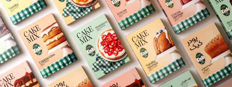
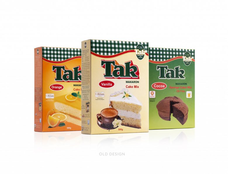
Our partner – the leading company in pasta and flour in Iran, Tak Makaron, required a redesign for one of its products.
We were to maintain the brand’s identity while creating a more modern, “tasteful” look for the consumers to feast upon, without deviating from traditional approaches and perceptions already prevalent in the market.
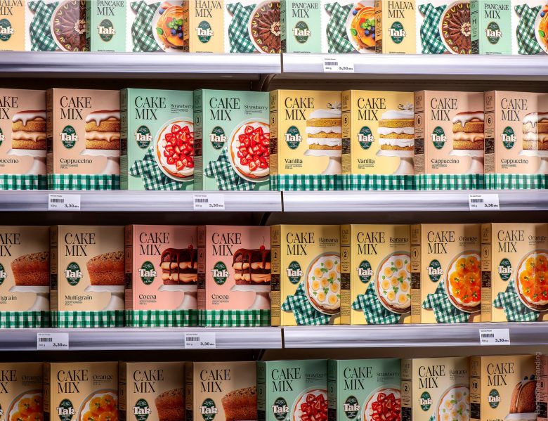
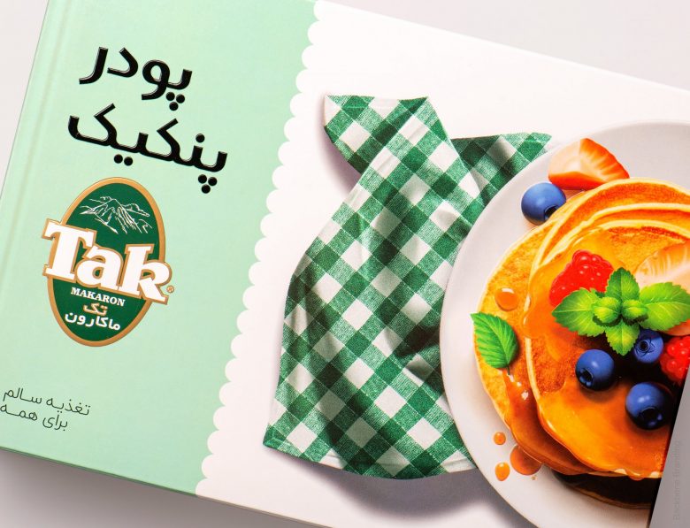
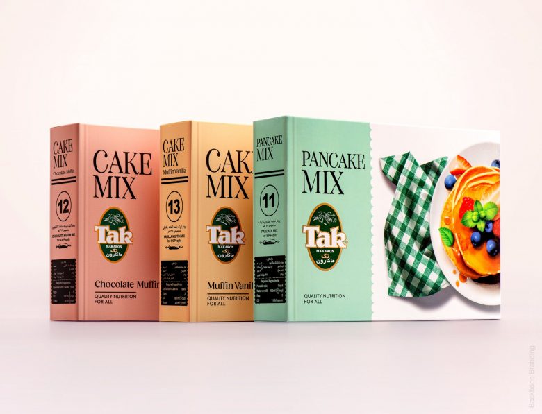
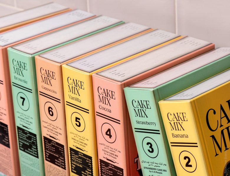
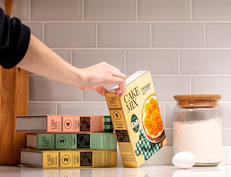
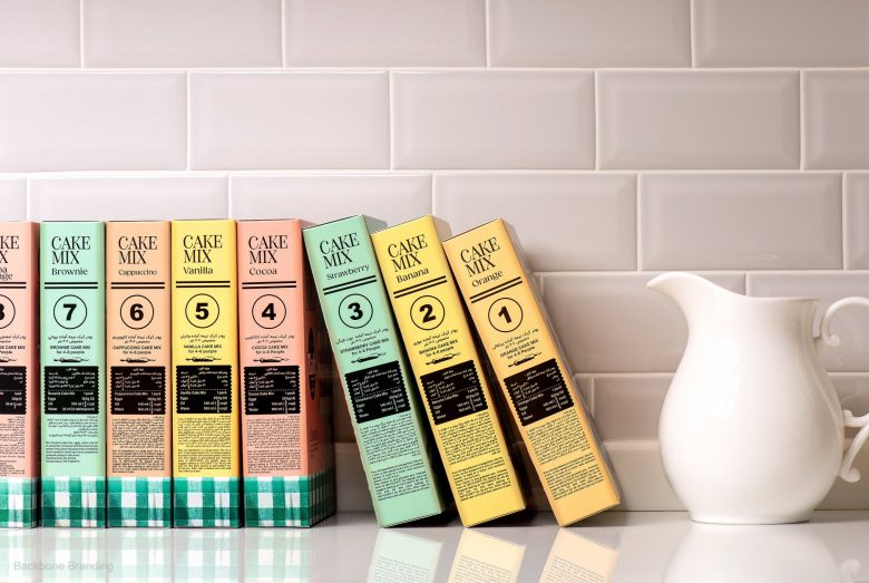
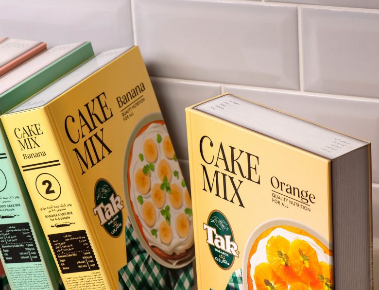
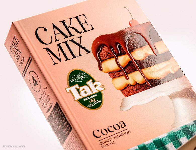
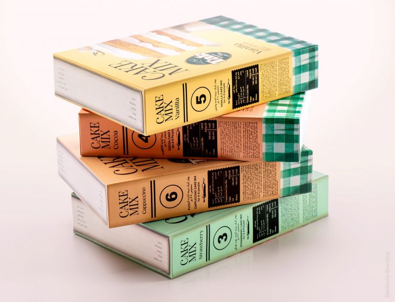
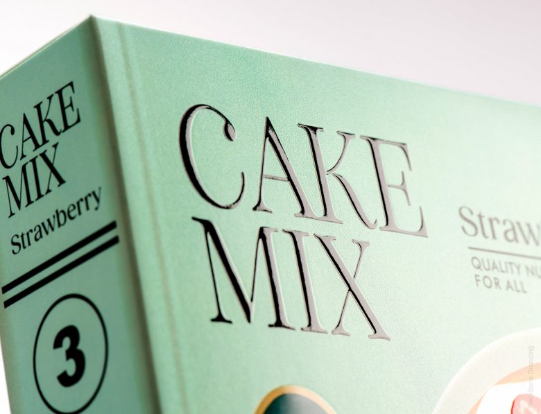
Clear conditions were laid before us: Two factors had to remain – the logo, and its matching design (a green and white checkered pattern), which were its standing reputation within the market. So, without completely changing its face, we looked at rather spicing up the old version to draw fresh attention.
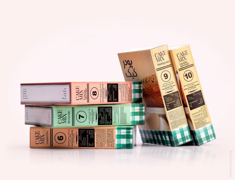
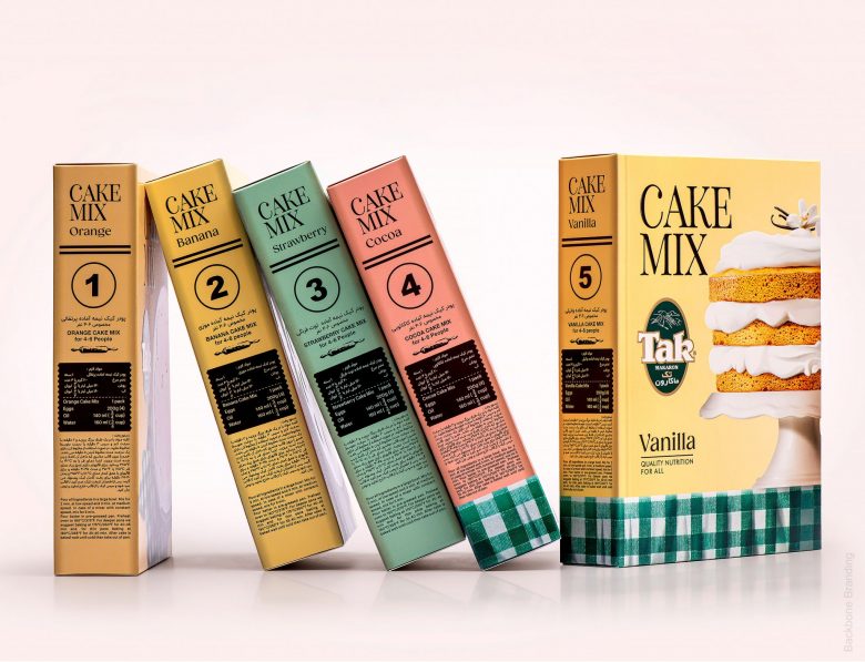
We came up with the idea to transform the product packaging into a cheerful multivolume set
Creative Director: Stepan Azaryan
Art Directors & Illustrators: Mariam Stepanyan, Elina Barseghyan
Graphic Designers: Mane Budaghyan, Ashot Hayrapetyan
Junior Designer: Mariam Gurgenyan
Video Animation: Sahak Zarbabyan
Photos by: Backbone Branding& Suren Manvelyan
Add to collection