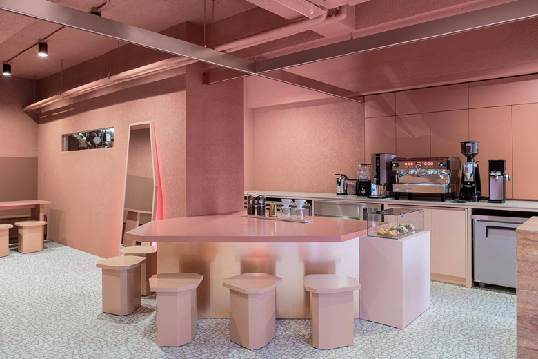
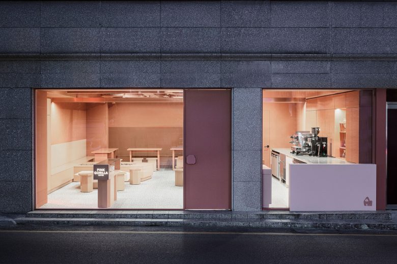
As if a gorilla looks ferocious and wild, it is actually a vegetarian animal. The space concept was designed to highlight the gorilla’s reversal charm. The sensuous and hard rock-like appearance is expressed in the form, and the gentle personality is expressed in pink.
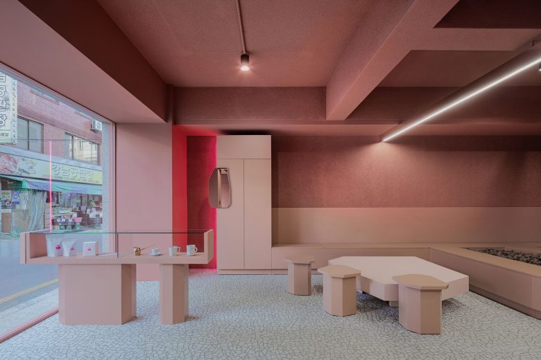
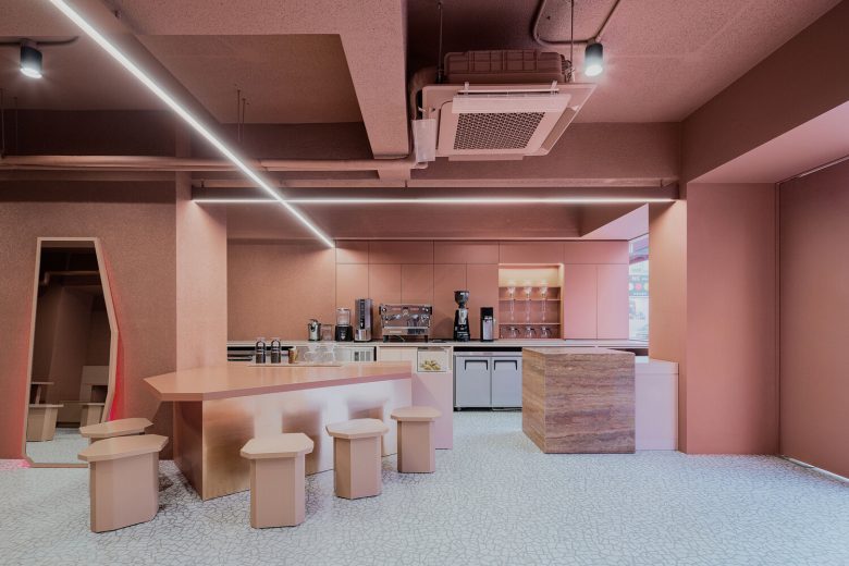
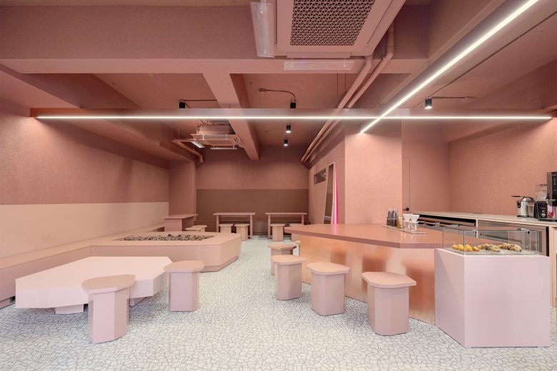
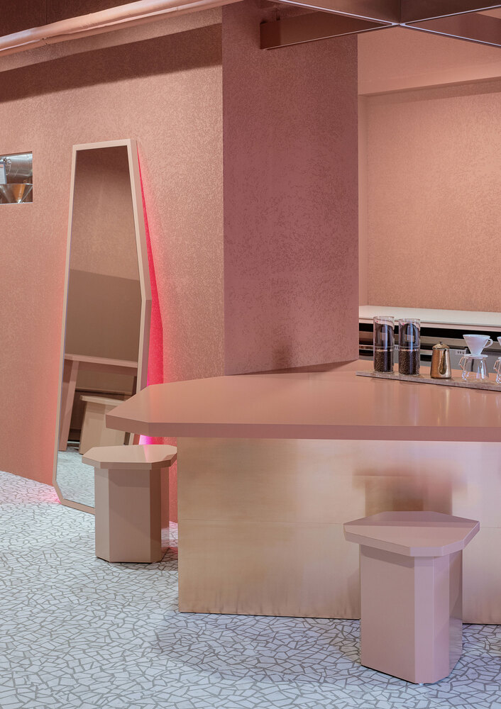
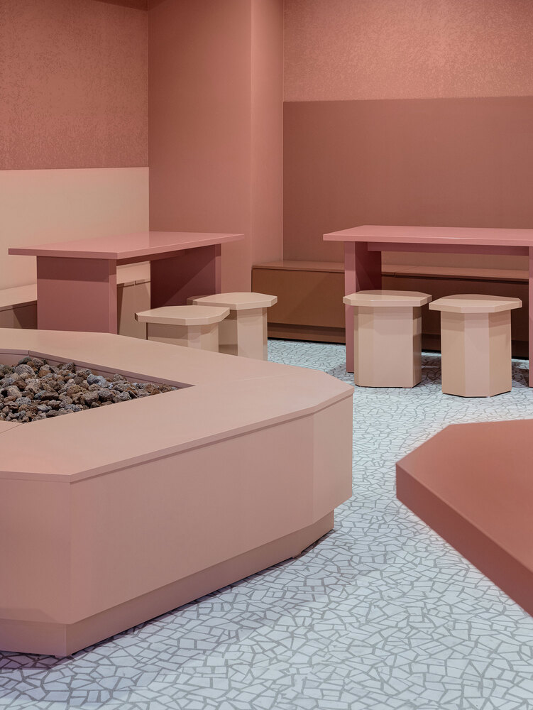
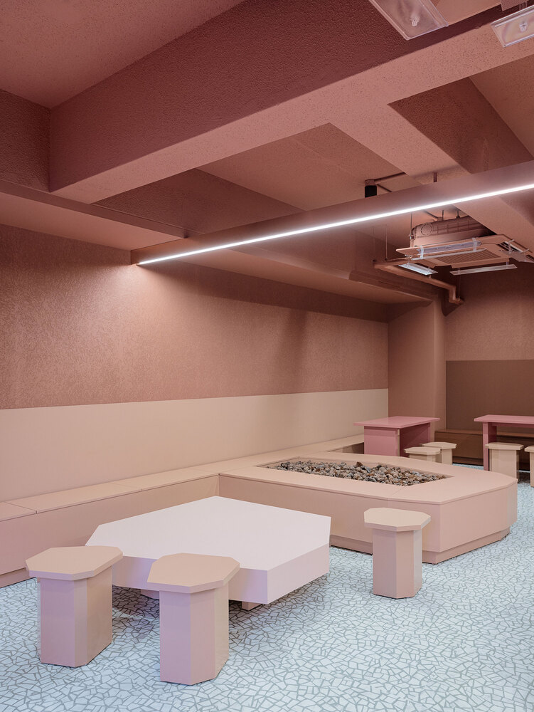
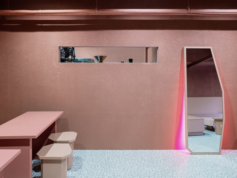
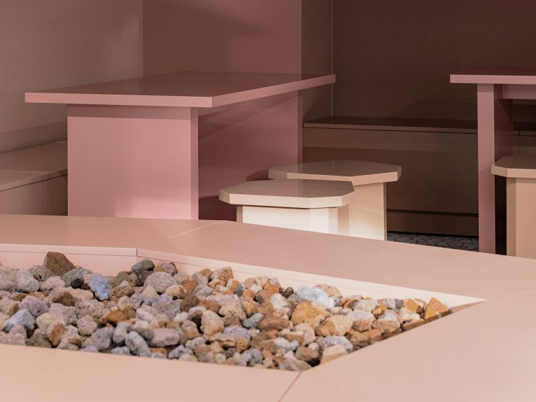
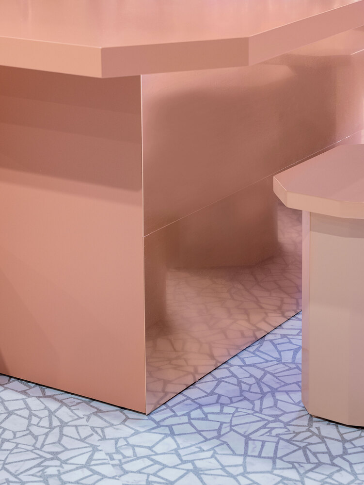
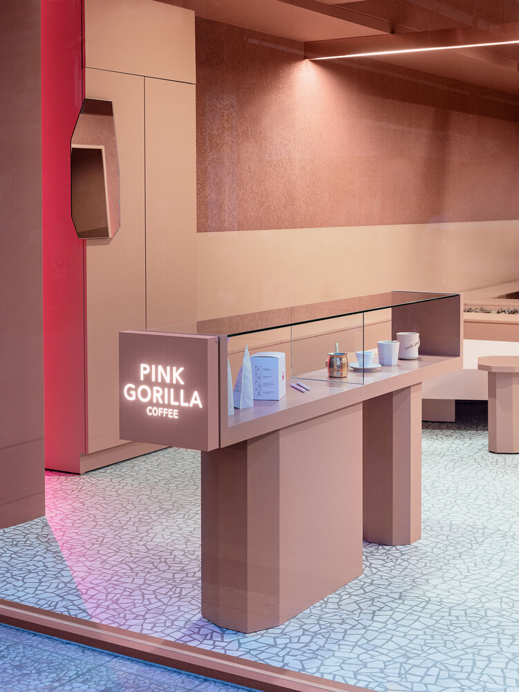
Tables and chairs were made in the form of a voluminous and crude polygonal shape. The flooring material also has the shape of a polygon, which was also selected to emphasize the gorilla’s rugged shape.
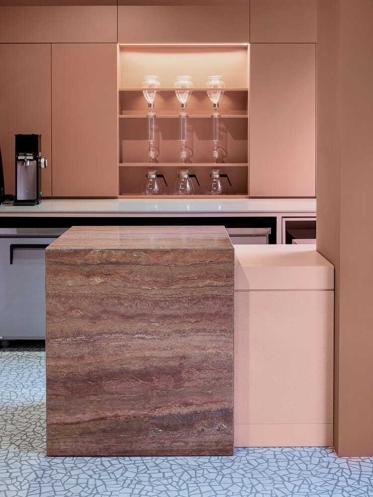
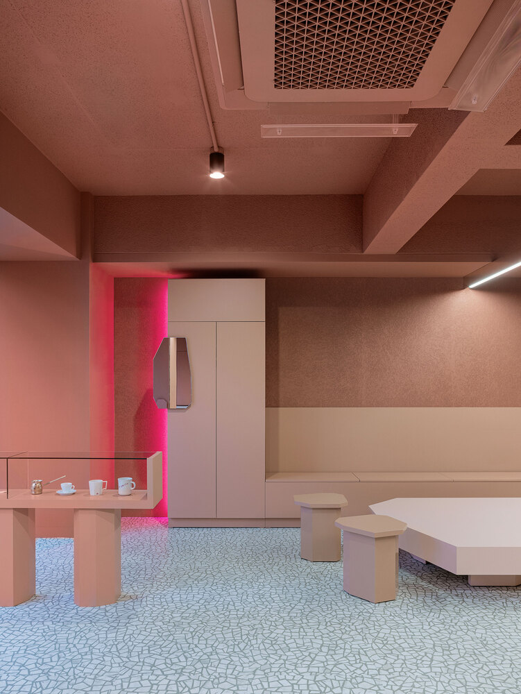
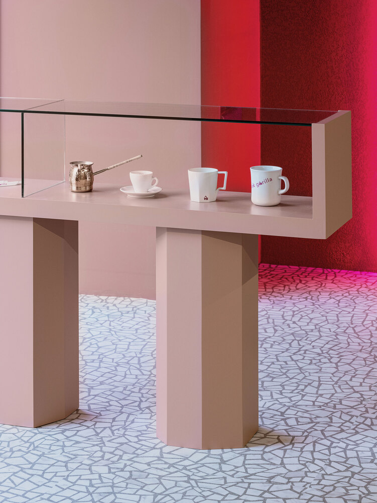
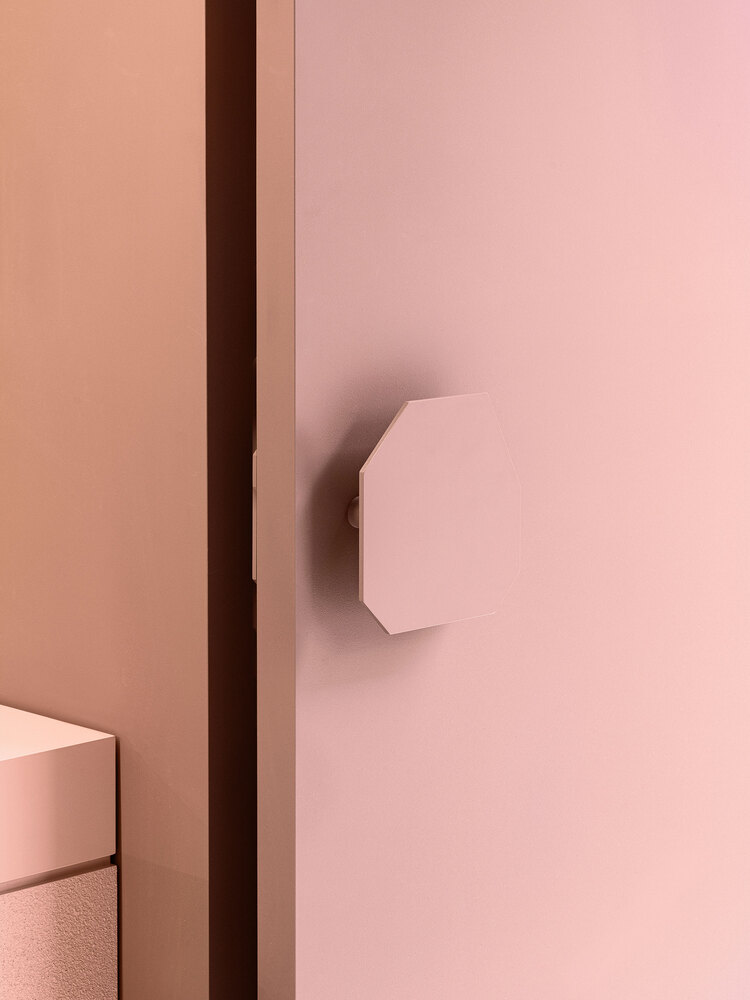
As for the color of the space, we tried to use as many different finishing materials as possible within the same pink tone. Pink-red copper plate, pink travertine marble, and 4 types of pink tone paint were used to make the space appear deeper by using dark colors as you go inside and go up from the bottom.
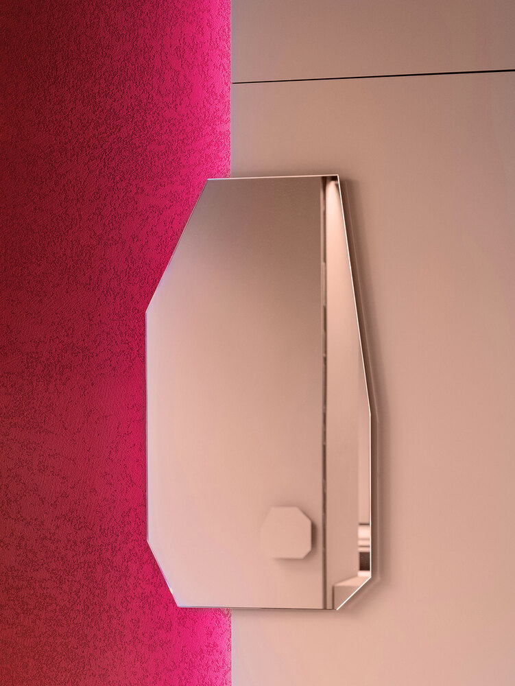
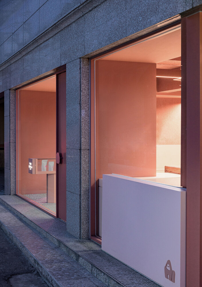
Using colored LEDs on the back of the leaning furniture and mirror, creating a pink shadow gave another reversal of fun. The landscaping space that evokes the central space uses external stones to bring a sense of locality like Africa where gorillas live. The exterior space is neatly organized, but rather than putting it through glass, the display furniture inside is extended to the outside, making it a signboard that stimulates curiosity.
Architects: Plainoddity
Lead Architect: Kim Jihye
Photographs: Choi Yongjoon





Add to collection

