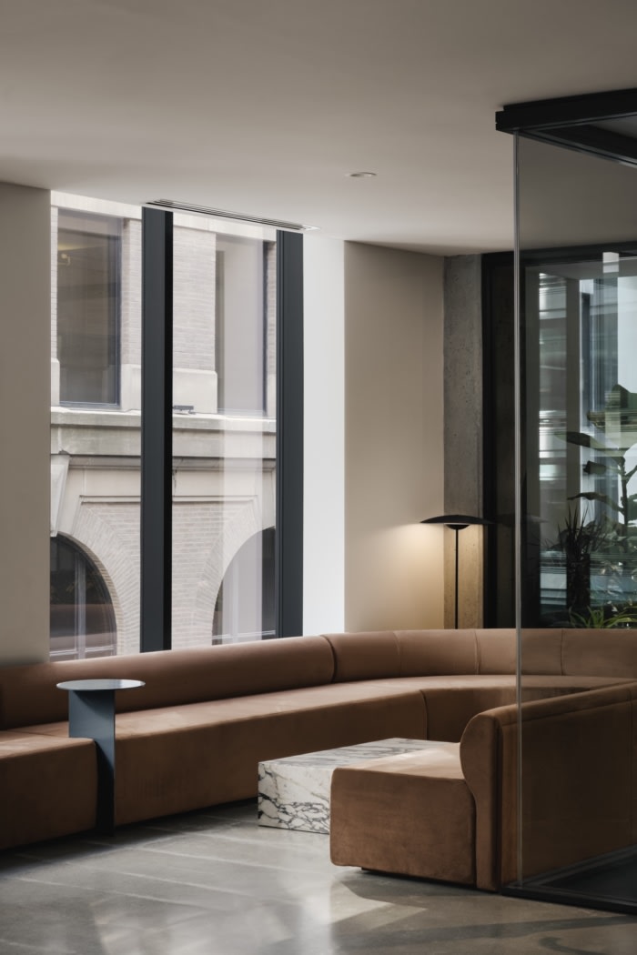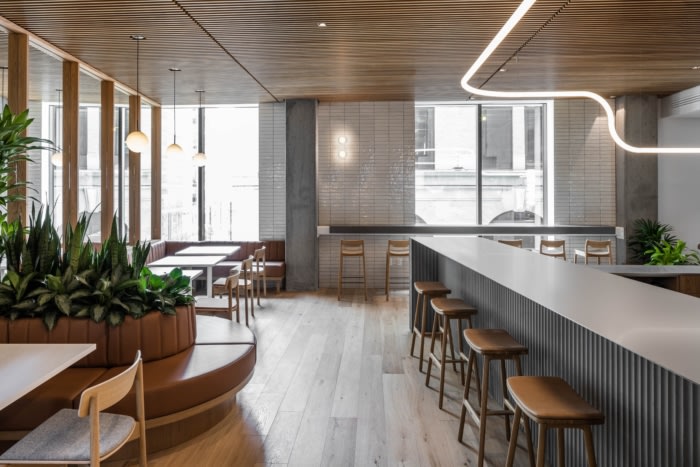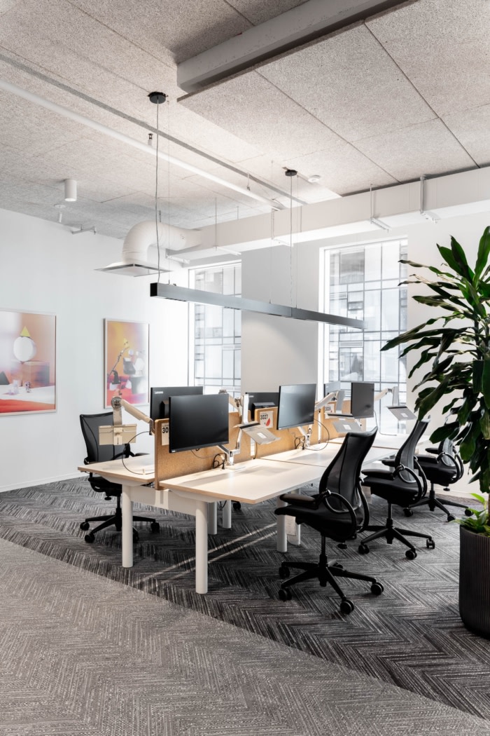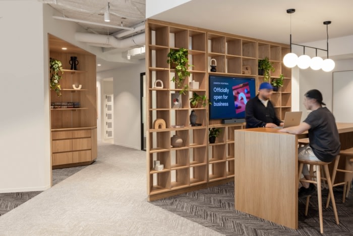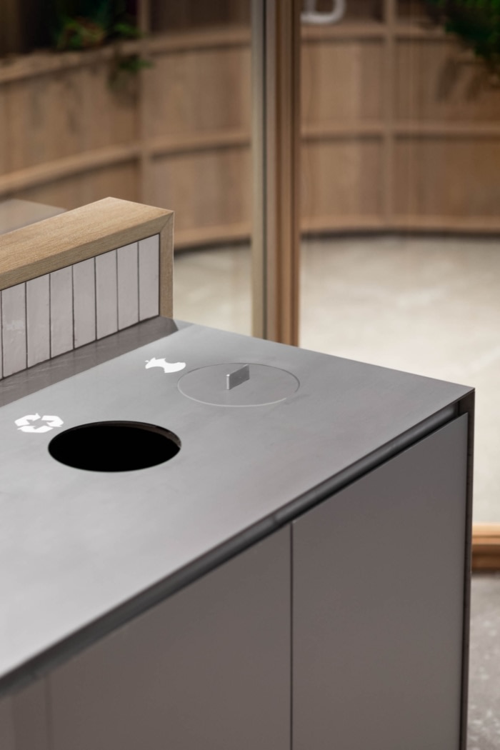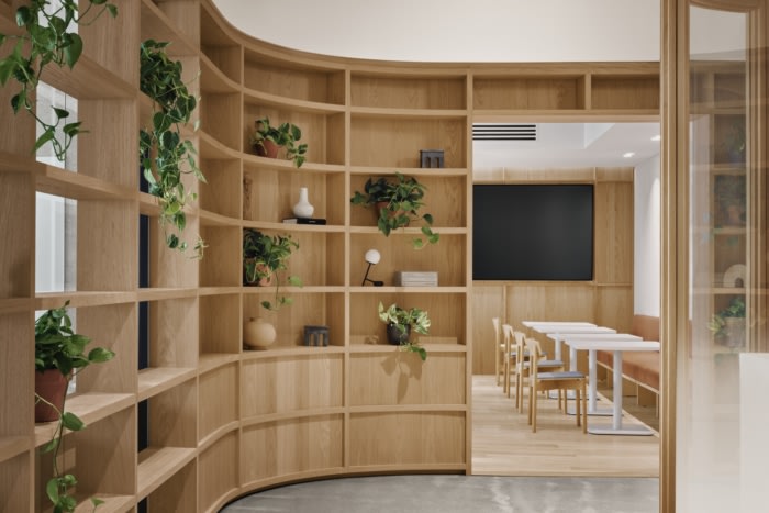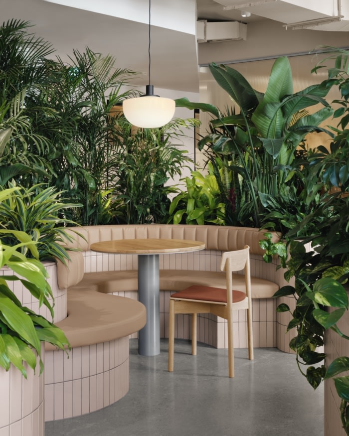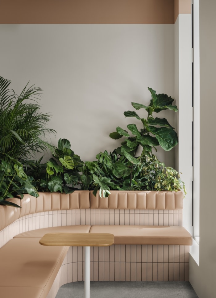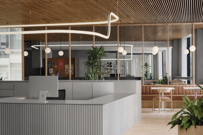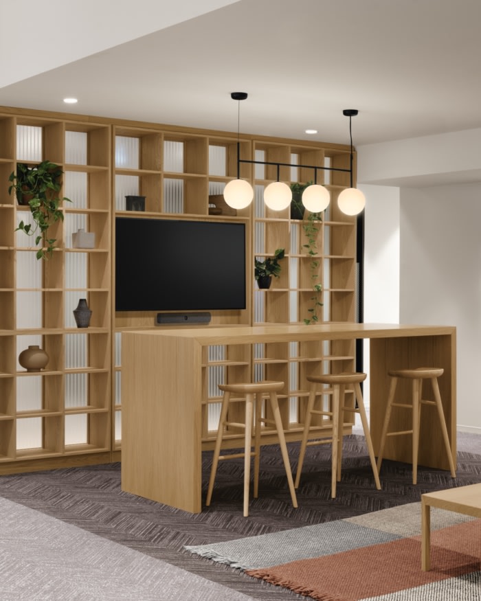
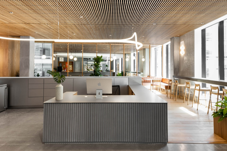
Forced to pivot in the wake of the COVID-19 pandemic, Zendesk sought to create a comfortable and safe work environment for employees to return to at the software company’s Montreal location. Ménard Dworkind Architecture & Design utilized natural materials and ample greenery to complete the Zendesk offices in Montreal, Canada.
After the acquisition of Montreal start-up ‘Smooch’, Zendesk sought to upgrade the offices for their new Canadian team. In early 2020, the design and planning of this 26,000 sq.ft. office were well underway when the global COVID pandemic came to turn the way we work in offices completely upside down. As offices around the world were shutting down and employees were working from home, Zendesk decided to cancel the build-out and reconsidering their approach to work, and the role of the office in the years to come.
Reimagining a post-covid office started by a companywide survey which made apparent that people found it easier to do focused work from home but that collaboration, interaction, sharing information and problem-solving were far better achieved in person. This triggered the search for a space half the size of the original office for the same headcount.
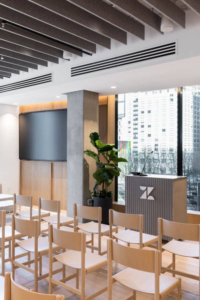
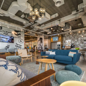
Collaboration and event space would be the emphasis for the new design. These spaces were designed to provide flexibility for the future, and to also be ideal to work with colleagues remotely. Traditional desks were kept to a minimum and the concept of assigned workstations was replaced with bookable desks. A series of flexible spaces offering relaxed work environments at a residential scale, similar to those people had become accustomed to working in at home, were provided throughout the office.
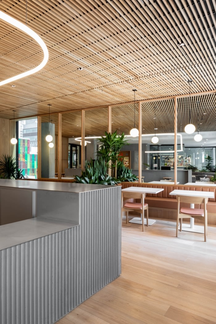
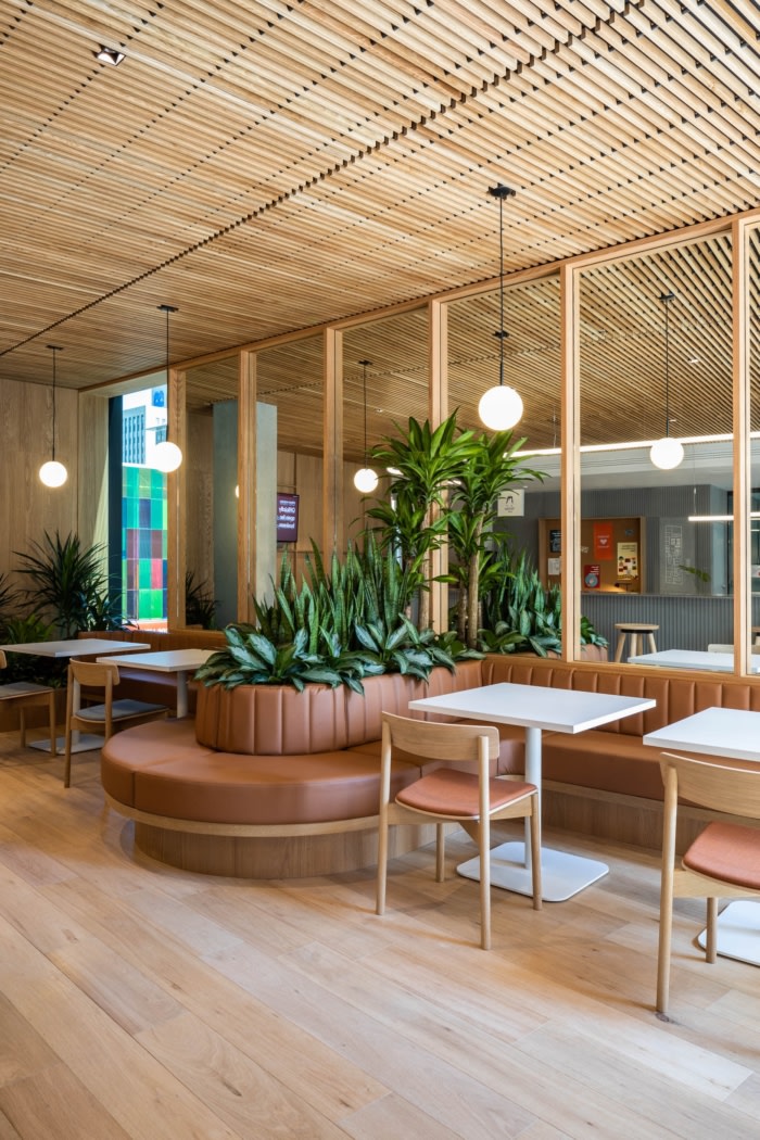
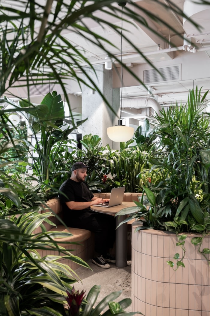
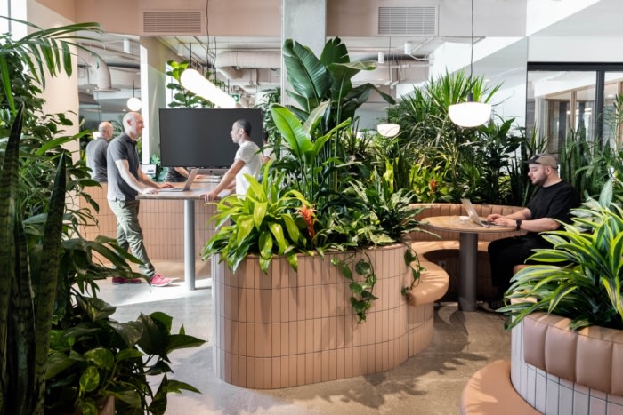
The flow of the space sends staff and visitors on a simple journey from public to private. Everyone enters through the reception, café, and event space. From there, it is through the large garden, which uses plants to create private spaces for both individual focused work as well as collaborative meeting spaces. Moving past the garden, a series of meeting rooms creates a buffer between the louder spaces at the entrance, and the workstations beyond. This helps with encouraging chance encounters and a vibrant atmosphere while still enabling staff to work in a quiet, focussed space.
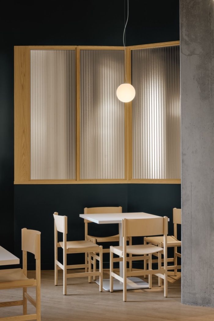
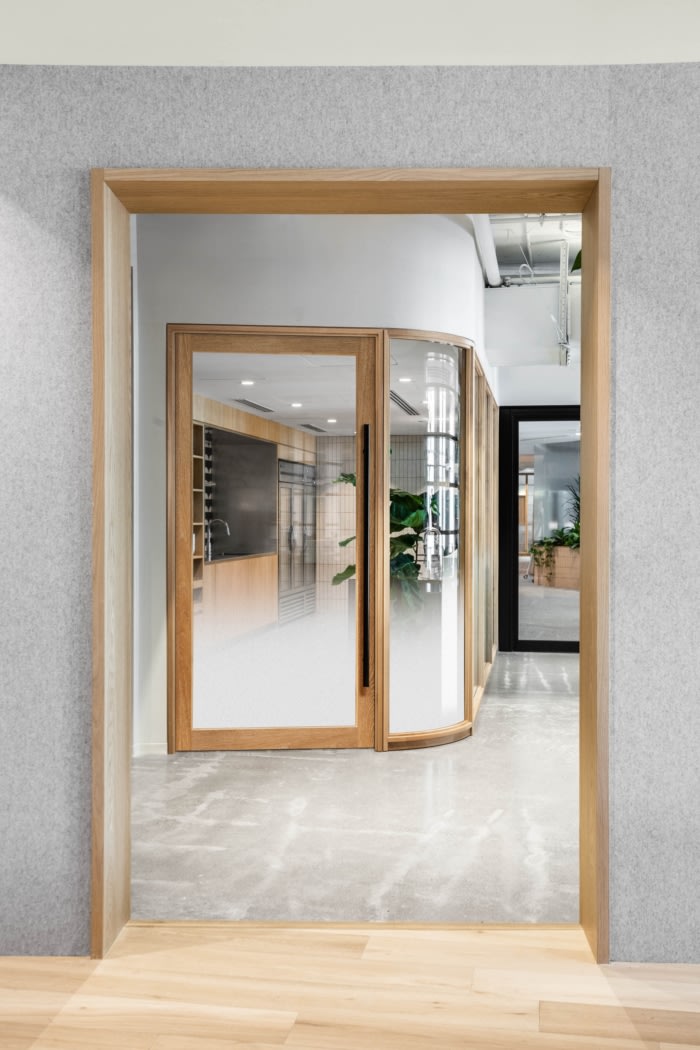
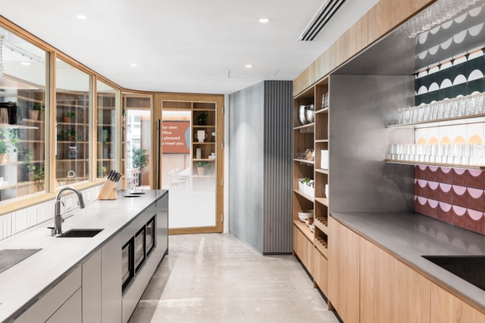
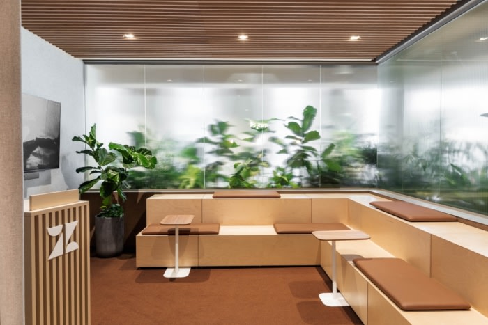
In addition to this spatial separation from public to private, varying levels of material transparency are used to create levels of privacy. In keeping with Zendesk’s culture of openness, glass and acrylic panels are favoured over solid walls. However, texture and translucency are added to these materials to limit and modify views. Fluted glass provides the next level of privacy, by distorting the image and limiting sound. Finally, translucent polycabonate panels, which allow only light but not views, are used as a screen at the entrance to the open office area, as well as along the lounge.
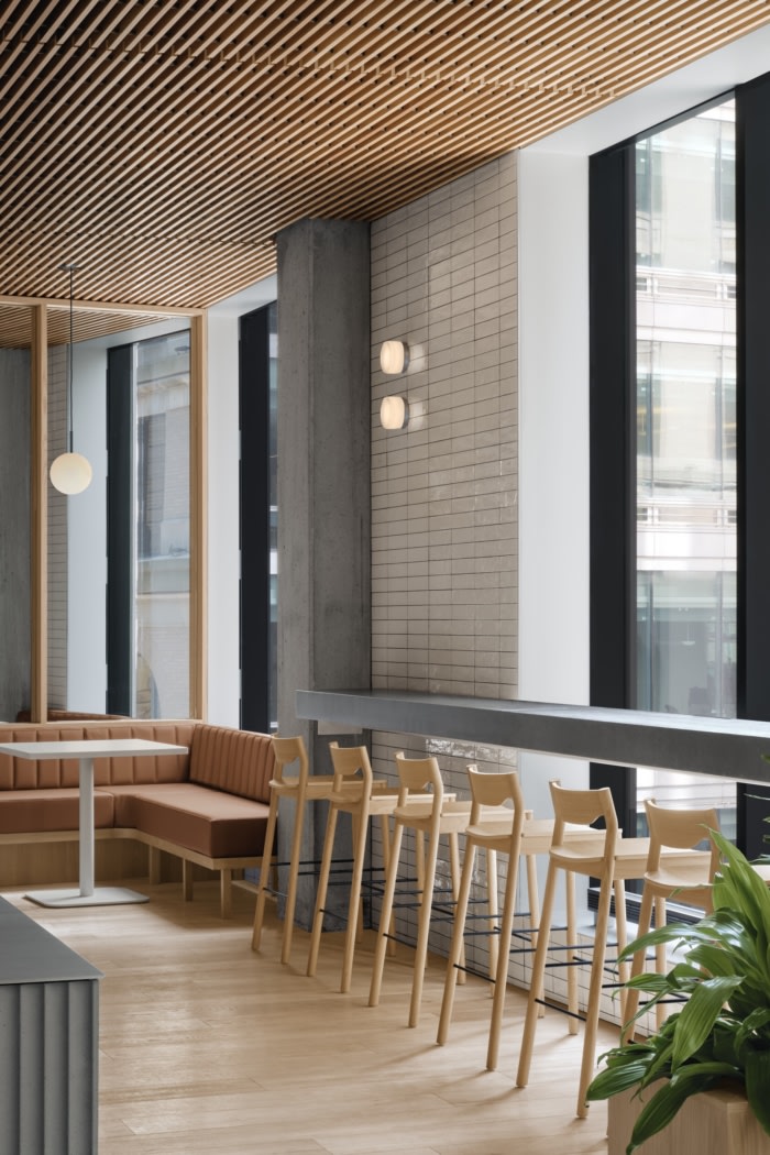
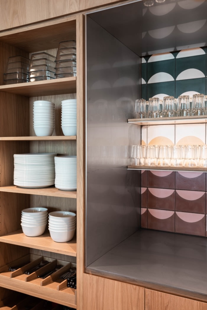
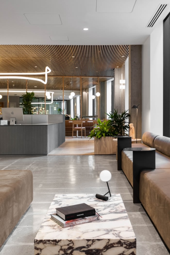
These glass and polycarbonate panels are combined with a muted palate of white oak, stainless steel, grey felt, concrete and tan leather. These materials emphasising a Scandinavian design aesthetic, in keeping with Zendesk’s Danish origins. To make the design more local, and as an homage to Montreal’s history of brutalist architecture, fluted concrete panels are a prominent material. Together the material palate serves as a background for the life of the office and the accents of art and plants.
Design: Ménard Dworkind Architecture & Design
Design Team: David Dworkind, Michael Hall, Guillaume Ménard, Mélissa Caron-Labreque, Benjamin Lavoie-Laroche
Photography: Alex Lesage, David Dworkind

