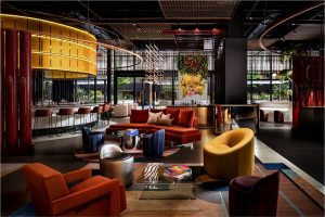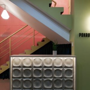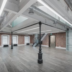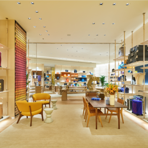

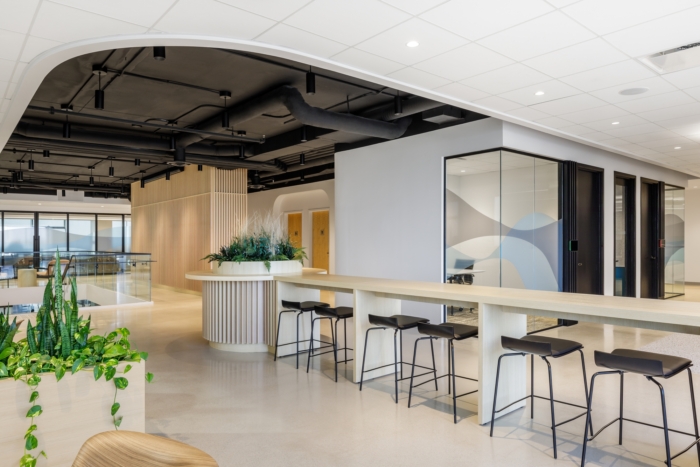
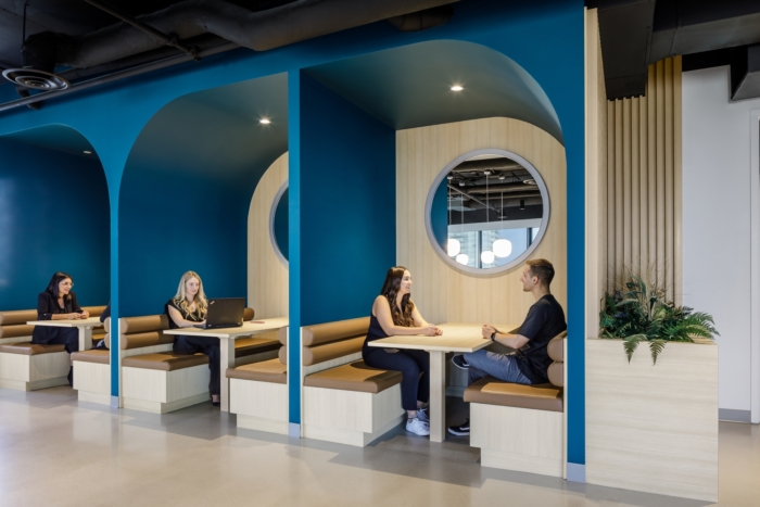
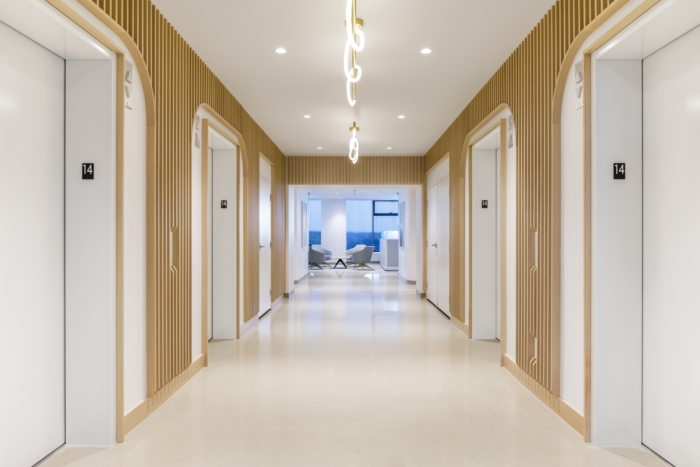
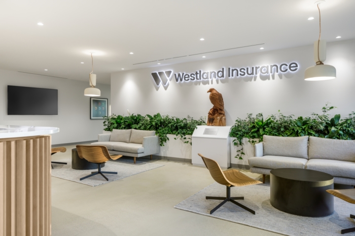
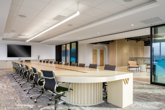
To keep up with the company’s recent exponential growth and new brand identity, Westland Insurance has moved into an inspiring and approachable 60,000 square-foot office in Surrey. Aura utilized architectural lines and arches to complete the Westland Insurance offices in Surrey, Canada.
Westland Insurance, Canada’s largest independent-owned brokerage, decided it was time for a brand refresh, which included a new head office location and design. After experiencing exponential growth in recent years, the company decided to consolidate three locations into one single central head office. The design goal for the new office, which spans 5 levels and 60,000 square feet, was to accurately reflect the company’s new brand while also exhibiting its inclusive and inspiring identity and culture. Working with Aura, Westland was able to develop a workplace strategy that directly impacted the design, ensuring that the new office was tailored to the demands of its employees and business, allowing its team to thrive.
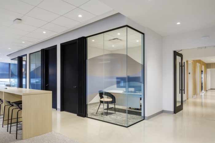
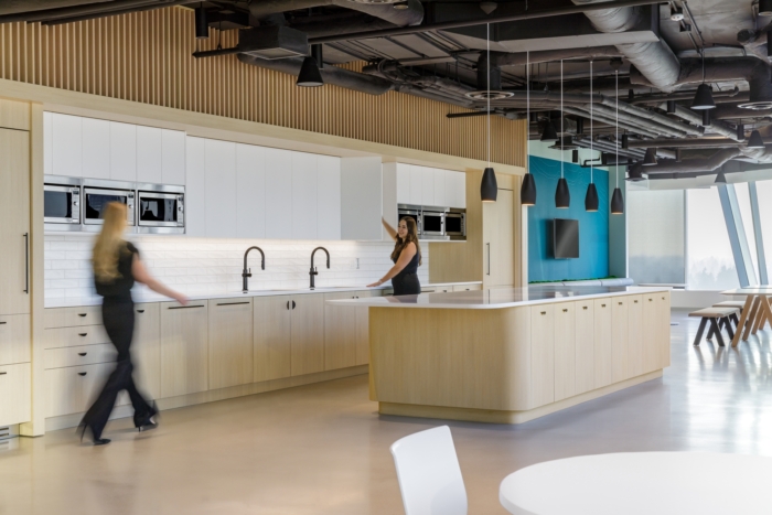
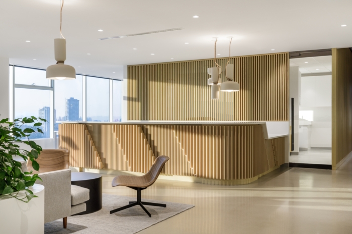
Aura worked with the Westland team to design a modern, flexible workplace that supports hybrid working, reflects its brand, and encourages connection among its vast network of employees. During a visioning session, the design concept of ‘Inspiring and Approachable’ emerged. Each floor has a consistent welcoming feel to produce a calm and inviting ambiance. Repetition is seen throughout the space in the layouts and elements to provide employees familiarity within the space. On each floor, social, support, and collaboration spaces are in the same or similar locations, allowing staff to navigate the different floors seamlessly.
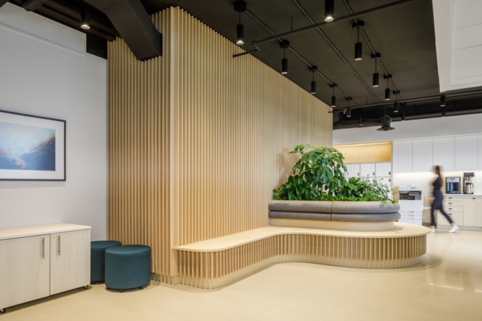
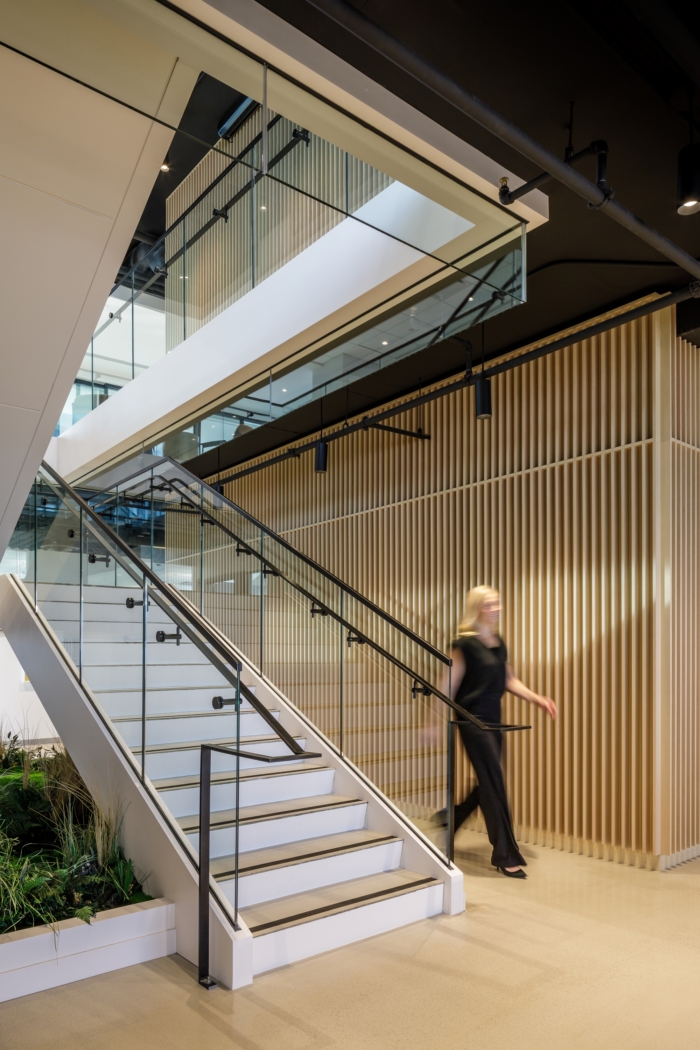
Connection was at the forefront of the design. A staircase between the top two floors was added to allow connections between floors. The staircase allows employees easy access between the workstations on the 14th floor and the reception and the Westland Bistro on the 15th floor. Location and connection to the natural world were also significant design considerations. Local materials were selected, and plant species native to the province were chosen over more tropical foreign plants. An organic design with an emphasis on natural elements was chosen to emphasize Westland’s connection to Canada.
There are a variety of workstations accessible so that employees can choose how they wish to work on any given day. There is an area for everyone, from individual desks to group workstations to virtual rooms and beyond. Furthermore, modular planning was incorporated into the design to accommodate company growth and future changes in the organizational structure. Workstations can be reconfigured to meet the needs of the workforce. The new Westland office reflects who they are: inclusive, connected, modern and inspiring.
Design: Aura
Photography: Luke Potter

Add to collection

