Add to collection
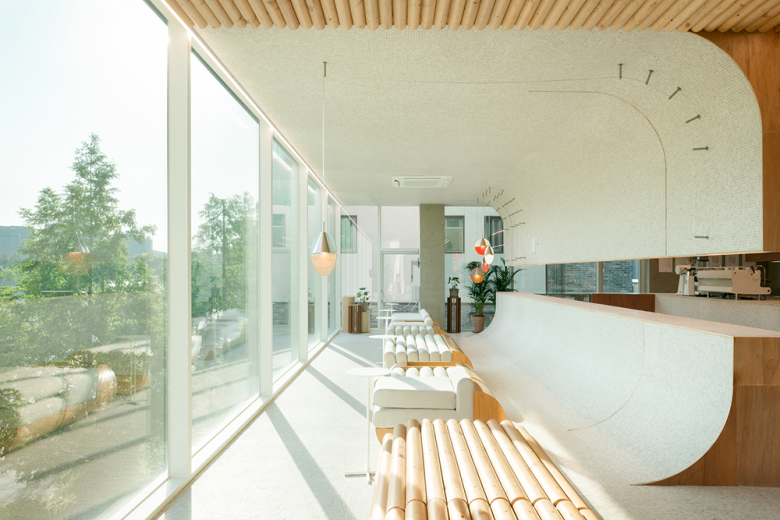
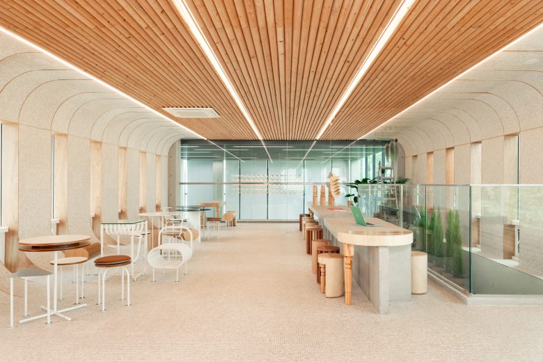
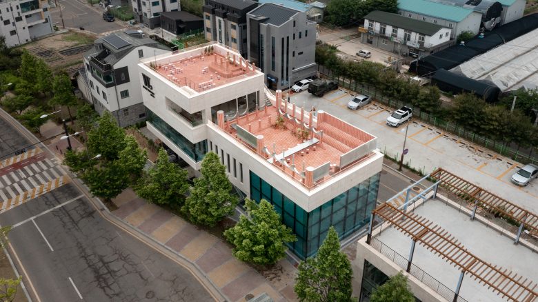
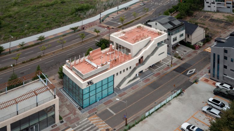
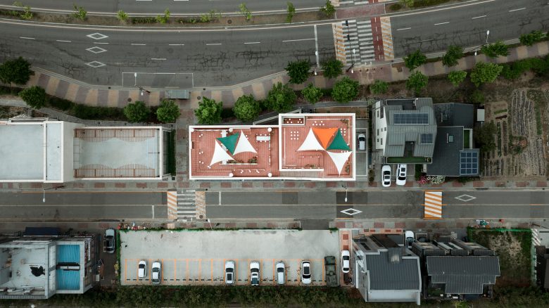
Parconido is a bakery cafe located in northern Gyeonggi-do that resembles a square seen in Europe. Created with basic materials and in simple shapes, the cafe presents a consistent space in which the space, furniture, and lighting are designed to create an unified atmosphere.
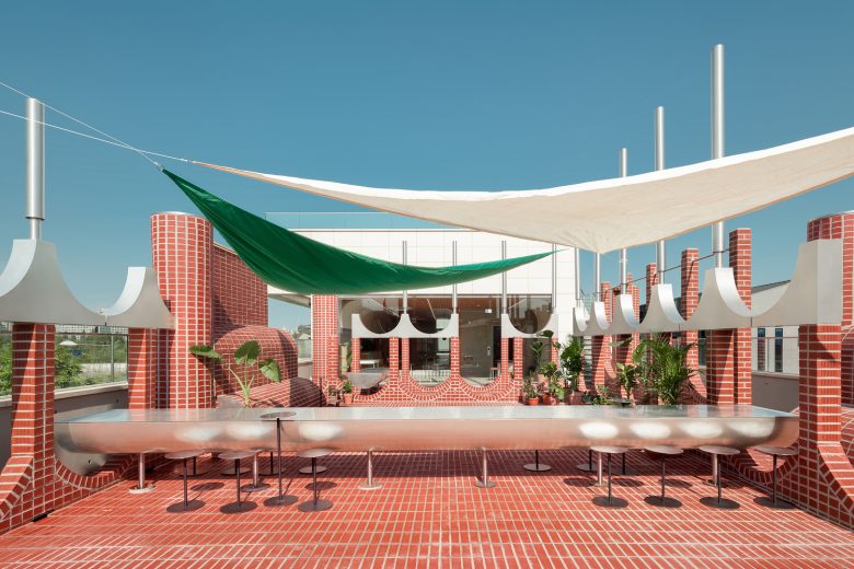
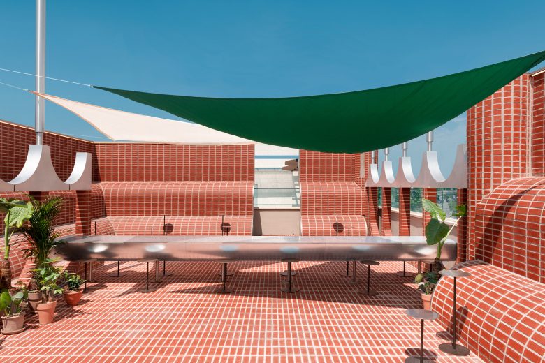
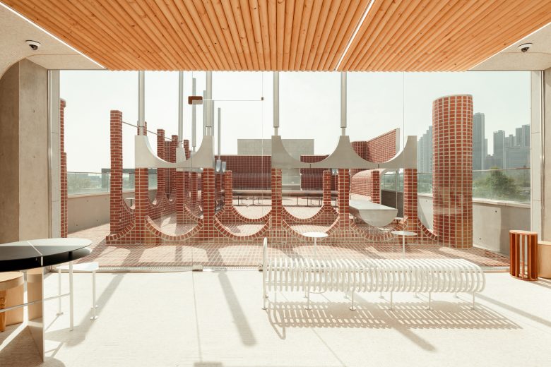
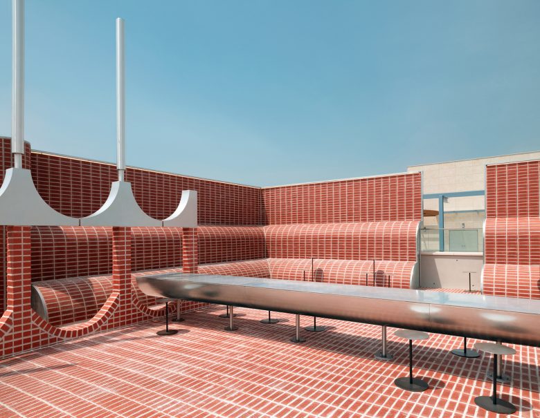
In accordance with the spirit of “sukchulmok” that space should resemble the user, we wanted to capture the environment of our client who has lived in Italy for a long time. However, we wanted to give it an identity as an homage and not a copy, but also we wanted it not to be intuitive. The beginning of this the cafe was the sight of a square where people were huddled together talking on a sunny day between red brick buildings and stone pillars. *Piled (in many layers) and stuck one by one.
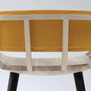
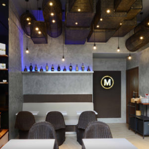
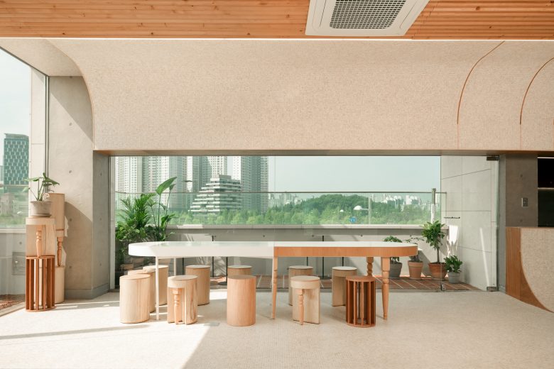
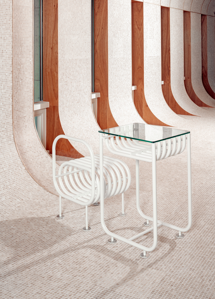
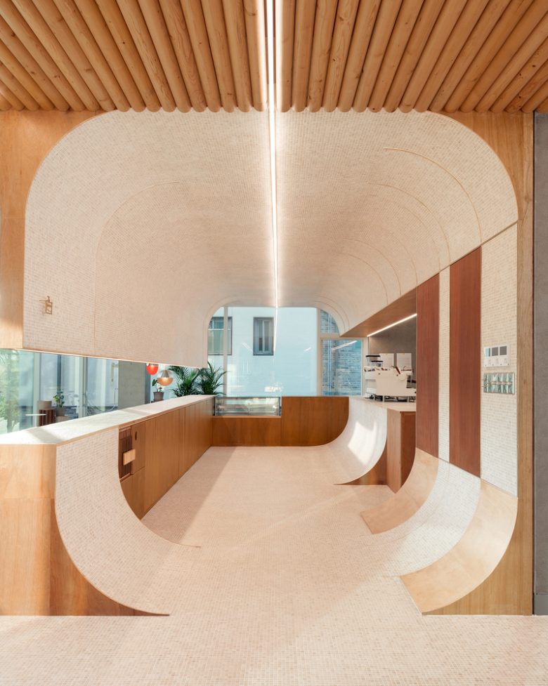
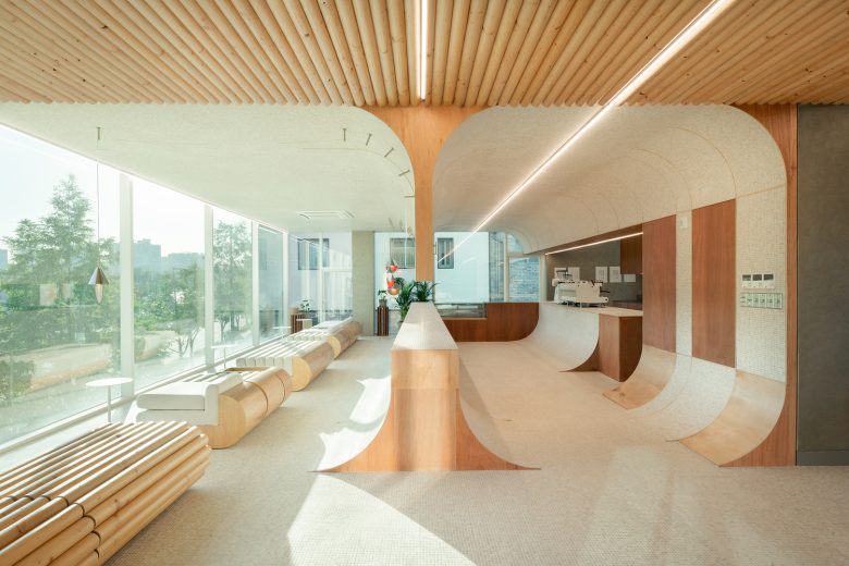
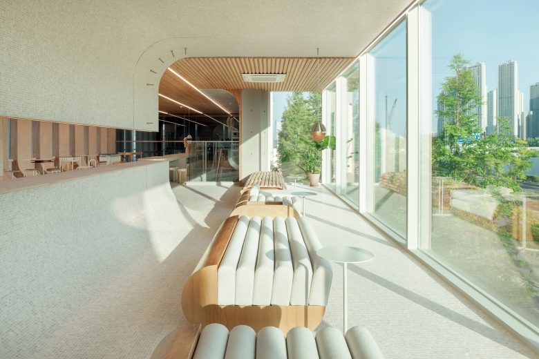
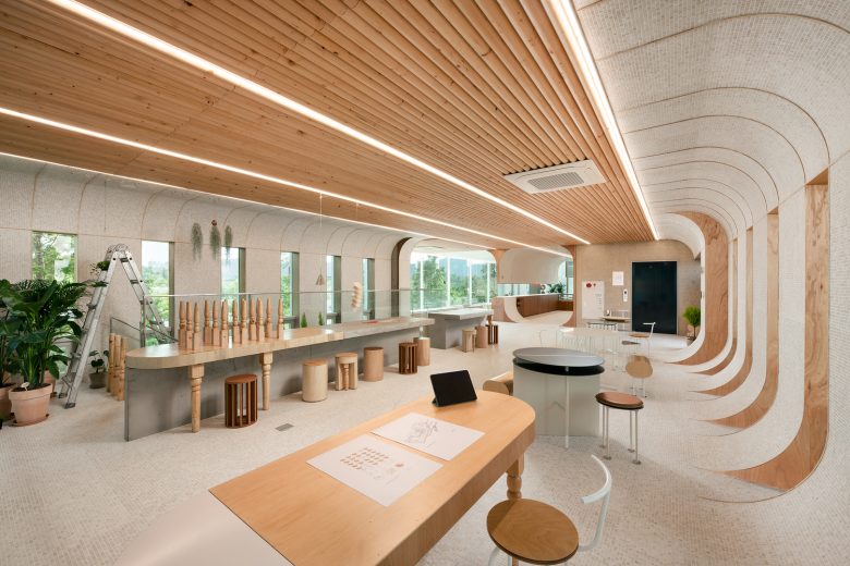
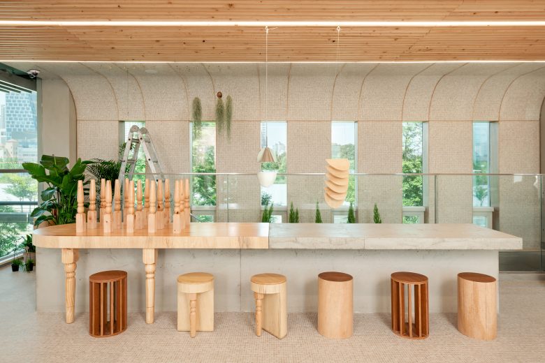
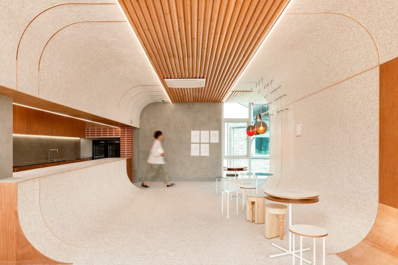
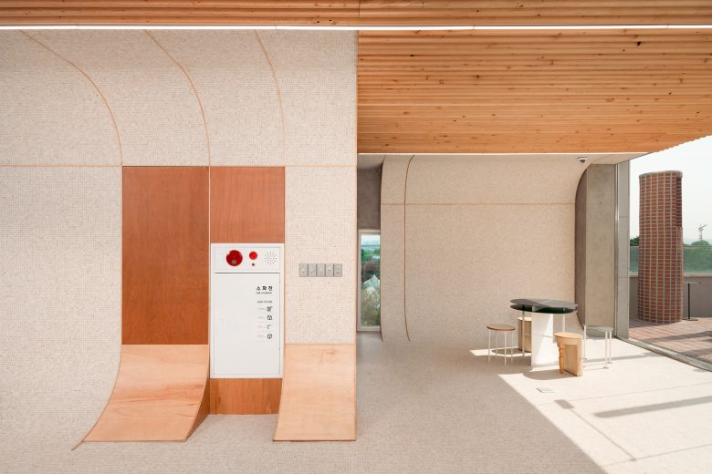
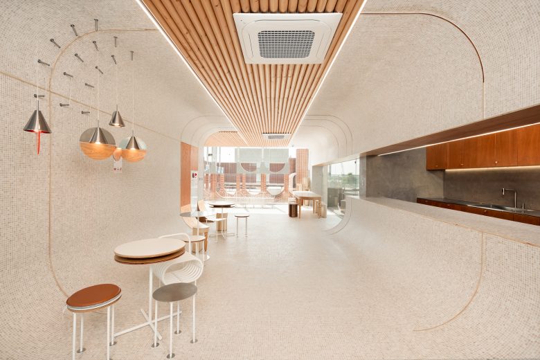
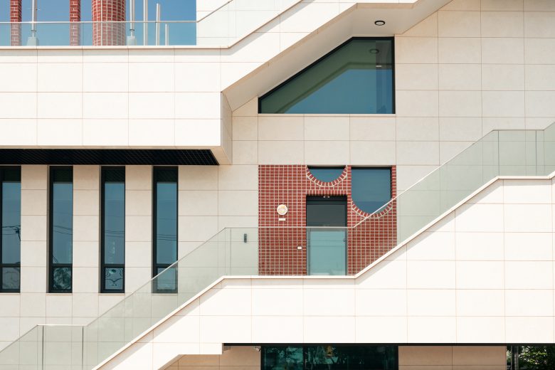
Columns that surge everywhere and rounded walls in the open air wrap the space. Although the walls and columns have different shapes, they all have a radius of 600mm. The space created through this rule acts as an excellent reference point to complete a sense of unity without it being monotonous. They were built by stacking clay bricks with no holes. The bricks were also cut off by two-thirds of the thickness and were coated like skin on an iron frame to relieve the load. *Furniture manufactured in perfect circles is appropriately blended into the space in various forms, such as concrete castings, combination with wood, and overlapping circular pipes. They also highlight round spaces without standing out themselves.
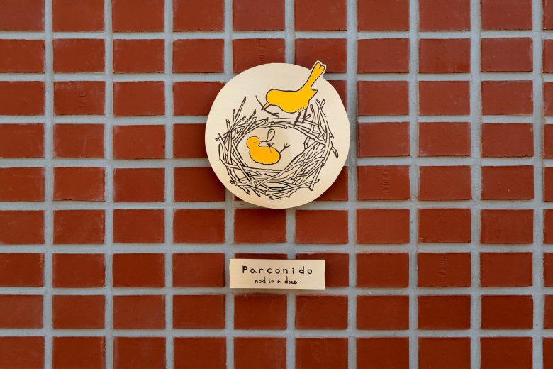
Travertine limestone, suited for the fountains in squares of Europe, is cut into pieces of 1.5mm*1.5mm and desinged to cover the floor, walls, and ceiling of the room. The angles in the indoor space are rolled in round shapes so that the boundary of each side becomes faint and gives an illusion that it expands. (They also have a radius of 600mm.) The space even makes the subject stand out with a feeling of weightlessness. *nod in a doze
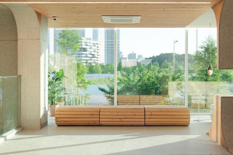
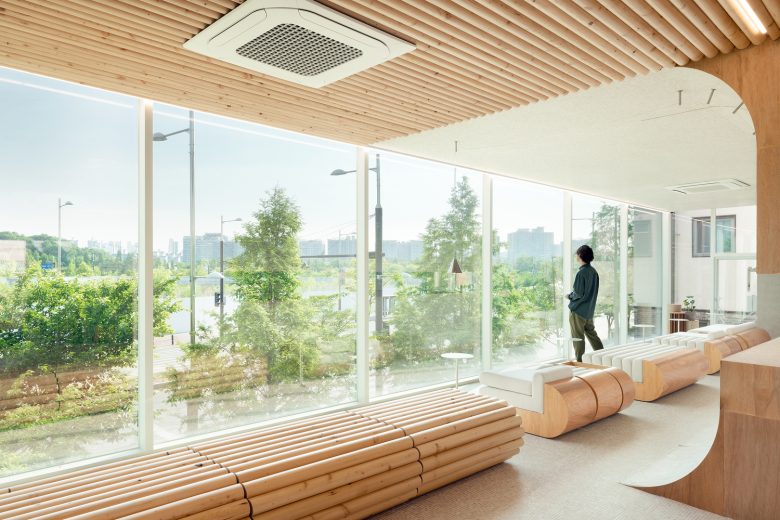
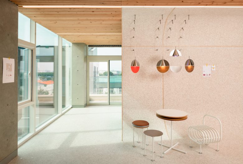
Red brick, travertine, and wood. the mixture of three materials create a warm-toned space. The visually warm space lowers one’s guard and even gives a calm feeling. The symbol of the place depicts a baby bird dozing off in a nest. It was built in the hope that visitors would put down their worries in life and enjoy the relaxed mood. The nest represents the comfortable home provided from the birth of new life until independence. This is an analogy that represents the beginning of the brand with the client challenging for a new business.
Completed in 2022, the cafe is ready to write down its own history in its new home by roasting and baking it’s own products. We hope that visitors will remember the cafe with beautiful and delicious memories. “The lighting and furniture used in this space are objects firsthand designed and produced“.
Architects: sukchulmok
Photographs: Hong Seokgyu
Add to collection