
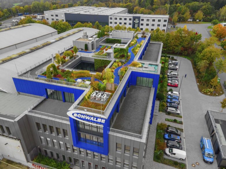
Schwalbe Hybrid Building is located in Reichshof, Germany. The interior architectural project for Schwalbe HQ covers around 2,200 square meters. The construction was realized during the pandemic and took three years from concept to completion. Schwalbe – a leading bicycle tire manufacturer owes its success to uncompromising quality, continuous innovation, and new technologies and pushing for more environmentally aware production.
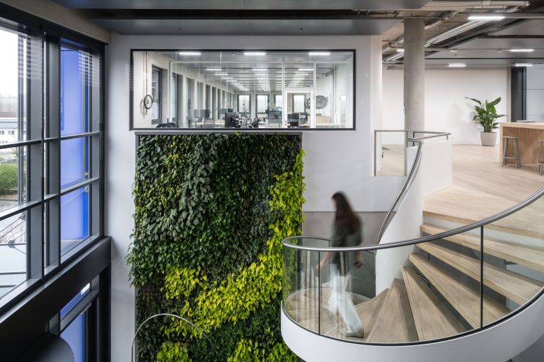
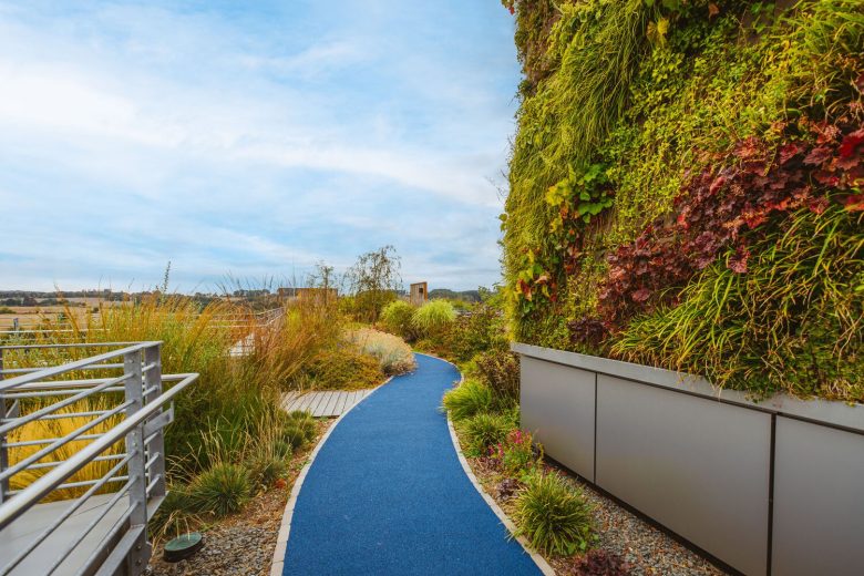
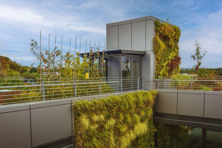
The project was born in parallel with the revision of the company’s approach to the working environment and an ambitious goal to create a responsible building for the future. Schwalbe Hybrid building is one of the few examples of cradle-to-cradle design principles used in industrial architecture now. 98% of project materials are recyclable and 100% of concrete and steel can also be recycled. Annually, the building generates over 60.000 kWh of electricity, a very energy-efficient air heat pump temperates the entire building via ceiling sails so it heats and cools autonomously. Considering the location in the region with regular heavy rainfalls, the rainwater is collected to irrigate the roof gardens, and green walls and to service the restrooms throughout the building to reduce water consumption.
The architectural brief was to follow the company’s corporate philosophy which puts environmental and social responsibility at the center and to provide inspiring and innovative spaces for work and recreation. The architects’ goal was to translate into space the values that the company carries and the passion for bicycles of all people behind Schwalbe. The key method in their approach was to use mostly natural, recycled, and recyclable materials found in the DNA of Schwalbe. Schwalbe brand is known for its product’s endurance, likewise, Archiproba believes in flexible and timeless design, where the only trends respected are quality and sustainability.
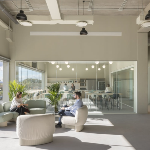
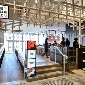
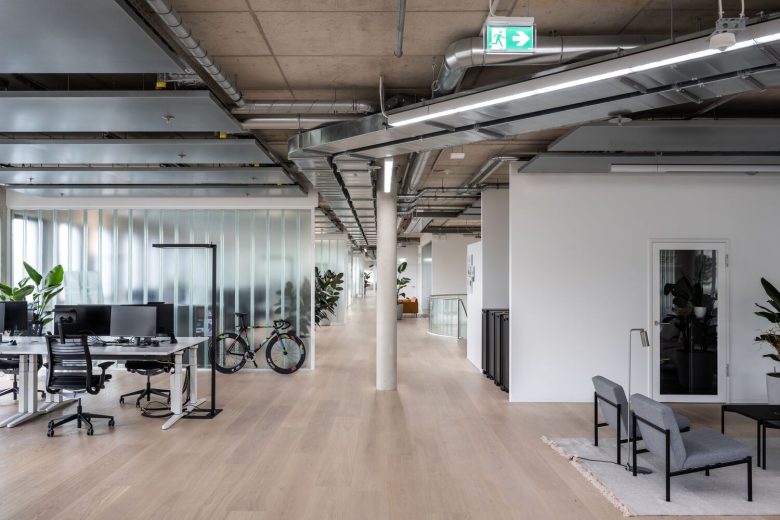
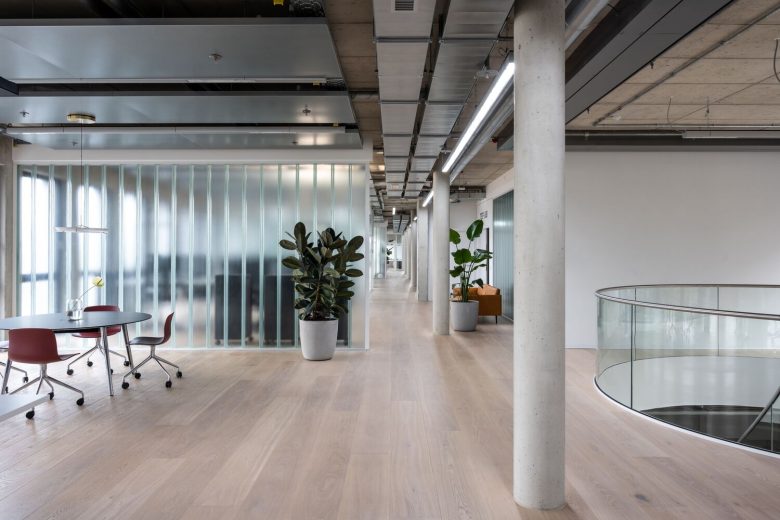
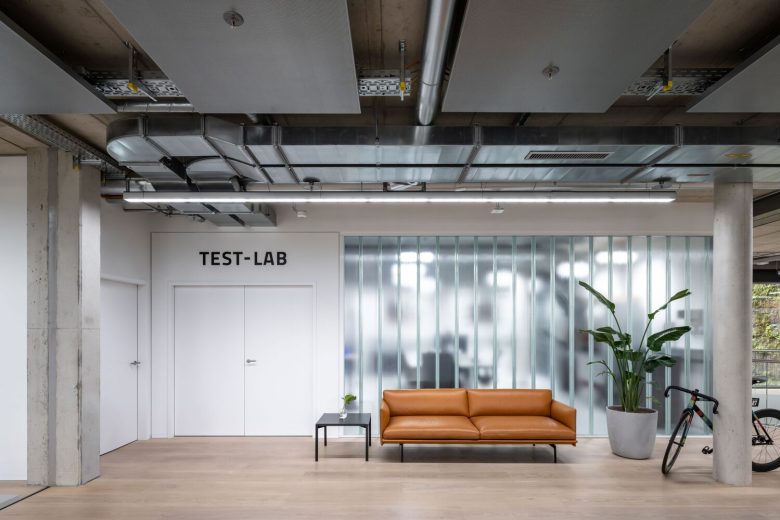
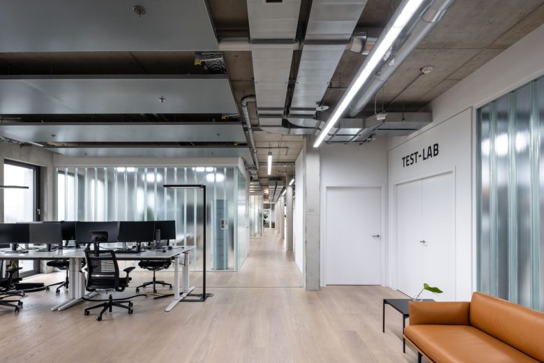
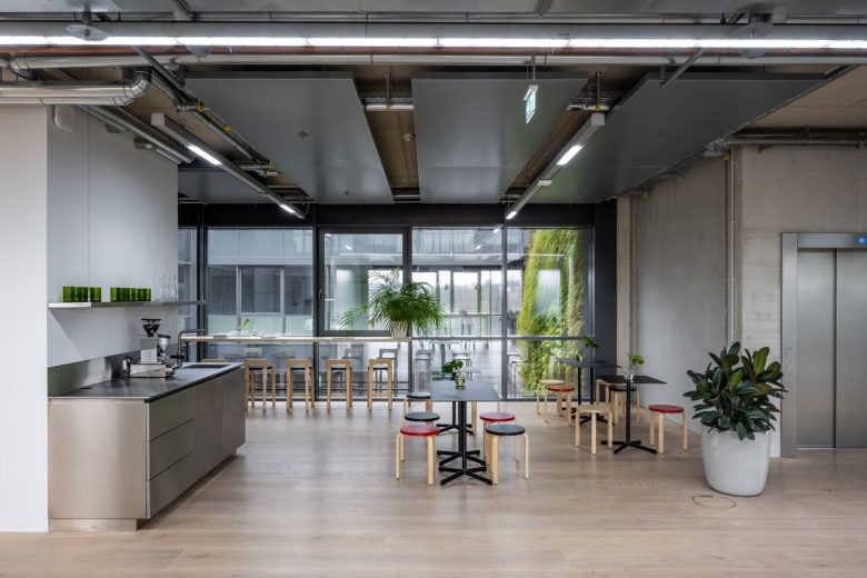
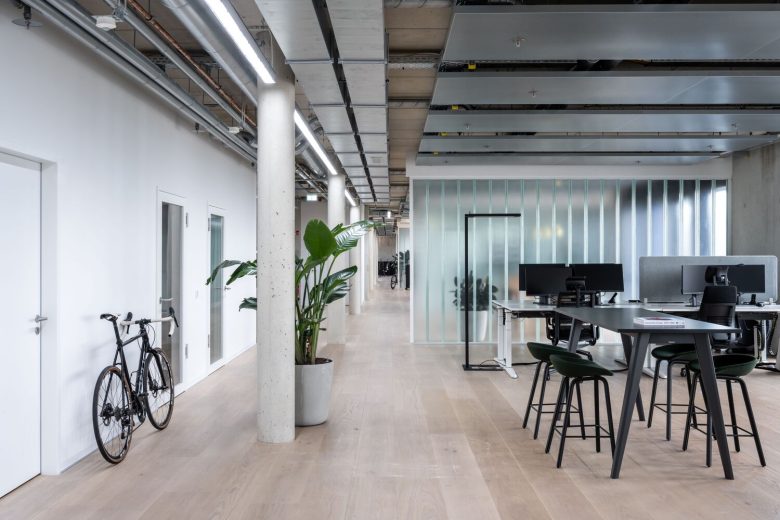
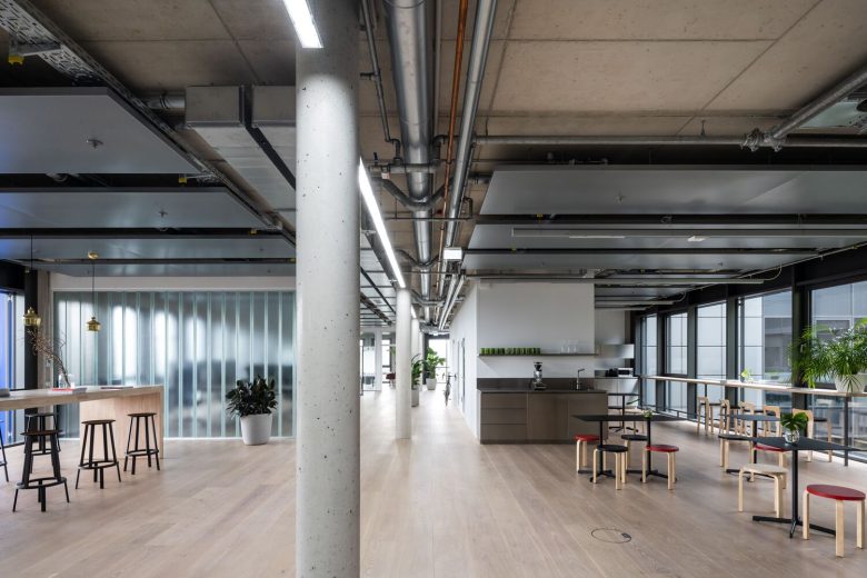
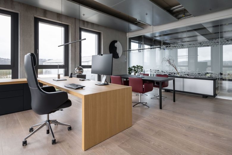
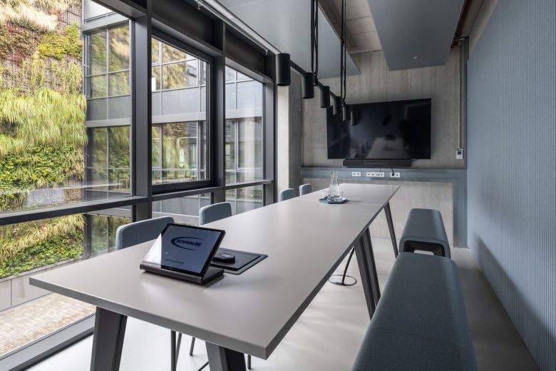
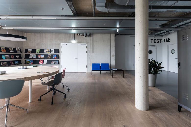
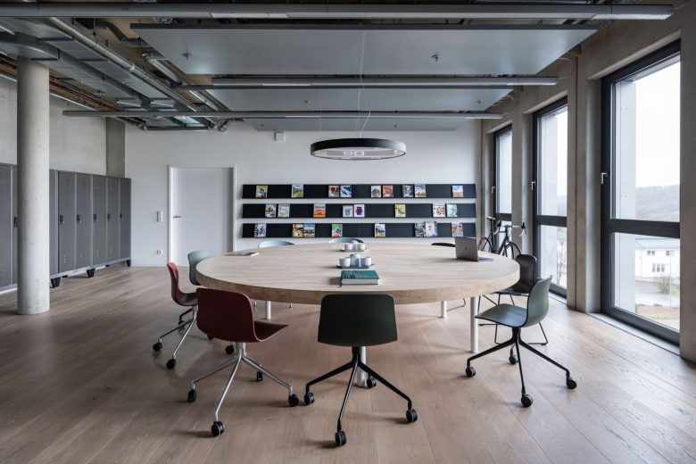
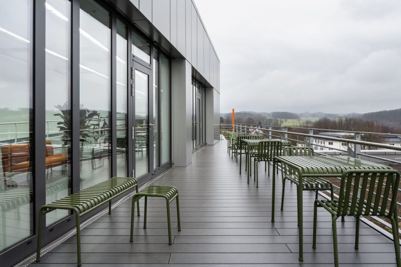
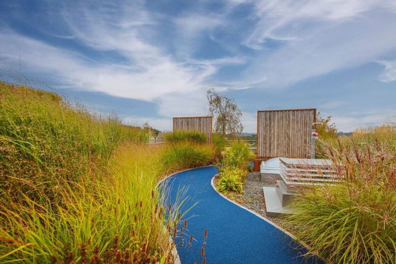
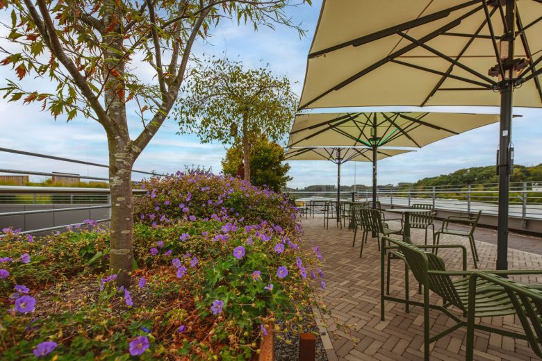
The new building occupies three floors and accommodates a reception area, bicycle workshop, Brand World, marketing and technical departments, lecture, and workshop halls, connecting bridge, and a rooftop garden with fresh fruits and vegetables used in the canteen. Extra working areas are provided for key sectors, such as the testing laboratory and customer service. In response to the request for open-plan solutions, the architects tried to expand the notion of “hybrid” into spatial design and working environments. Every area of the building has multiple functions and may be used for individual or collaborative working, meetings, and events. In order to capture the light and air in the space, dry walls were swapped with glass, where possible.
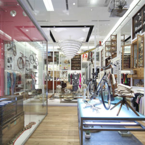
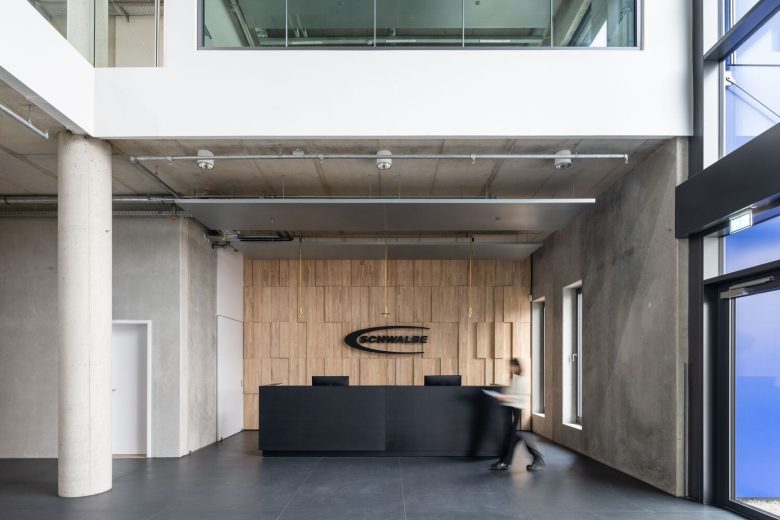
Thus the users of this vast building are feeling more united and the visitors are given a glimpse behind the scenes of Schwalbe’s different departments. The ground floor offers two main entries, one through a formal reception and one through a bicycle workshop. The centerpiece of the reception area is a voluminous custom-made rubber wood wall reminiscent of the pattern found on bicycle tires. Contrary to the brightness typical for reception zones, warm and minimal lighting by Peter Zumthor – Candela Di Vals is used to create a calm and peaceful atmosphere.
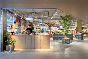
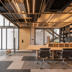
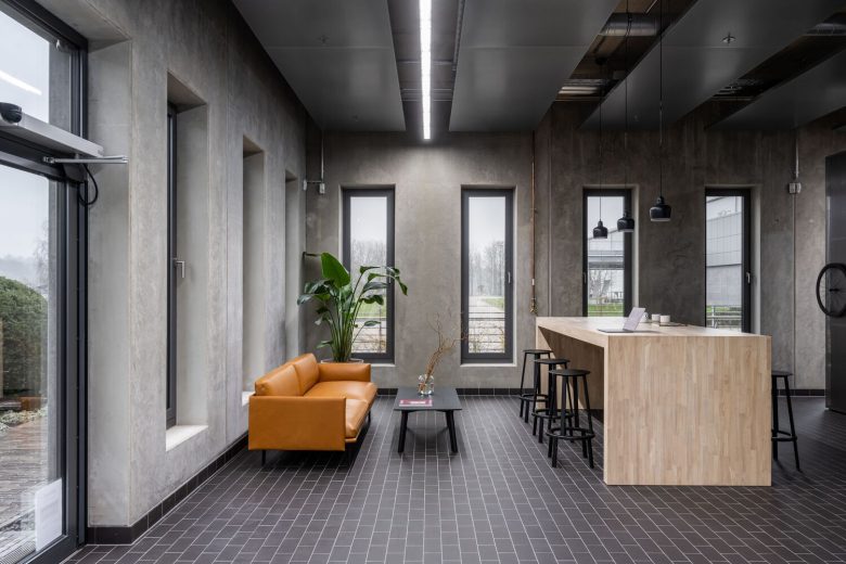
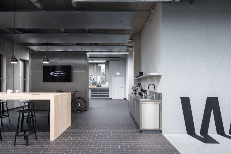
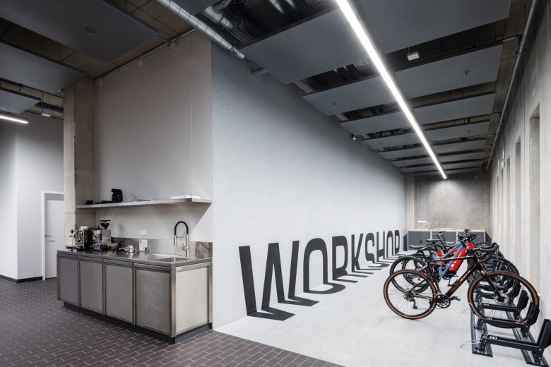
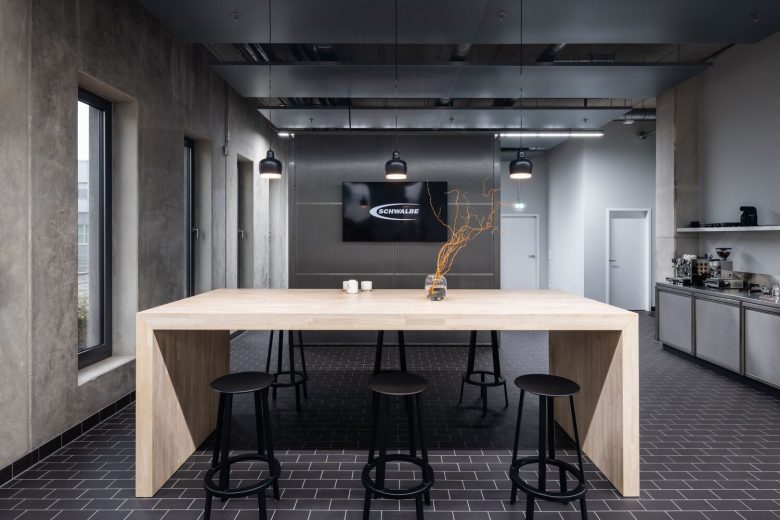
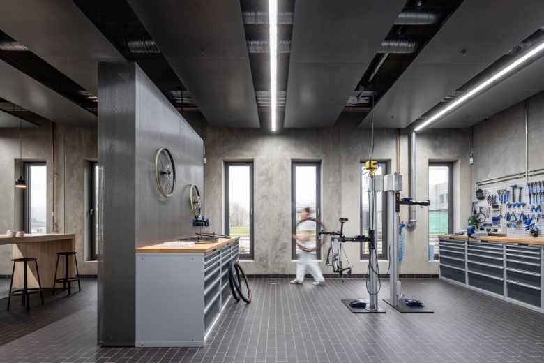
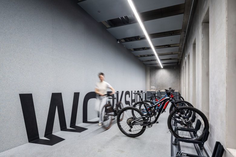
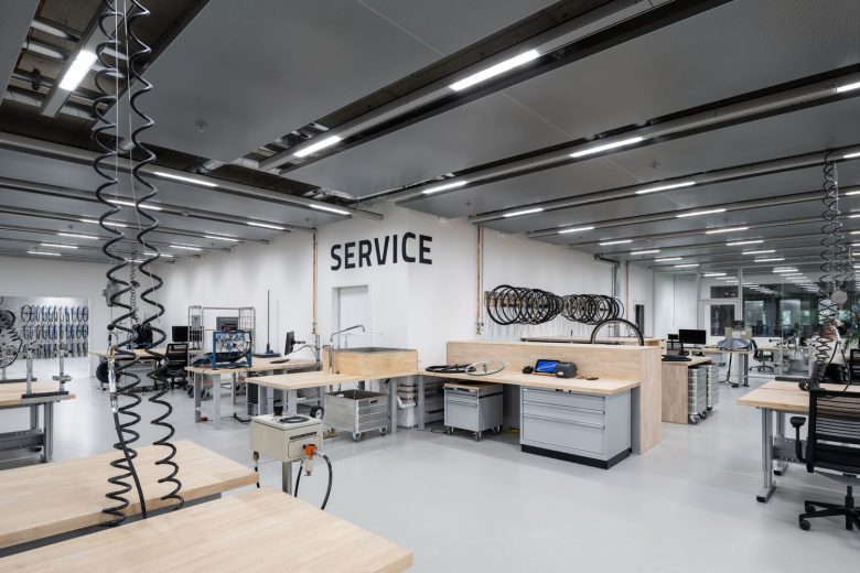
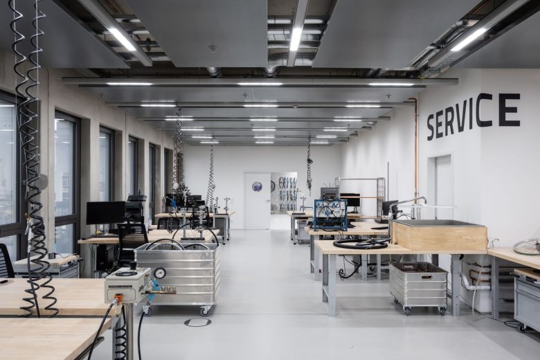
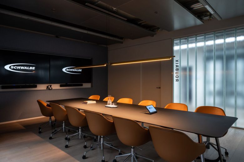
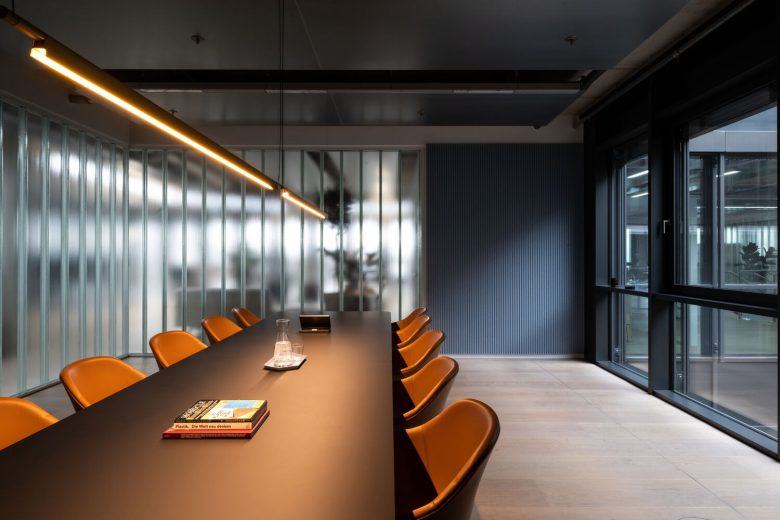
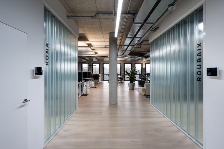
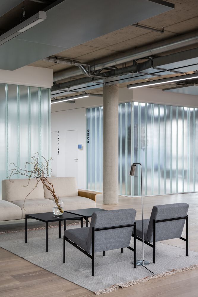
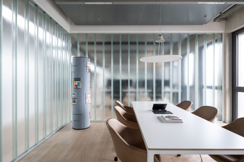
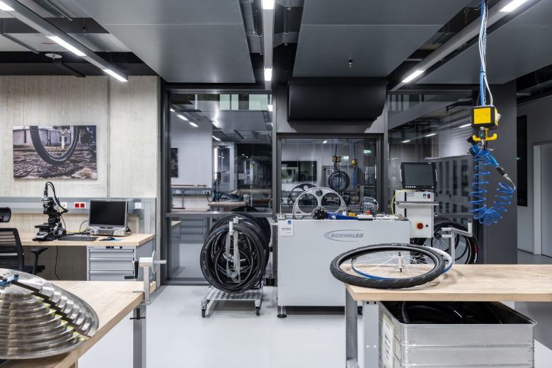
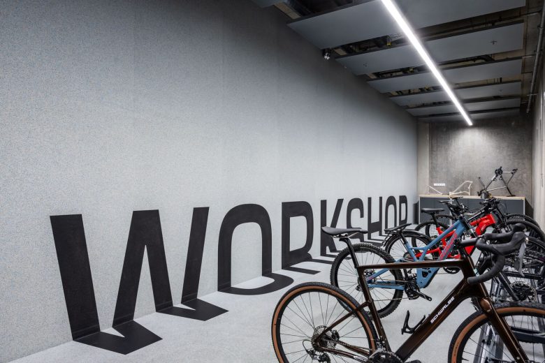
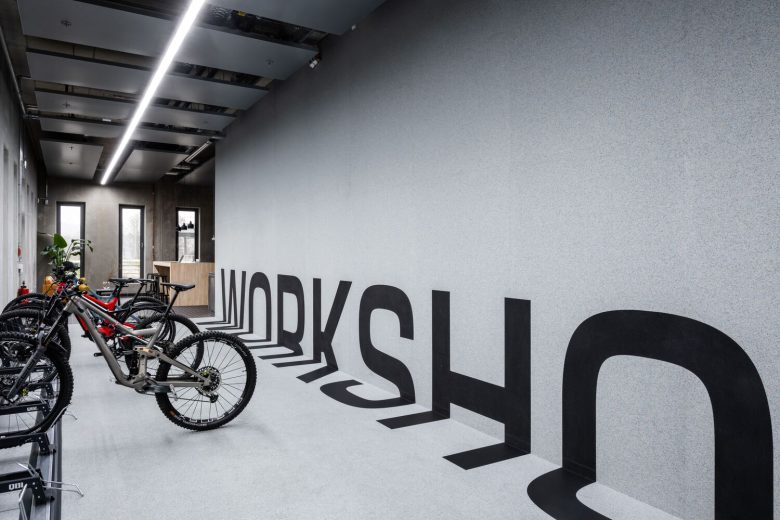
The bicycle workshop is designed to appear as an extension of the street as it welcomes any cycling enthusiast to pass by. Durable street tiles, recycled rubber on the walls, stainless steel, and dynamic lettering are the key features of this space. Customer Service located on the first level is a clear and minimal environment where function prevails. The architects deliberately revealed industrial elements and tools to exhibit the beauty of work-in-progress and the valuable role of this department in the chain of the company’s daily operations. Rubberwood on the table tops and rubber C2C certified flooring, are both able to withstand any work tasks. Translucent U-glass was chosen to zone the office areas and to create meeting rooms. This eco-glass caters to smart constructions and is one of the most sustainable building products available today.
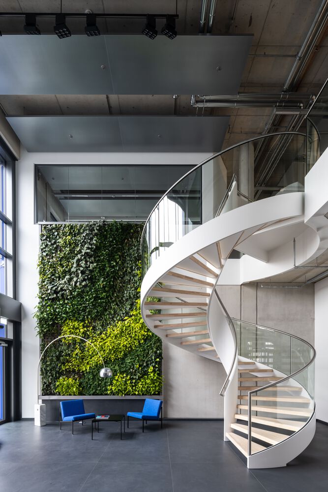
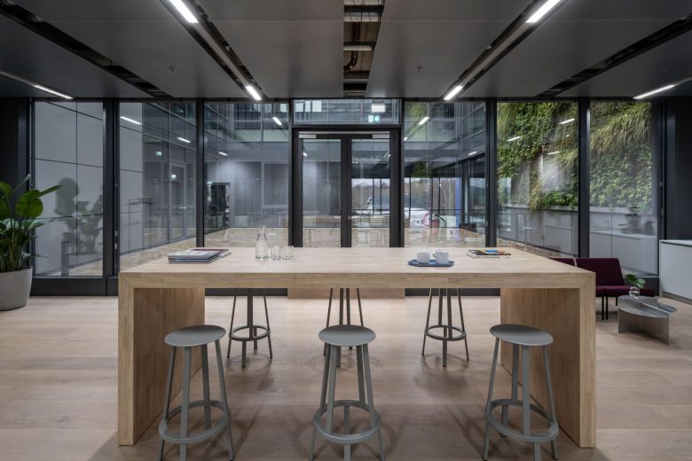
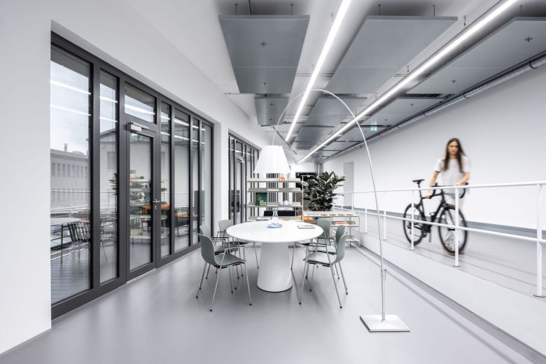
The furniture selected for the office is mostly cradle-to-cradle certified products or iconic designs with long afterlife. Light wooden floors and various green lounges form a friendly and comfortable environment for both working and relaxation. The special attention of the client was directed to the bridge that connects the old building with the new one. The decision to get away from the bridge serving as just a passage led to the proposal of a layout that includes space for activities. The bridge became a “common room” where the employees from both buildings can meet halfway to play a ping-pong match or host a casual meeting. The fully glazed side of the Bridge allows more daylight and provides an additional outdoor environment for lunch breaks. For quicker access, the bridge can be crossed with a scooter.
Architects: Archiproba
Lead Architect: Tamara Muradova
Project Team: Marinika Sadgyan, Ralph Janz
Photographs: Ilya Ivanov
Add to collection
