As the inaugural national flagship store of the exceptional Chinese lifestyle brand “Nice Rice,” this establishment embodies simplicity and versatility while celebrating the subtleties of oriental culture. Nestled on Huaihai Road (M.), a crossroads of Chinese and Western cultures, this location serves as a hub for cultural, artistic, and everyday life. It particularly resonates with the cultural sensibilities of the younger generation.
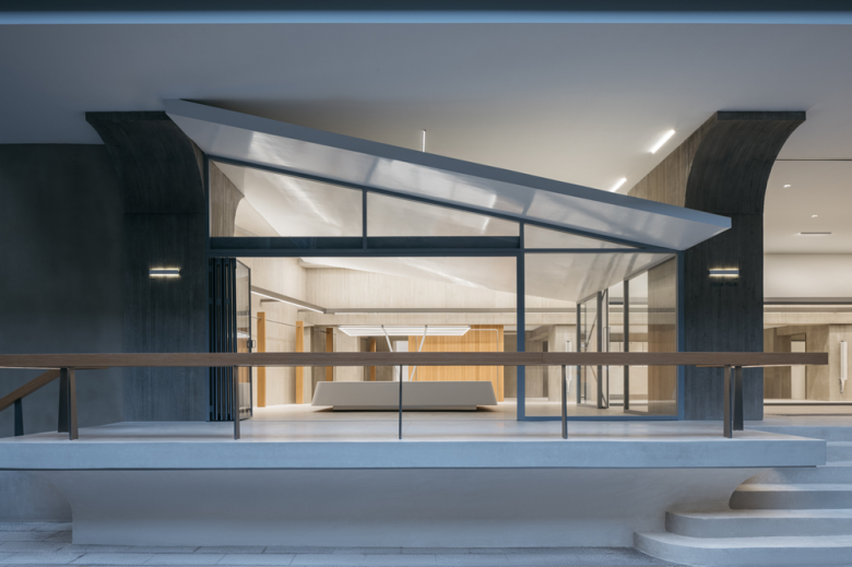
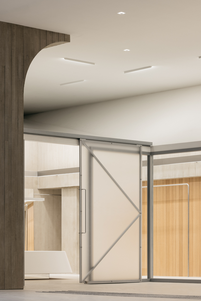
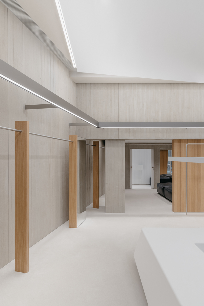
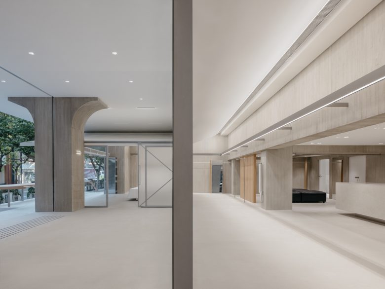
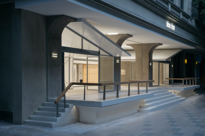
The roof, an iconic feature of traditional Chinese architecture often referred to as the “fifth elevation,” symbolizes a unique cultural heritage refined over time. say architects have extended the traditional Chinese roof form into the interior, creating an inclusive and inviting “sanctuary” beneath the eaves. This “sanctuary” concept aligns with the essence of the Oriental Rice Warehouse, historically used for storing rice, symbolizing inclusivity and the spirit of giving. It transforms the space into a vibrant hub for cultural exchange.
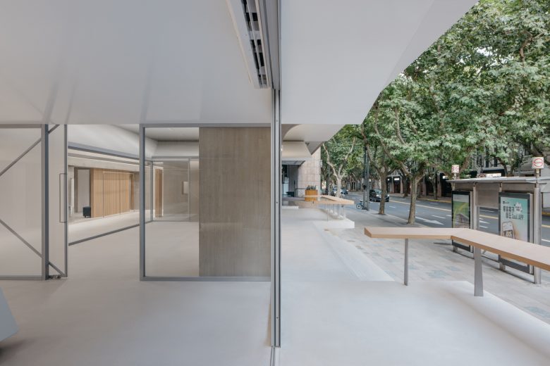
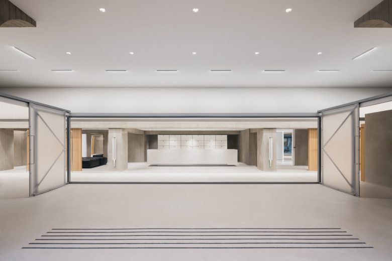
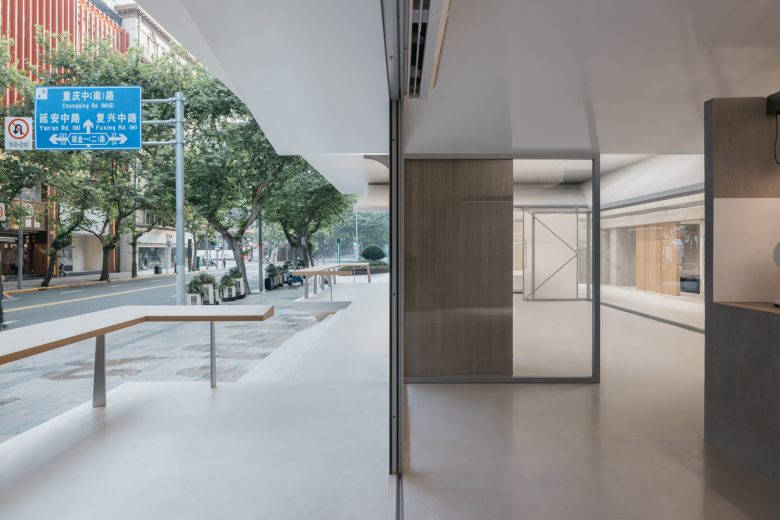
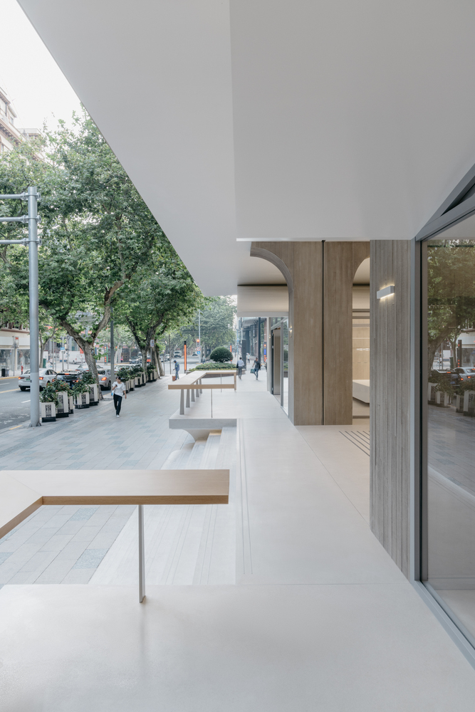
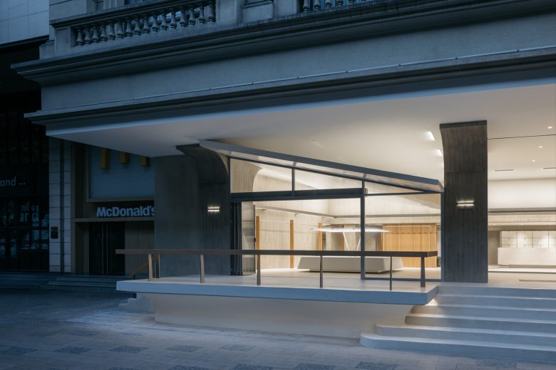
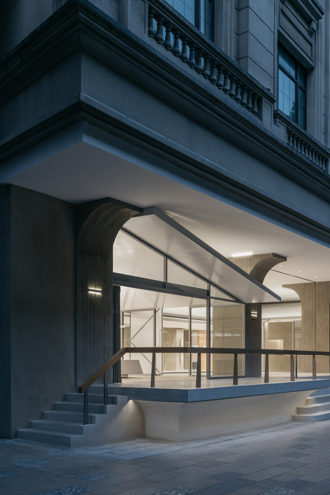
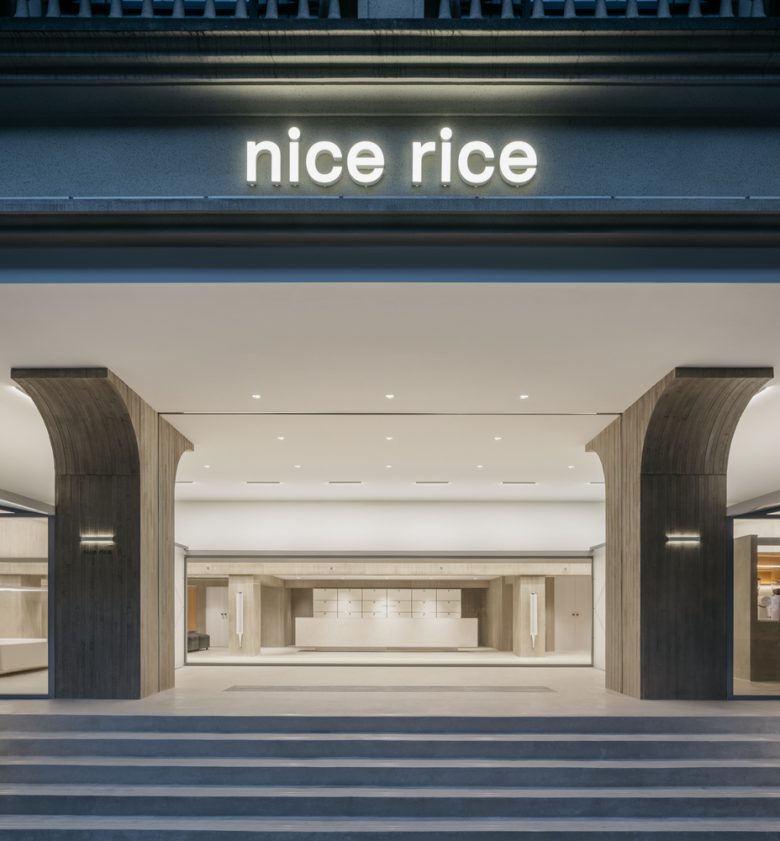
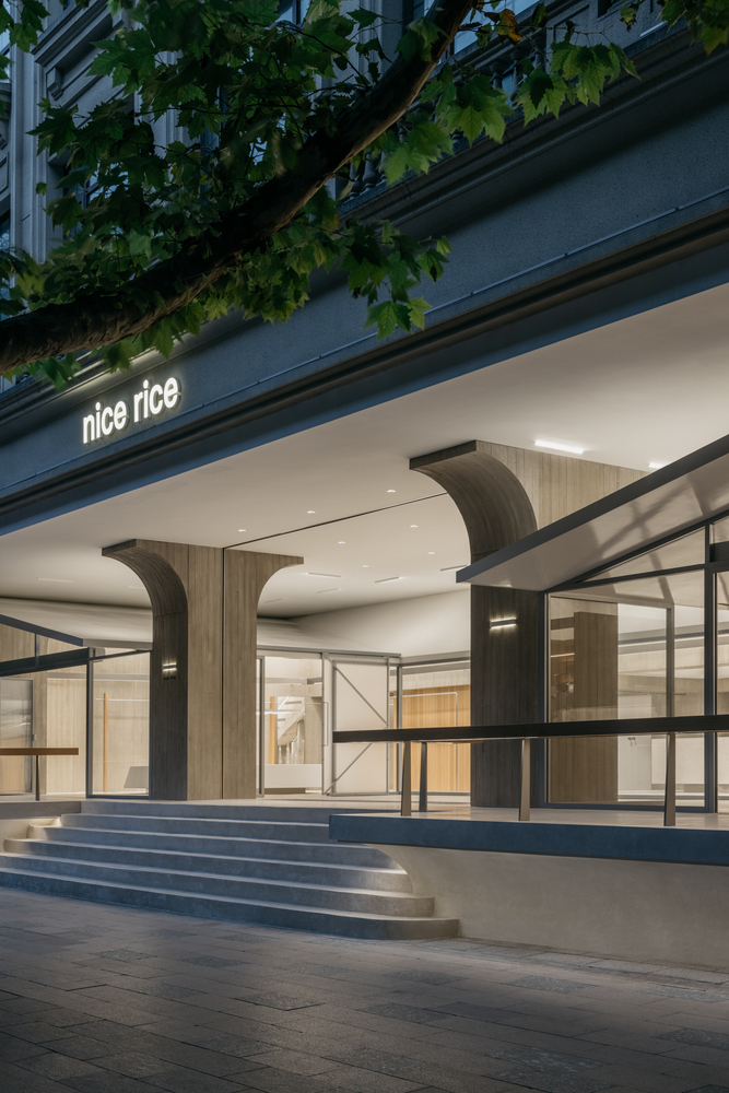
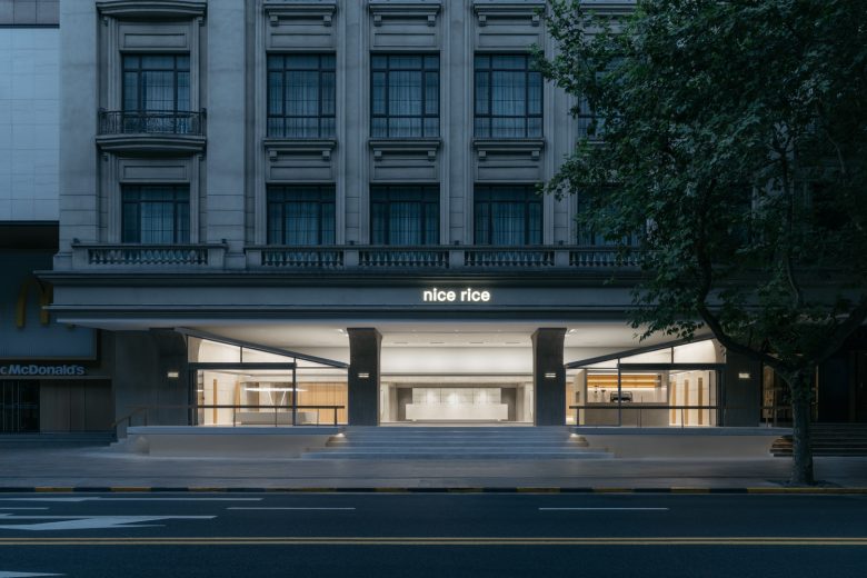
Symmetrically designed eaves balance the spatial facades, with mirrored double-sloped roofs on the outer facade, emphasizing visual harmony and balance. Original steps leading to the entrance add a sense of ceremony to entering this “rice warehouse.” The overall inward recess of the storefront provides ample outdoor space and serves as a street-facing display, blurring the lines between the fashion consumption scene. This highlights the intriguing and diverse aspects of the “fashion + coffee” dual-business model, attracting the attention and engagement of young people.
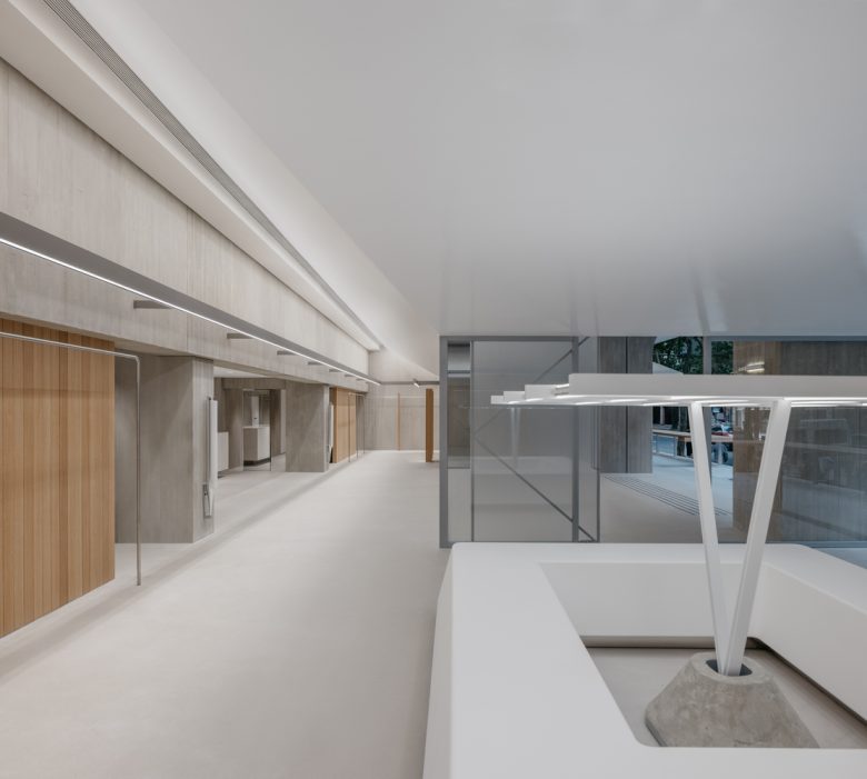
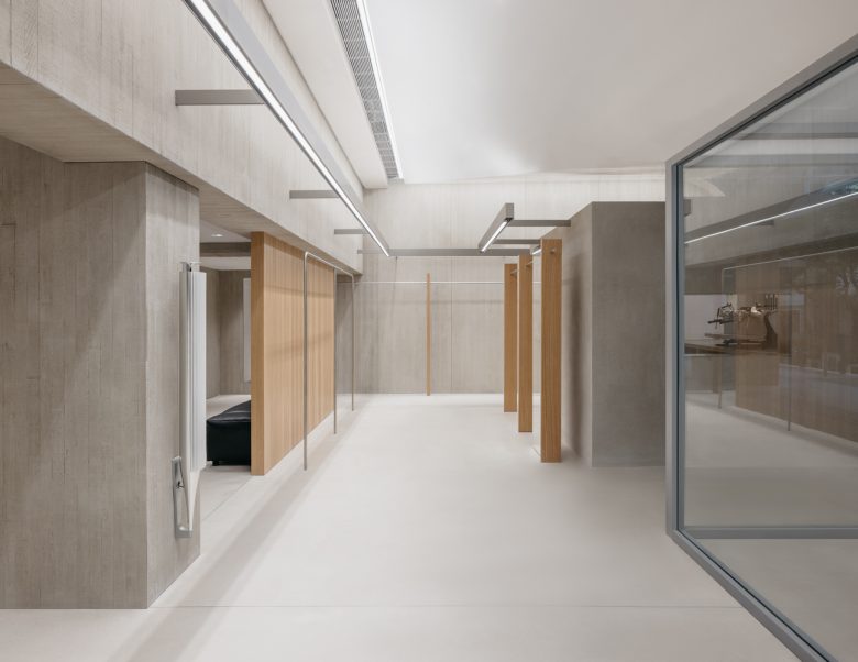
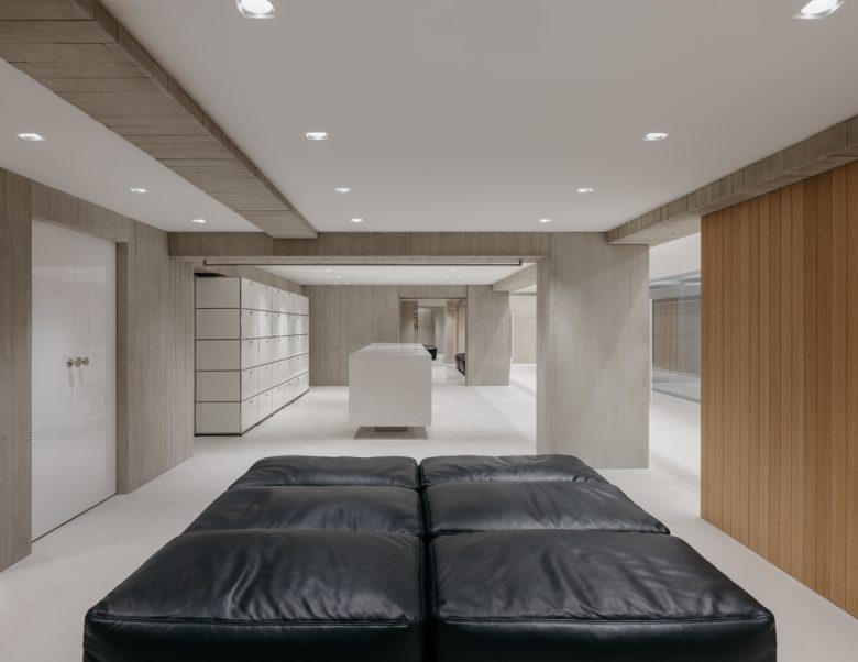
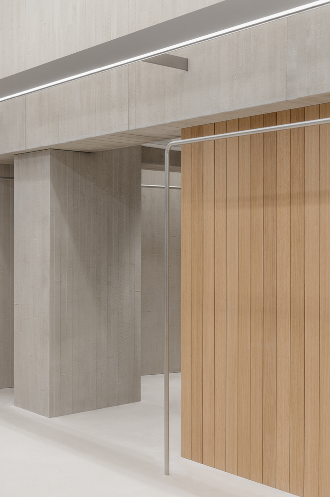
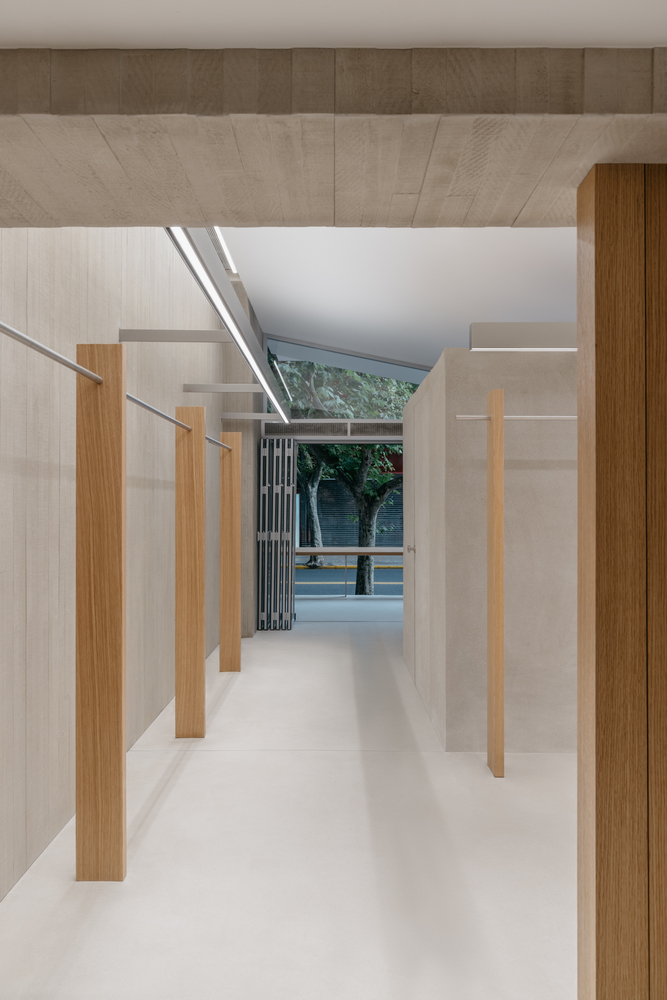
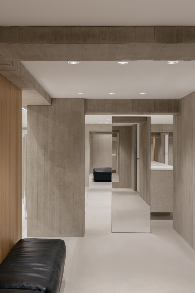
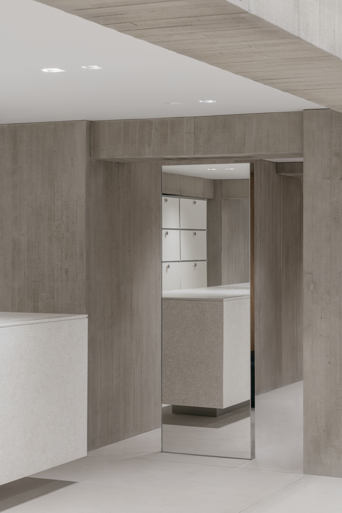
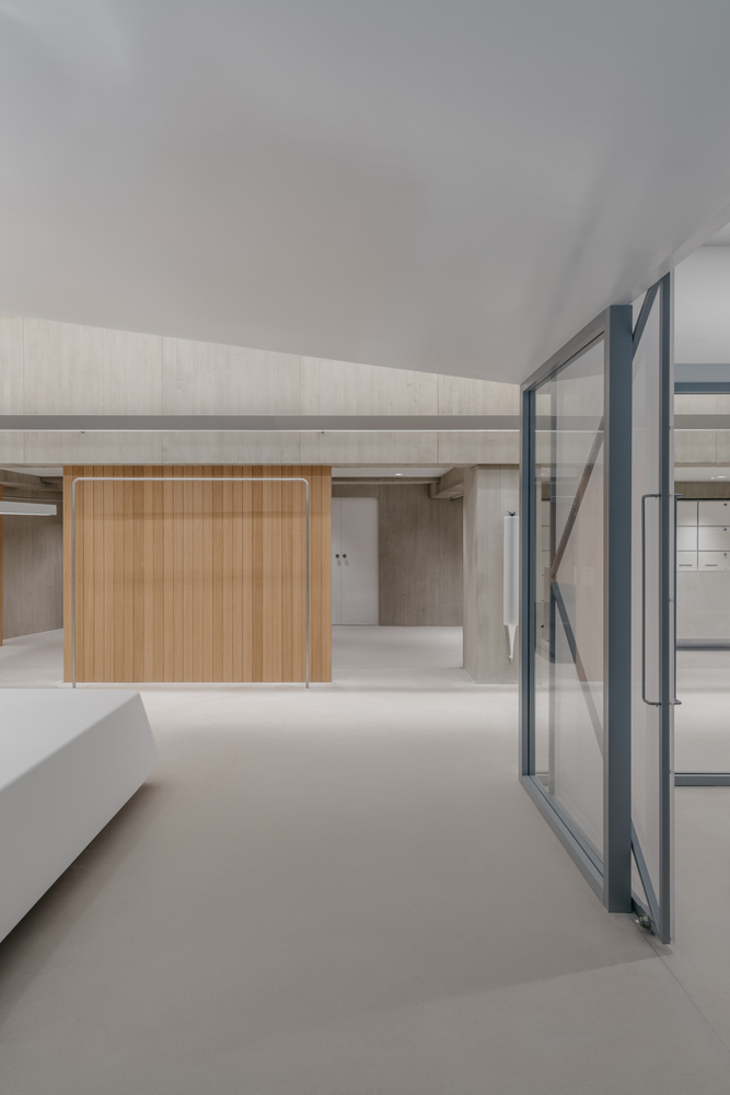
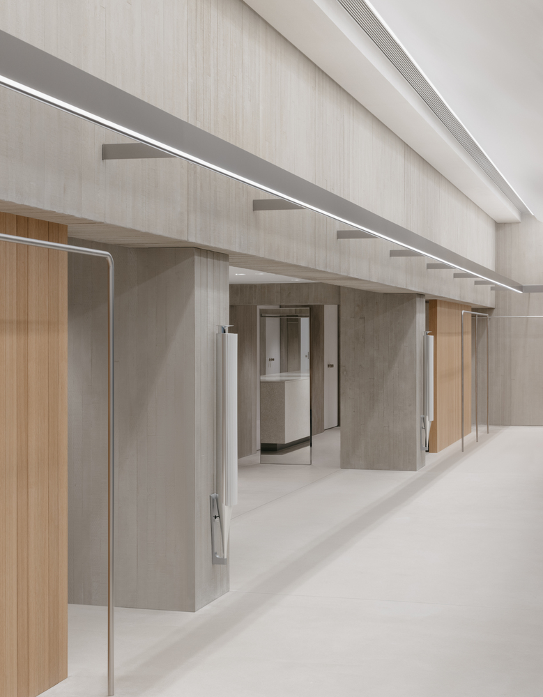
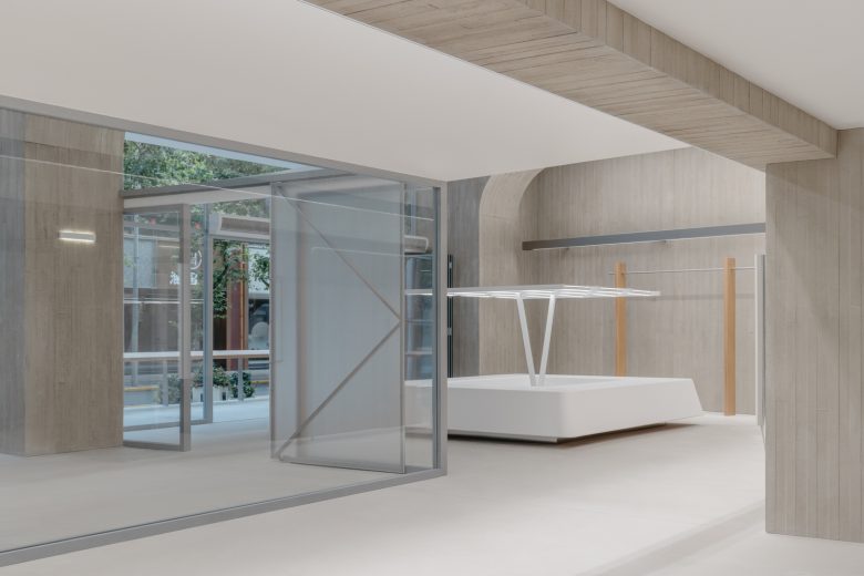
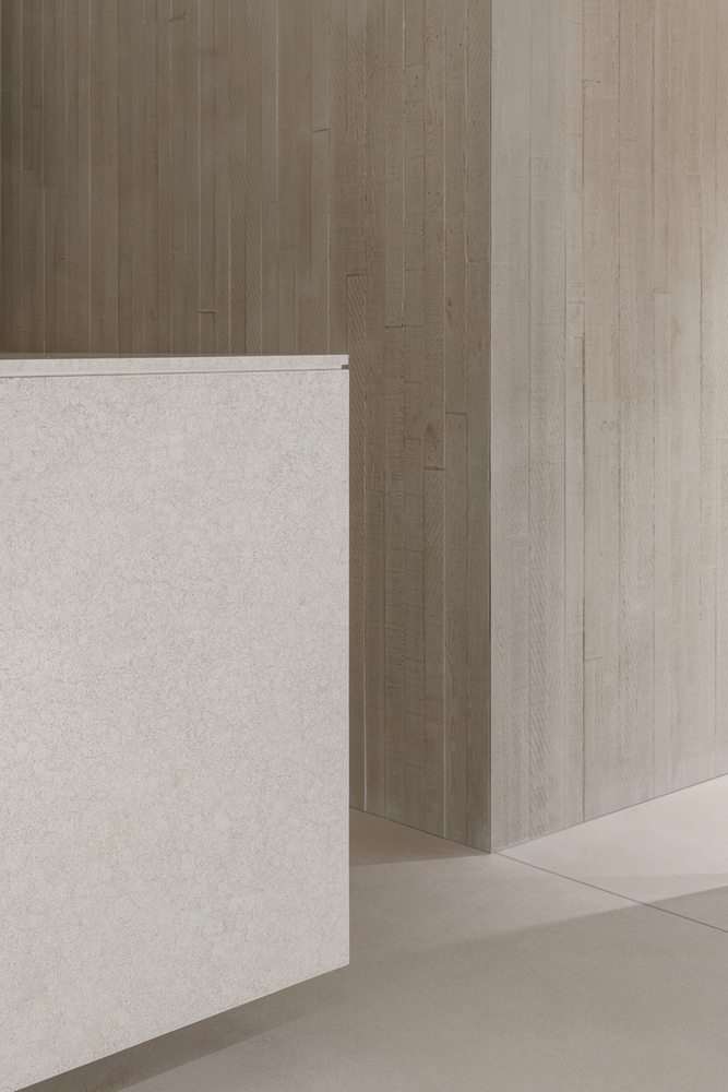
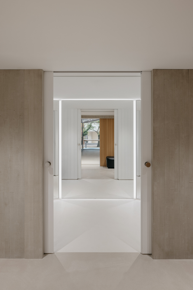
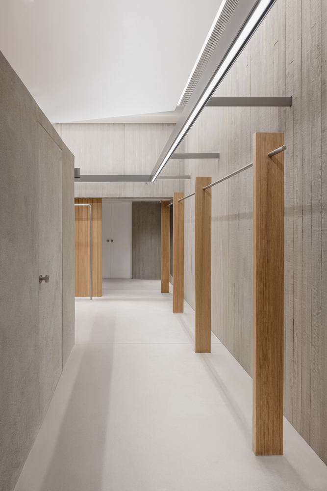
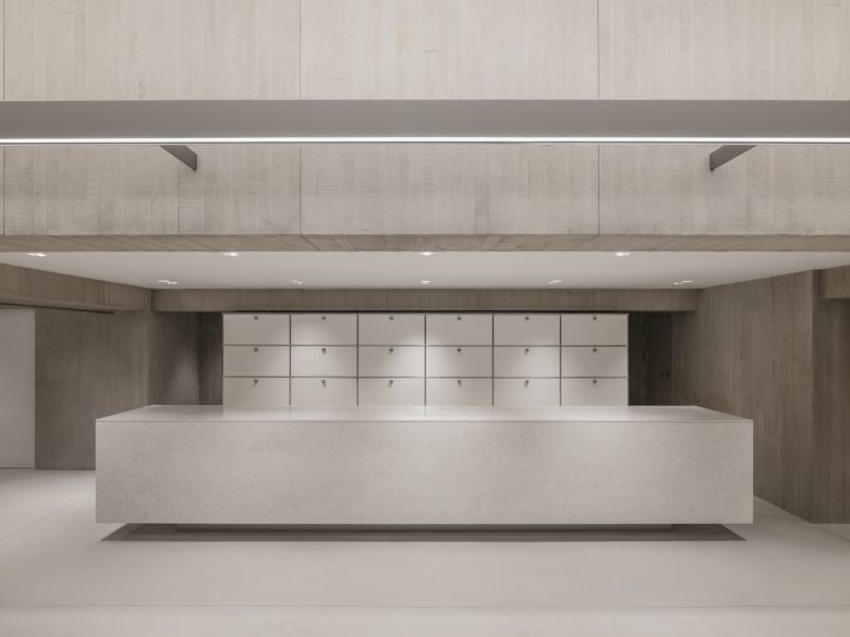
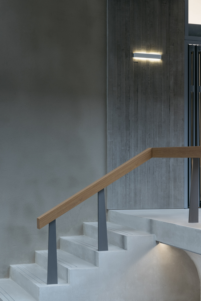
The grand eaves “envelope” creates a courtyard-like space within the entrance’s concave gray area, forming a well-organized layout. The interconnected functional areas also create a circular flow within the consumption pathway. Clearwater concrete serves as the primary tone for the space. say architects have ventured to incorporate Chinese intangible cultural heritage art into this youthful consumption scene. Collaborating with a lacquer artist, they have created the artwork One.
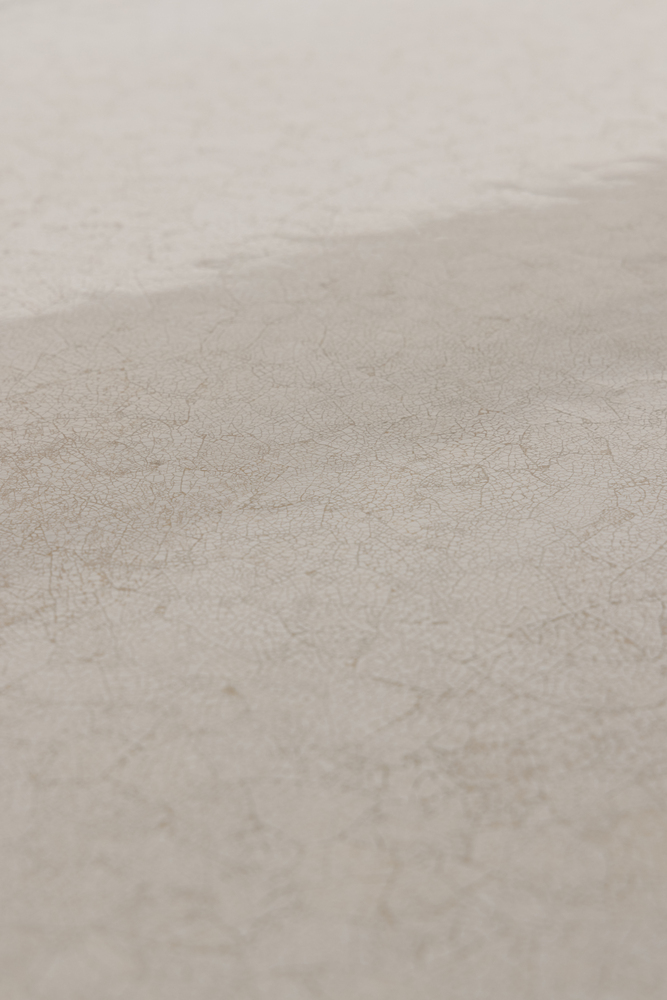
The piece cleverly utilizes eggshells as a canvas and embeds a maze-like, ever-changing yet elegant lacquer art on the neat rectangular blocks. This showcases the delicate fusion of Oriental charm and modern design, where simplicity is imbued with texture. The contrast between precision and ruggedness in material brings out subtle contrasts.
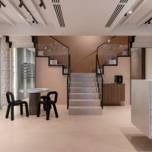
The space continues the brand’s minimalist and clean design philosophy while subtly exuding an understated Oriental temperament. It externalizes the essence of culture in daily life, bridging the gap between people and tradition in a relaxed and intuitive artistic manner. This space, beneath the eaves, not only provides an open social and consumption scene for the young population of the neighborhood but also presents a new interpretation of traditional culture from a youthful perspective. It blends tradition with modernity, giving new cultural connotations and contemporary characteristics to the area beneath the eaves – a symbol of openness, inclusivity, and harmony.
Architects: say architects
Lead Architects: Yan Zhang, Jianan Shan
Team: Jia Wang, Yao Zhou, Yixuan Zhang, Tiejun Jin
Photographs: Wen Studio
Add to collection
