

Add to collection
Floral Honey:
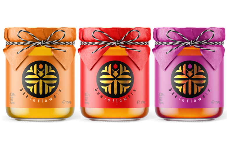
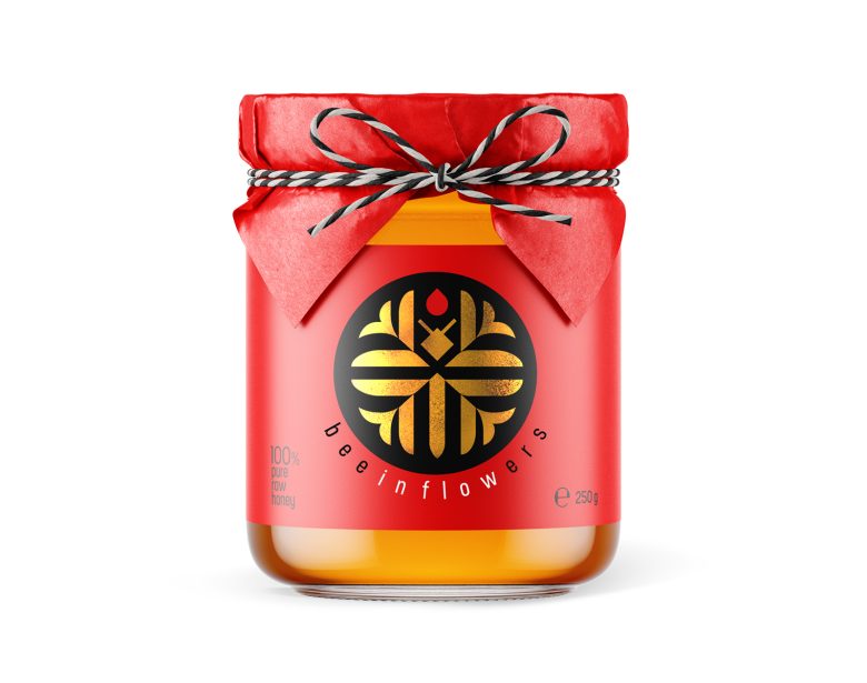
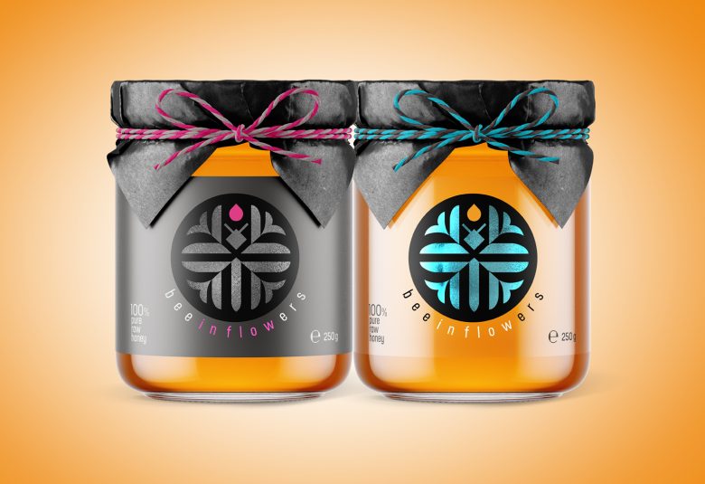
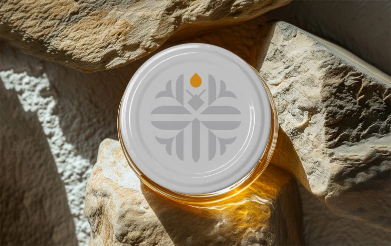
Introducing honey production from Kyrgyzstan to the international market with a unique twist — the creation of honey based on a “floral” blend. Positioned as a premium product with simple packaging, the production initially adhered to standards: a high-quality glass jar, a label around the jar (with the option of using foil or transparent film), and a simple white lid.
Challenge:
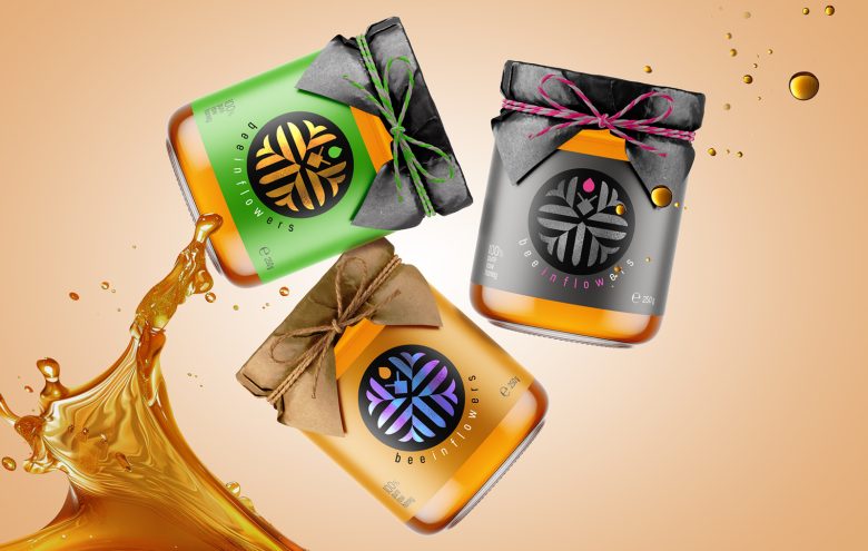
A new approach to packaging was needed—developing a distinct name, logo, and identity for a small series of products featuring different honey flavors and varieties. The name had to be both clear and original, while the design needed to be simple, minimalist, vibrant, and memorable.
Solution:
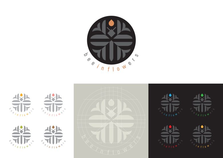
The chosen name was “beeinflowers” (“Bee in Flowers”) accurately describing the product while playing with words to convey a creative, modern, and intriguing vibe. A logo was created, depicting a bee in flowers with graphic precision and a strict minimalist style. The black-and-white base became the centerpiece of the packaging design, complemented by the addition of color through the use of printed foil. The series performed exceptionally well in tests and is poised to captivate the hearts and palates of sweet enthusiasts soon!
Designed by Alexey Lysogorov
Add to collection