
Add to collection
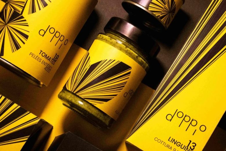
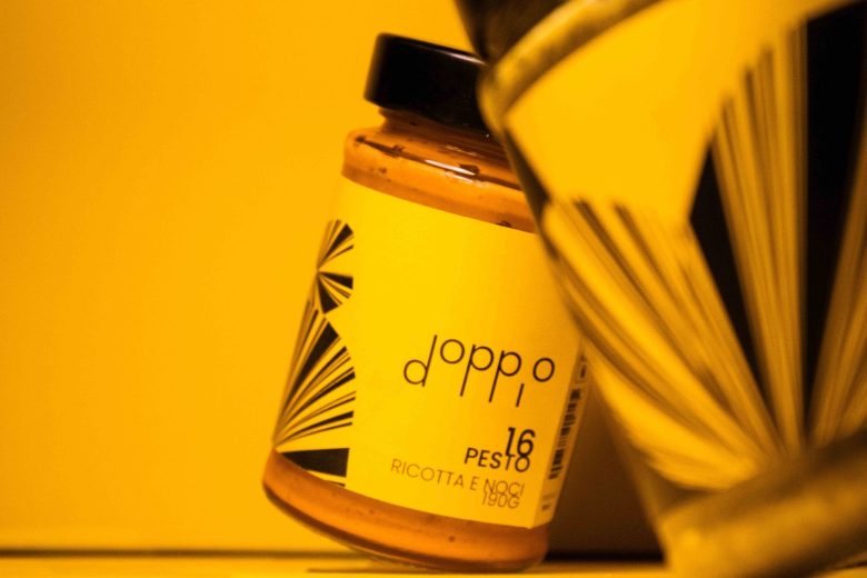
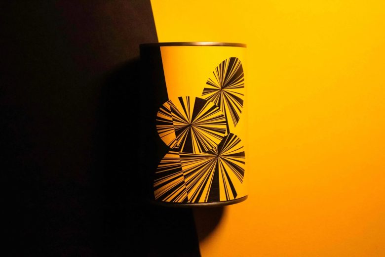
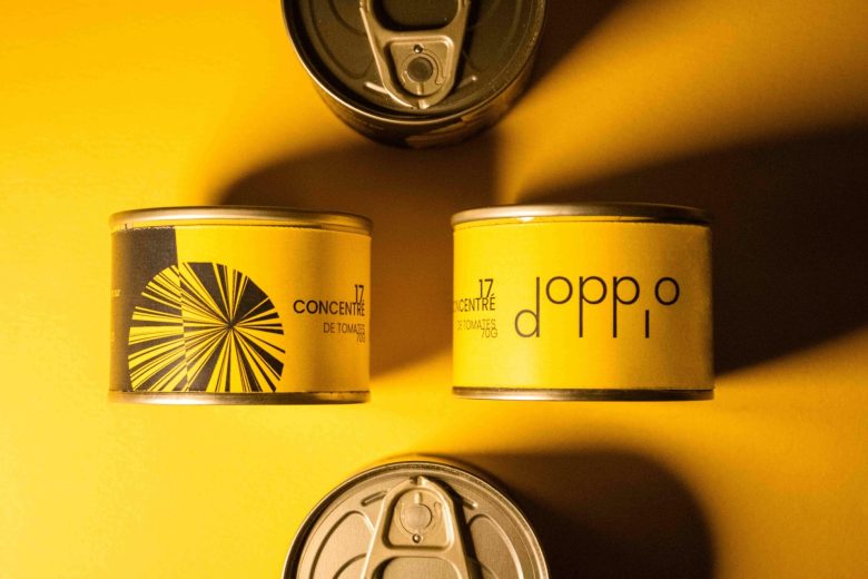
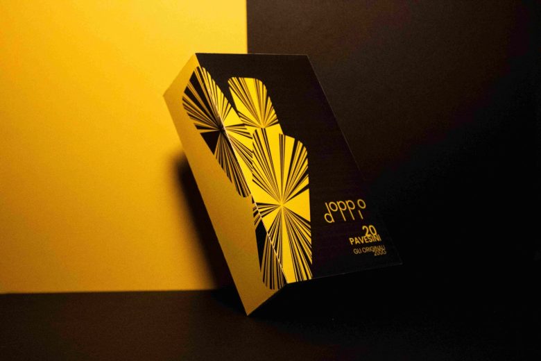
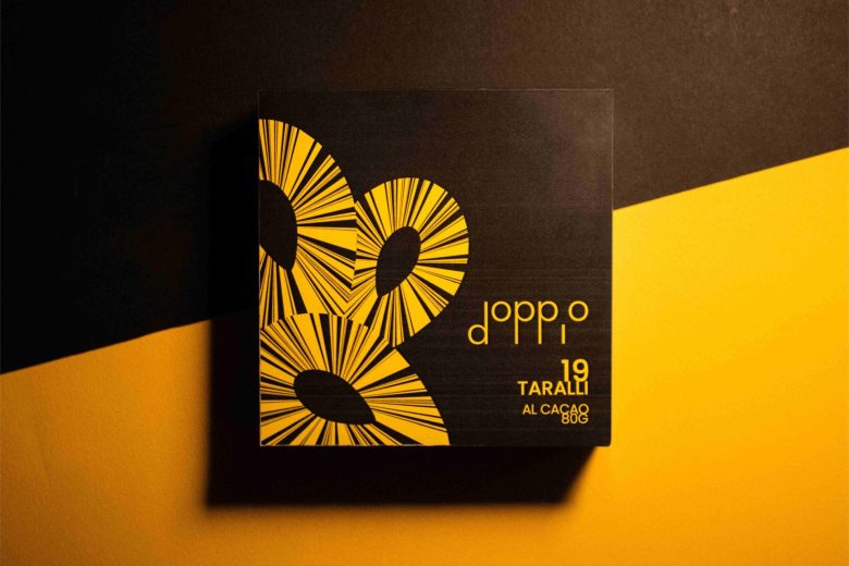
Venice and its carnival, an ode to elegance and an invitation to celebrate. We don our masks to interpret the cult characters of the Commedia dell’arte. Masking ourselves means doubling our personality. The double embodies Doppio’s identity. The duality between the refinement of black and the vivacity of yellow recreates the atmosphere of the Venice carnival. The originality of the logo lies in its structure: slender, distinguished and unique with its double “P”. Constructed entirely of circles and segments, the letter “P” echoes the structure of the Venetian masks linked to a thin rod. The elevation of the “O” adds that note of lightness and pleasure that is this event. Doppio’s Italian range offers more than just an experience, it’s an invitation to lived unique moments.
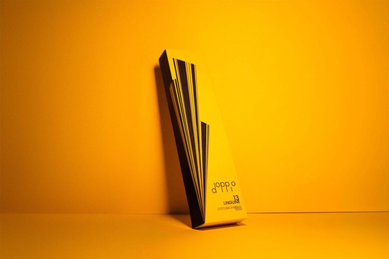
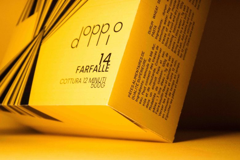
Rhythmic graphics, simple shapes and a balance between elegance and dynamism make up the Doppio product range. Each illustration is a feast for the senses. Like the carnival in Venice, the streets and the squares are bustling, all in a refined and distinguished setting. We can detect this atmosphere in the packaging. The savoury range, which is predominantly yellow, contrasts with the sweet range, which is predominantly black, recalling the original inspiration of the Carnival. The evocation of the double is again present, notably thanks to the inversion of colors on the edge of the packaging. The uniqueness of Doppio lies in its radical colors and graphics.
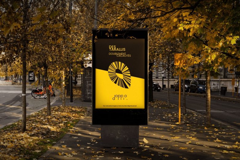
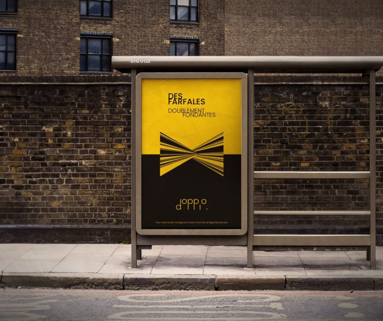
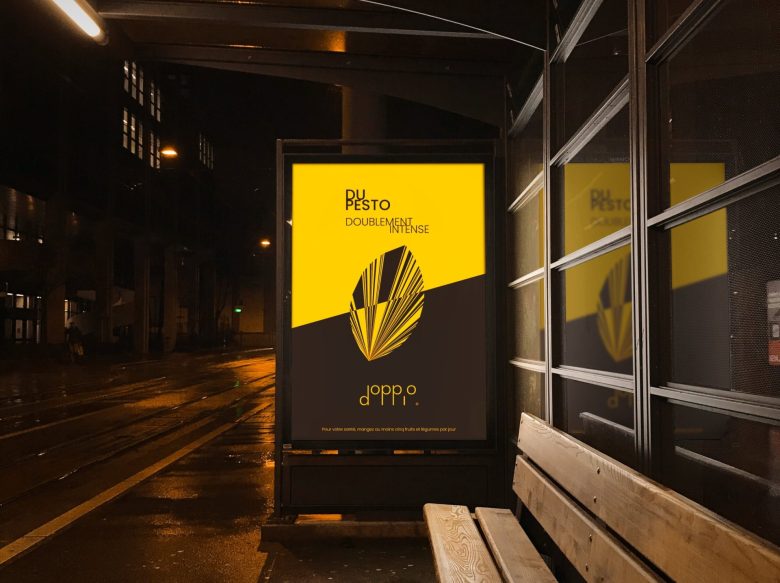
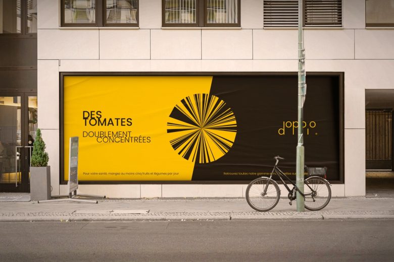
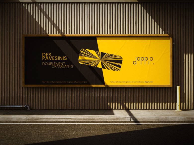
The double, a fundamental concept of Doppio, once again finds its way into several aspects of this advertising campaign. The Doppio range is doubly tasty. This superiority emanates from the slogans that extol the best of each product: They’re doubly good. The graphic composition amplifies this message by playing on symmetry and colour inversion, just like the packaging. The adverts, with their blend of elegance and dynamism, capture the very essence of Doppio.
Add to collection