
Add to collection
Background:
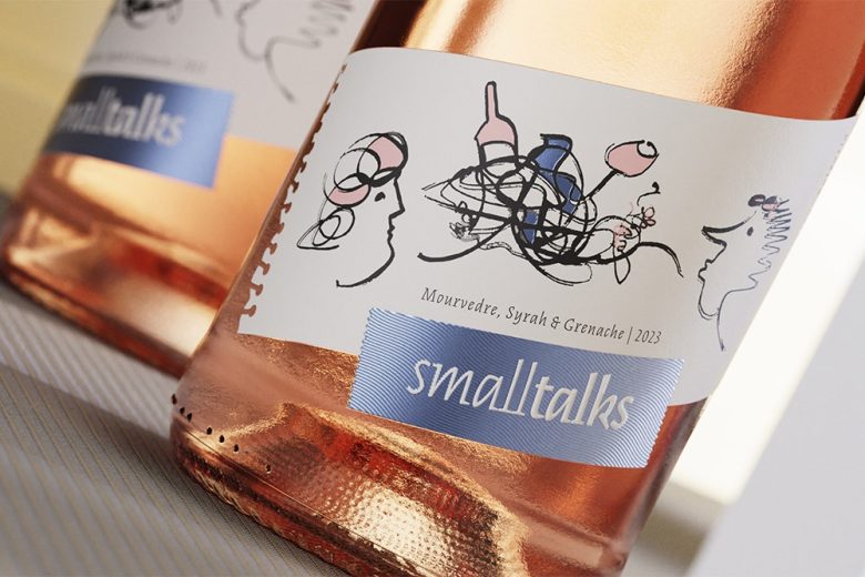
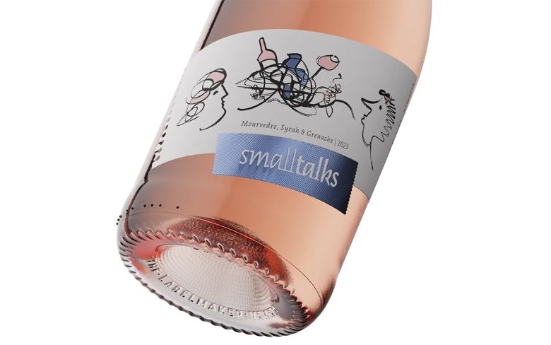
Oriachovitza, a family-owned winery and a living icon of Bulgarian winemaking, stands proudly near Stara Zagora. Originally built in 1935 by an Austrian architect, the winery has been fully renovated and equipped with modern technologies, breathing new life into its storied legacy. Known for its award-winning Rosé wines, Oriachovitza continues its tradition of excellence with the introduction of Smalltalks Rosé.
Design Thinking:
The Smalltalks brand is dedicated to the younger generation, celebrating the myriad conversations and connections that a good wine can spark. For this label, we sought a modern design that would resonate with young wine enthusiasts—something original, attractive, and easy to recognize. The goal was to create a label that embodies the spirit of casual, enjoyable conversation over a delightful glass of wine.
Challenges:
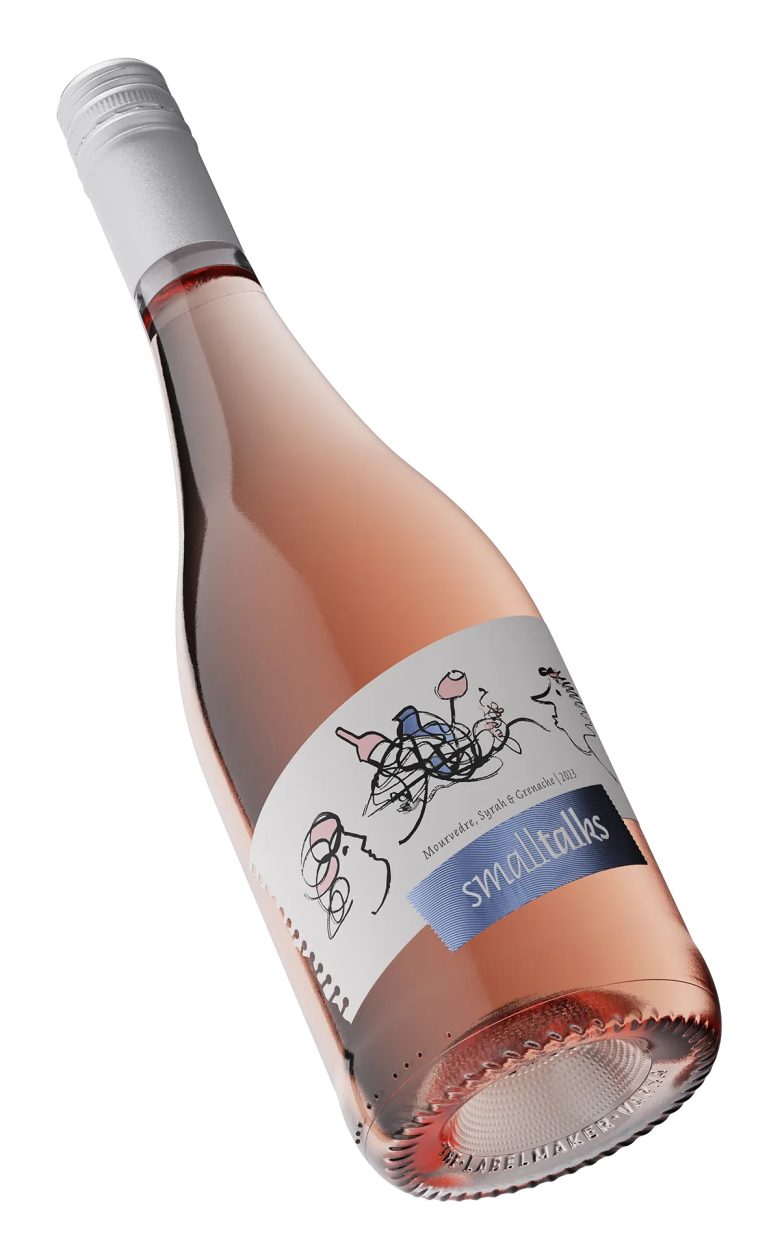
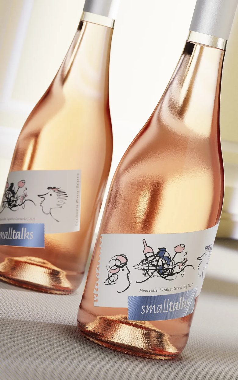
Crafting the illustration for this label was particularly challenging. After exploring various options, I finally landed on a design that is simple yet abstract, capturing the essence of the Smalltalks brand. This artistic image evokes the brand’s core values: light-hearted conversations, good wine, and great friends. Another significant challenge was creating the special die-cut, designed to resemble a torn page from a notebook. The team at Dagaprint went above and beyond to bring this vision to life, despite the complexity of the task.
Favorite Details:
Among the elements that stand out in the Smalltalks label design is the use of white cotton solid paper stock, which provides a luxurious and tactile feel. The non-traditional hot foil color used for the brand tag adds a unique touch, further enhanced by the intricate engraving in the foil die, resulting in an impressive stamped effect. While the illustration itself is a highlight, the torn paper effect achieved in the label die line is particularly satisfying, adding a distinctive and memorable touch to the overall design.
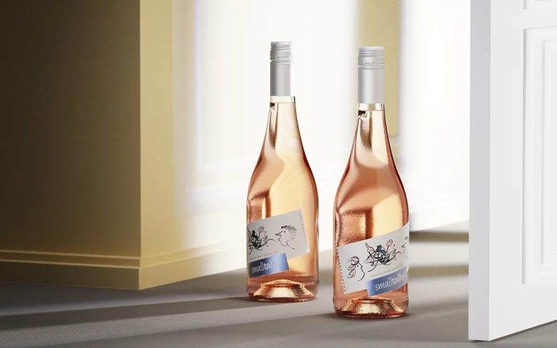
In conclusion, the Smalltalks Rosé wine label is a prime example of artistic wine label design, blending modern aesthetics with a playful yet sophisticated approach. Each detail, meticulously crafted, contributes to a visually engaging and meaningful representation of the brand, ensuring that the wine stands out on the shelf and resonates with the target audience. The design reflects Oriachovitza’s commitment to innovation and quality, celebrating the joyous moments that wine can inspire.
Designed by the Labelmaker
Add to collection