
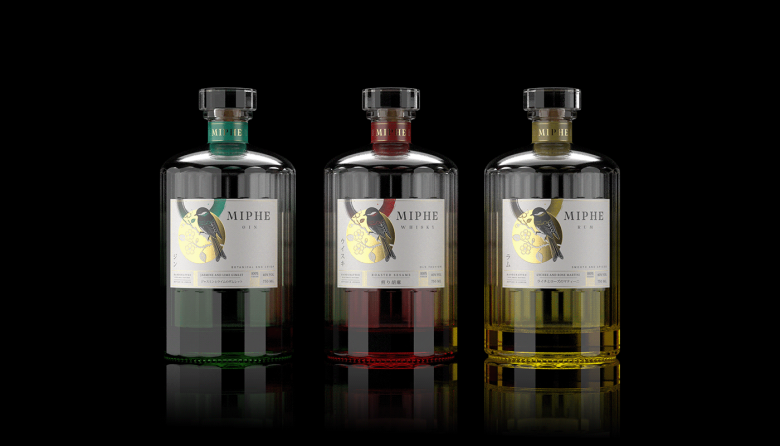
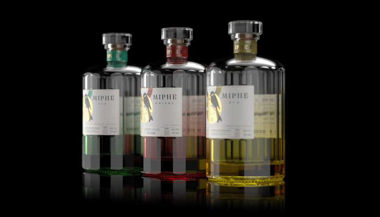
The Miphe Whisky label is an artistic fusion of traditional Japanese aesthetics, the wabi-sabi philosophy, and modern minimalist design. This project thoughtfully integrates cultural elements, nature-inspired motifs, and clean typography to create a unique and captivating visual experience.
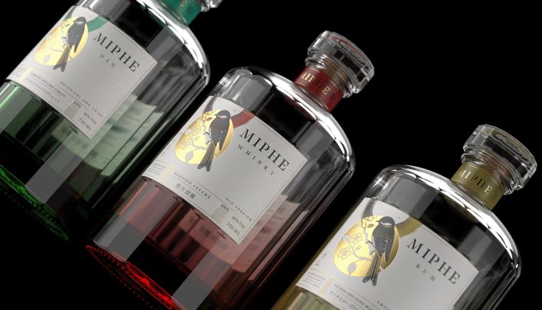
Bird Illustration: At the heart of the design is the Japanese tit, symbolizing resilience and harmony with nature. Its striking black and red plumage serves as a captivating focal point, embodying the delicate balance between strength and beauty.
Circle Motif: The bird is framed by a pale yellow circle, evoking the sun or moon, with intricate cherry blossom patterns that symbolize the fleeting beauty of life. This motif underscores the ephemeral nature of existence, a core tenet of wabi-sabi.
Brush Stroke: A vibrant red brush stroke, inspired by Japanese calligraphy, adds a touch of authenticity and energy. This element connects the design to the ancient art of sumi-e, infusing it with cultural depth and artistic flair.
Color Scheme: The label employs a restrained palette of black, white, red, and pale yellow, enhancing readability while exuding elegance. This minimalist approach ensures that each element stands out, creating a harmonious and balanced composition.
Wabi-Sabi Philosophy: Embracing the wabi-sabi philosophy, the design finds beauty in imperfection and transience. Natural elements and organic forms reflect simplicity and the intrinsic beauty of nature, inviting viewers to appreciate the subtle elegance in the mundane.
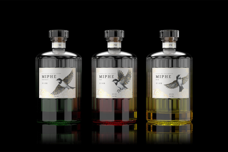
Bird Illustration:
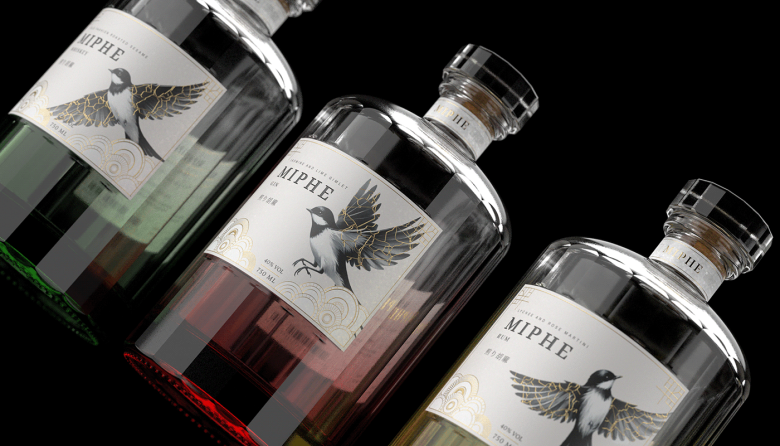
At the heart of the design is a detailed Japanese tit, symbolizing resilience and harmony with nature. Depicted in flight, the bird adds a sense of dynamism and freedom, capturing the viewer’s attention with its elegance and grace.
Kintsugi Design:
A unique feature of the bird’s wings is the kintsugi pattern, an ancient Japanese art of repairing broken pottery with gold. This element symbolizes beauty in imperfection and strength in healing, adding depth and cultural richness to the design.
Geometric Patterns: The lower part of the label showcases circular, wave-like geometric patterns, reminiscent of traditional Japanese motifs. These patterns introduce a sense of movement and balance, enhancing the overall aesthetic.
Color Scheme: The label employs a refined palette of black, white, gold, and soft beige. Gold accents highlight the kintsugi theme, while the overall palette maintains an elegant and sophisticated appearance.
Kintsugi Philosophy: The kintsugi design on the bird’s wings celebrates the philosophy of finding beauty in imperfection and resilience in mending. This symbolizes the handcrafted nature of the whisky and tells a story of overcoming adversity and embracing uniqueness.
Designed by hunap studio


Add to collection


