In Odessa, a flagship glo™ store with a conceptual interior based on the company’s updated brand book has opened. The interior design team at ZIKZAK Architects worked on the design, successfully creating a unique space that reflects the individuality of the glo™ brand.
Modern, unique, innovative – these are the characteristics that define the new glo™ studio, combining the vision of Ukrainian designers with modern technologies.
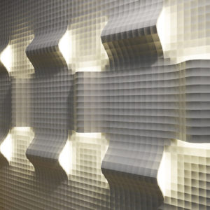
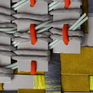
The philosophy of the glo™ brand embodies a constant search for and creation of unexpected combinations, as well as a refusal to compromise. Unusual texture combinations, geometric shapes effectively complement elements of functionalism and futurism. The design of the studio was developed taking into account the solutions to two tasks at once. The first is to create not just a store, but a modern and individual space where every design element will convey the atmosphere and philosophy of the brand – the world of glo. The second is to build a cozy and convenient store for visitors.
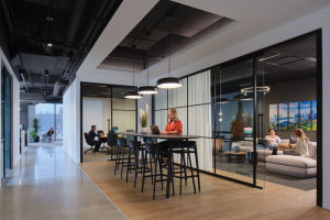
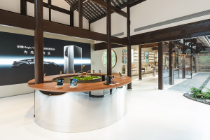
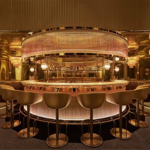
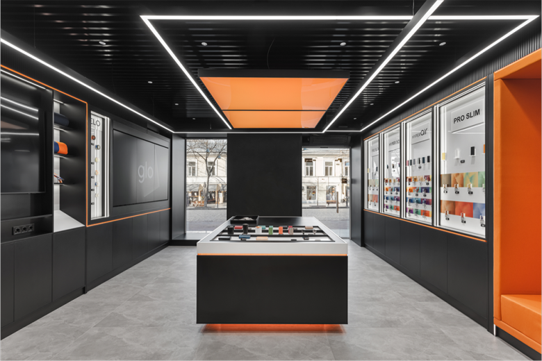
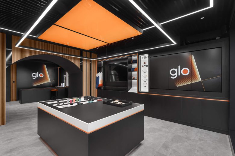
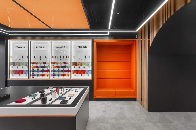
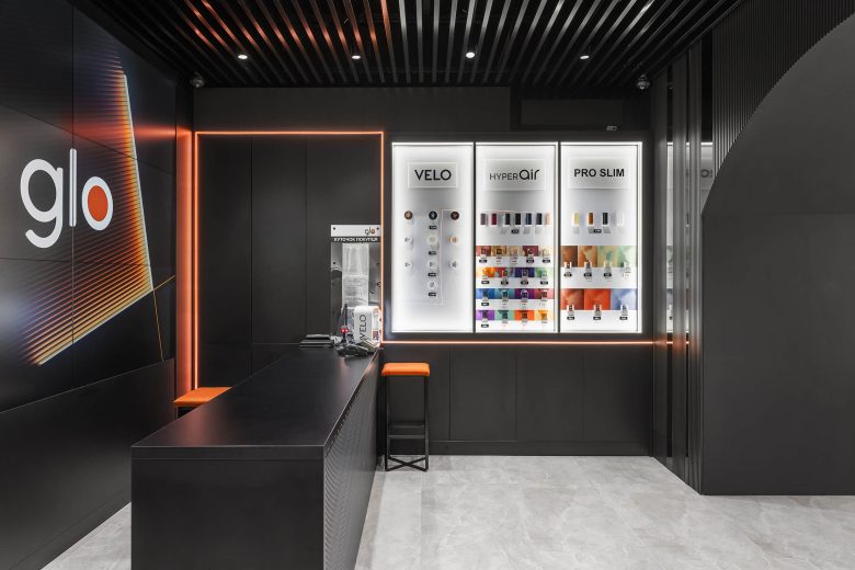
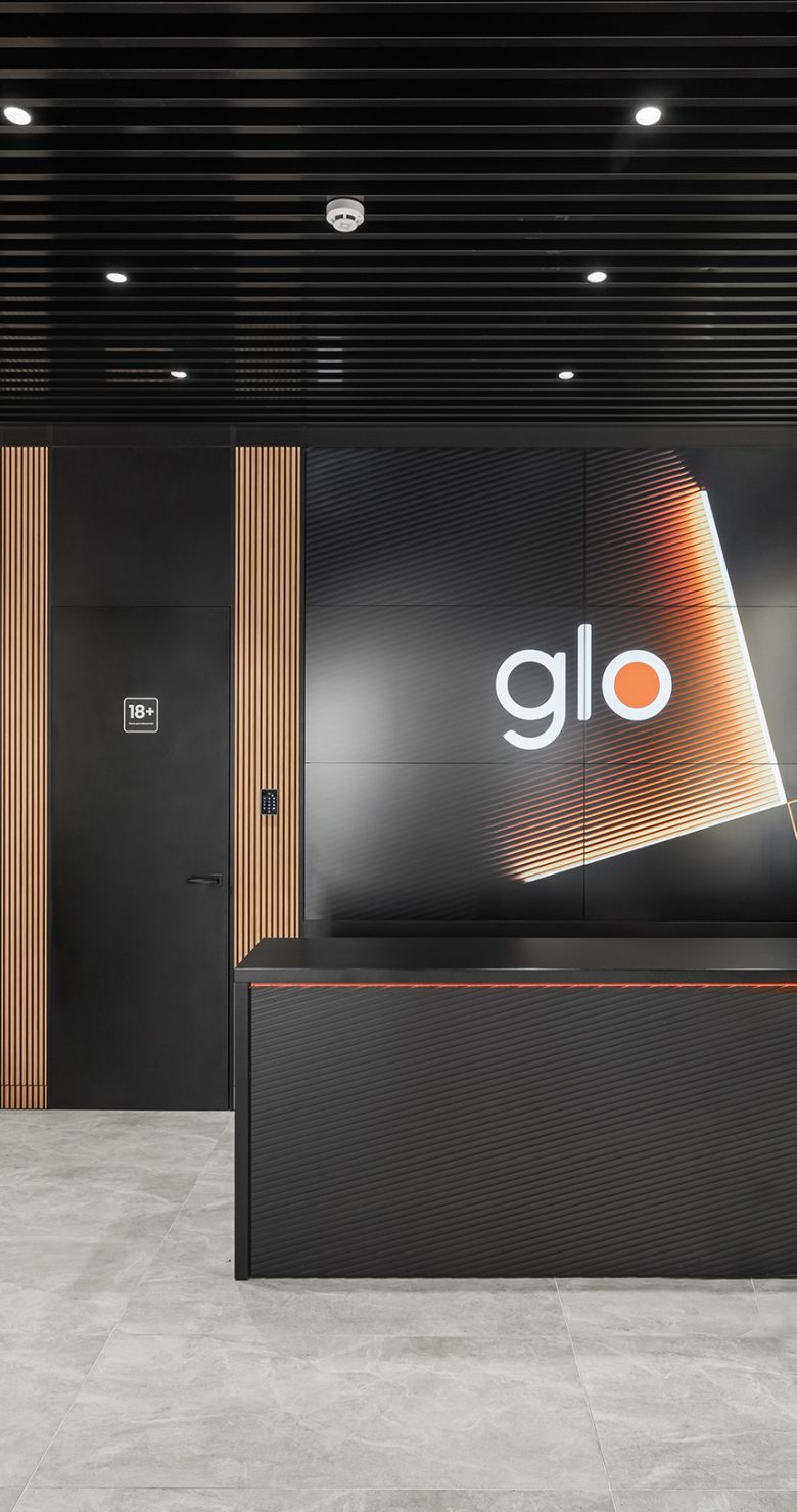
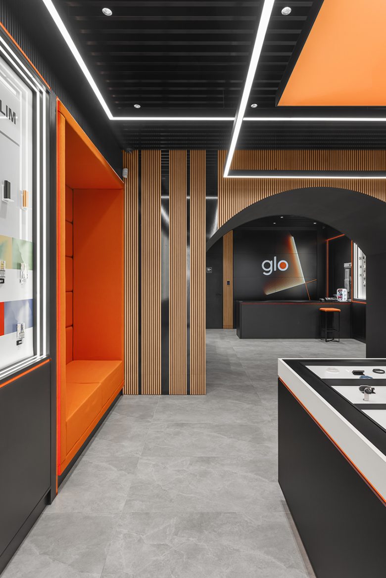
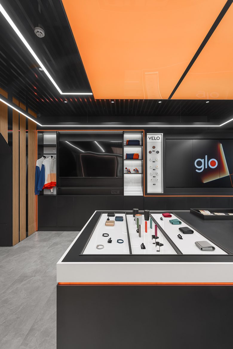
The new glo™ studio is located in a historical building in the city center: the classic facade remains unchanged, with a neat illuminated sign added. Inside, existing load-bearing structures and arches were retained and modernized: they were decorated with textured rails and tinted glass, creating a mirror effect. The arch divides the space into 2 retail halls. The first hall is the product showcase area for glo™, designed to make devices and stands clearly visible and easily accessible for guests to explore the products. The second hall houses the service area and cash desk. An OGO corner is dedicated to the brand’s merchandise: it features a television with virtual reality glasses. Each zone has a consultant present to guide consumers through their journey into the world of glo.
An exceptional feature of the interior design of the glo™ studio is the accent lighting and multimedia elements. The central area – an island displaying the products – creates a levitation effect thanks to the illumination. A light panel above the product island makes it instantly noticeable and vibrant.
Dark colors predominant in the interior contrast with bright accents of the brand’s orange and actively engaged lighting elements. The design is somewhat restrained to not distract attention from the main focus – the brand’s products. However, despite this, thanks to the combination of textures, geometric shapes, lighting effects, and multimedia elements, the space looks innovative and futuristic.
The new glo™ studio is an innovative space, highly focused on consumer needs and their comfort. Stepping over the threshold of the store, you find yourself in another dimension – a highly customer-centric world of the future – the world of glo.
Designed by ZIKZAK Architects
Add to collection
