
Add to collection
Camparoja SelecciónVisual Identity & Packaging · The Aesthetics of Restraint
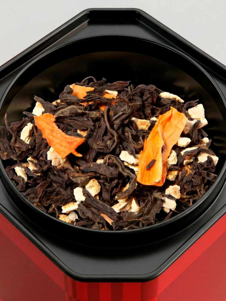
01. The Concept
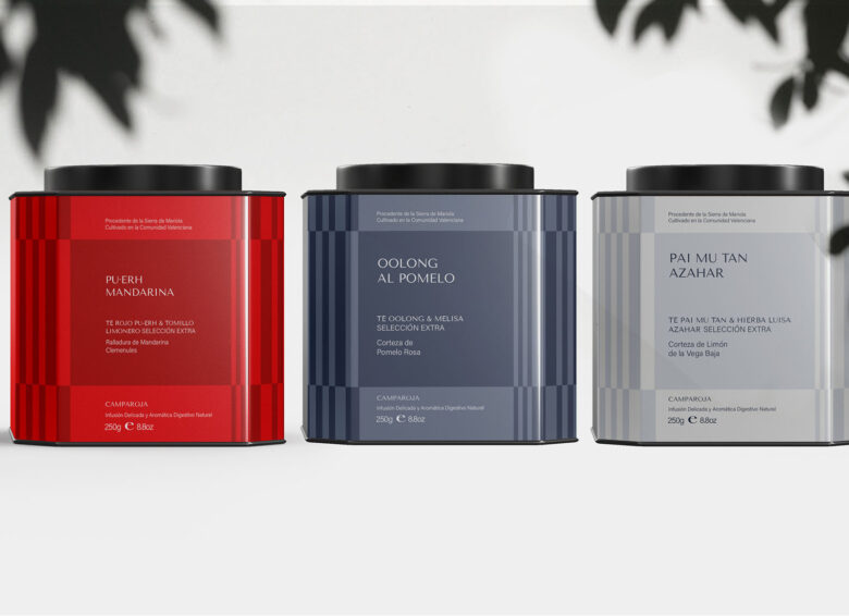
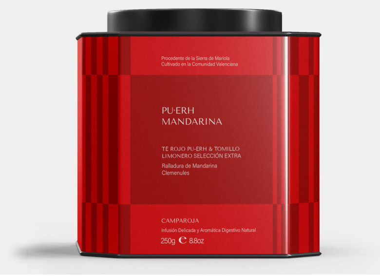
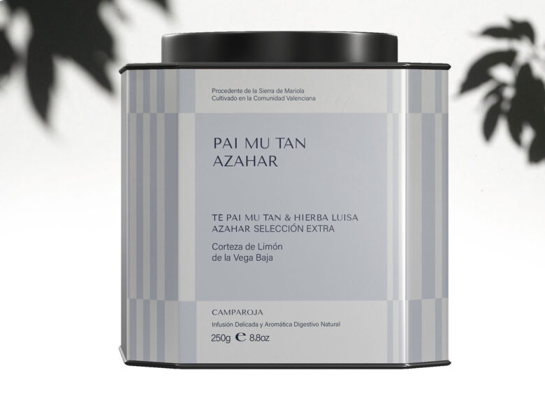
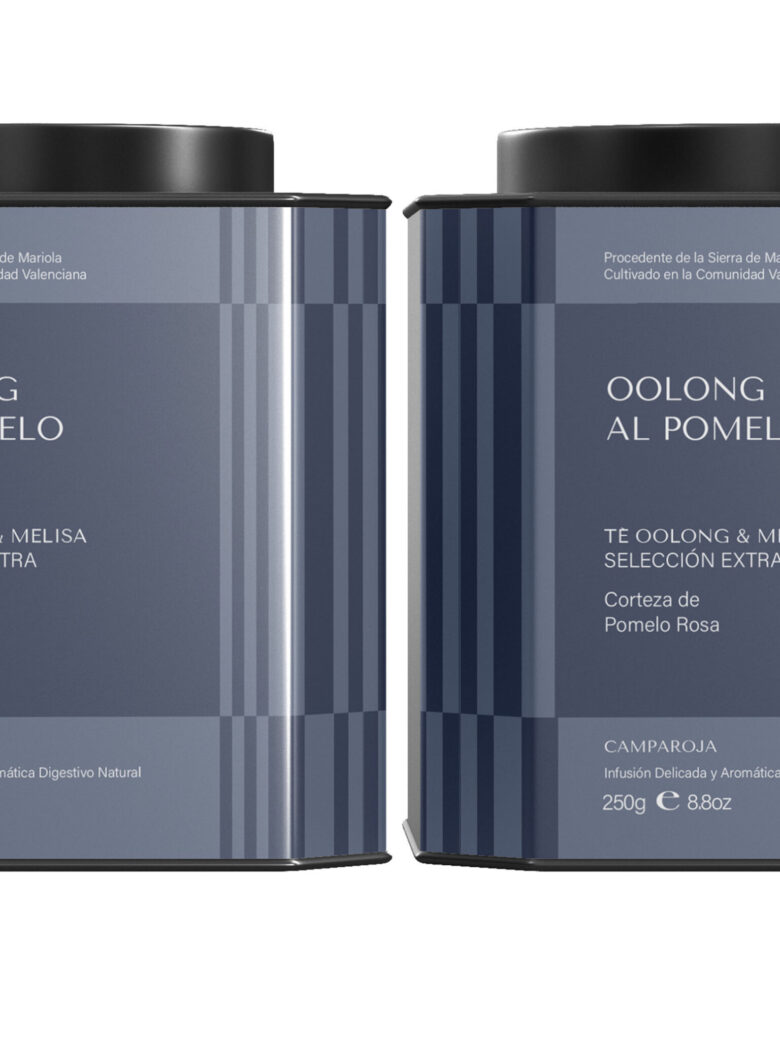
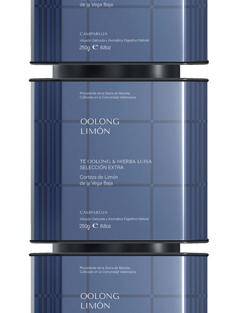
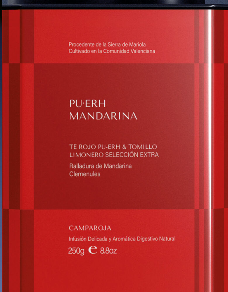
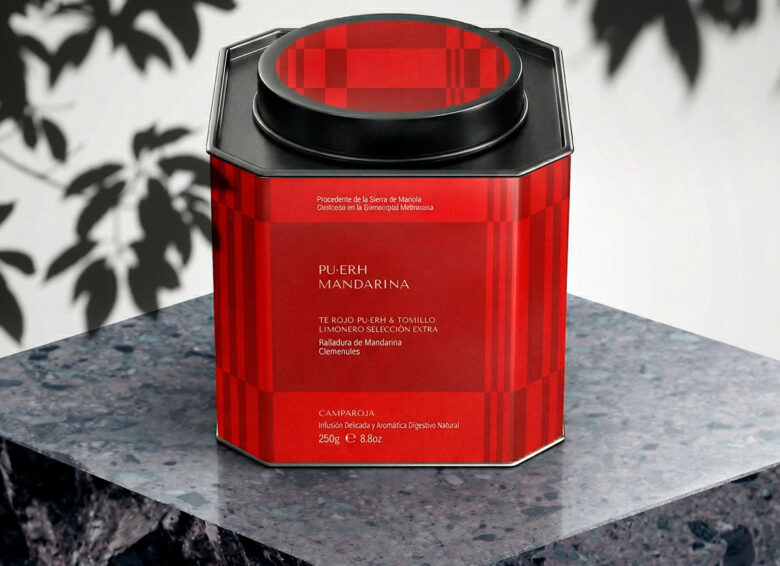
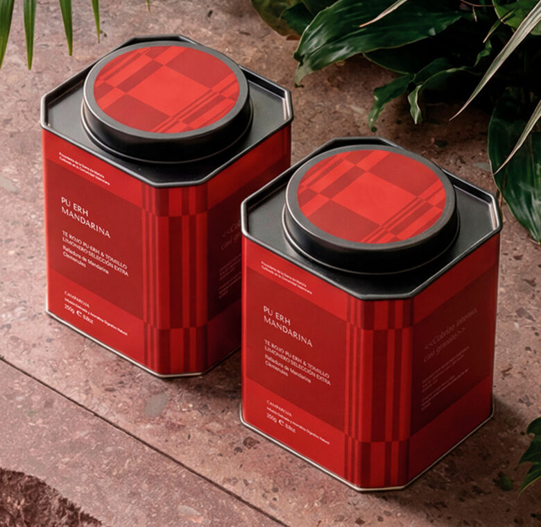
Camparoja is more than just a tea brand; it is a sensory bridge between selected origins and the essence of the Mediterranean. The project’s core was to dress a collection that fuses premium tea varieties with aromatic herbs from the Levante and citrus fruits from the Valencian Community.
The objective: to translate botanical freshness into a visual language that breathes calm and authenticity.
02. Design Philosophy: Designing through Restraint
In a landscape saturated with “loud” typography designed for fleeting digital attention, Camparoja bets on visual silence.
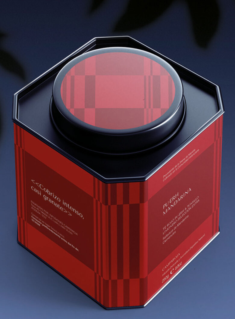
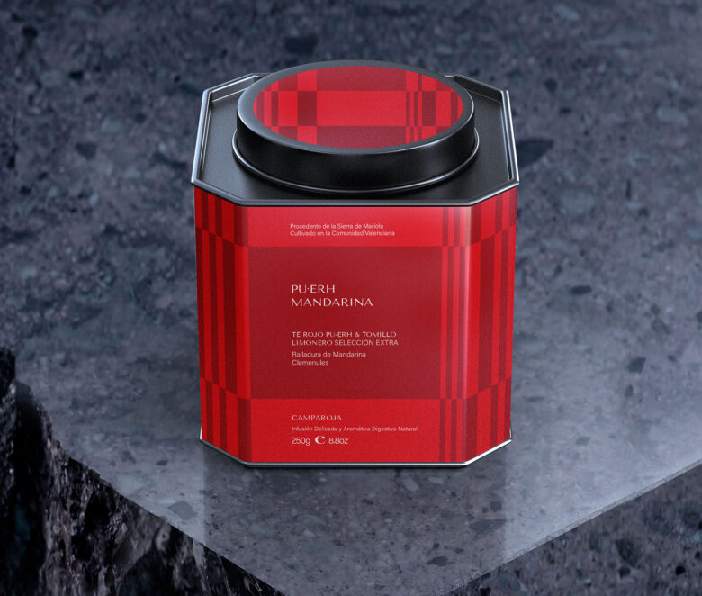
“The main challenge was to move away from the prevailing trend of graphic artifice, embracing a logic of clear and honest identification.” This project was born from restraint. The typographic selection and chromatic treatment prioritize informational hierarchy, allowing the product to speak for itself without unnecessary distractions.
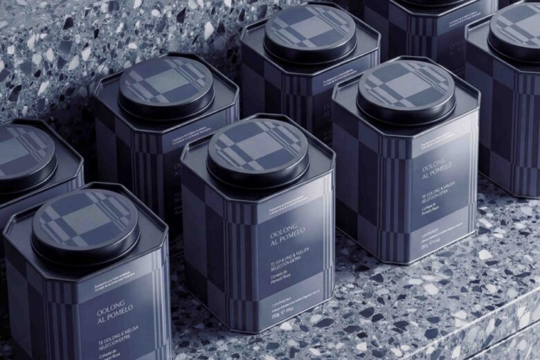
03. The Blue Palette: Defying Conventions
There is a widespread belief in packaging design that labels blue as a “forbidden” color for food and beverage. In this development, we turned that taboo into a competitive advantage.
The blue was strategically implemented to convey:Stillness: Evoking the slow, rhythmic ritual of brewing tea.Depth: Reflecting the quality and body of the selected blends. Contrast: Creating a sophisticated harmony with the warm tones of herbs and citrus.
04. From Pixel to Material
Unlike projects designed solely for the thumbnail of a screen, Camparoja was conceived for a tangible tactile experience. Special emphasis was placed on how the design interacts with the user “in hand”—where legibility, sensory textures, and sophisticated compositional sobriety truly come to life in every nuance.
Design: Lujan Estudio
Photo: Roverto Harta Sanchez
Art Direction. Lujan Estudio
Add to collection