
“We have dreamed about the pinkest and most positive and open place in the world. COME CHECK IT OUT” This incredibly innovative idea of combining a shop with a café is defned by an even more innovative and brave concept: that all the products sold here will be… pink! This unique pink task was given to the architects from mode:lina studio, meanwhile the brand concept as well as the communication strategy was designed by the MINIMA studio. “We are open to everything that’s pink: positive meetings, events, conversations, pink objects and snacks. We know everything about the positive.”

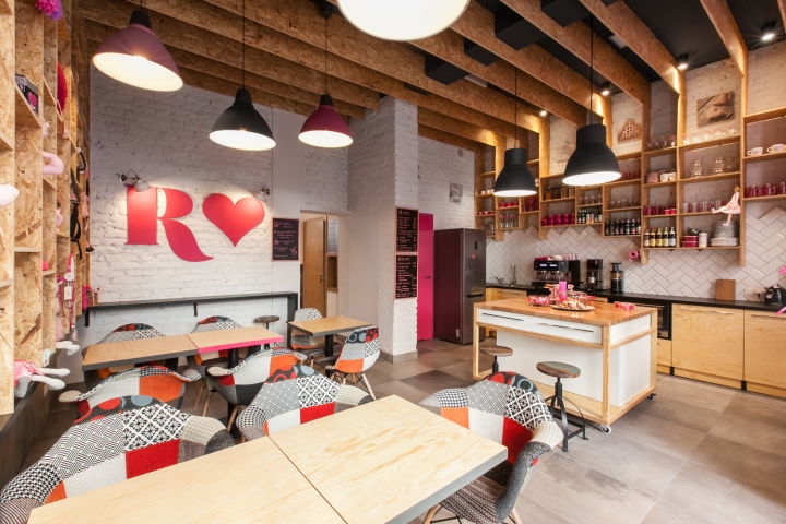
The designers had to meet the challenge of combining a store full of varieties with a bustling cafe, and all of it on just 45 sq. meters!
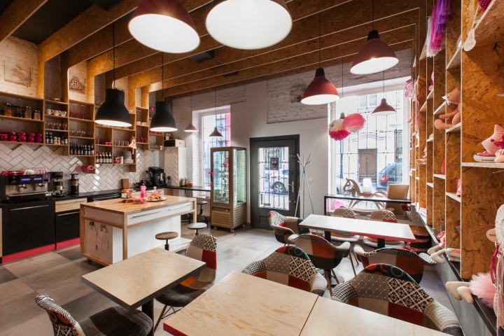
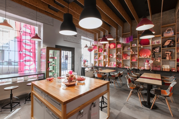
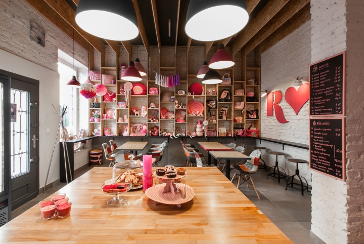
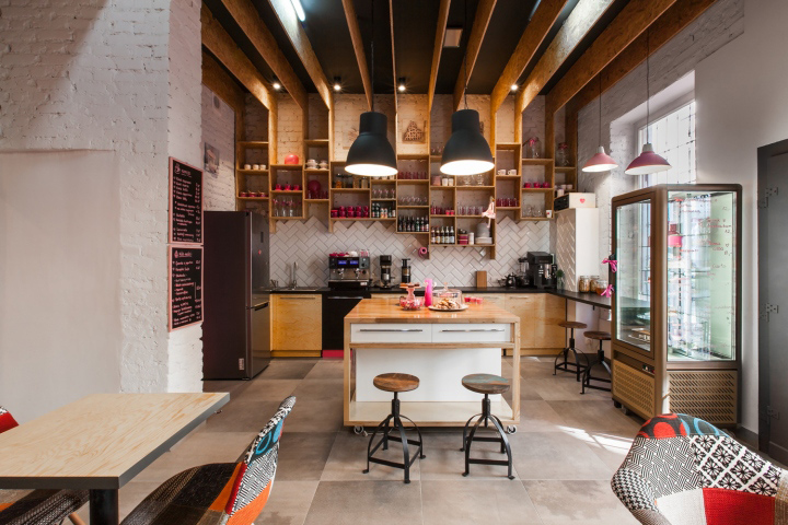
The most optimal solution was to create a single, suspended structure that would function both as shelves and the ceiling. This way the exposition area was maximized while not using up the incredibly valuable space.

“I want our guests to feel as if they have entered our home.”
To meet the dreams of the owners that were captured during long hours of conversations, the architects decided to substitute the traditional café counter with a kitchen island. A place that would be the center of the café’s life. This solution helped blur the line between the staf and the customers, introduce a homey feel, but also together with the modular tables, created a space easy to rearrange for diferent events.

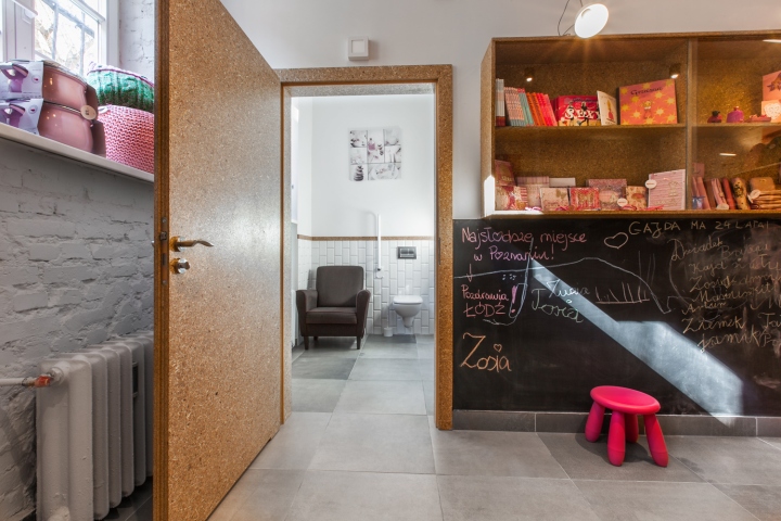
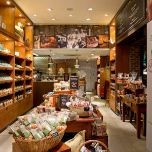
To best expose the pink products, the architects used raw and contrasting materials such as plywood and mfp boards. Also they left the original brick wall, in some places patching it up with ceramic herringbone tiles.
Design: mode:lina architekci / Paweł Garus / Jerzy Woźniak / Kinga Kin
Branding: MINIMA
Photography: Marcin Ratajczak


via Archdaily

