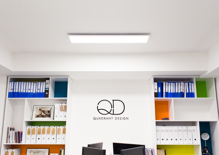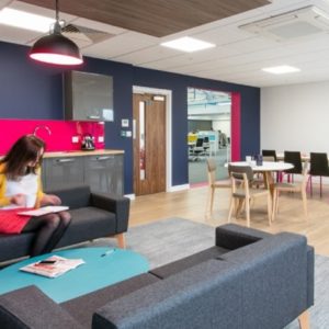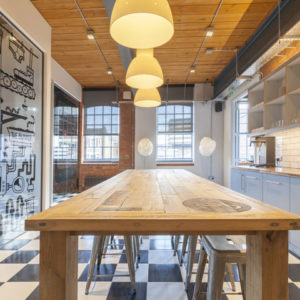


The opportunity for a team of designers to have completely free rein on a project doesn’t come around too often, but when you’re both the Client and the Designer, it can make for an interesting project. Quadrant Design is an Interior Architecture and Design practice based in central Reading. Quadrant Design had the opportunity to design their new home and office space from scratch. The whole concept was based around creating a vibrant and positive working environment, to be enjoyed by clients and employees alike, a space which highlights and expresses the creativity of the company.

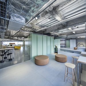
The design of the office has been a collaborative effort, with input from the whole team in every aspect of the project. From the furniture specification and floor finishes to the signage scheme and bespoke graphics. The whole space has been tailored to the practice’s day to day workings and has been broken into a number of meeting spaces, a main open plan studio, conference rooms and break-out area.

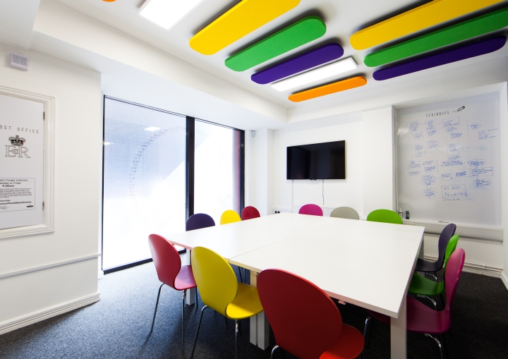
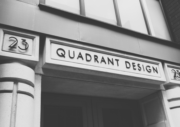
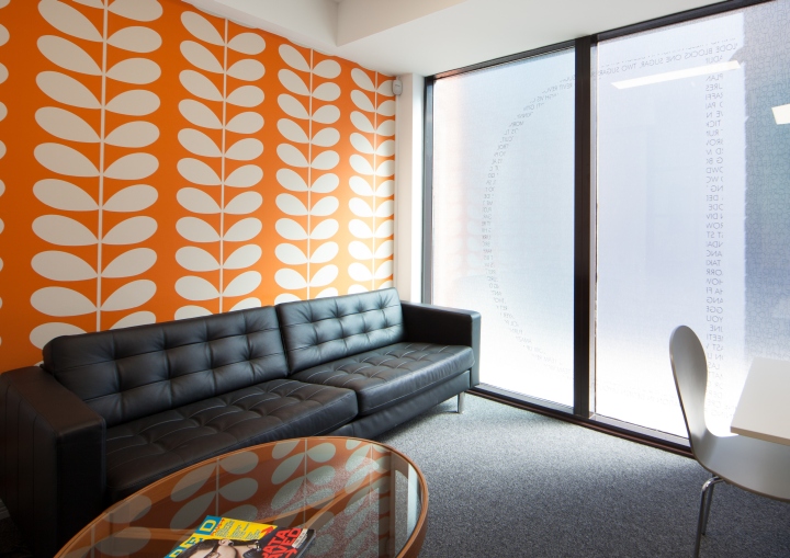
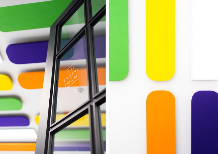
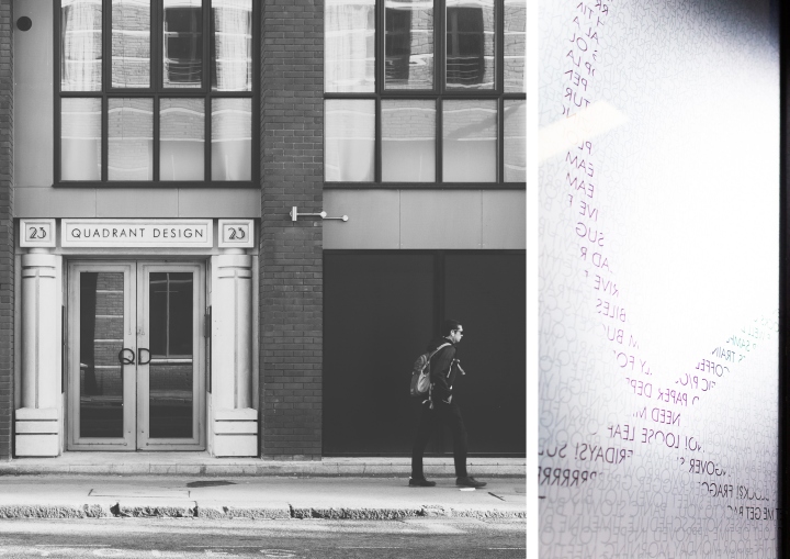
The design concept took inspiration from the main building’s architectural features and art deco detailing. The signage scheme to the frontage gives a subtle nod to the company’s employees, with specially formed privacy vinyl’s that are made up from hundreds of company related buzz words complied by the team. The main conference room, ‘The Engine Room’ has been injected with colour through the use of furniture and coloured acoustic rafts, with wipeable walls for note taking and full height American loft inspired glazed screening to maintain the open plan atmosphere.

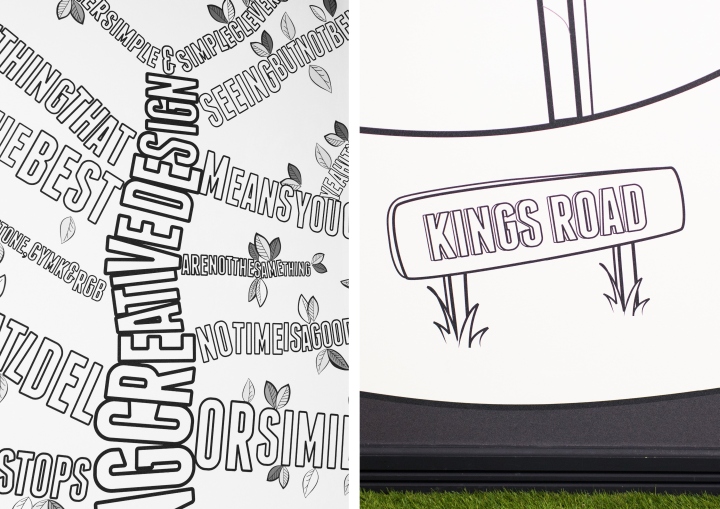
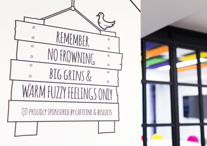
The walls have been lined with bespoke graphics, all of which were designed and created in house by the artwork and graphics team. The break-out space, although nestled next to the main studio, feels like a separate part of the office for staff to relax in. It is softened by the faux grass flooring, picnic bench and full height illustrations to the walls. Of course our MD was delighted that the office reflected the company’s personality and that it came in on budget.
Design: Quadrant Design
Photography: Richard & Sonia Brown
