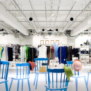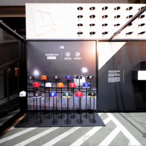

The main challenge we set to ourselves in the current architectural project was to highlight the existing store and to allow a strong identity and a personal and defined character in its working space through an aesthetical intervention that stood as a continuation of the original brand designed by us twelve years ago.
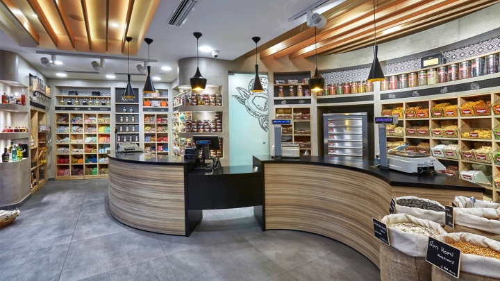
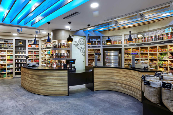
The interior is mainly decorated by wood (the shelves, the service bench, the roof) and forged, ornamented concrete – corner layers were used for the walls. The abstract, pergola styled wooden striped roof highlights the presence of the traditional element combined with a modern touch. Functionally, the design has been developed according to the professional needs and requirements of the current space. The shelves that are used to display and promote the products have been positioned in the periphery of the store, in a way that is convenient for the customers to spot effectively the product that they seek.
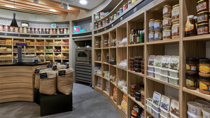
The client due to the stereotaxic placement of the shelves enjoys an unobstructed overview of every part of the store. The imposing presence of the service bench in the middle of the store, functions as a prolongation of the product exhibition, while simultaneously its curved shape, following the physical curves of the space imparts animation and motion to the working environment.
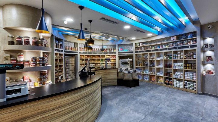
All these elements combined with the relaxed and inviting, earthly colors create a harmonic ensemble, that emphasizes and highlights the natural origin of the products that the store merchandises.
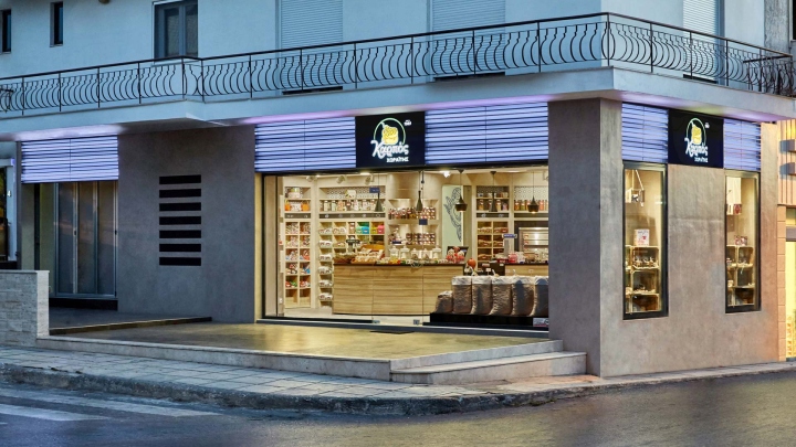
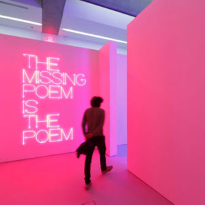
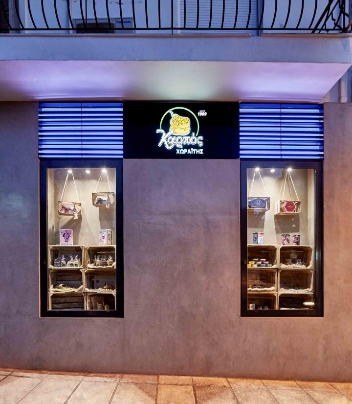
In the exterior, the bright impressive neon label attracts the attention, which allows the store to make its presence noticeable. This clue, combined with the clear view from the exterior towards the interior, creates a sense of openness to the public and invites the customer in. The materials, here again, through harmonic correlations or creative contrasts, represent the combinations of traditional and modern, old and new, natural and artificial influences.
Designed by Lefteris Tsikandilakis
Photography by Pantelis Mathioudakis


Add to collection

