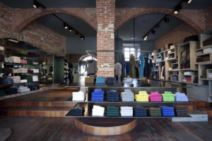

Located on one of Bali’s most exclusive shopping streets, the new Denimdenim store by Word of Mouth certainly demands attention. The refurbishment of the existing two storeys structure, with a petite floor plate of only 60sqm, saw the need to manipulate the building facades to create a strong street presence.

The new store is part of an existing chain already on the island, however because of the more exclusive location, the brief from the client requested that although this store should have a relationship with its counterparts, it should pursue a new direction for the brand and endeavor to attract a more discerning customer. The design therefore adopts elements of the industrial material palette of the other stores to maintain continuity within the brand, but seeks to create a new look and feel through the use of custom graphics, recycled elements and foliage.
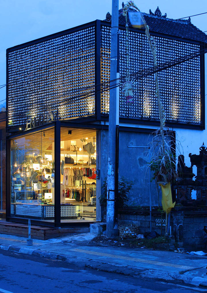
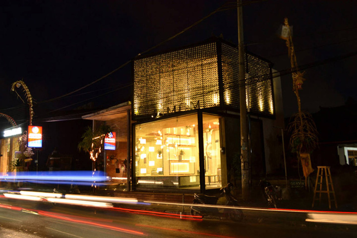
The ‘masculine’ nature of the previous stores is carried through with the use of strong architectural forms. The store sits proudly on the street, giving the impression of two stacked boxes, rotated on their axis. This illusion works to effectively capture the attention of passing traffic from both directions, whilst complying with the site restrictions of the adjacent temple.
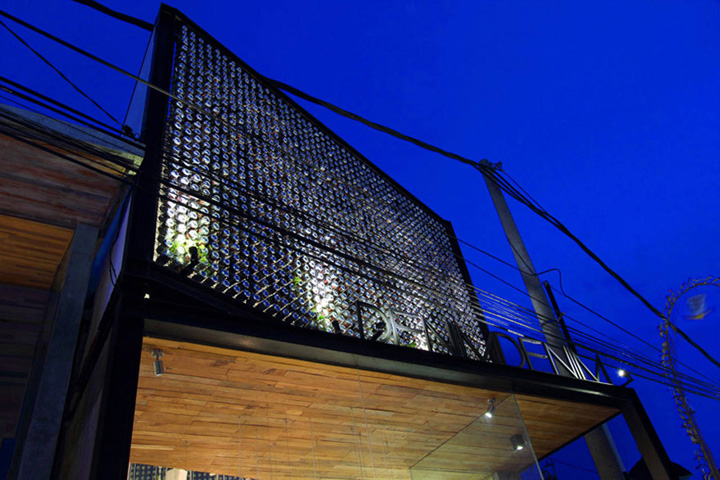
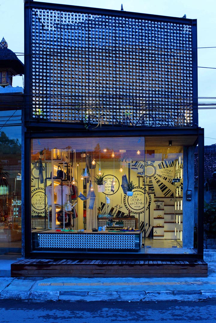
The boxes are given their form with the use of a black steel frame, in filled with a mesh and be-jeweled with thousands of recycled aluminium cans. The screen act as a sunshade while providing a network for creeping plants to grow. The cans create a striking effect from the street, a sparkling repetition of circular forms that only reveal themselves as recycled components upon closer inspection.
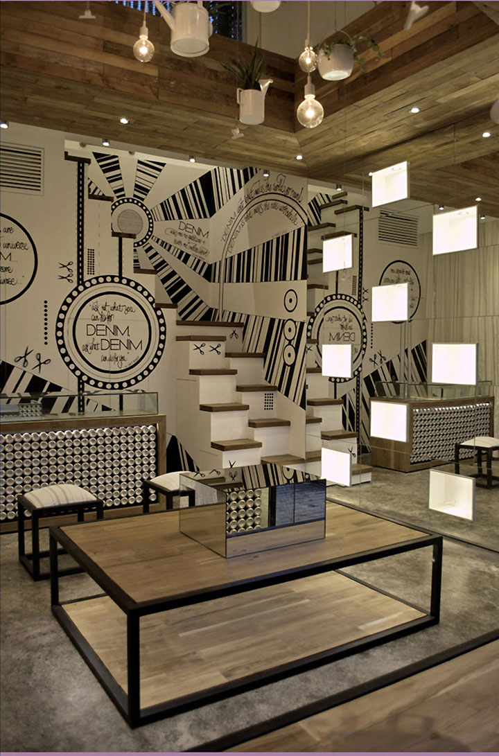
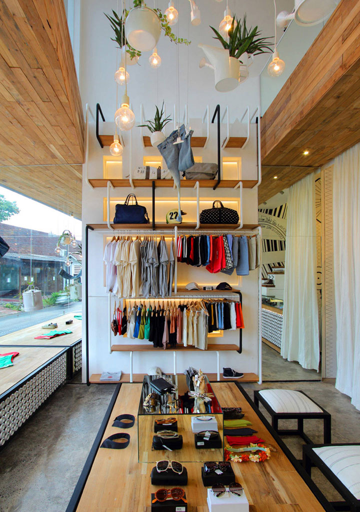
The small building footprint demanded a careful treatment of the space, in order to make the space appear as large as possible, even when full of merchandise. A giant angular void was cut in the centre of the space, which provided a vast double-volume filled with natural light. A custom “chandelier” dominates the void – a combination of gently glowing oversized bulbs and a series of found objects converted into hanging planters.
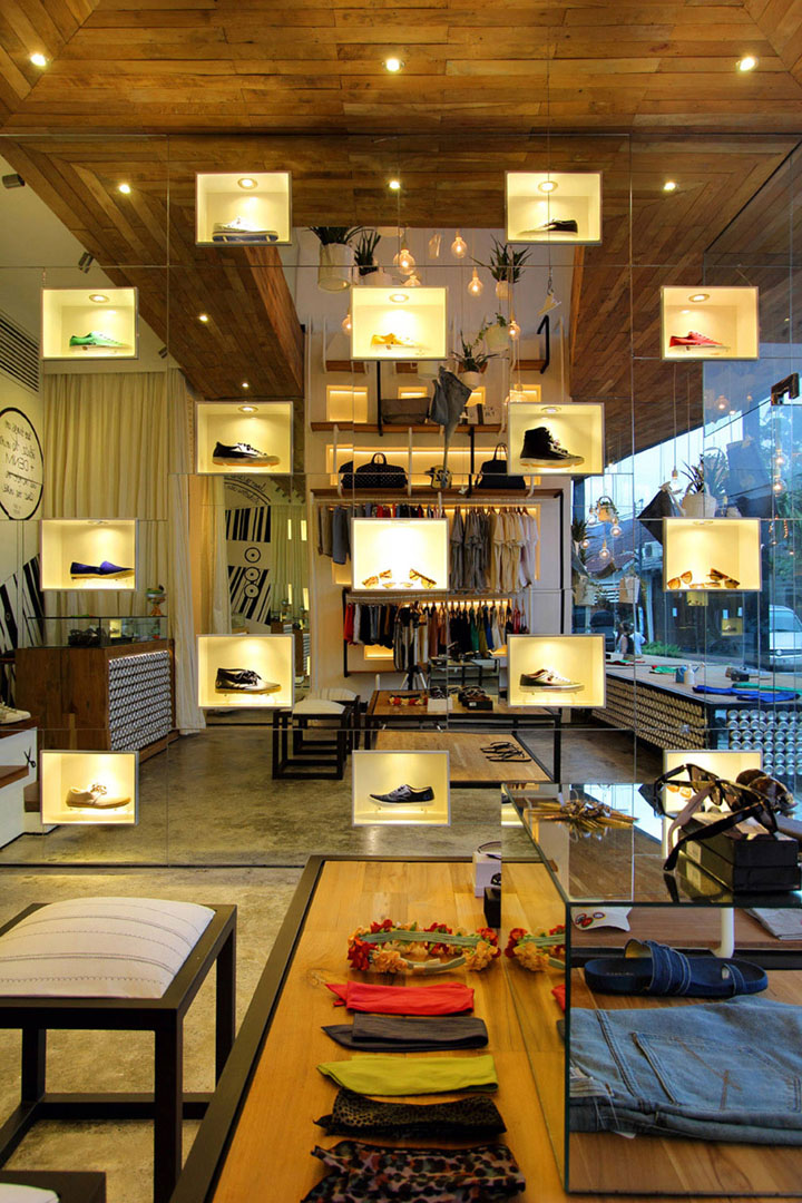
The void is also utilized for merchandise display, as clothing items float elegantly amongst the greenery. Mirrors are used extensively within the space to further enhance the perception of the void and the natural light it provides. One wall of the store is comprised of mirrored panels which surround glowing white shoe display boxes – these are concealed within the spaces of the existing column structure.
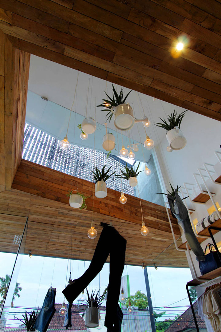
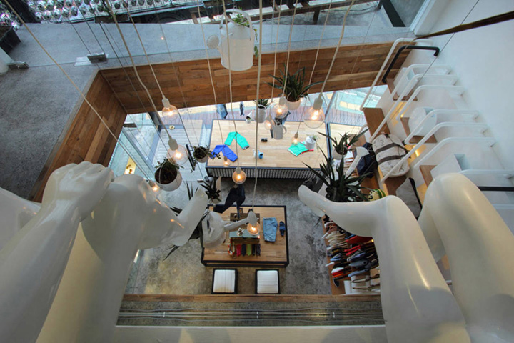
The neutral palette of polished concrete, recycled teak wood, black steel and recycled cans works to connect the exterior and interior spaces. The interior is intended to be light-hearted and introduce a bit of humour to an otherwise neutral material palette. Two mannequins sit watch over the void space, their heads replaced with plants.
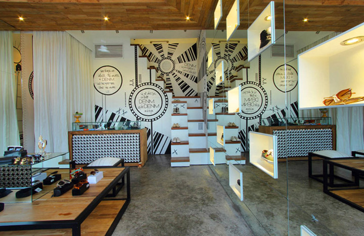
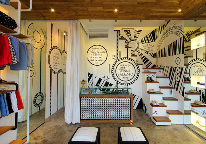
A custom designed wall graphic is painted across the back of the shop – a combination of famous quotes that have been manipulated to illustrate a denim obsession, and graphics and patterning inspired by denim and stitching details. This also works to conceal the storage components behind the sales counter. The space encourages customers to not take it or themselves too seriously…
http://www.archdaily.com/223472/denimdenim-word-of-mouth-architecture/


Add to collection
