
W Hotel Seoul, an urban resort situated at the Mount Acha overlooking the Han River, is now renewed to “Vista Walkerhill Seoul Hotel” to receive clients with new spaces. As a five-star luxury resort targeting family guests, Vista Walkerhill Seoul Hotel is not just an ordinary luxury hotel. Its extra ordinary luxury, classy and fun concepts will offer cozy spaces to the guests throughout their stay.
LOBBY
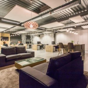
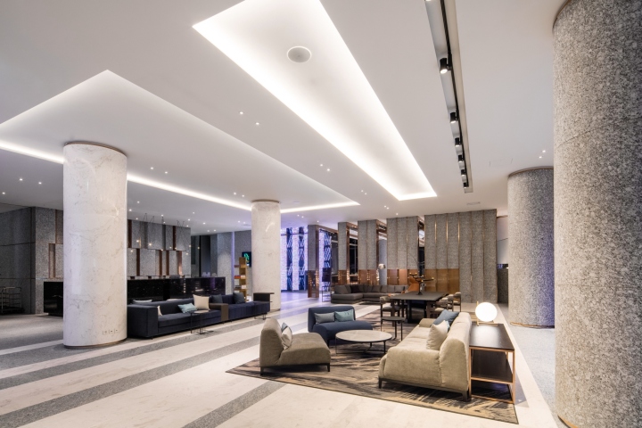
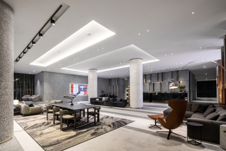
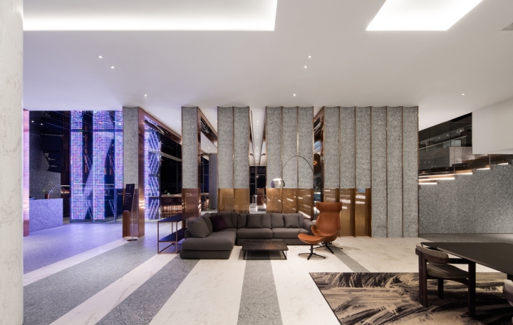
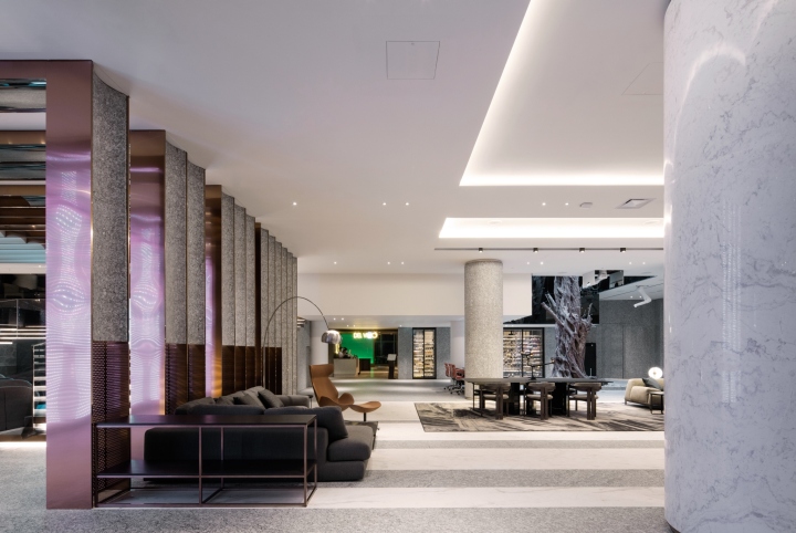
While Woobar and Lobby of the W Hotel used to be a one space with different floor levels, the new lobby offers a space separate from the bar. It is an effective, independent and functioning space. Minimal design erased the existing pop, causal details and a luxurious and unique space was created to serve the five-star hotel. The floor and mass of the walls were finished with gray colored main stone with minimal design. White marble pillars and floor patterns give special characters to the space. Through wall, situated at the edge of RE: BAR, opens up and closes the space smoothly. Furniture of the lounge was placed to offer a warm, cozy feeling to remind a living room and a den.
RE: BAR
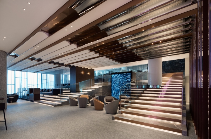
Woobar, which used to be the symbol of W Hotel, was renewed by using the existing concepts and structures of a stairway. Bar counter was finished with green-color marble stones to make it a trendy and luxurious. Bronze metals and patterned woods were used to design back wall to display liquors to feature the traditional identity of a bar. The ceiling was finished with super mirror to give a visional enlargement to the space. The partitioned wall from the lobby is extended to the ceiling to create a unique ceiling design of the new space. The hall, designed as a stairway, kept the existing structure, while foot lightings were installed to integrate the space with lighting. Couple seats along the windows were separated with metal curtains. Furniture was freely placed in the mezzanine to make it an active space. A view to look down on the first floor from the mezzanine makes it a special space.
RE: BAR VIP ROOM
A smoking lounge was planned at the lounge bar for VIP guests. On the way to mezzanine from the bar entry, a black marble stone image wall is found for the VIP rook. On the right sight, a new glass house is located. The lounge is located behind a see-through curtain, prompting curiosity of the guests. Unique walls, designed with mass, are located inside, and a large chandelier captures eyes.

MOEGI (JAPANESE RESTAURANT)
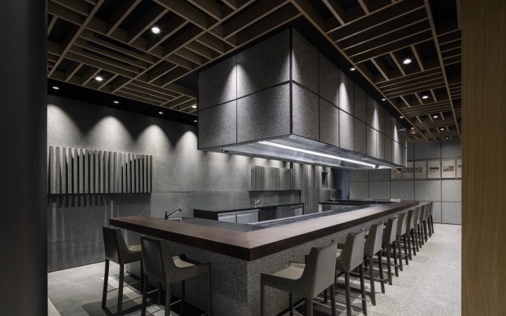
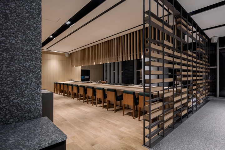
The restaurant was designed to harmonize modernity and traditional Japanese style. The entry area was designed with massive, dark-colored granite stones. A foyer, almost like a gallery, is situated inside to display arts. The space will be used as a waiting and reception place. Tepanyaki zone, private booth and main hall are located one after another in an open space, and yet the layered space is also separated with partitions extended from ceiling structures and wood mass.

Stone floor and walls are designed to form a minimal mass, while the wooden structures on the ceiling expresses oriental and warm style. Metal frames and masonry joints are used for a Japanese-style space division. The finishing lines of the floor materials are also used to express the delicate, Japanese-style modernity. Sushi bar is located along the windows to give the guests river view. It is a private and special space; the floor, walls and counter are finished with wood to give a warm feeling. Of the five rooms, three haves moving walls to be used independently or integrated.
DELVINO (ITALIAN RESTAURANT)
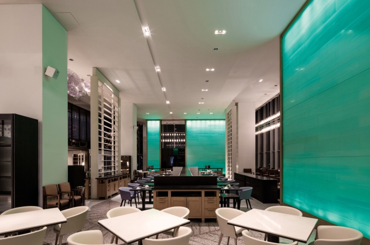
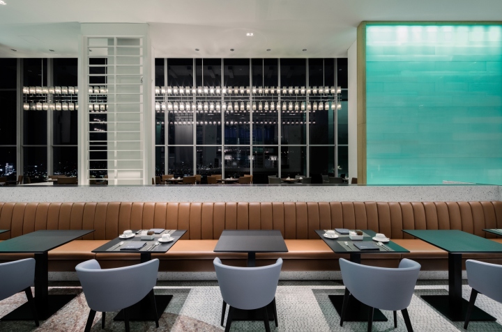
Hot and cold buffet sections of the existing restaurant were strengthened, while a bakery section was newly added at the entry façade to give the impression to the guests of a deli space. White and grey artificial stones were used to harmonize the existing materials of the restaurant to satisfy family guests. Furniture was rearranged for more effective operation of the hall. Art zone was converted to private dining rooms to serve group guests.
GUEST ROOM
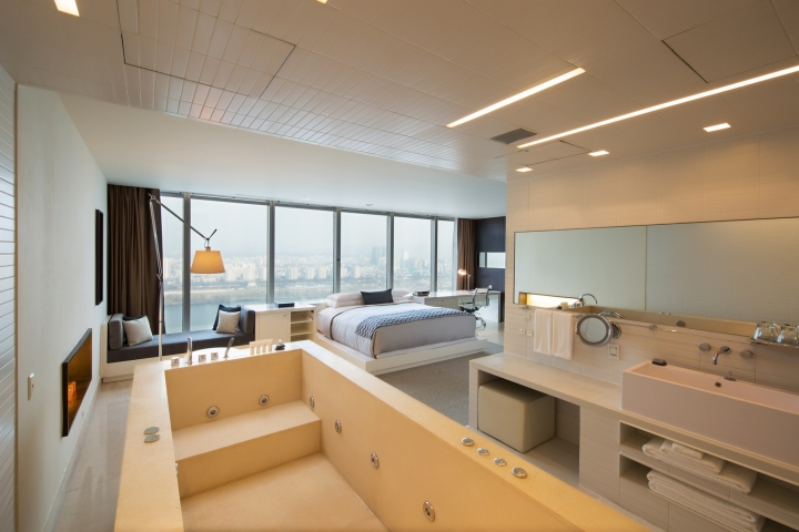
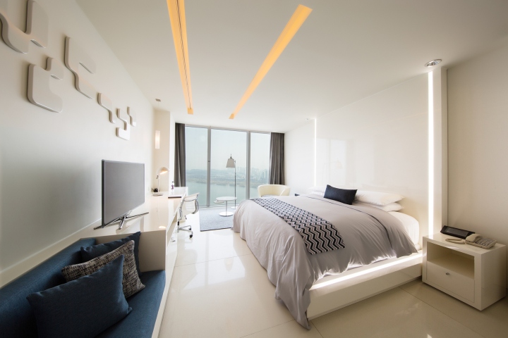
The theme of red color was removed from the existing room designs and blue grey color was chosen as the new point color. Only by changing curtains, rugs and textile of furniture, rooms were given new designs.
Designed by Quaddesign
Photography by Choi Yong Joon






Add to collection
