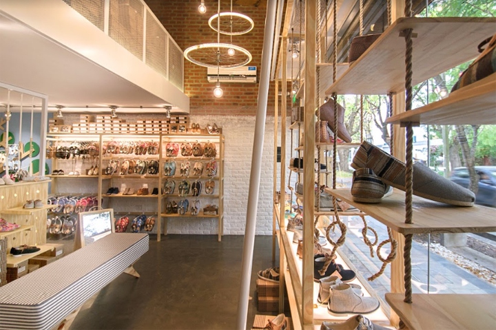

PERKY is a famous shoe company in Brazil dedicated to bring the soul of the “Argentinian Alpargatas” shoes into comfortable and light shoes, as a part of their brand core. After their first concept store in Brazil it was time to return to their origins and launch a Perky Store in Argentina, from where their shoes were originally inspired. Our That Design Team created and developed the architecture and retail design project in Brazil, and the execution was signed by the Proyecto Triangular time, from Argentina with the Lighting Design created by Arch Eduardo Becker, also from Brazil.
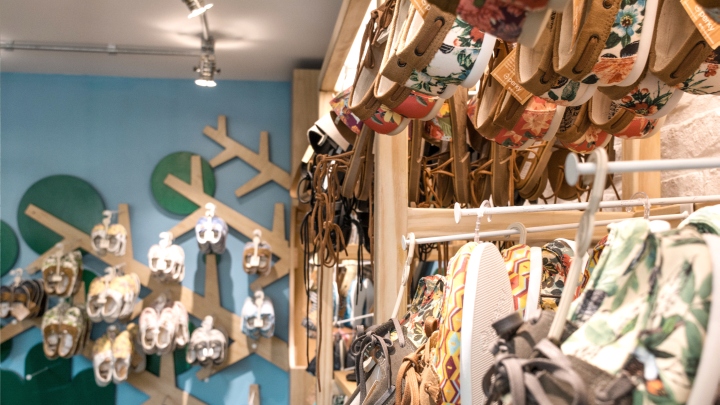
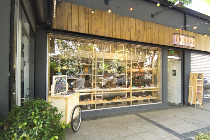
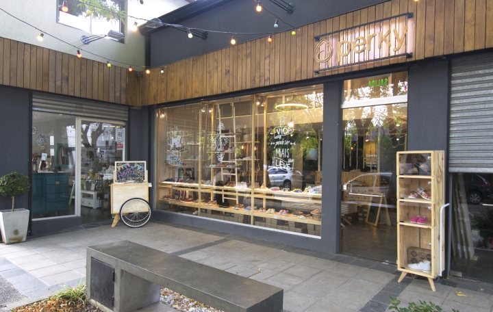
This first Perky Store outside Brazil determined their future store concept for the entire Latin America stores to come. With their concept that JOY GENERATE JOY our team designed a project that not only would carry all the PERKY’S DNA, but also could be mutant as the evolution of the brand worldwide. The main idea was to link the soul of the brand with the identity of the store, adapted to the Argentine public in a mall with several other stores.
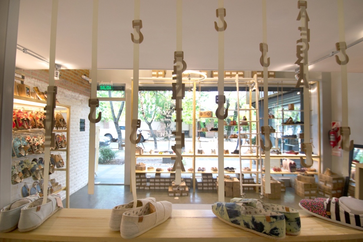
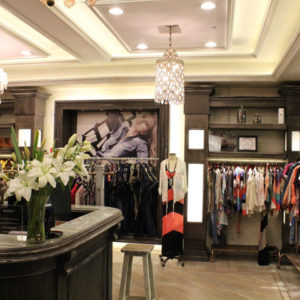
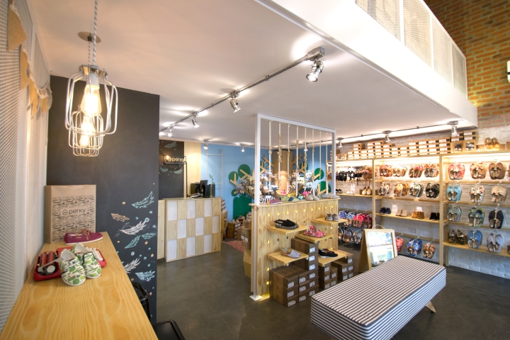
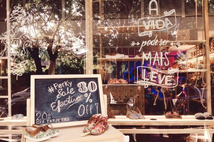
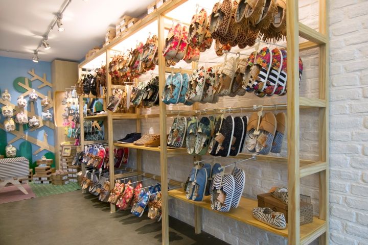
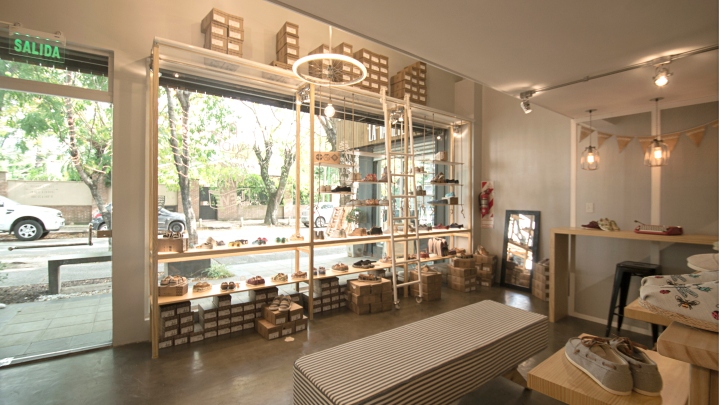
The first challenge was to adapt the furniture to a large Window display system, unlike the small windows of the historic building where the original Casa Perky Brasil is located. The store also has a mezzanine that almost doubles the space and will mainly be used as as store stock area. Original features like rustic brick, flooring, store zoning, hot spots, modular furniture with shelves and hooks, and gift packaging customization area remained on the project.
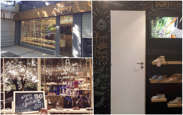
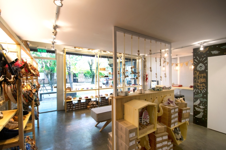
The PERKYDS space, with the classic illuminated fun tree and its azure blue wall, gained place near the checkout with cushions and rugs with the exclusive pattern stamps of the brand. The Perkyds showcase was moved to a piece of furniture in the center of the store with the original straps of backpacks and wooden shaped hooks with adjustable heights. The originally designed wooden animals remain on one of the faces, facing the Kids area, giving an interactive spot for the little ones to play and interact with the brand.
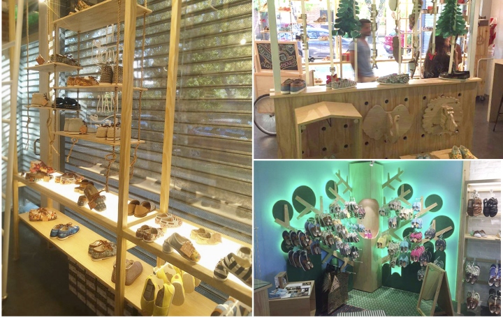
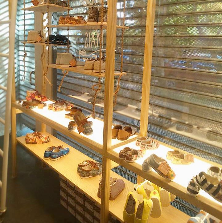
On the front face of the furniture are the new releases and products of the brand, so as you enter the store you will spot them right away. At the checkout we applied the brand’s classic light (a miniature of the large facade sign) and created a display case for backpacks with a pulley and rope system, together with an interchangeable shelf system for small impulse sales objects, next to the Check-out. The entire checkout environment features a chalkboard wall, decorated with chalk by a local artist.
Design: That Design Company
Photography: Proyecto Triangular Team



Add to collection
