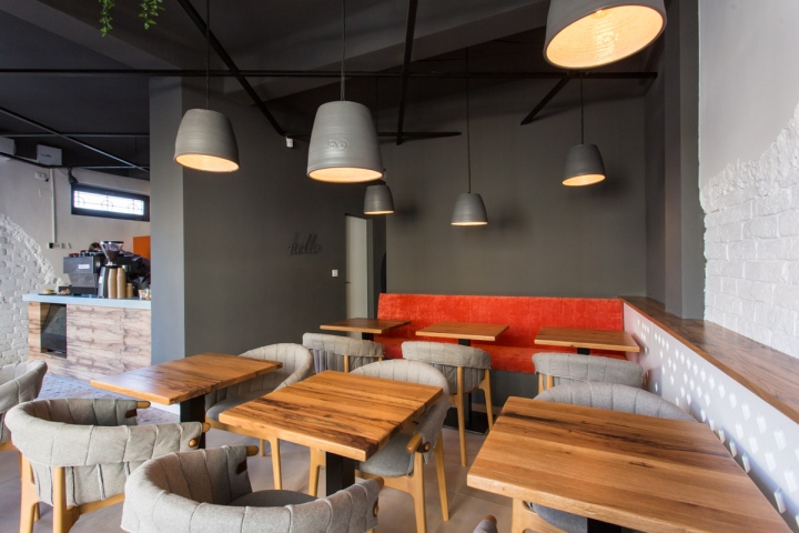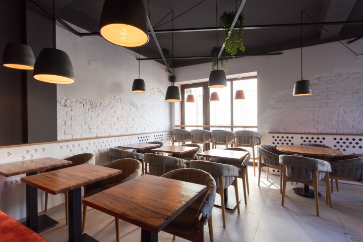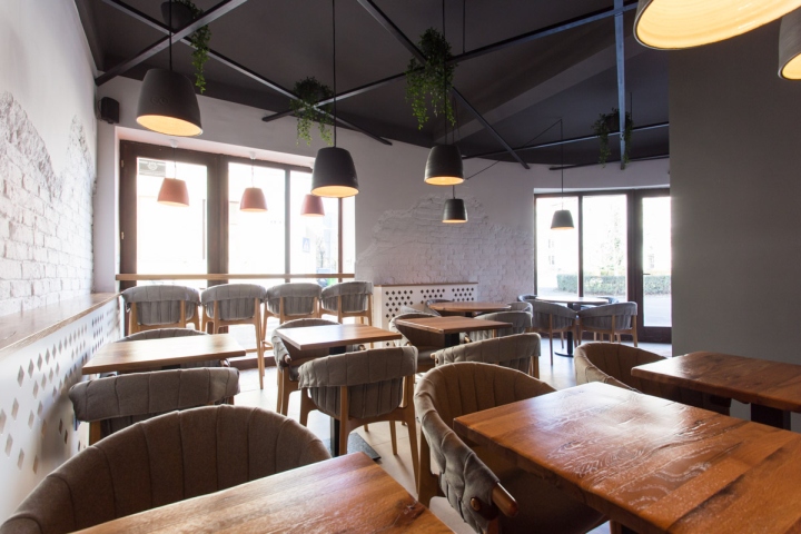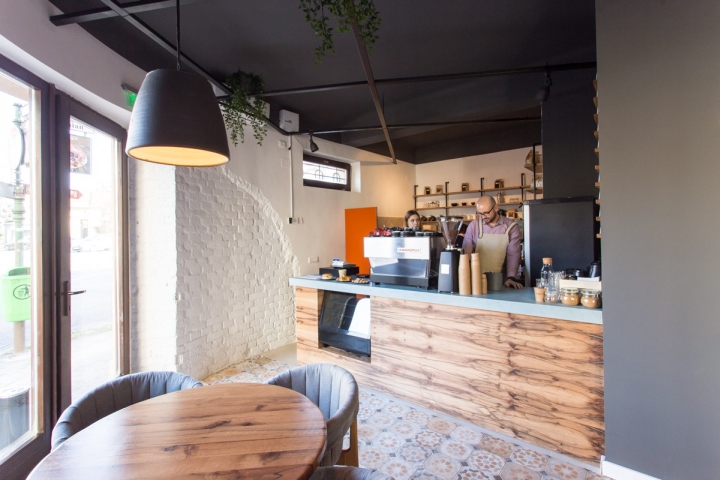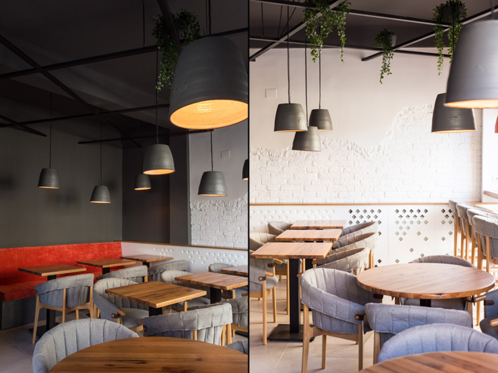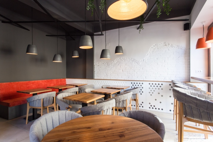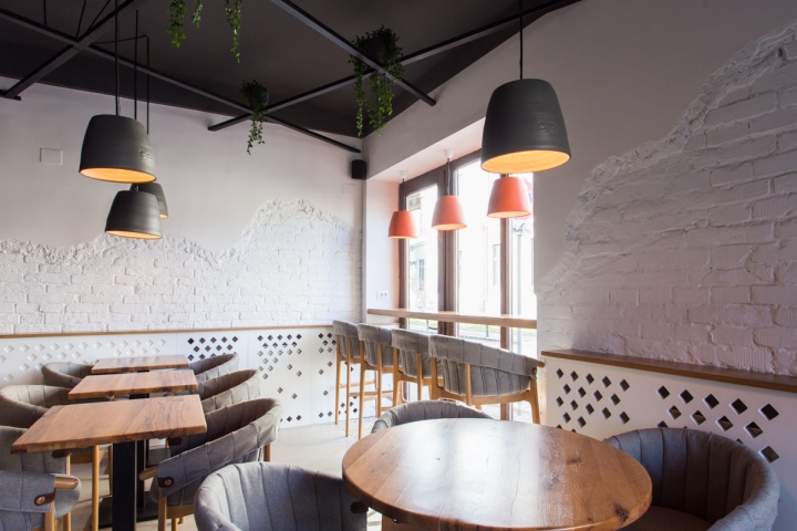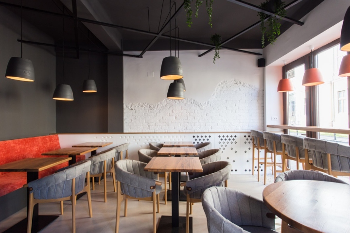
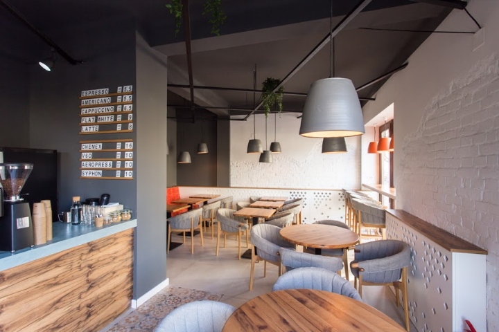

The task was to create a cozy, welcoming interior in a difficult, small place. There was a thin wall that had to be torn down to create a single space, which also helped with the natural light spreading beautifully all over the place. The location is in an old building from around 1920 with thick brick walls that were covered in plaster, so we decided to take down just a part of the plaster and let the brick visible.

The floor was kept neutral, using the decorative tiles from the same collection in the bar area to emphasise the most important place – where you place and take your order. We used it again at the bar by the window, but also in the tiny bathroom.

We painted part of the walls and the ceiling in dark grey to add contrast and intimacy to the atmosphere. For warmth, we opted for the wooden finishes of the tables & chairs, paired with the soft, textured fabric that hugs the chairs. There was something missing in the white/grey scheme, so we completed it with a pop of colour in the form of the pumpkin red sofa, which we used again here and there around the interior (e.g. in the three lamps by the window).

The low white furniture by the walls actually hides the heaters; the diamond shaped holes were inspired from the tiny diamond shaped tiles from the decorative floor. The dark metallic grid under the ceiling helps hide some cables and acts as a great support for hanging some greenery to liven up the place even more. Last but not least, the lamps are ceramic, custom made by Raul Bocse, branded with the client’s logo and painted afterwards. All in all, we tried to play with textures and details, giving various areas of interest for the eyes, while at the same time keeping it simple.
Interior design & branding: davidsign
Photographer: Andreea Iancu
Furniture: DUVAL
Construction team: AD WEST CONSTRUCT
