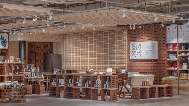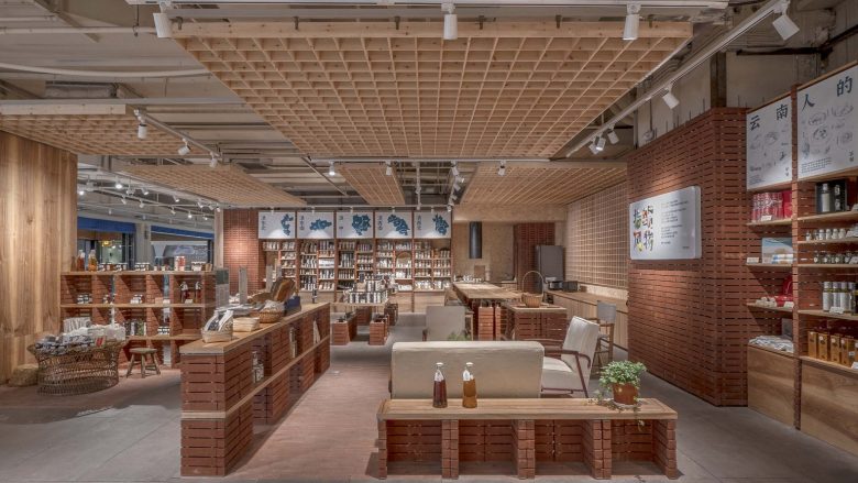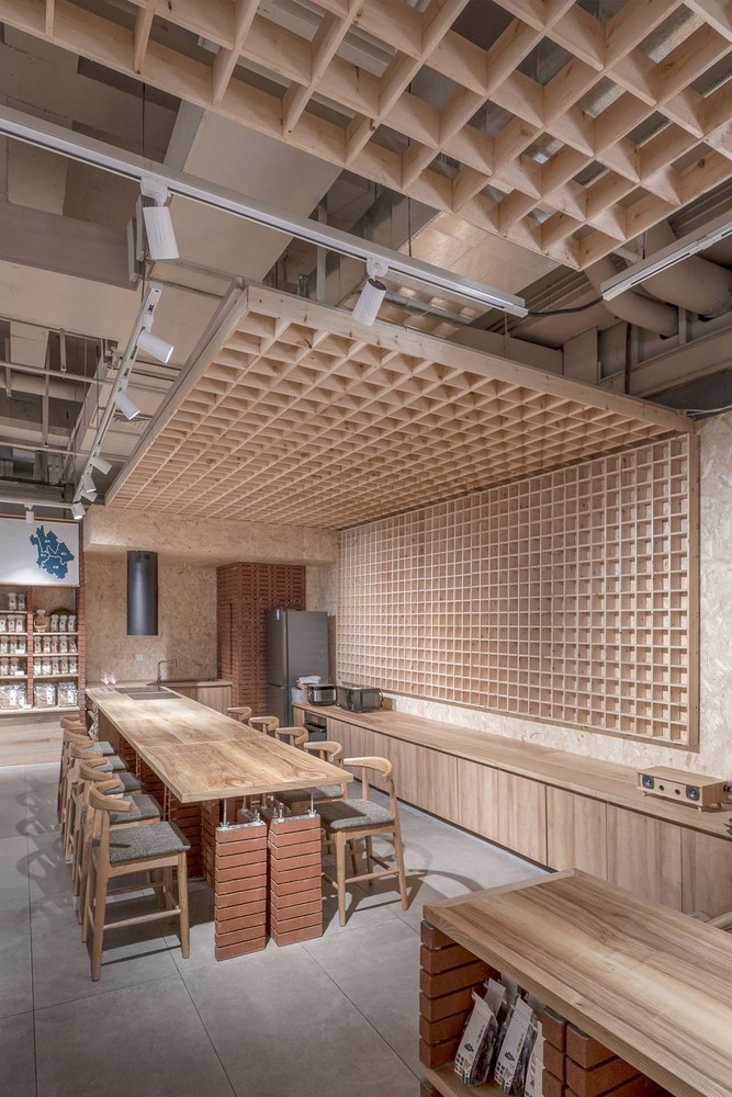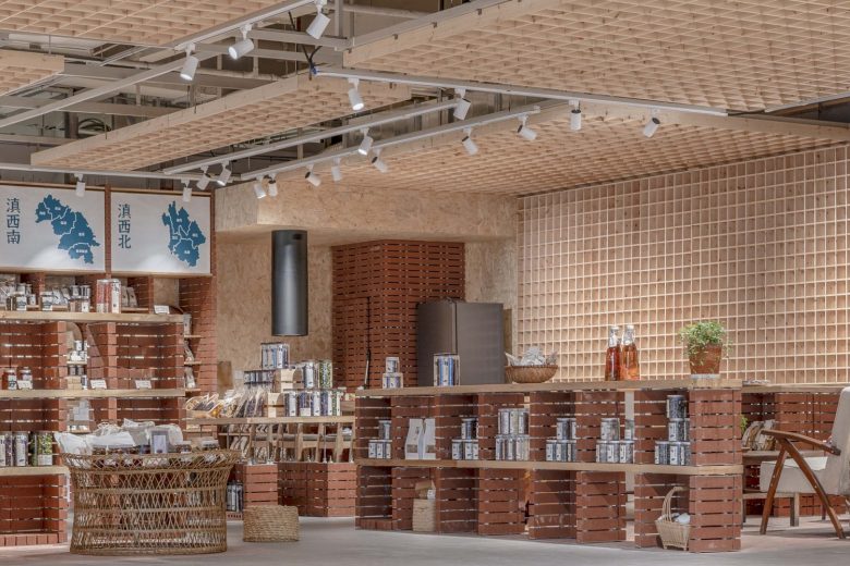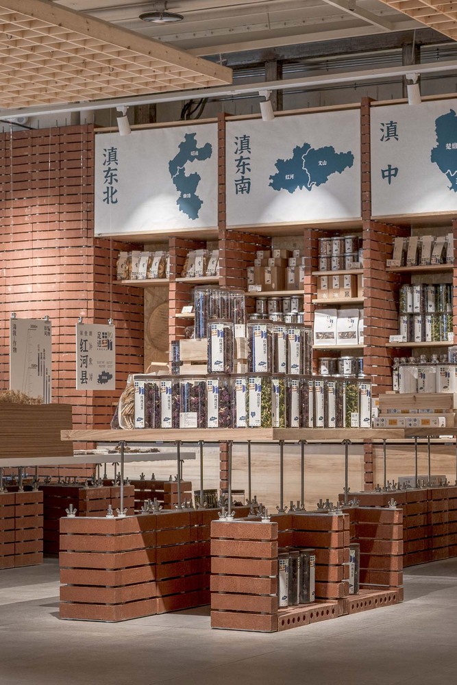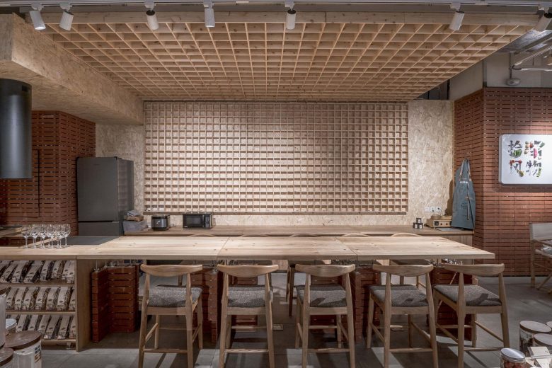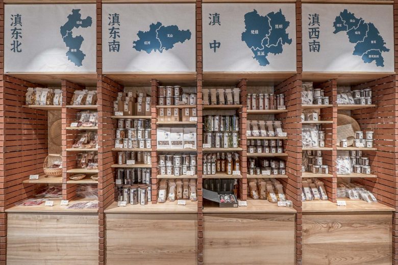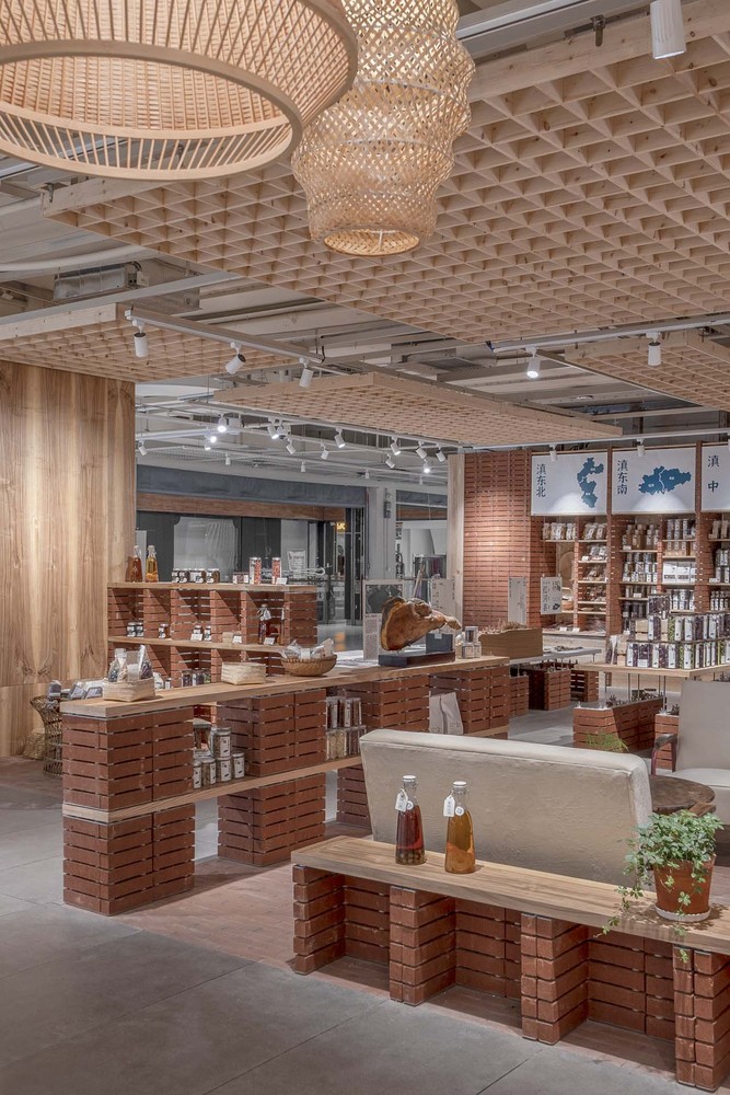
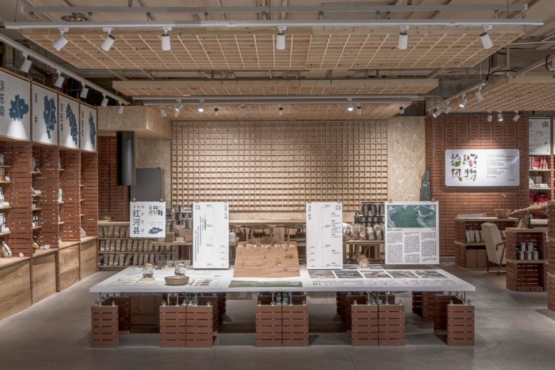
The store is located at the core of the space, facing the end of the entrance passage. Consider placing important functions, such as map wall, exhibition stand, shared kitchen, to a relatively complete square space in the lower half. The overall space is relatively limited. Different functions are modularized, becoming partitions of the space. Floorings and ceilings are corresponding to program zones, which increases the richness of experience.
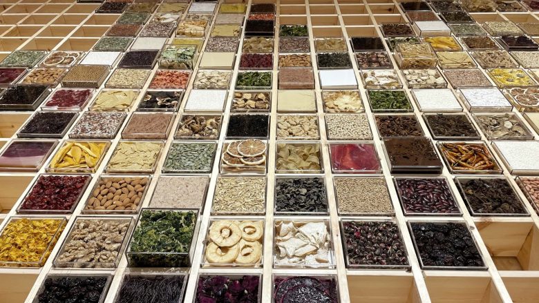
The booth is composed of four modules, with an overall size of 1.8m×3.6m. Different exhibition themes will be arranged according to different seasons and regions. The height of the table surface is changed by different screw lengths. From the booth to the shared kitchen in front of the map wall, the table gradually becomes higher. The purpose is to create an inviting space without forming a line of sight to the map wall.
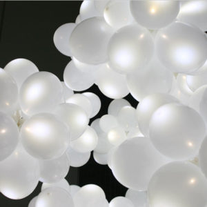
Extend the ceiling to the wall, “embrace” the kitchen, of which the grille can be used as the frame of the “fengwu map”. The living area is defined by lower shelves, flooring, and ceilings, which serve as areas for customers to check out, rest, talk and wait.
From the living area to the village direct supply area, the space is defined by lower shelves. The height of the low shelves gradually increases, breaking the spatial experience of the original functional areas and forming visual continuity to establish a connection between the two spaces. The shelf area is arranged to the concrete wall, and the frame is evenly divided. The design considers the flexibility of the later arrangement of the partitions, and the vertical spacing can be adjusted according to the size of the goods.
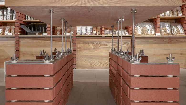
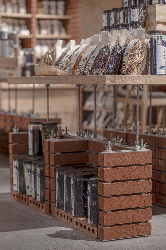
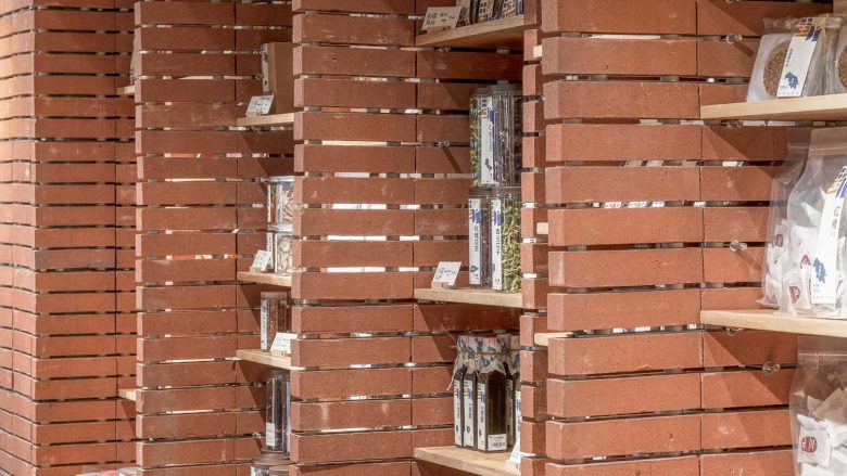
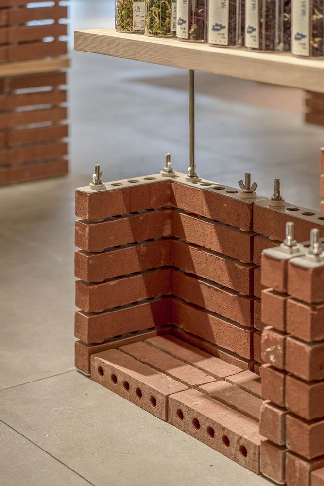
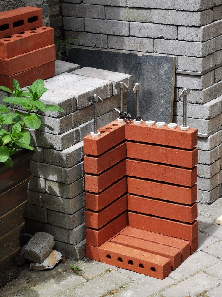
The design uses the traditional materials “red brick” and “wood” , to create a simple and warm tone like traditional buildings. We use modern architectural construction methods to give traditional material modernity. Each functional area is composed of smaller “red brick & wood” modular units, and all materials are connected by hardware. Bricks are heavy and wood is light. Separating the wood board from the bricks and exposing the screw rods strengthen the tension contrast between “lightness” and “heaviness”. The furniture module looks more like an architectural unit.
The distance between the wooden board and the brick can be adjusted by screwing the nut so that the furniture module can adapt to the height requirements of different usage scenarios. The horizontal pores formed between the bricks can be used as a space where the partitions can be placed freely. A horizontal “hollow-out” gap is formed between bricks, which dissolves the heaviness of the brick element. The horizontal hollows, different from the dense joints of traditional brick walls, give the brick wall a “breathing sense” as a partition element.
Architects: Tuo + Urban Wave
Lead Designers: Xiangyang Wu, Tuo Lin, Mengzhe Tang
Photographs: HAIYI, Xiangyang Wu, Yansheng Jin
