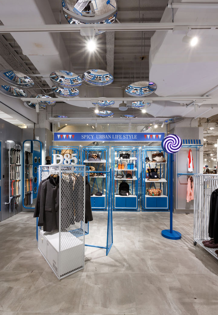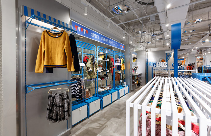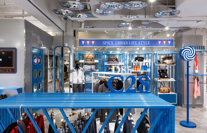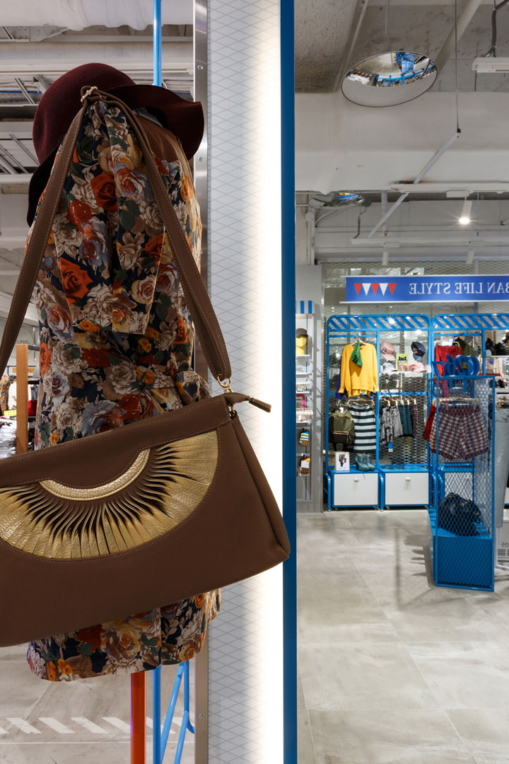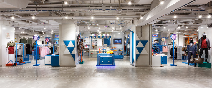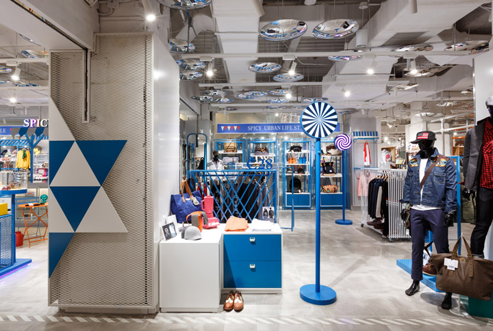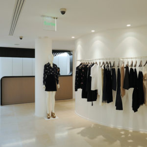
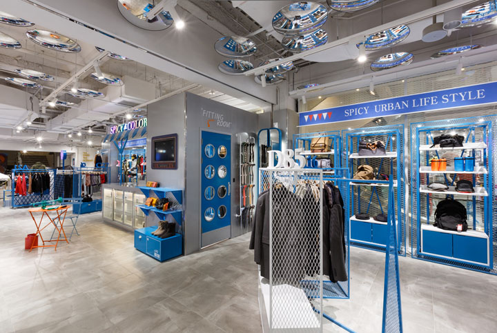

Since 2003, Myeong-dong Lotte Young Plaza has been renovated as almost reopened. Prepared for the renewal advocated the slogan ‘generation of fashion replacing the’ Young Plaza is great. Interior design of numerous budding brand in the neighbor competition was amazing. Young plaza construct the floor, and the ceiling of basic construction and then each design of brand apply to in space. Department stores of the overall design concept of the ‘see through.’ So we tried to make a space as one of entire.

Lots of thick pillars and low ceiling give us feeling a pressure. We focus on dividing section for each section through the frame. White+Blue only using the cool environment of the store, a long and narrow. And Each section that can be accessed easily via the built stand with led sign. Because of ‘see through’, we design furniture used Square frame box. On the front of the two stars are the logo of Spicy Color and the door into the store. Fit to the slogan of ‘urban pop culture’, Between the simple structure, the overlap of products between sheer variety of directing and want to express your feelings.

DESIGN:
Design Office: khanproject
khanprojectkr@gmail.com
www.khanproject.com
Design team: Han, Kwang-hyun / Park, Chang-hee / Yoon Na-ri / Seon Bi-oh / Lee yeon-jin
Constructor: khanproject

SUMMARY
Location: 1f lotte youngplaza, sogong-dong, jung-gu, seoul, korea
Use: retail store
Area: 110m2
Design Period: august 2012
Completion Period: september 2012
Floor finish: gray phlishing tile
Wall finish: white lacq , metal blue mesh, metal white mesh
Ceiling finish: concerte ,white lacq paint,
Photo by: Lee Pyo-joon
