
Add to collection
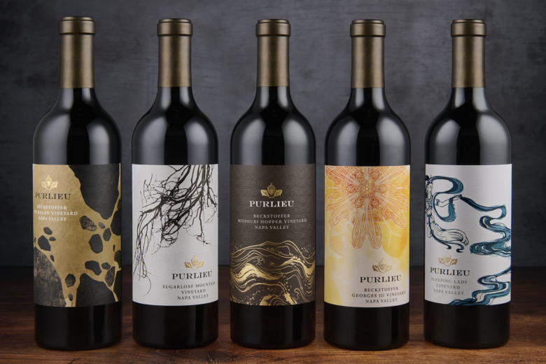
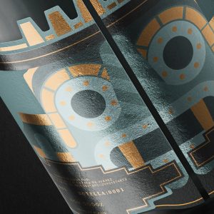
Purlieu Wines came to CF Napa to create a design system for their Single Vineyard wines. While the wines needed to share a familial look, each label needed to take on an individual design that expressed the unique character of each wine.
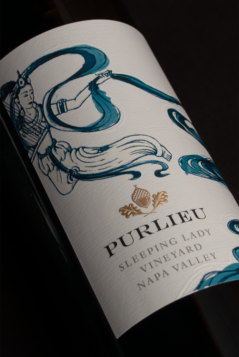
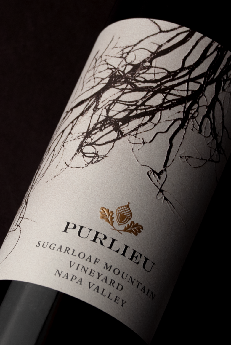
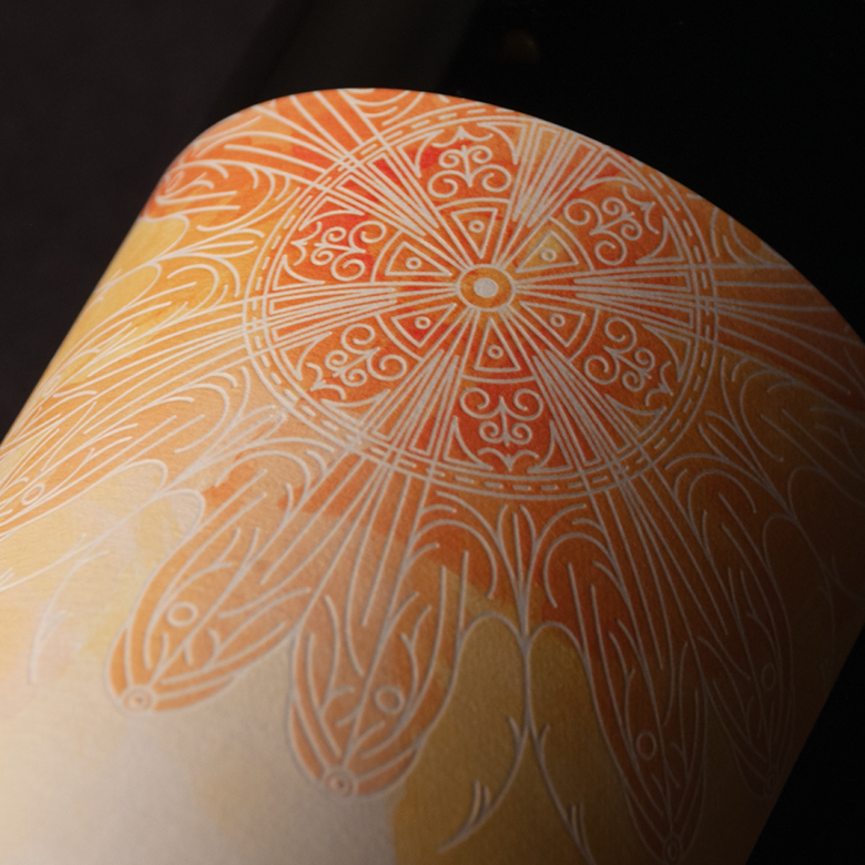
To honor the brand ownership’s Asian background, CF Napa developed a concept for the design of a portfolio of labels that emphasized this bridge between American and Asian cultures. Stylistically the illustrations were inspired by artwork and historical artifacts found along the Silk Road, an ancestral exchange route of culture and commerce, while the subject matter of the drawings represented each of the key elements that influence the vineyards.
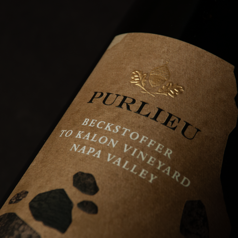
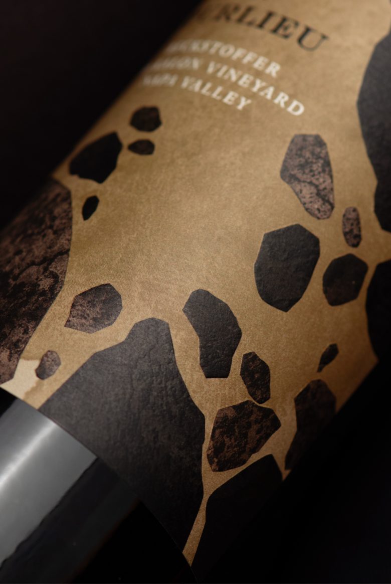
Beckstoffer To Kalon: Deep soil and rock accumulated over time, bringing structure and texture to the wine.
Sugarloaf Mountain Vineyard: The vines’ deep roots on a gentle hillside bring structure and texture to the wines.
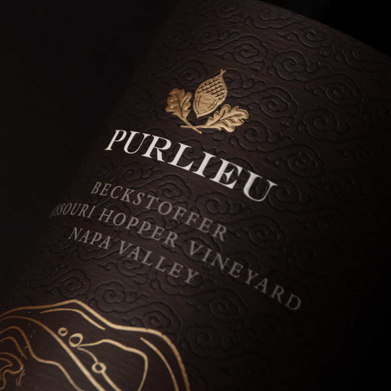
Beckstoffer Missouri Hopper Vineyard: Earth deposits from the river as it changes its course, creating wines with a darker profile with bright touches and layers.
Beckstoffer Georges III Vineyard: Warm sun and evening exposure. Lots of warm light and heat from the sun influences ripeness toward sweet ripe fruit.
Sleeping Lady Vineyard: The woman represents the waters running through the gravelly hillside which create delicate wines with ample robe.
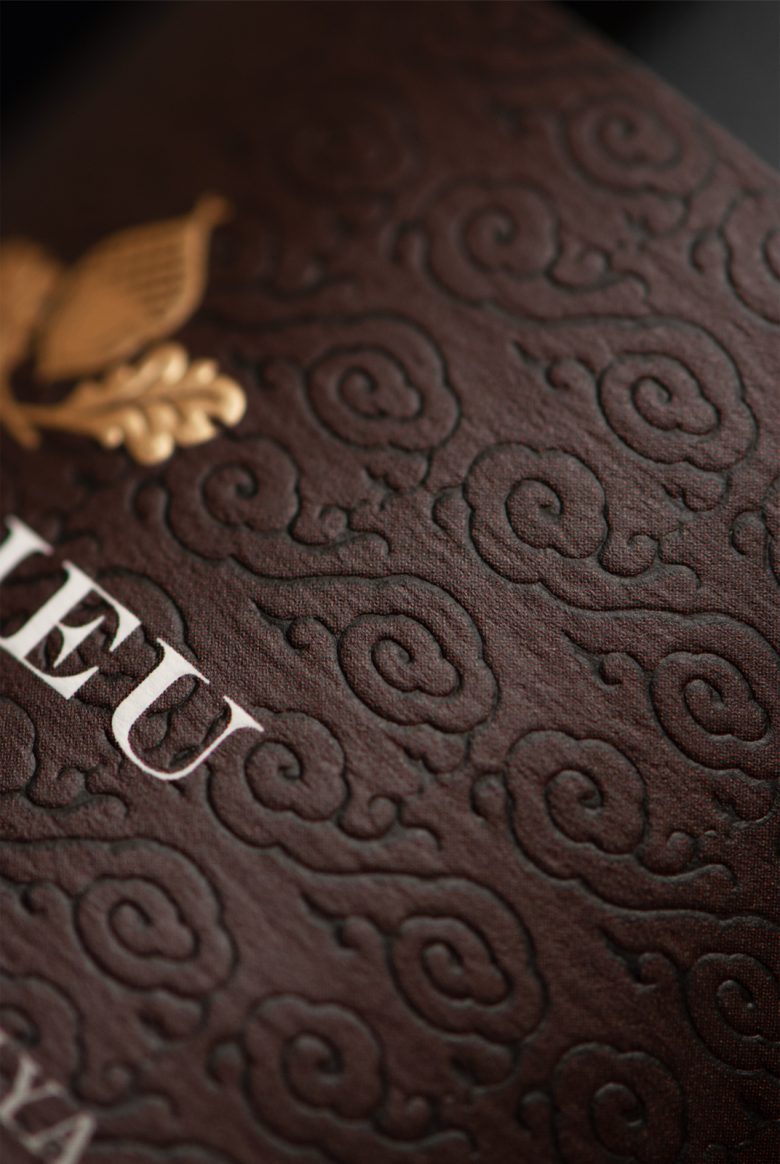
CF Napa reimagined the Purlieu acorn icon to be more readable and treated it in gold foil across all labels, creating consistency across each of the unique labels and asserting unity within the brand.
Designed by CF Napa Brand Design
Add to collection