

Add to collection
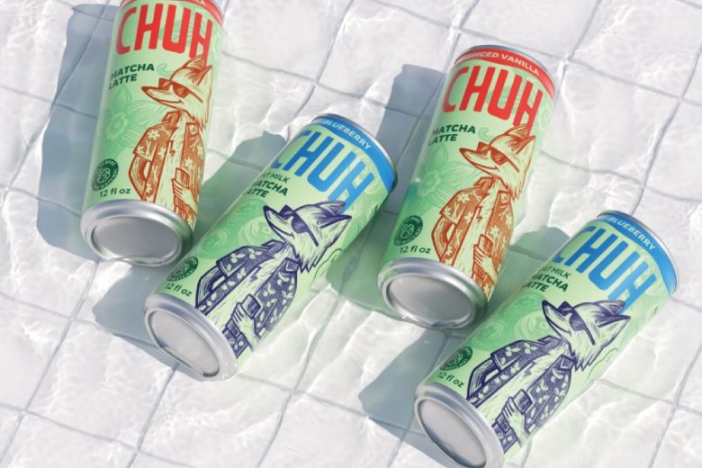
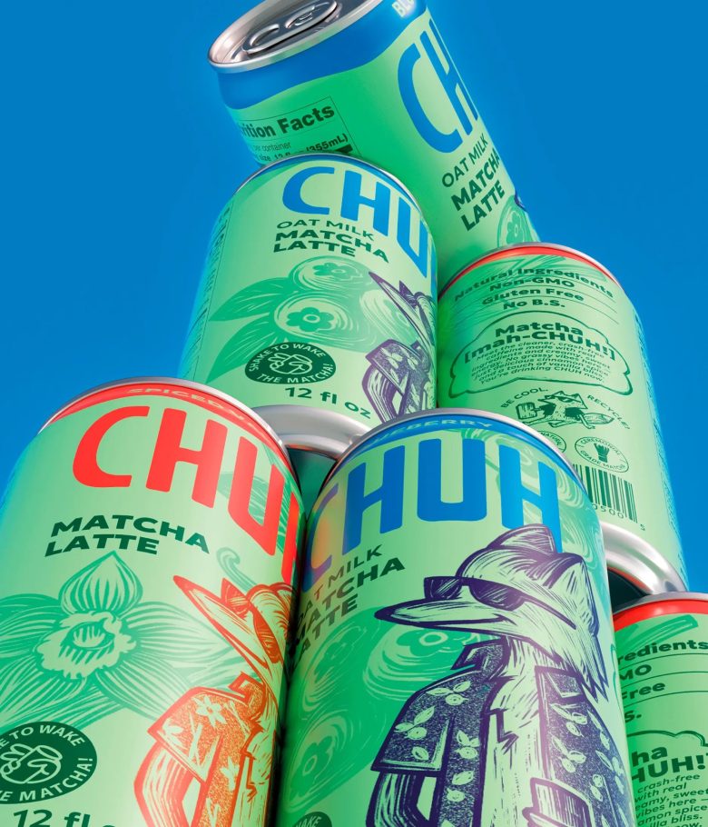
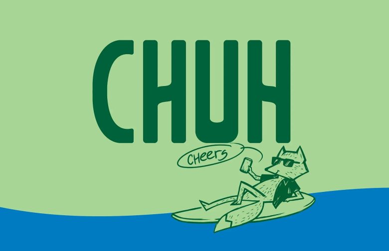
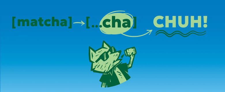
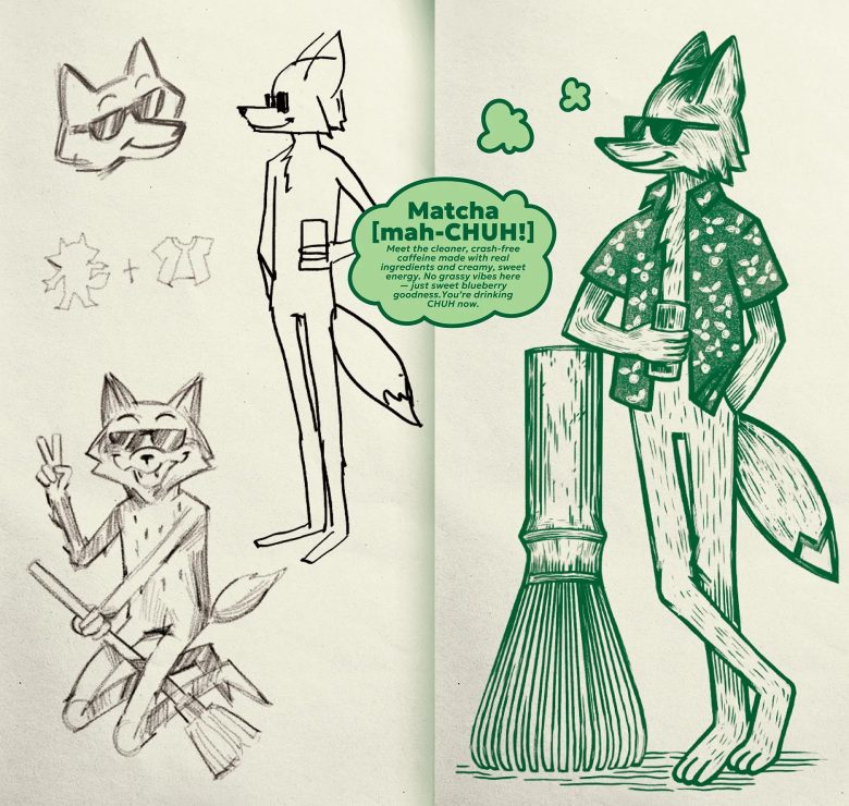
CHUH is a matcha-based latte drink with various flavors. It occupies a niche in the RTD (ready-to-drink) product market, bridging the gap between CSD (carbonated soft drinks) and cold coffee. The name itself plays on the main ingredient. This is thanks to the phonetic similarity of CHUH with [matcha] and [chug].
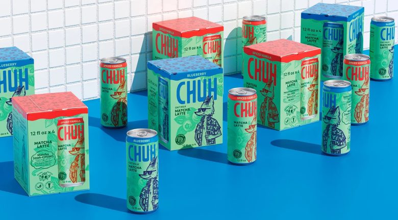
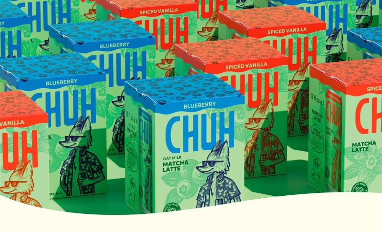
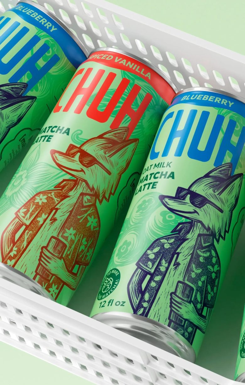
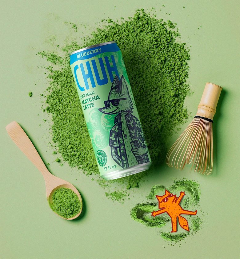
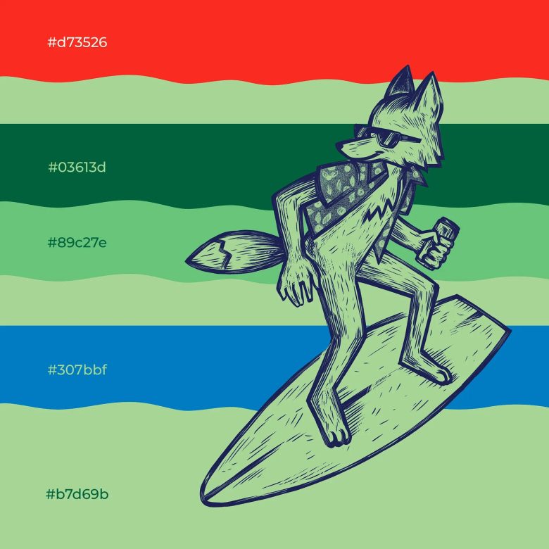
In the packaging design, we focused on three main aspects: the illustration of a unique character, precise work with the SKU color palette, and the overall look and feel of the product. Despite the simple and contrasting logo, the packaging is packed with details and storytelling elements. The vibe of CHUH is primarily conveyed through the fox character: he is relaxed, friendly, and open to everything new. The character’s image serves as an emotional element of the packaging. Also, it’s a rational differentiator of SKU flavors and a brand spokesperson in communications.
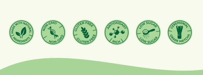
The CHUH color palette is natural and fresh, emphasizing the flavor profile and the natural character of ceremonial-grade matcha. We used green as the basic brand color, and navigation between flavors is achieved through the color and patterns of the character’s shirt and the character himself, through the color-filled collar at the top, and the logo, which dynamically adapts to the flavor profile.
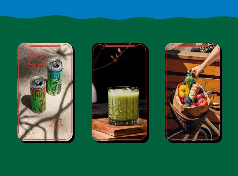
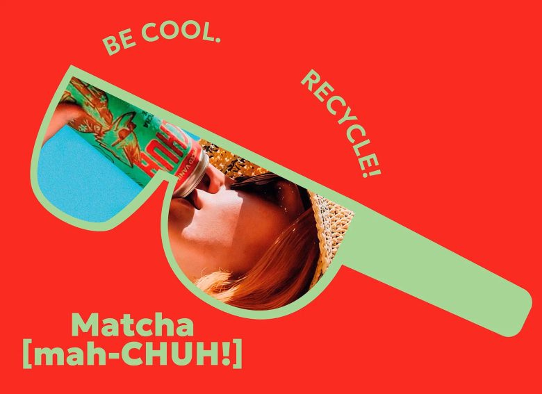
In the details, we actively communicate with the consumer. We ask them to shake the can vigorously. We also tell the story of the name. The packaging serves as the main advertising medium and the primary touchpoint for communication with the consumer.
Designed by PG Branding

Add to collection