Add to collection

As with a lot of journeys, there can be moments where not everything goes to plan. Despite Wolfburn Distillery in many ways having the helping hand of luck on their side when bringing their business and brand to life, there were times along the way where changes needed to be made — this also included elements of their packaging. MD of Wolfburn, Daniel Smith, who was originally bombarded with advice when it came to actually bottling his new whisky, shared his research when MD of Progress, Simon Farrow made the 500-mile journey north to visit the distillery and experience a day in the life of whisky production for himself.
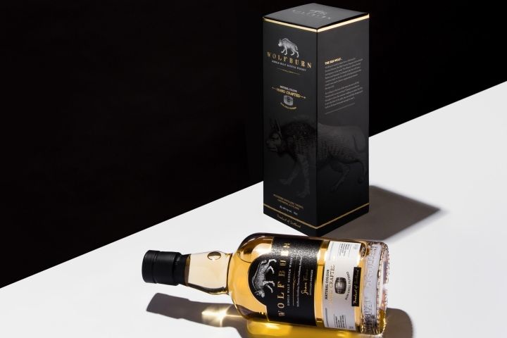
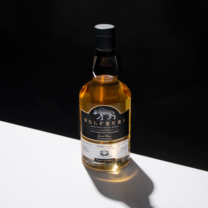
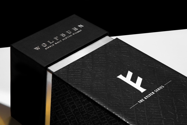
“I was told allsorts. Don’t make the bottle too big; people only want to be able to pick a bottle up with one hand, especially men. The original design looked nothing like how it looks now. If you don’t have vertical sides on a bottle, your labelling machine goes from costing £1,000 to £25,000. So you think, right, okay, let’s make the sides parallel.” Since forming a working partnership with Wolfburn, Progress have gone on to provide all the packaging requirements for these incredible bottles, as well as the branded labels (manufactured using Fedrigoni Tintoretto paper, then digitally printed and foil-blocked in gold) which are the main focus of the product brand when it stands independently.
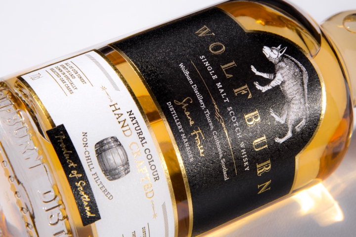
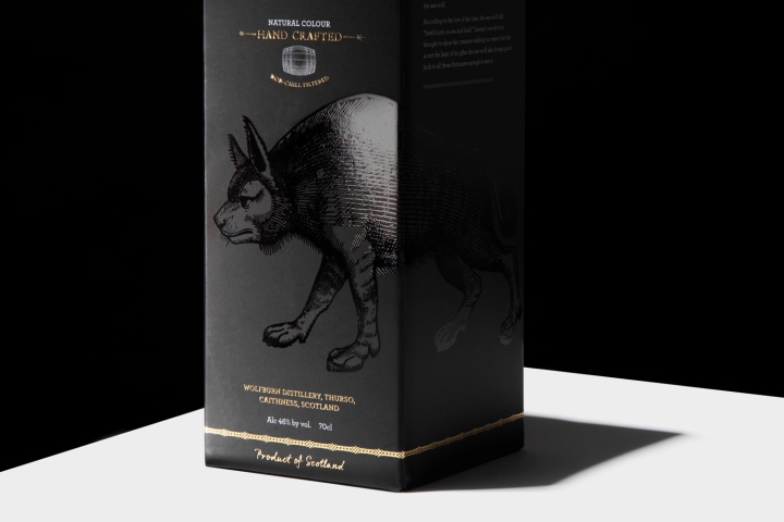
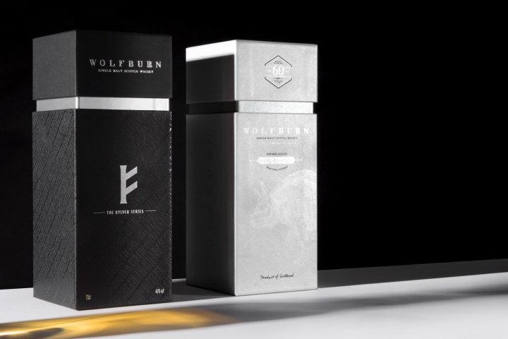
The crash-lock base cartons most definitely look the part too, tying in with the brand, allowing the wolf logo to stand out while complimenting the foil blocking and print that showcases the typography. The wolf illustration was discovered by Daniel’s wife through researching Conrad Gessnar; a 17th century artist who drew magical beasts based on stories recounted by old sailors upon returning from their travels. “Some love the wolf logo, others hate it,” Daniel told us honestly. From my point of view they don’t have to love it or hate it. They just have to remember it.”
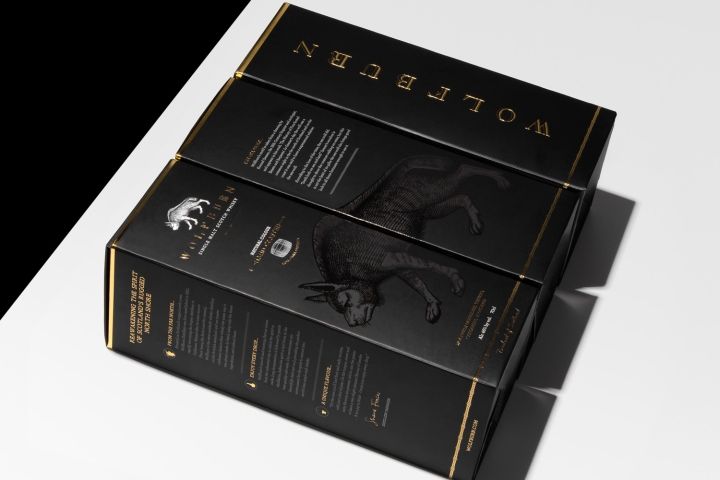
Progress have produced four different kinds of packaging for Wolfburn’s whisky, including two variations of cartons as well as two paper over board rigid boxes — all of which feature foil-blocking and gloss UV varnishing to the outers. “We get a lot of comments about our packaging — all different things. Even how the card feels nice and thick. They like that it justifies the price. A lot of whisky is bought for gifts — a huge amount — and if people don’t know much about the actual whisky, they do know what feels good in their hands. They buy their own clothes, shoes, watches, etc. It’s about how things feel. It’s how they choose what they like and what they’re going to buy. It’s all about perception.”
Daniel, while fascinatingly savvy yet relaxed about his business and the way he continues to push it forward, believes that who you work with along the way is incredibly important to making any part of your brand a success. “I want a few [employees] who know what they’re doing and do it efficiently. That’s from the top to the bottom whether it’s production or the suppliers I work with. It’s got to be efficient, helping the business run cheaper, but not at the expense of the brand and the quality of the product.”
From the very first step taken right through to creation of what was once nothing more than a vision, packaging is ultimately a journey of exploration. Not only does the final product have to look good, it also has to feel good. Whether it involves rebranding or relaunching, attention to detail is key to producing something that is functional, affordable, as well as visually appealing. We couldn’t agree with Daniel more when he stated, “It’s ultimately all about the Wolfburn brand – and our packaging doesn’t just support that, it’s part of it.”
Design: Progress Packaging


Add to collection