

Tenute Testarde by Marco D’Aroma
posted by retail design blog on 2026-04-28
Add to collection
TENUTE TESTARDE
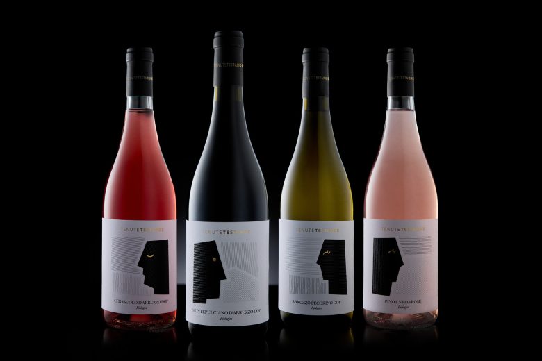
4 wines, 3 estates, 1 headstrong family.
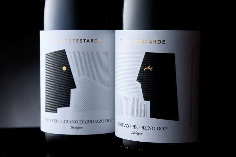
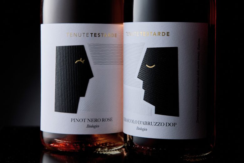
Tenute Testarde was born from a life choice: to believe in the land and in its most authentic identity. One family — Sergio, Romina, and their daughters Helena and Giorgia — produces four wines, each reflecting a distinct personality: the intense and bold Montepulciano d’Abruzzo, the lively and radiant Cerasuolo, the fresh and linear Pecorino, and the elegant, refined Pinot Noir Rosé.
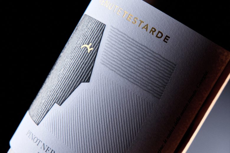
The entire visual system works as a cohesive family. The design celebrates the diversity of the wines and the estates while maintaining a unified narrative: rigor and sensitivity, nature and identity, landscape and face merge into a clear and distinctive visual balance.
The project distills the concept of “Tenute Testarde”: a territory with character, rooted yet personal, that takes on human traits and becomes a direct expression of the strength and personality of the wines.
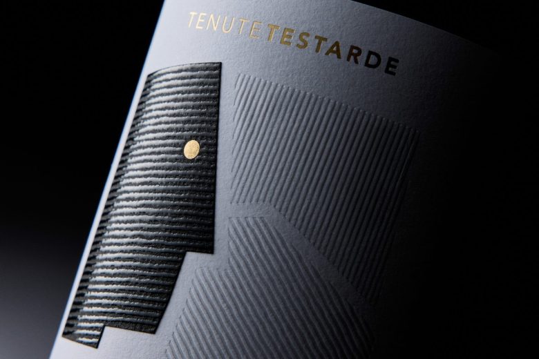
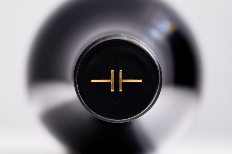
The Tenute Testarde logo originates from two opposing capital “T”s. From simple letters, they evolve into two rams facing each other — a visual reference to determination, strength of will, and a character that never backs down. A mark that speaks of identity, vision, and tenacity.
Curator’s Insight
The gold eye is the whole system in miniature. Everything around it… the embossed striations, the flat black silhouette, the debossed geometry… is controlled and deliberate. That single curved mark is the only moment of warmth, and it lands differently on each variant: a dot, a stroke, a glint. It is a small decision that gives the face its expression without ever becoming illustrative. That restraint is what keeps the label feeling like a mark rather than a scene.
Designed by Marco D’Aroma
Add to collection