



GDTON by HONGLT Brand Design
posted by retail design blog on 2026-09-10
Add to collection
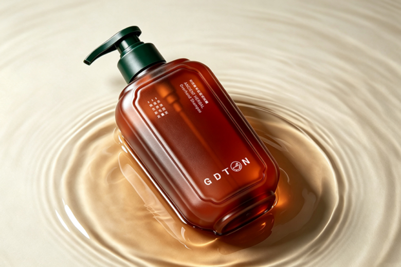
广德堂 GDTON|Ancient‑Herbal New‑Chinese Hair‑care Packaging
The over‑saturated Chinese‑style personal‑care market is flooded with copied landscape‑and‑floral decorative patterns. For GDTON, our studio Honglt refused superficial cultural collage. We dug into traditional Chinese herbal‑medicine ritual, took the mortar‑and‑pestle as the exclusive core symbol, and built a complete family‑packaging system balancing oriental temperament, shelf competitiveness, mass‑production feasibility and cost control. This case shares our real‑world experience: how to translate traditional oriental culture into modern commercial packaging without aesthetic cliché.
Design Concept|品牌创意设计理念
In most herbal‑care projects we receive, clients tend to stack mountains, flowers, birds and traditional patterns directly on bottle surfaces. From our studio’s point of view, true new‑Chinese packaging is not decorative printing, but extracting cultural spirit and re‑interpreting it for modern consumer goods. That was our starting point for GDTON.
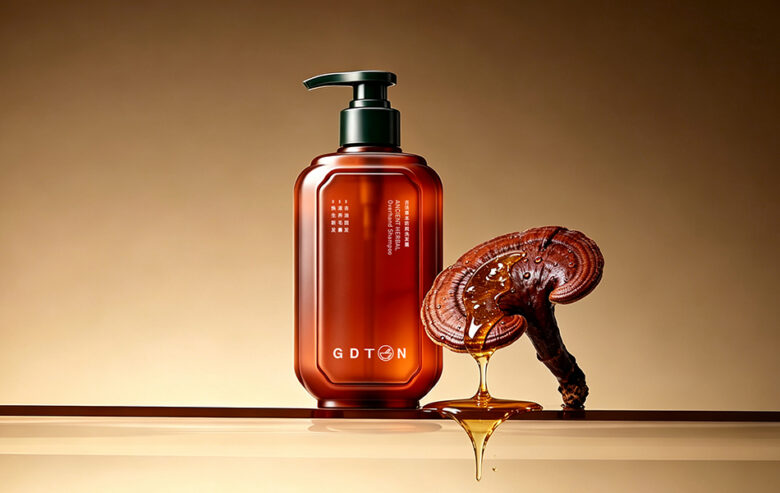
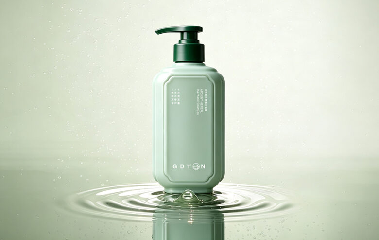
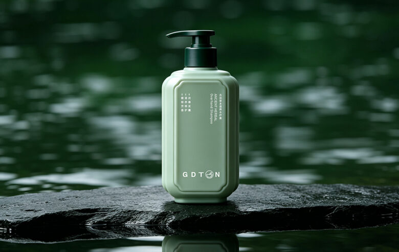
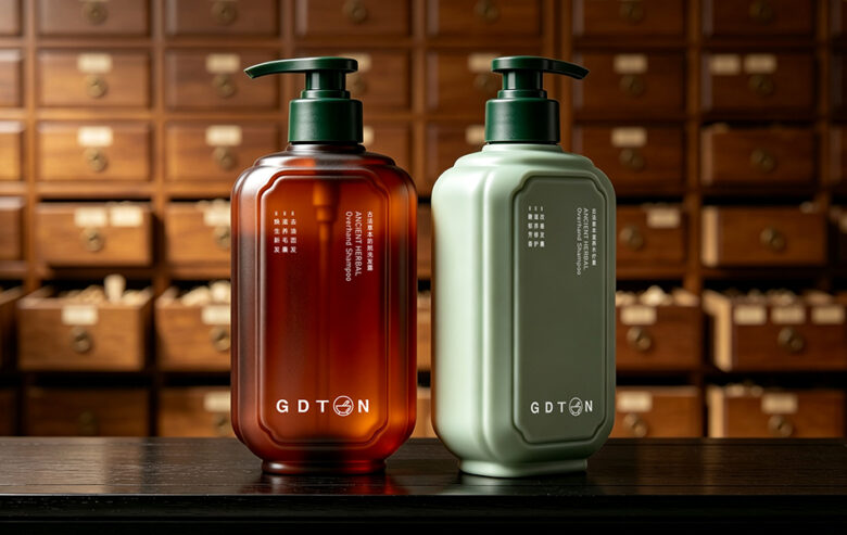
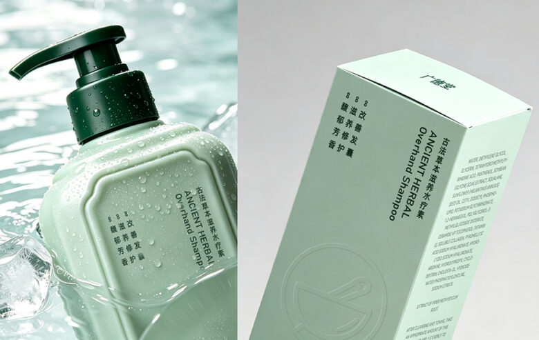
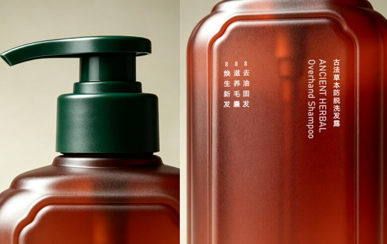
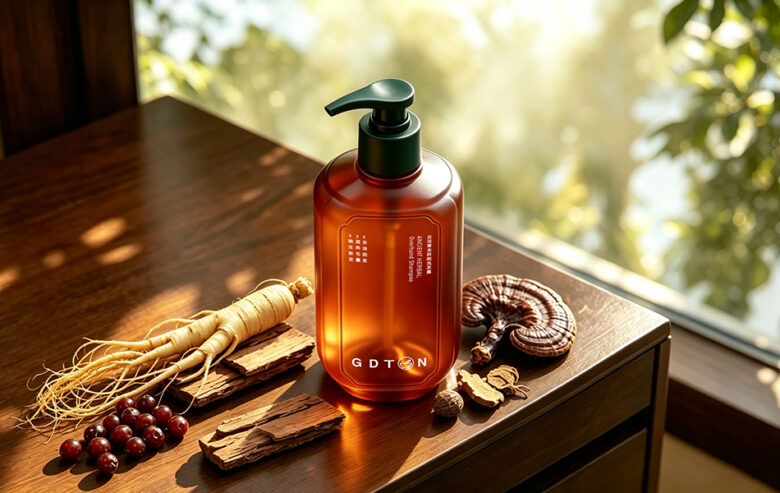
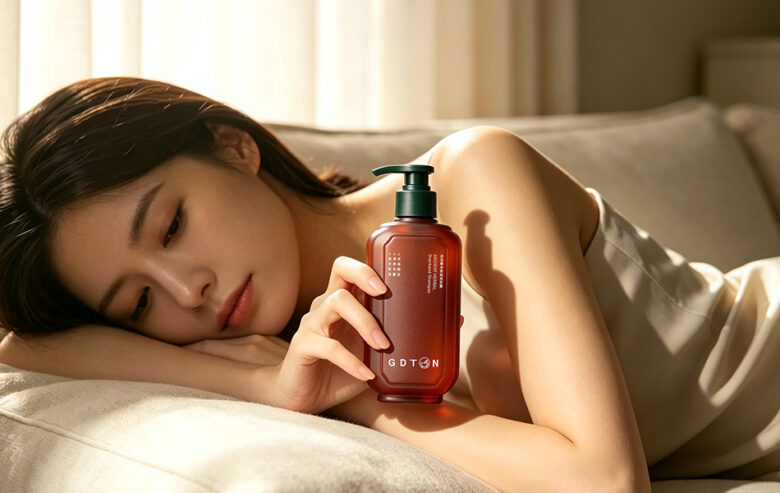
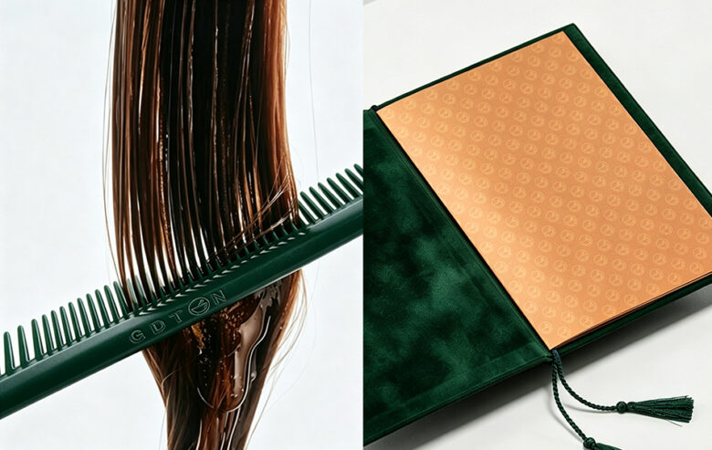
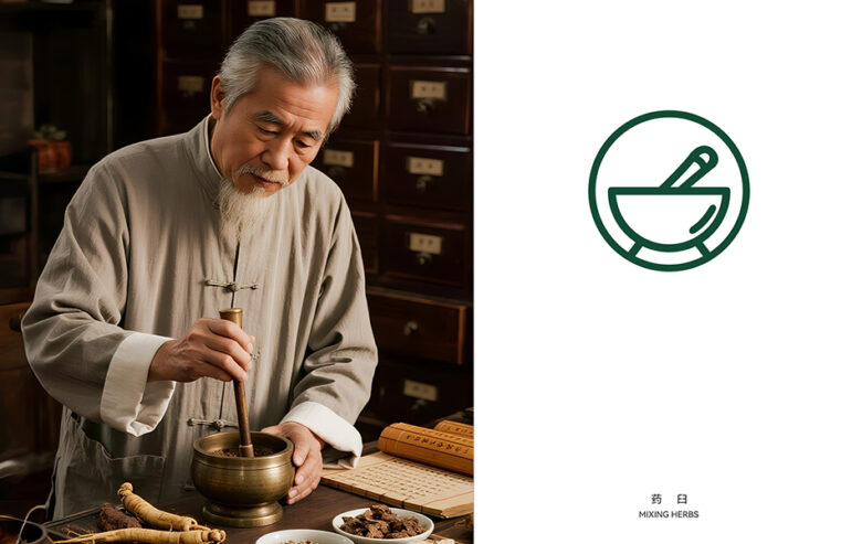
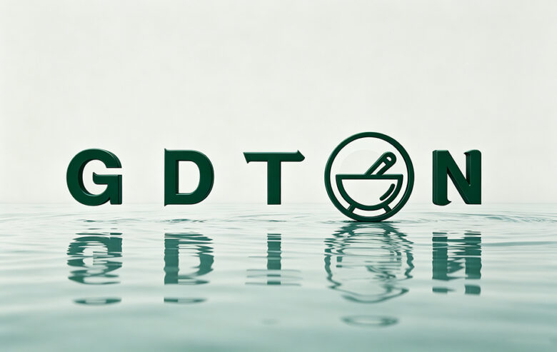
Core Symbol Extraction:Mortar‑and‑pestle minimalist icon We picked mortar and pestle, the classic tool of ancient Chinese herbal preparation, rather than popular decorative motifs. We refined it down to clean linear iconography. This symbol is embedded right into the middle of brand logotype “GDTON”, merging graphic mark and brand lettering as one unit. We reuse this single consistent symbol across bottles, outer boxes and gift bags. Instead of throwing dozens of different graphics at consumers, one strong repeated mark builds solid brand memory. This is our studio view:One powerful cultural symbol beats ten trivial decorative patterns.Cultural Narrative, controlled visual restraint We avoided cramming cultural storytelling onto bottle surfaces. The bottle silhouette references ancient Chinese medicine vases, softened with rounded modern revisions. Scenes of medicine cabinets, herb grinding and raw herbal materials are reserved for photography and brand collateral, not printed all over packaging. Keeping bottle surfaces clean with generous negative space prevents information overload. The packaging itself carries quiet temperament; atmosphere is delivered through scenario visuals. This is a key lesson we summed up from multiple domestic herbal‑care projects:Do not make packaging do all the narrative work.Dual‑colour family bottle system, control mould cost We adopted one shared bottle mould for two product variants. Only body colour differentiates product lines, while bottle shape, pump, typography grid stay identical. This family‑structure logic brings two practical commercial benefits:strong unified brand visual on retail shelves; when brand launches new SKUs later, they only need to adjust silk‑screen content instead of opening new expensive moulds, greatly shortening iteration cycle and cutting manufacturing expense. Many brands overlook this point and waste budget on redundant mould development.Layout logic:Ancient‑book inspired inner recessed window We integrated a recessed frame window directly into bottle blow‑moulding, no extra adhesive labels. All copy is confined within this frame, mixing vertical Chinese‑English types, echoing ancient book reading rhythm. We keep graphic printing minimal. Clean bottle surfaces perform much better both for offline shelf display and e‑commerce photography.
宏洛图专属观点植入: For oriental‑style personal‑care, layout discipline counts more than fancy illustrations. Restricting all text inside fixed visual frames guarantees visual consistency across the whole product matrix.
Material Selection|产品包装材质选型
Material texture is the core carrier of new‑Chinese quiet premium feel. In this project, we prioritised tactile performance and mass‑production stability, avoiding high‑maintenance decorative materials that look great in renders but fail in physical production.
Bottle Components
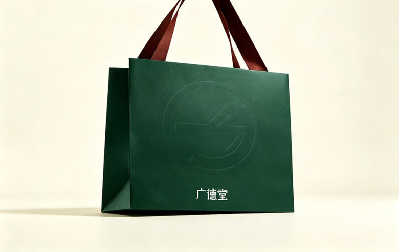
Main Bottle:PET matte plastic bottleBrown‑tea translucent PET version:Base material is semi‑transparent tea‑coloured PET with in‑mould etching matte finish. You can vaguely see the liquid inside. It balances premium texture and large‑batch production cost.Pale bean‑green solid‑colour PET version:Internal colour‑blending blow‑mould, unified matte frosted texture. Muted soft tone avoids cheap glossy‑plastic visual effect.Pump head:PP plastic pump Dark‑moss‑green PP pump with matte spray finishing. Colour contrasts gently with bottle body. High‑flow press pump fits daily hair‑care usage. Matte treatment unifies tactile feeling with frosted bottle.Outer carton:High‑weight art paperboard with soft‑touch lamination High‑grammage white card base, matched with brand moss‑green tone. Soft‑touch matte film brings smooth fingerprint‑resistant hand‑feel, protects printed layers. Brand mark, typography and regulatory information are printed on surface.Gift paper bag:High‑grammage dark moss‑green art paper The paper itself carries subtle natural texture. We skip full‑surface printing. Mortar‑and‑pestle logo is presented only by blind deboss. Match with tone‑consistent woven ribbon handle for gifting scenarios.
宏洛图实操提醒: PET frosted transparency must be strictly confirmed during pre‑production sampling. Translucency deviation will completely change the visual of inner liquid, which is a frequent pitfall for herbal‑care bottle projects.
Production & Craft|落地工艺要点
We rejected over‑complicated luxury craft. Every technique we chose solves real‑world pain points:scratch resistance, production yield, long‑term usability and cost control.
Bottle‑body craft
In‑mould frosted etching:Matte texture is formed in bottle blowing phase, not post‑spray painting. Comparing with post‑process spray‑frosting, it is scratch‑resistant, will not peel off in daily use, has higher mass‑production yield and reasonable cost. Translucent tea‑PET lets inner liquid colour become part of visual effect naturally.Curved‑surface silk‑screen printing:Logo and all bottle text adopt white silk‑screen ink. Ink adhesion is stable on curved frosted plastic. Lines stay sharp and neat. From our studio’s past project experience, hot‑stamping metallic foil easily wears off on repeated contact in bathroom scenarios. Silk‑screen fits the calm herbal temperament better and improves product durability.
Carton & Gift‑bag craft
Carton:CMYK printing + soft‑touch matte lamination. Anti‑fingerprint, improves hand‑feel and protects printed graphics.Gift bag:Blind deboss (indented pressing). Zero‑ink craft uses paper texture fluctuation to show brand mortar‑pestle logo. Low cost yet delivers restrained premium sense, no heavy ink coverage required.
Structural advantages
Recessed‑window is one‑piece blow‑moulded. No separate label stickers needed. All corners are rounded for comfortable grip and anti‑chipping.Shared bottle‑blank mould for two lines:Only bottle body colour changes. New product roll‑out only needs updated silk‑screen artwork, no new mould investment. This is our recommended solution for growing Chinese herbal‑care brands.
Honglt Studio’s New‑Chinese Packaging Practical Insights(宏洛图差异化设计观点)
Many so‑called new‑Chinese personal‑care packages fall into two traps:either piling numerous traditional patterns, or blindly applying expensive complicated craft for visual vanity. Based on our accumulated domestic case experience, we sum up 4 core principles for this category:
Reduce decorative symbols, focus on cultural spirit Do not flood bottle surface with Chinese‑style illustrations. Condense cultural inheritance down to one single strong core icon. Keep large negative space on packaging. Reserve complex oriental imagery for shooting scenes and marketing materials, not bottle printing.Low‑saturation oriental colour palette We use deep moss‑green as main brand identity colour; tea‑brown and bean‑green for product‑line differentiation. Avoid garish high‑saturation hues. Muted earth‑oriented tones match herbal positioning and perform well both online photography and offline shelf display.Material texture out‑weights over‑printing Matte, low‑reflective tactile experience is key for herbal‑care packaging. Prefer frosted mould texture, art‑paper texture, blind deboss. Keep away from excessive gloss, holographic and flashy metallic craft. Tactile quality delivers premium feeling more effectively than multi‑colour fancy printing.Full‑link visual consistency is non‑negotiable Logo, bottle, carton, gift bag must share identical symbol, typography and colour system. Visual unity across physical product and e‑commerce asset strengthens brand recognition.
Critical sampling reminder from our practice: Before mass production, three items must be verified:PET frosted transparency, silk‑screen ink adhesion on curved frosted bottle, deboss depth on paper bag. Perfect renderings do not guarantee qualified physical product. Sampling test is indispensable to avoid final‑output failure.
Design Agency:宏洛图品牌设计(HONGLT Brand Design)
Project Type:Brand Visual Positioning + Full‑range Product Packaging Realisation
Core Products:Herbal shampoo & hair conditioner
Application Scenarios:Offline counter display, e‑commerce visual system, gift box & paper bag full set
Add to collection