




Sévelle by Axiniya Knyazeva
posted by retail design blog on 2026-09-29
Add to collection
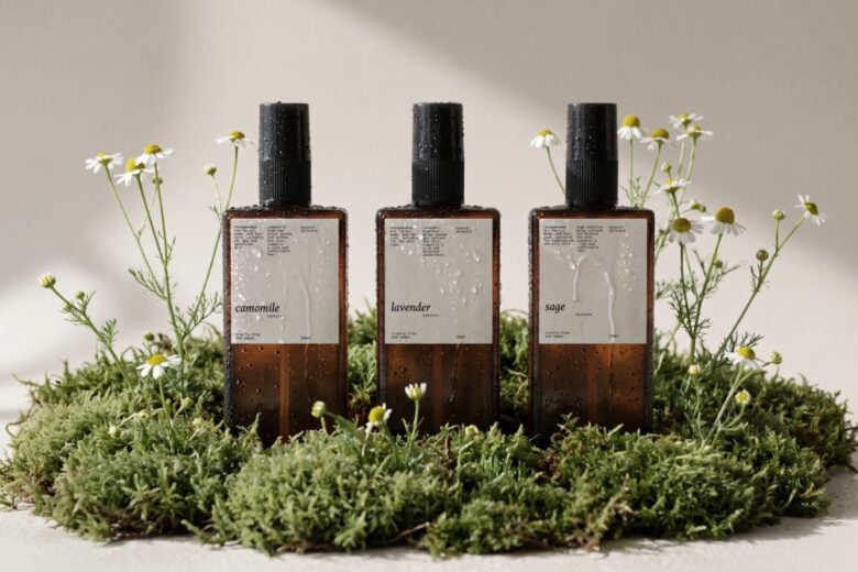
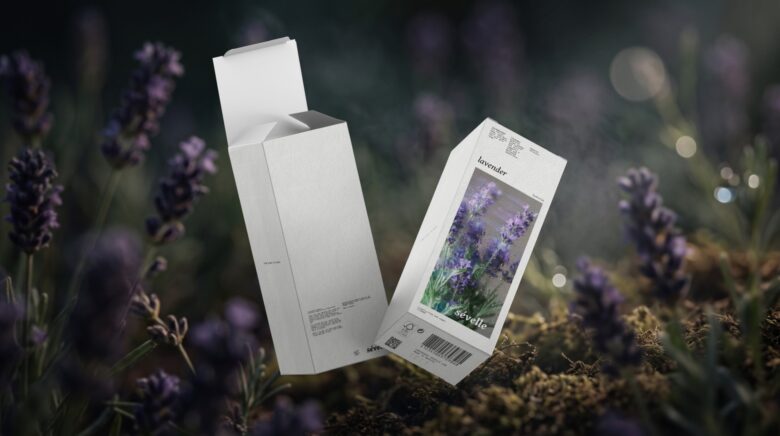
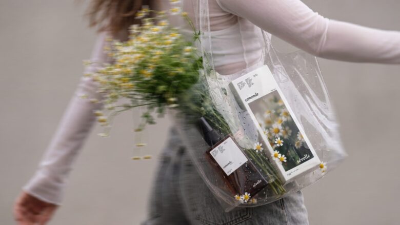
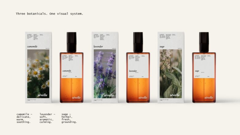
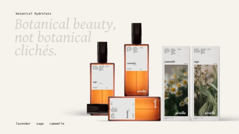
Sévelle is a line of natural hydrolats for everyday, created around three botanical ingredients: lavender, sage and chamomile. The project included the development of the brand identity and packaging for the range.
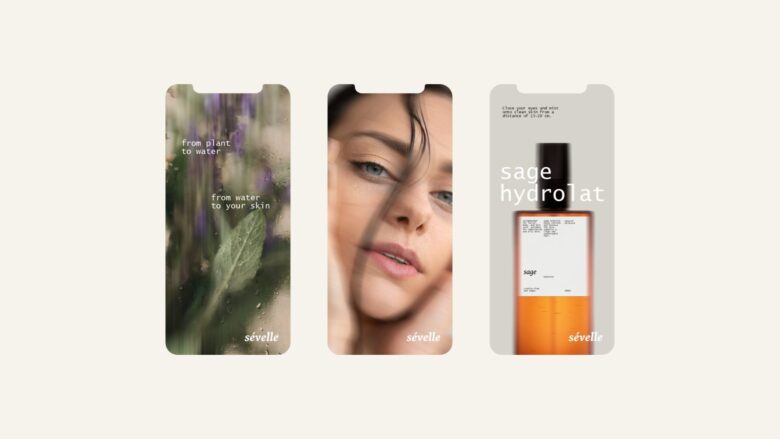
The idea was to move away from the familiar visual language of natural cosmetics and herbal products and give hydrolats a more refined, sensory character. The design takes cues from niche fragrance and premium skincare, treating the product as a small everyday beauty ritual rather than simply a functional botanical product.
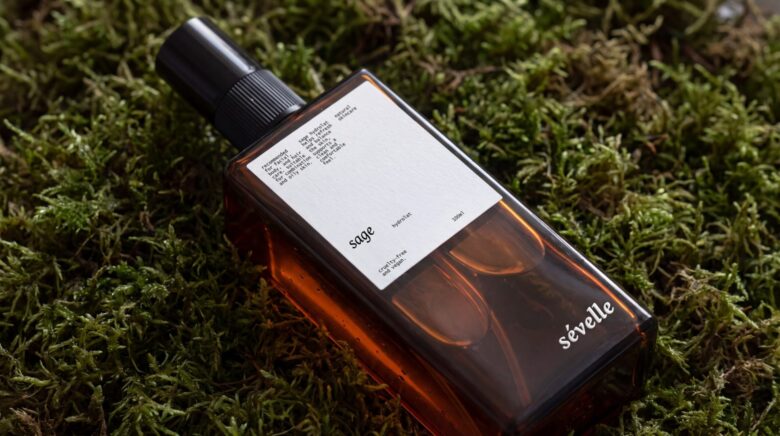
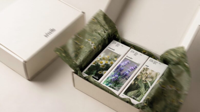
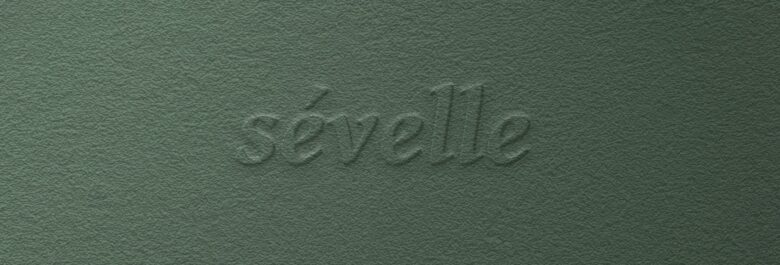
The visual identity combines elegant typography, botanical photography, a muted colour palette and tactile paper details. Each hydrolat has its own botanical image and colour accent, while the overall system remains calm and cohesive. Dark glass bottles and cotton-paper labels add depth and tactility, creating a more intimate and almost perfumery-like experience.
Rather than using decorative botanical illustrations or conventional eco aesthetics, the design relies on materiality, restrained composition and the natural beauty of the ingredients themselves. This balance between botanical authenticity and a sophisticated visual language gives Sévelle its distinctive character.
The result is a contemporary packaging system that makes natural hydrolats feel more like a considered beauty product — tactile, quiet and premium, while keeping the individual formulas clear and recognizable within the range.
Designed by Axiniya Knyazeva
Add to collection